
What is a Wastewater Collection Network Overflow & Backup Dashboard?
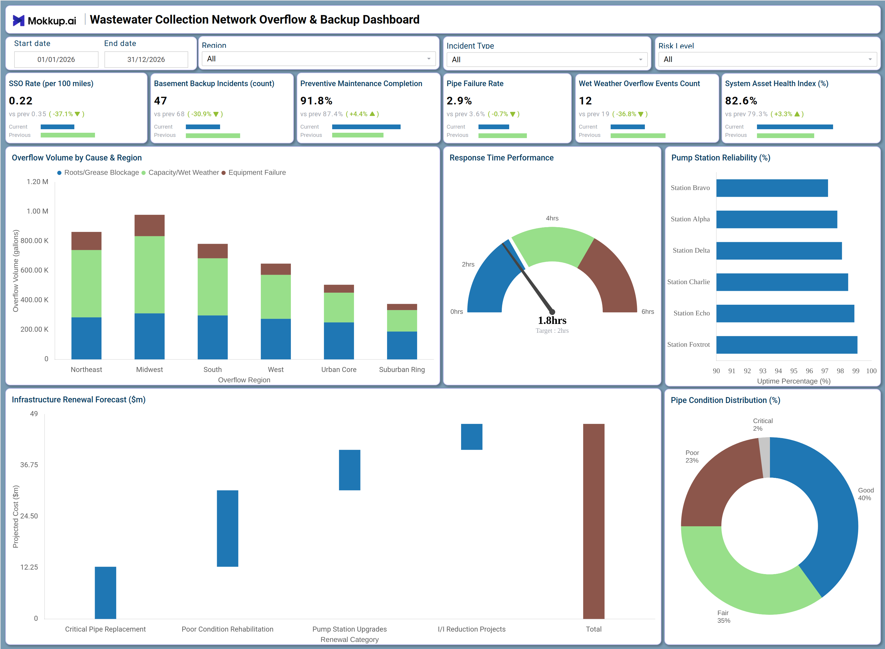
The Wastewater Collection Network Overflow & Backup Dashboard is a structured operations and asset management tool designed for municipal utility managers, wastewater engineers, and public works directors who need a consolidated view of network health across collection infrastructure. This wastewater collection network overflow dashboard functions as an SSO rate yearly tracking dashboard, monitoring critical indicators such as sanitary sewer overflow rates, basement backup incidents, preventive maintenance completion, pipe failure rates, wet weather overflow events, and system asset health, giving operations teams the situational awareness needed to manage a complex buried infrastructure network. The dashboard supports both daily operational decisions and longer-range capital planning by combining overflow cause analysis with infrastructure renewal forecasting in a single interface. Teams managing urban and suburban sewer systems use this dashboard to monitor pipe condition distribution, pump station uptime, and response time performance, helping them reduce overflow incidents and maintain regulatory compliance across their service territory.
How to Create a Wastewater Collection Network Overflow & Backup Dashboard
You don't need to build your report from scratch; just start with a ready-to-use dashboard template from Mokkup. Add in your data and export it however you like. Here's how to do it:
1. Create or Log in to Your Mokkup Account
Start by signing up on Mokkup.ai using your email. If you already have an account, just log in, and you'll be good to go.
2. Choose and Customize Your Dashboard Template
Find the Wastewater Collection Network Overflow & Backup Dashboard template in the Templates section. Use the drag-and-drop editor to adjust KPIs, edit filters, or add elements based on your data.
3. Export to Your BI Tool
Once your dashboard wireframe is ready, use the BI Tool Export feature to send it directly to Power BI or Tableau for further analysis and enhancements. You can also download the dashboard as a PDF, PNG, or JPEG, embed it on a platform, or invite your team to collaborate.
Note: This is a Pro template. You'll need a Pro subscription on Mokkup to use and customize this dashboard wireframe. Upgrade anytime to unlock full access.
Wastewater Collection Network Overflow & Backup Dashboard Example
A utility operations manager opens this dashboard at the start of a shift to assess network conditions after a heavy rainfall event. They use the Region and Incident Type filters to isolate overflow activity in the most affected service zones, then review the Overflow Volume by Cause & Region stacked bar chart to understand whether spikes are driven by capacity and wet weather conditions, pipe blockages from roots or grease, or equipment failures. This wastewater overflow cause analysis by region helps the team dispatch crews to the right locations with the right equipment rather than relying on verbal field reports.The operations team also checks the Response Time Performance Yearly gauge to see whether field crews are meeting the target response window. If response times are trending close to the upper limit, supervisors adjust crew deployment schedules accordingly.
The Pump Station Reliability chart provides station-by-station uptime visibility, allowing maintenance leads to identify which stations are underperforming and prioritize pump station maintenance scheduling before a failure triggers a downstream overflow event.Capital planning teams use the Infrastructure Renewal Forecast chart to understand projected spending across Critical Pipe Replacement, Poor Condition Rehabilitation, Pump Station Upgrades, and Inflow and Infiltration Reduction Projects. Combined with the Pipe Condition Distribution donut chart, which segments the network into Good, Fair, Poor, and Critical condition categories, this view supports defensible budget requests and sanitary sewer infrastructure asset management decisions. The System Asset Health Index KPI gives leadership a single summary metric for overall network condition, useful for board presentations and regulatory reporting.
How to Analyze Data in a Wastewater Collection Network Overflow & Backup Dashboard
Here is how you can analyze data from this dashboard:
- Use the Region filter to isolate overflow patterns for specific service zones such as Northeast, Midwest, Urban Core, or Suburban Ring.
- Use the Incident Type and Risk Level filters together to focus the view on high-priority overflow events requiring immediate response.
- Review the Overflow Volume by Cause & Region chart to distinguish between blockage-driven, capacity-driven, and equipment-related overflow incidents by area for wastewater overflow cause analysis by region.
- Monitor the Response Time Performance Yearly gauge to confirm field crews are meeting the target response window and identify scheduling gaps.
- Analyze the Pump Station Reliability chart to identify which stations have the lowest uptime and flag them for pump station maintenance scheduling.
- Use the Infrastructure Renewal Forecast chart to compare projected spend across renewal categories and prioritize capital investments.
- Review the Pipe Condition Distribution donut chart to assess what proportion of the network is in Poor or Critical condition.
- Track the SSO Rate Yearly and Pipe Failure Rate KPIs together to measure the effectiveness of preventive maintenance programs over time.
- Filter by Start date and End date to compare overflow metrics across dry and wet weather seasons and support sanitary sewer infrastructure asset management planning.
Benefits of a Wastewater Collection Network Overflow & Backup Dashboard
The following are the benefits of using this dashboard:
- Consolidates wastewater overflow cause analysis, pump station reliability, and pipe condition data into one structured operations template.
- Supports pump station maintenance scheduling by surfacing station-by-station uptime performance across all monitored facilities.
- Reduces manual data compilation by providing pre-built KPI tiles for SSO Rate, Backup Incidents, and Preventive Maintenance Completion.
- Enables region-level breakdown of overflow volume by cause, supporting targeted crew dispatch and sanitary sewer infrastructure asset management planning.
- Provides a stacked bar view of overflow causes segmented by region, giving operations teams clear context for infrastructure decisions.
- Helps utility managers and capital planners align renewal priorities across pipe replacement, rehabilitation, pump upgrades, and inflow reduction.
- Gives field supervisors and executive leadership a shared view of system asset health through the System Asset Health Index KPI.
KPIs to Track in a Wastewater Collection Network Overflow & Backup Dashboard
The following key KPIs can be tracked by using this dashboard:
- SSO Rate Yearly (per 100 miles): This wastewater collection network overflow dashboard metric measures the annual frequency of sanitary sewer overflows normalized by network length, serving as the primary regulatory compliance indicator for collection system performance.
- Basement Backup Incidents (count): Tracks the total number of confirmed basement sewage backup events within the service period, a direct measure of customer impact and collection system failure.
- Preventive Maintenance Completion (%): Quantifies the percentage of scheduled inspection and cleaning tasks completed, a core driver of wastewater overflow cause analysis — teams with higher completion rates consistently show lower SSO rates.
- Pipe Failure Rate (%): Measures the proportion of pipe segments experiencing structural or functional failure, key to sanitary sewer infrastructure asset management planning and capital renewal forecasting.
- Wet Weather Overflow Events Count: Evaluates how frequently rainfall-driven surges exceed collection system capacity, supporting inflow and infiltration reduction project prioritization across regions; SSO rate yearly tracking dashboard teams use this metric to flag seasonal risk.
- System Asset Health Index (%): Tracks the overall condition score of collection system assets across all monitored pipe segments and pump stations, used as a summary indicator for pump station maintenance scheduling effectiveness and network-wide resilience.
Frequently Asked Questions
1. What industries benefit most from this Wastewater Collection Network Overflow & Backup Dashboard?
Municipal wastewater utilities, public works departments, and environmental compliance teams benefit most from this dashboard. It is also used by engineering consultants supporting capital improvement planning for aging sewer infrastructure.
2. Can this dashboard track overflow events by cause and geographic region simultaneously?
Yes. The Overflow Volume by Cause & Region stacked bar chart segments overflow volume by Roots/Grease Blockage, Capacity/Wet Weather, and Equipment Failure across six regional categories. This makes wastewater overflow cause analysis by region a core function of the dashboard.
3. Is this dashboard suitable for capital planning and infrastructure renewal decisions?
Yes. The Infrastructure Renewal Forecast chart displays projected costs across Critical Pipe Replacement, Poor Condition Rehabilitation, Pump Station Upgrades, and Inflow and Infiltration Reduction Projects. Combined with the Pipe Condition Distribution donut chart, it provides the data needed for sanitary sewer infrastructure asset management budget requests.