
What is a Wastewater Collection Inflow & Infiltration Dashboard?
The Wastewater Collection Inflow & Infiltration Dashboard is a structured analytical template built for municipal engineers, utility managers, and wastewater operations teams to monitor and manage excess flows entering sewer collection systems. Inflow refers to stormwater that directly enters sewer pipes through openings, while infiltration is groundwater that seeps in through cracks, joints, and defective pipe connections. This wastewater collection inflow and infiltration dashboard tracks critical performance indicators including total I&I volume, overflow incidents, rehabilitation progress, and financial impact in one consolidated view. Utility planners and infrastructure teams use this template to conduct wastewater basin risk level assessment, prioritize repair activities, and allocate capital budgets effectively across service areas.
How to Create a Wastewater Collection Inflow & Infiltration Dashboard
You don’t need to build your report from scratch; just start with a ready-to-use dashboard template from Mokkup. Add in your data and export it however you like. Here’s how to do it:
1. Create or Log in to Your Mokkup Account
Start by signing up on Mokkup.ai using your email. If you already have an account, just log in, and you'll be good to go.
2. Choose and Customize Your Dashboard Template
Find the Wastewater Collection Inflow & Infiltration Dashboard template in the Templates section. Use the drag-and-drop editor to adjust KPIs, edit filters, or add elements based on your data.
3. Export to Your BI Tool
Once your dashboard wireframe is ready, use the BI Tool Export feature to send it directly to Power BI or Tableau for further analysis and enhancements. You can also download the dashboard as a PDF, PNG, or JPEG, embed it on a platform, or invite your team to collaborate.
Note: This is a Pro template. You'll need a Pro subscription on Mokkup to use and customize this dashboard wireframe. Upgrade anytime to unlock full access.
Wastewater Collection Inflow & Infiltration Dashboard Example
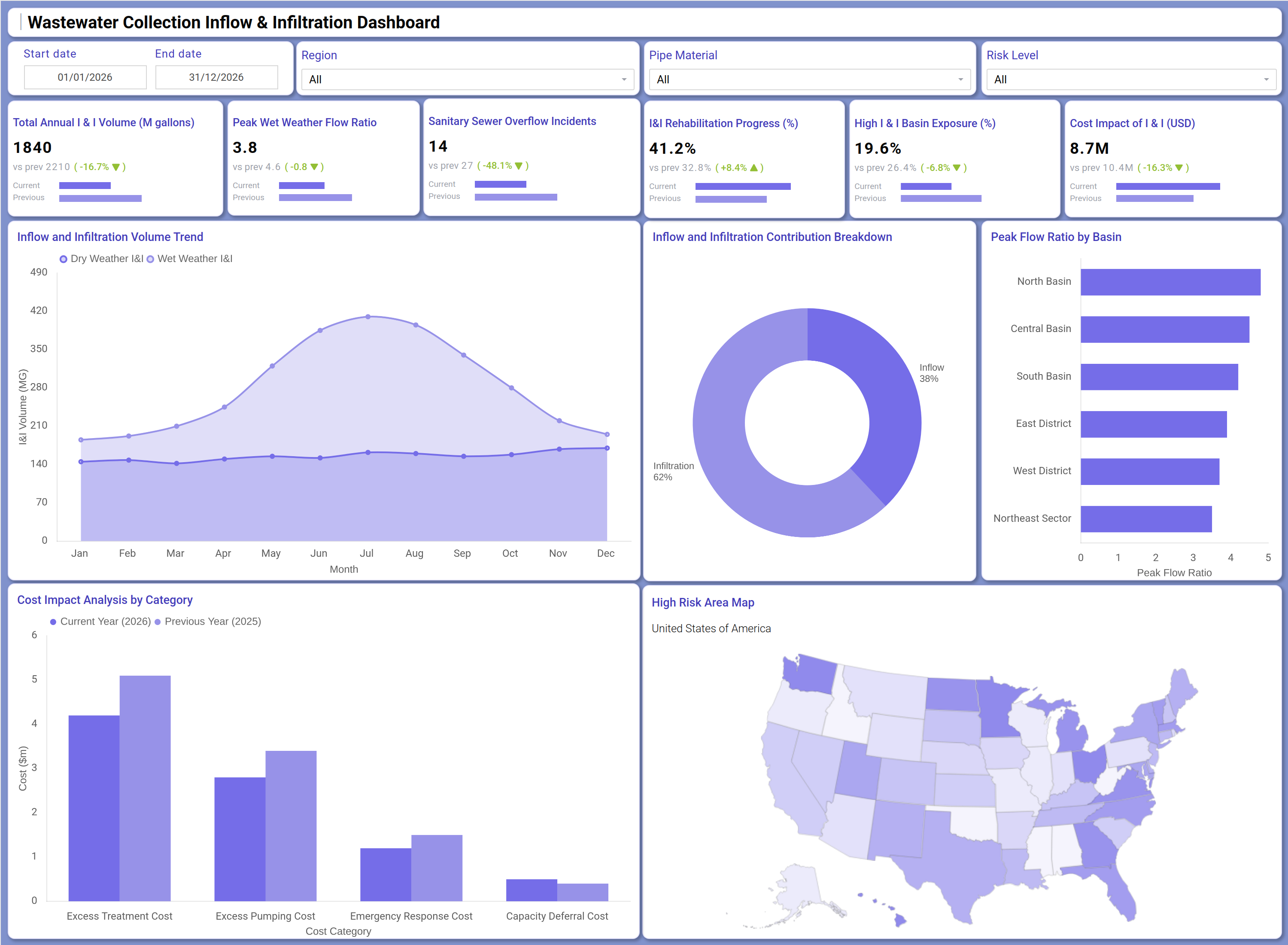
A wastewater utility operations team opens this dashboard at the start of each review cycle to understand how much excess flow entered the collection system and where the greatest exposure points are. The KPI tiles at the top immediately surface whether I&I volume is increasing or decreasing compared to the previous period, how many sanitary sewer overflow incidents have occurred, and what the current rehabilitation progress looks like across the network. For teams managing large service territories, this sanitary sewer overflow tracking template consolidates multi-basin reporting without requiring separate reports for each area.
Moving deeper into the dashboard, planners use the inflow and infiltration contribution breakdown to understand the split between direct inflow and groundwater infiltration, a distinction that shapes which repair interventions to prioritize. The high-risk area map highlights geographically concentrated zones where exposure is highest, enabling field crews and capital planners to focus resources on the basins with the greatest need. The cost impact analysis by category gives budget owners a clear view of year-over-year spending on excess treatment, pumping, emergency response, and capacity deferral, supporting accurate financial planning aligned with the I&I volume trend analysis for the season ahead.
How to Analyze Data in a Wastewater Collection Inflow & Infiltration Dashboard
Here is how you can analyze data from this dashboard:
- Use the Region filter to isolate I&I performance for specific service territories and compare basin-level conditions independently.
- Apply the Risk Level filter to focus the view on high-exposure basins and identify where rehabilitation efforts are most urgently needed.
- Monitor the Inflow and Infiltration Volume Trend area chart to track seasonal fluctuations between dry weather and wet weather I&I across all twelve months.
- Review the Inflow and Infiltration Contribution Breakdown donut chart to determine the relative share of inflow versus infiltration and align intervention strategies accordingly.
- Analyze the Peak Flow Ratio by Basin horizontal bar chart to identify which basins are experiencing the highest peak wet weather flow ratio monitoring thresholds.
- Use the Cost Impact Analysis by Category grouped bar chart to compare current year versus previous year spending across excess treatment, pumping, emergency response, and capacity deferral costs.
- Reference the High Risk Area Map to identify geographic concentrations of I&I exposure and guide field prioritization decisions.
- Filter by Pipe Material to assess whether specific pipe types are contributing disproportionately to infiltration volumes and target material-specific repair programs.
- Track I&I Rehabilitation Progress over successive periods to measure how efficiently the network is being restored and whether program targets are on track.
Benefits of a Wastewater Collection Inflow & Infiltration Dashboard
The following are the benefits of using this dashboard:
- Centralizes total I&I volume, overflow incidents, rehabilitation progress, and cost impact data in a single structured template.
- Supports wastewater basin risk level assessment across all six basins without building separate reports for each service zone.
- Reduces manual reporting overhead for sewer overflow compliance reviews with pre-built KPI tiles and chart layouts.
- Enables material-specific and region-specific filtering to pinpoint where I&I rehabilitation investment will deliver the greatest reduction in excess flow.
- Provides a year-over-year cost comparison across all four cost categories to support budget forecasting and capital planning.
- Gives operations teams and finance stakeholders a shared view of network exposure and remediation progress.
- Helps utility managers align infrastructure investment with measured outcomes tracked through the sewer rehabilitation progress KPI.
KPIs to Track in a Wastewater Collection Inflow & Infiltration Dashboard
The following key KPIs can be tracked by using this dashboard:
- Total Annual I & I Volume (M gallons): Key Performance Indicators (KPIs) like this measure the total volume of inflow and infiltration entering the collection system annually — a core indicator of system integrity and the starting point for any I&I volume trend analysis.
- Peak Wet Weather Flow Ratio: Measures the ratio of peak wet weather flows to baseline dry weather flows — essential for peak wet weather flow ratio monitoring and identifying overtaxed infrastructure segments.
- Sanitary Sewer Overflow Incidents: Counts the number of overflow events during the reporting period — directly tied to regulatory compliance and sanitary sewer overflow tracking requirements.
- I&I Rehabilitation Progress (%): Tracks the percentage of planned rehabilitation work completed — the primary sewer rehabilitation progress KPI used to assess program execution against targets.
- High I & I Basin Exposure (%): Identifies the proportion of basins classified as high-exposure — central to wastewater basin risk level assessment and capital prioritization decisions.
- Cost Impact of I & I (USD millions): Quantifies the total financial burden attributed to inflow and infiltration — including excess treatment, pumping, emergency response, and capacity deferral costs — enabling accurate budget planning.
Frequently Asked Questions
1. What teams benefit most from the Wastewater Collection Inflow & Infiltration Dashboard?
Municipal wastewater engineers, utility operations managers, and capital planning teams gain the most value from this dashboard. It is also useful for regulatory compliance officers who need to document sanitary sewer overflow incidents and rehabilitation progress.
2. Can this dashboard compare inflow and infiltration volumes across different basins?
Yes. The Peak Flow Ratio by Basin bar chart and the Region filter allow users to compare I&I conditions across North Basin, Central Basin, South Basin, East District, West District, and Northeast Sector independently. This supports targeted wastewater basin risk level assessment without switching between views.
3. Is this dashboard suitable for tracking year-over-year cost changes in I&I management?
Yes. The Cost Impact Analysis by Category chart displays current year versus previous year spending across excess treatment, pumping, emergency response, and capacity deferral costs, making multi-year financial comparison straightforward.