What is an LNG Terminal Safety & Emergency Response Dashboard?
An LNG Terminal Safety & Emergency Response Dashboard is a comprehensive visualization platform designed to monitor, analyze, and report on safety performance and emergency preparedness across LNG terminal operations. It consolidates critical safety metrics, including safety training completion rates, lost time injury frequency rate (LTIFR), near misses, recordable incidents, investigation closure times, injury severity rates, and emergency response times into a unified interface.
By integrating LNG terminal safety monitoring, incident management tracking, and emergency response performance analytics, this dashboard wireframe enables HSE managers, safety officers, and terminal leadership to proactively identify hazards, reduce workplace injuries, ensure regulatory compliance, and continuously improve emergency preparedness. It serves as a central command center for safety culture cultivation, incident investigation, and demonstration of due diligence to regulators and stakeholders.
How to Create an LNG Terminal Safety & Emergency Response Dashboard
You don’t need to build your report from scratch, just start with a ready-to-use LNG Terminal Safety & Emergency Response dashboard template from Mokkup. Add in your data and export it however you like. Here’s how to do it:
1. Create or Log in to Your Mokkup Account
Start by signing up on Mokkup.ai using your email. If you already have an account, just log in, and you'll be good to go.
2. Choose and Customize Your Dashboard Template
Find the LNG Terminal Safety & Emergency Response Dashboard template in the Templates section. Use the drag-and-drop editor to adjust KPIs, edit filters, or add elements based on your data.
3. Export to Your BI Tool
Once your dashboard wireframe is ready, use the BI Tool Export feature to send it directly to Power BI or Tableau for further analysis and enhancements. You can also download the dashboard as a PDF, PNG, or JPEG, embed it on a platform, or invite your team to collaborate.
Note: This is a Pro template. You’ll need a Pro subscription on Mokkup to use and customize this dashboard wireframe. Upgrade anytime to unlock full access.
LNG Terminal Safety & Emergency Response Dashboard Example
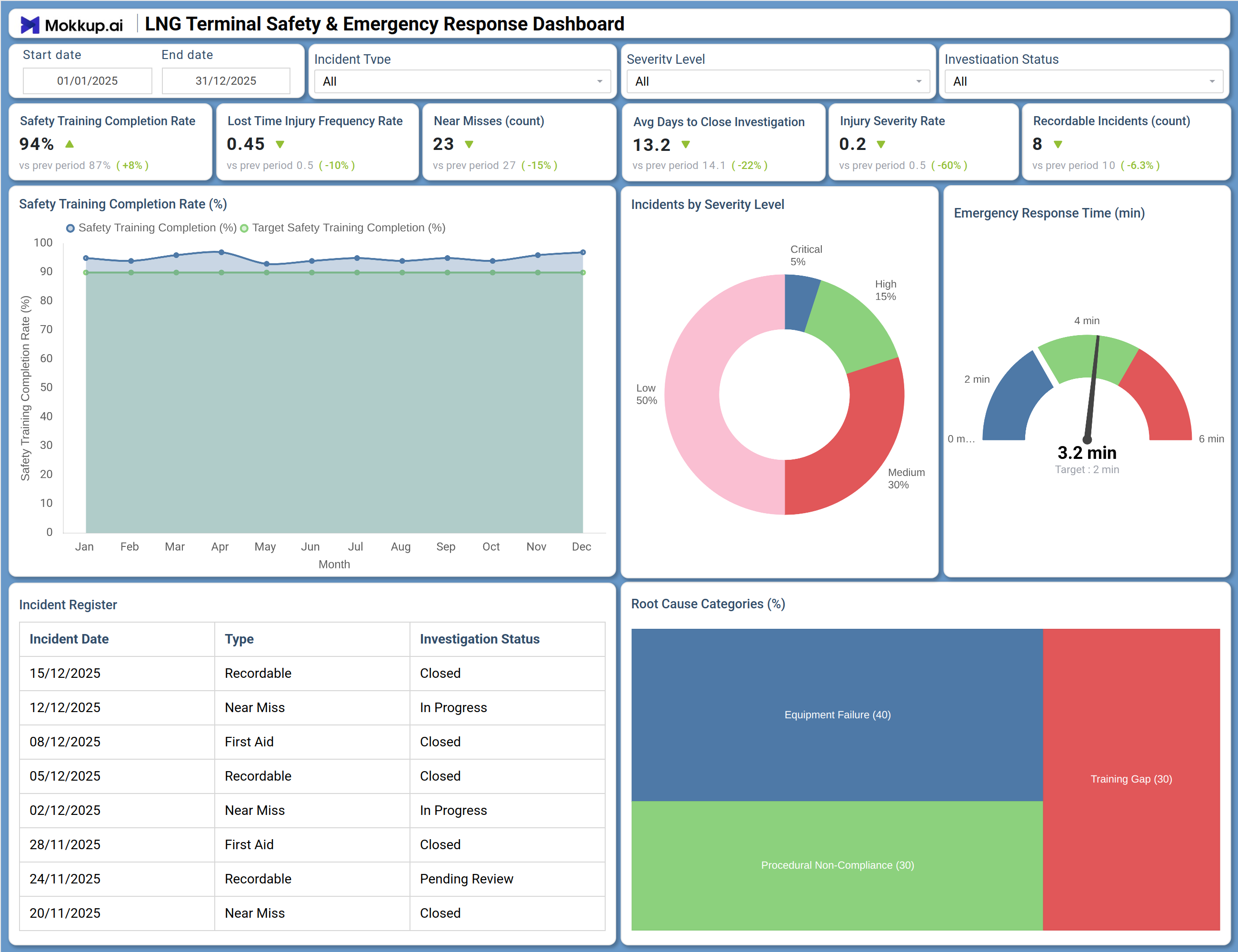
This dashboard delivers a comprehensive view of safety performance and emergency response readiness across LNG terminal operations. The Overview screen prominently displays six critical safety KPIs: Safety Training Completion Rate at 94% (up 8% from prior period), Lost Time Injury Frequency Rate at 0.45 (10% improvement), Near Misses reduced to 23 (15% decrease), Average Days to Close Investigation improved to 13.2 days (22% faster), Injury Severity Rate at 0.2 (60% reduction), and Recordable Incidents at 8 (6.3% decrease). The Root Cause Categories pie chart breaks down incidents by underlying cause — Equipment Failure (40%), Procedural Non-Compliance (30%), Human Error (25%), and External Factors (5%) — helping target prevention efforts.
How to Analyze Data in an LNG Terminal Safety & Emergency Response Dashboard
Here is how you can analyze data from this dashboard:
- Safety Training Monitoring: Monitor Safety Training Completion Rate (%) over time to ensure workforce readiness and identify gaps across departments or shifts.
- Injury Rate Analysis: Track Lost Time Injury Frequency Rate (LTIFR) to evaluate the effectiveness of safety programs and benchmark performance.
- Near Miss Tracking: Review Near Misses (count) as leading indicators to identify potential risks and strengthen safety culture.
- Investigation Efficiency Review: Analyze Average Days to Close Investigation to detect delays and improve incident resolution processes.
- Severity Assessment: Examine Injury Severity Rate to understand the impact level of incidents beyond frequency.
- Incident Compliance Monitoring: Assess Recordable Incidents (count) to ensure adherence to regulatory reporting standards.
- Root Cause Analysis: Analyze Root Cause Categories to focus prevention efforts on key drivers like equipment, process, or human factors.
- Emergency Response Evaluation: Evaluate Emergency Response Time against targets to identify areas needing faster intervention.
Benefits of an LNG Terminal Safety & Emergency Response Dashboard
The following are the benefits of using this dashboard:
- Centralized Safety Visibility: Provides a real time view of safety performance and incident management across operations.
- Proactive Risk Identification: Enables early detection of hazards through near miss and leading indicator tracking.
- Regulatory Compliance Support: Helps meet OSHA, EPA, and international safety standards with structured reporting.
- Improved Investigation Efficiency: Identifies delays and streamlines incident investigation workflows.
- Reduced Injury Risk: Supports data driven programs to lower injury frequency and severity.
- Enhanced Emergency Preparedness: Improves response readiness by tracking and optimizing response times.
- Stronger Safety Culture: Promotes transparency and continuous improvement through visible safety metrics.
- Audit & Stakeholder Readiness: Demonstrates compliance and due diligence with clear, auditable safety records.
KPIs to Track in an LNG Terminal Safety & Emergency Response Dashboard
- Safety Training Completion Rate (%): Percentage of required safety training completed by all personnel.
- Lost Time Injury Frequency Rate (LTIFR): Number of lost time injuries per million hours worked.
- Near Misses (count): Number of incidents with potential for serious injury but no actual harm.
- Average Days to Close Investigation: Mean time from incident occurrence to investigation completion.
- Injury Severity Rate: Measure of the seriousness of injuries (often days lost per incident).
- Recordable Incidents (count): Number of incidents meeting regulatory recordable criteria.
- Emergency Response Time (minutes): Average time from incident alert to first response arrival.
- Root Cause Distribution: Percentage breakdown of incidents by underlying cause category.
- First Aid Cases: Number of minor injuries requiring only first aid treatment.
- Incident Investigation Status: Count of incidents by investigation status (Open, In Progress, Closed, Pending Review).
Frequently Asked Questions
Q1. What is Lost Time Injury Frequency Rate (LTIFR) and how is it calculated?
LTIFR measures the number of lost time injuries per million hours worked. It is calculated as: (Number of lost time injuries × 1,000,000) ÷ Total hours worked. This standard metric allows benchmarking across industries and facilities.
Q2. What is a good emergency response time for LNG terminals?
Many LNG terminals aim for response times under 5 minutes for initial incident assessment, with first responders on scene within 2-3 minutes for high-risk areas. The dashboard helps track progress against facility-specific targets.
Q3. How can this dashboard help reduce investigation closure times?
By tracking average days to close investigations and highlighting incidents with "In Progress" or "Pending Review" status, the dashboard enables managers to identify bottlenecks and ensure timely completion of root cause analysis and corrective actions.
Q4. What root cause categories should be tracked?
Common categories include Equipment Failure, Procedural Non-Compliance, Human Error, and External Factors. The dashboard can be customized to reflect facility-specific categories.
Q5. Who typically uses this dashboard?
HSE managers, safety officers, terminal managers, shift supervisors, incident investigators, and corporate safety directors use it to oversee safety performance and drive continuous improvement.