What is a Titanic Survival Analysis Dashboard?
A Titanic Survival Analysis Dashboard is a data visualization platform that helps researchers, historians, and data analysts explore survival patterns from the Titanic disaster using structured datasets. This Titanic dataset survival analytics platform combines socio-economic, demographic, and travel details to show how passenger class, gender, fare, family size, and embarkation port influenced survival.
By integrating data science and disaster research, this Titanic disaster survival insights tool simplifies complex statistics into clear, interactive visuals. It enables analysts to filter data by parameters such as passenger class, gender, or embarkation port and identify the factors that most impacted survival outcomes. The dashboard’s unified structure transforms raw Titanic passenger data into a complete picture of human behavior and crisis survival during one of history’s most studied maritime tragedies.
How to Create a Titanic Survival Analysis Dashboard
You don’t need to build your report from scratch—just start with a ready-to-use dashboard template from Mokkup. Add in your data and export it however you like. Here’s how to do it:
1. Create or Log in to Your Mokkup Account
Start by signing up on Mokkup.ai using your email. If you already have an account, just log in, and you’ll be good to go.
2. Choose and Customize Your Dashboard Template
Find the Titanic Survival Analysis Dashboard template in the Templates section. Use the drag-and-drop editor to adjust KPIs, edit filters, or add elements based on your data.
3. Export to Your BI Tool
Once your dashboard wireframe is ready, use the BI Tool Export feature to send it directly to Power BI or Tableau for further analysis and enhancements. You can also download the dashboard as a PDF, PNG, or JPEG, embed it on a platform, or invite your team to collaborate.
Note: This is a Pro template. You’ll need a Pro subscription on Mokkup to use and customize this dashboard wireframe. Upgrade anytime to unlock full access.
Titanic Survival Analysis Dashboard Example
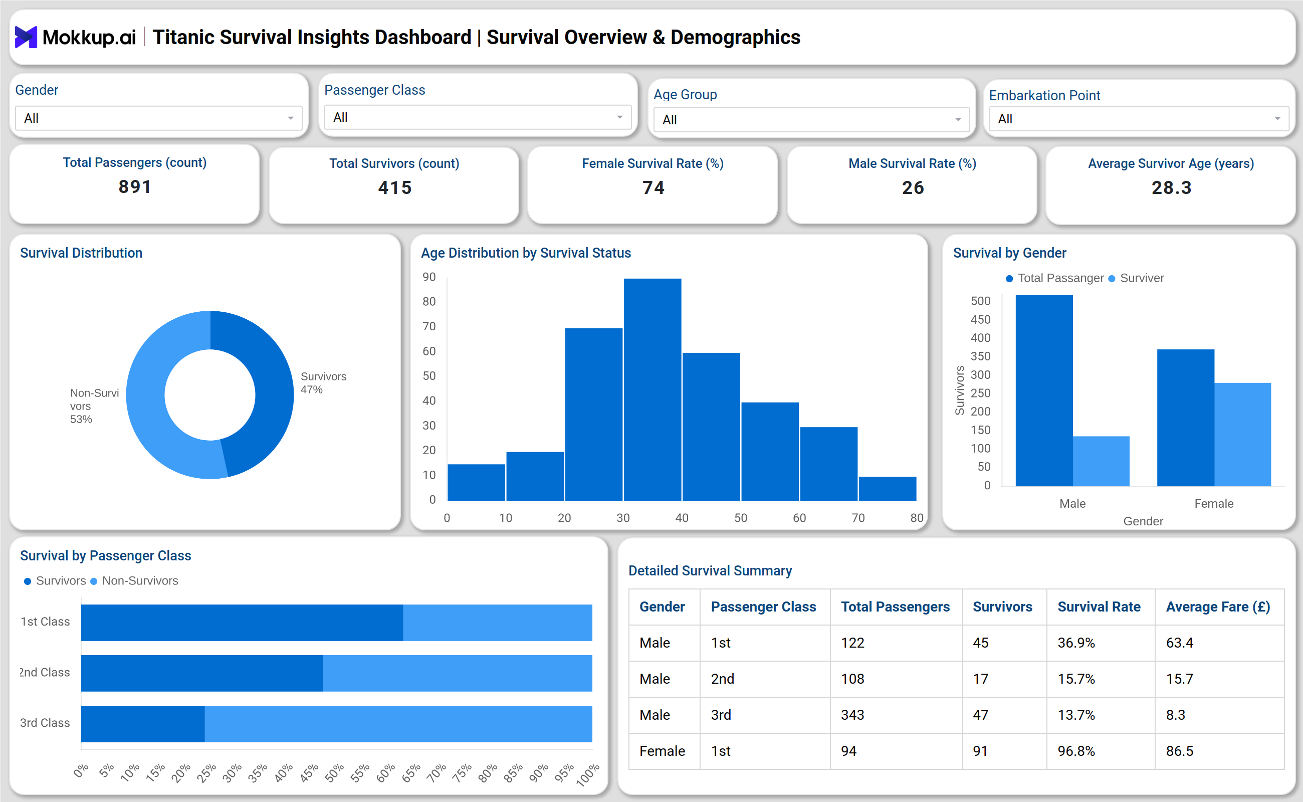
You can create your own Titanic passenger survival data dashboard to examine the social and economic dynamics of survival. The dashboard typically includes two major analytical modules — Survival Overview & Demographics and Socio-Economic & Travel Trends. In the first module, users can visualize how survival rates differ by gender, age, and class. Female survival rates are notably higher, while third-class passengers faced a greater risk. The visualizations include survival distributions, class-based comparisons, and detailed gender summaries.
The second module focuses on socio-economic and travel-related variables. It studies the influence of fare category, embarkation port, and family size on survival. For example, passengers paying higher fares and those boarding from Cherbourg or Southampton displayed better survival chances. Similarly, smaller families and younger passengers tended to survive more often. By combining both modules, this Titanic survival rate monitoring dashboard provides a comprehensive view of the demographic, economic, and social patterns underlying survival probabilities.
How to Analyze Data in the Titanic Survival Analysis Dashboard
To analyze data effectively in this dashboard, follow these structured steps:
- Filter by Passenger Class: Compare first, second, and third-class survival rates to understand the effect of socio-economic status.
- Compare Gender Statistics: Review male vs. female survival patterns to identify demographic disparities.
- Study Age Distribution: Use histograms to pinpoint which age groups had the highest or lowest survival odds.
- Analyze Fare Categories: Examine the low, medium, and high fare ranges to assess the relationship between ticket cost and survival rate.
- Evaluate Embarkation Port: Identify which ports (Southampton, Cherbourg, Queenstown) contributed to higher survival probabilities.
- Examine Family Size: Explore how traveling alone or in larger groups affected survival outcomes.
- Monitor the Correlation Between Fare and Age: Use scatter plots to identify clusters where age and fare intersect with survival chances.
Benefits of Titanic Survival Analysis Dashboard
The following are the benefits of using this titanic disaster management survival tracker:
- Comprehensive Data Visualization: Converts historical passenger records into easy-to-read visual formats.
- Socio-Economic Insight: Demonstrates how class and wealth levels influenced survival during the Titanic disaster.
- Gender and Age Analysis: Highlights demographic patterns, showing the advantage of women and children in rescue efforts.
- Interactive Filtering: Enables real-time exploration of various survival parameters, such as embarkation point and fare range.
- Research & Educational Use: Ideal for academic studies, machine learning projects, or teaching data visualization and ethics in disaster response.
- Historical Interpretation: Enhances Titanic research by connecting quantitative analysis with human stories.
These benefits make the dashboard not only a research tool but also a modern example of how data analytics can reshape historical understanding.
KPIs to Track in Titanic Survival Analysis Dashboard
- Total Passenger Count: Represents the complete dataset of passengers used for survival and demographic analysis.
- Total Survivors: Indicates the number of passengers who survived, serving as the basis for calculating survival trends.
- Survival Rate by Gender: Highlights the difference in survival likelihood between male and female passengers.
- Average Survivor Age: Shows the typical age range of passengers who were most likely to survive.
- Average Fare of Survivors: Reveals the economic influence on survival chances, linking fare amount to passenger class.
- Average Family Size: This reflects the average number of family members traveling together, which influences group survival behavior.
Frequently Asked Questions
1. What is the purpose of the Titanic Survival Analysis Dashboard?
The dashboard helps visualize and interpret the factors that affected passenger survival during the Titanic disaster using structured datasets and statistical analysis.
2. How does this dashboard differ from traditional reports?
Unlike static reports, this Titanic survival analysis dashboard provides real-time filtering, visualization, and interactivity, making it easier to uncover relationships across variables like age, fare, and embarkation point.
3. Who can use this dashboard?
It’s designed for researchers, data analysts, students, and historians interested in combining data analytics with social and disaster studies.