
What is a Stormwater Utility Climate Risk & Capacity Dashboard?
The Stormwater Utility Climate Risk & Capacity Dashboard is a purpose-built analytical template for stormwater utility managers, municipal engineers, and public works directors who need a consolidated view of infrastructure risk, flood exposure, and system capacity. It brings together climate risk scoring, asset condition data, and service zone performance into a single workspace. As a stormwater utility climate risk assessment dashboard, it helps teams evaluate how infrastructure holds up against climate pressures, identify where conveyance capacity is strained, and prioritize capital investments based on liability. This stormwater infrastructure capacity planning software template replaces disconnected reports with a unified view that supports faster, evidence-based decisions.
How to Create a Stormwater Utility Climate Risk & Capacity Dashboard
You don't need to build your report from scratch, just start with a ready-to-use dashboard template from Mokkup. Add in your data and export it however you like. Here's how to do it:
1. Create or Log in to Your Mokkup Account
Start by signing up on Mokkup.ai using your email. If you already have an account, just log in, and you'll be good to go.
2. Choose and Customize Your Dashboard Template
Find the Stormwater Utility Climate Risk & Capacity Dashboard template in the Templates section. Use the drag-and-drop editor to adjust KPIs, edit filters, or add elements based on your data.
3. Export to Your BI Tool
Once your dashboard wireframe is ready, use the BI Tool Export feature to send it directly to Power BI or Tableau for further analysis and enhancements. You can also download the dashboard as a PDF, PNG, or JPEG, embed it on a platform, or invite your team to collaborate.
Note: This is a Pro template. You'll need a Pro subscription on Mokkup to use and customize this dashboard wireframe. Upgrade anytime to unlock full access.
Stormwater Utility Climate Risk & Capacity Dashboard Example
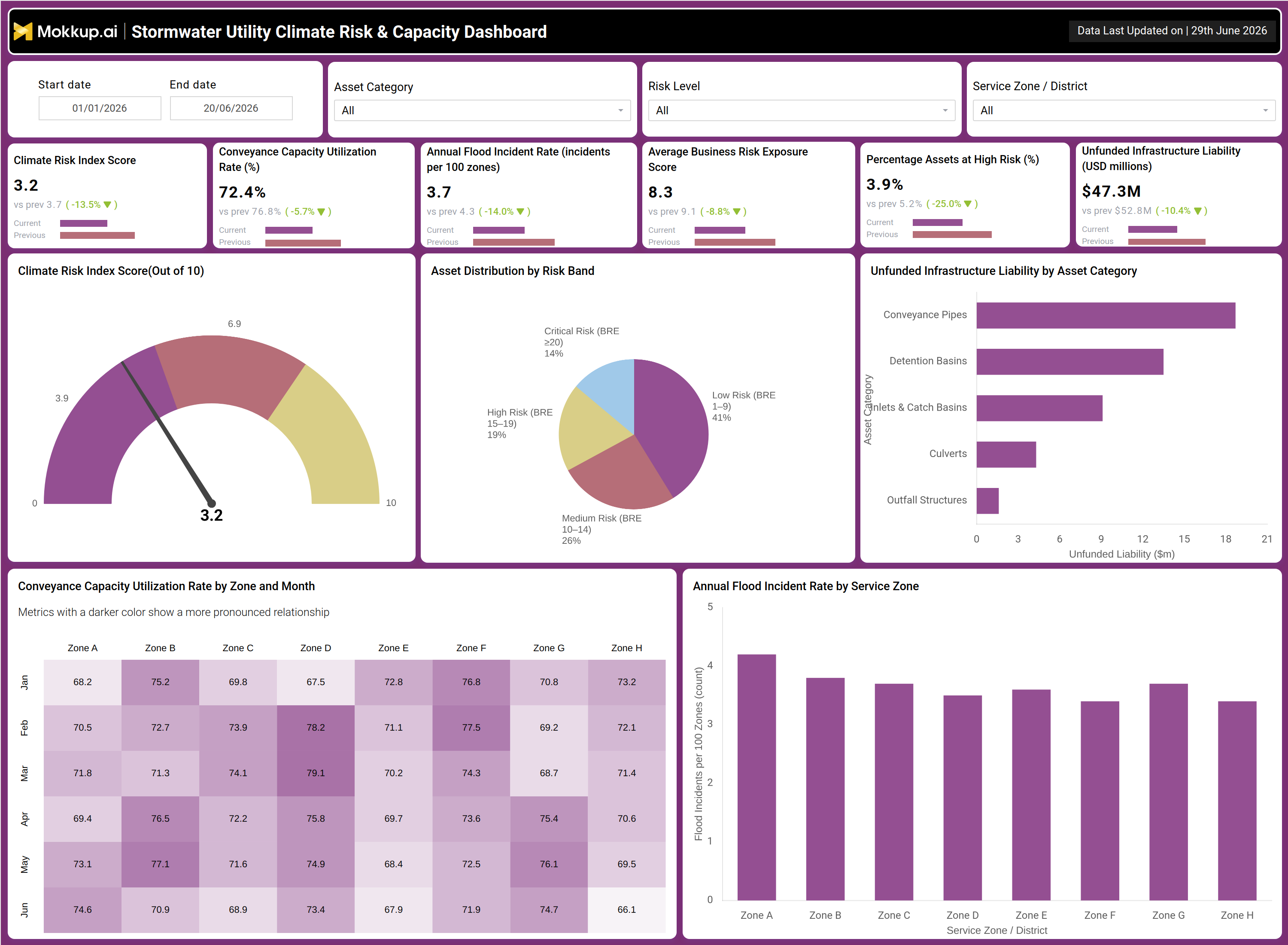
A stormwater utility planning team opens this dashboard at the start of a budget cycle or after a major weather event with one central question: where is infrastructure most exposed and how much risk is unfunded? The KPI tiles give planners an immediate read on system-wide health, helping them gauge whether the climate risk index is within acceptable bounds and whether conveyance capacity is approaching thresholds that warrant action. As a stormwater utility climate risk assessment dashboard, it frames these questions with data before any meeting begins. Teams then use the asset distribution view to see how infrastructure is distributed across risk bands. Managers identify in advance which zones carry the heaviest concentration of high-risk assets and allocate inspection resources accordingly. The asset distribution by risk band, from a stormwater utility view, makes it clear whether the network is skewed toward manageable or critical exposure across the full asset inventory.
The unfunded liability breakdown by asset category supports budget conversations directly. Finance leads compare exposure across conveyance pipes, detention basins, culverts, and outfall structures to prioritize funding. Unfunded infrastructure liability stormwater management planning requires this asset-level detail to move from general concern to specific budget requests. Flood incident rate tracking by service zone adds geographic context, helping teams target zones with elevated incident counts rather than spreading resources evenly. The result is a clear action list: where to act, in what order, and with what evidence. Whether preparing a capital improvement program or briefing elected officials, this stormwater infrastructure capacity planning software template gives teams the foundation to defend every decision.
How to Analyze Data in a Stormwater Utility Climate Risk & Capacity Dashboard
Here is how you can analyze data from this dashboard:
- Filter by Asset Category, Risk Level, and Service Zone / District to isolate specific network segments for targeted analysis
- Use the Climate Risk Index Score gauge to benchmark system exposure against acceptable risk thresholds
- Review the Asset Distribution by Risk Band donut chart to assess the proportion of infrastructure in critical, high, medium, and low risk bands
- Examine Unfunded Infrastructure Liability by Asset Category to identify which asset types carry the largest unaddressed financial exposure
- Use the Conveyance Capacity Utilization Rate by Zone and Month heatmap as a conveyance capacity utilization monitoring tool to detect seasonal patterns and zones nearing capacity limits
- Analyze the Annual Flood Incident Rate by Service Zone bar chart to prioritize zones with persistently elevated flood frequency
- Track Average Business Risk Exposure Score alongside Percentage Assets at High Risk to monitor shifts in risk concentration over time
- Use Start Date and End Date filters to compare performance across periods and assess whether interventions are reducing exposure
Benefits of a Stormwater Utility Climate Risk & Capacity Dashboard
The following are the benefits of using this dashboard:
- Consolidates climate risk scoring, capacity data, and liability figures into one workspace, eliminating manual report assembly
- Enables proactive identification of high-risk asset concentrations before infrastructure failures occur
- Supports capital budget justification with liability breakdowns by asset type across conveyance pipes, detention basins, culverts, and outfall structures
- Improves flood incident rate tracking by service zone, enabling targeted geographic interventions rather than blanket spending
- Reduces time spent on cross-departmental data reconciliation with a single analytical view
- Strengthens communication with leadership by presenting complex risk data in clear, visual format
- Accelerates stormwater infrastructure capacity planning through zone-level and asset-level performance visibility
- Supports compliance and regulatory reporting by documenting risk exposure and unfunded liabilities systematically
KPIs to Track in a Stormwater Utility Climate Risk & Capacity Dashboard
The following key KPIs can be tracked by using this dashboard:
- KPIs (Key Performance Indicators) are quantifiable metrics that evaluate system or process performance against defined objectives. In stormwater management, KPIs translate infrastructure health and risk into trackable numbers that drive operational and capital decisions.
- Climate Risk Index Score — measures overall climate-related risk exposure across the stormwater network on a standardized scale, enabling benchmarking across periods and peer utilities
- Conveyance Capacity Utilization Rate (%) — tracks the percentage of conveyance system capacity in use; central to any conveyance capacity utilization monitoring tool assessment
- Annual Flood Incident Rate (incidents per 100 zones) — measures flood event frequency relative to service zones, essential for flood incident rate tracking by service zone programs
- Average Business Risk Exposure Score — quantifies economic and operational risk that stormwater events pose to businesses and municipal operations within the service area
- Percentage Assets at High Risk (%) — indicates the share of infrastructure classified as high risk, directly informing asset distribution by risk band stormwater utility planning
- Unfunded Infrastructure Liability (USD millions) — captures deferred maintenance and capital investment not yet covered by approved budgets, foundational for unfunded infrastructure liability stormwater management decisions
Frequently Asked Questions
1. Who should use the Stormwater Utility Climate Risk & Capacity Dashboard?
This dashboard is designed for stormwater utility managers, municipal engineers, capital planners, and public works directors. It is also valuable for finance teams preparing capital improvement programs or regulatory submissions that require documented risk exposure data.
2. Can this dashboard template be customized for different service zone configurations?
Yes. The template is fully customizable in Mokkup using the drag-and-drop editor. Teams can adjust zone labels, modify filters, and add or remove KPI tiles before exporting to Power BI or Tableau.
3. How does this dashboard support stormwater infrastructure capacity planning?
The dashboard surfaces conveyance capacity utilization by zone and month alongside flood incident frequency and asset risk distribution. This gives planning teams the context they need to sequence capital investments and justify budget priorities with clear evidence.