
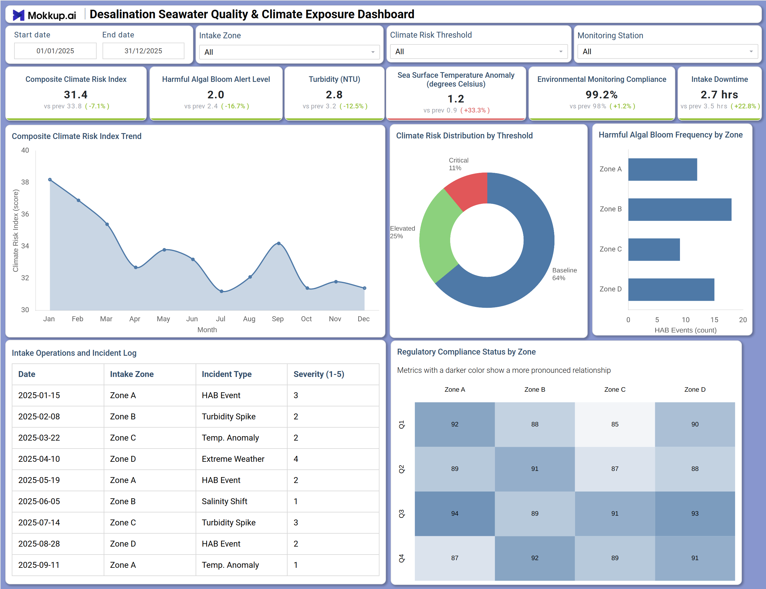
What is a Desalination Seawater Quality & Climate Exposure Dashboard?
This desalination seawater quality monitoring dashboard gives plant operators, environmental compliance teams, and facility managers a unified view of ocean intake conditions, climate-driven risk levels, and regulatory performance across all intake zones. Built as a climate exposure desalination dashboard, it consolidates sea surface temperature anomaly monitoring, algal bloom alerts, turbidity readings, and extreme weather incident data into a single operational platform.
The dashboard tracks how environmental stressors build over time, enabling teams to move from reactive incident response to proactive risk management. From composite climate risk scoring and zone-level compliance heatmaps to detailed incident logs, it equips teams with the visibility needed to protect intake operations and meet regulatory standards.
How to Create a Desalination Seawater Quality & Climate Exposure Dashboard
You don’t need to build your report from scratch, just start with a ready-to-use Desalination Seawater Quality & Climate Exposure dashboard template from Mokkup. Add in your data and export it however you like. Here’s how to do it:
1. Create or Log in to Your Mokkup Account
Start by signing up on Mokkup.ai using your email. If you already have an account, just log in, and you'll be good to go.
2. Choose and Customize Your Dashboard Template
Find the Desalination Seawater Quality & Climate Exposure Dashboard template in the Templates section. Use the drag-and-drop editor to adjust KPIs, edit filters, or add elements based on your data.
3. Export to Your BI Tool
Once your dashboard wireframe is ready, use the BI Tool Export feature to send it directly to Power BI or Tableau for further analysis and enhancements. You can also download the dashboard as a PDF, PNG, or JPEG, embed it on a platform, or invite your team to collaborate.
Note: This is a Pro template. You'll need a Pro subscription on Mokkup to use and customize this dashboard wireframe. Upgrade anytime to unlock full access.
Desalination Seawater Quality & Climate Exposure Dashboard Example
At the start of a shift, managers review the Composite Climate Risk Index trend to see whether environmental pressure is rising or stabilizing. A companion distribution chart shows how readings split across Baseline, Elevated, and Critical tiers, helping teams decide if conditions require stricter operational controls. Teams then assess intake zones for biological risks. If algal blooms are concentrated in specific areas, engineers can adjust pre-treatment or reroute intake to lower-risk zones to avoid disruption.
The Intake Operations and Incident Log tracks events like turbidity spikes, salinity shifts, and extreme weather, helping identify patterns and support audits. Finally, a compliance heatmap highlights zones falling behind standards, enabling timely corrective action.
How to Analyze Data in a Desalination Seawater Quality & Climate Exposure Dashboard
Here is how you can analyze data from this dashboard:
- Filter by Intake Zone: Isolate a specific intake area and compare its climate risk profile with the broader network.
- Track Risk Trends: Use the Composite Climate Risk Index trend chart to detect early signs of environmental deterioration.
- Assess Risk Distribution: Review the threshold donut chart to understand the share of Baseline, Elevated, and Critical readings.
- Identify Biological Risk Zones: Analyze the HAB frequency chart to spot zones needing stronger pre-treatment.
- Evaluate Compliance by Zone: Use the heatmap to find low-performing zones and prioritize inspections.
- Review Incident Patterns: Check the Incident Log to identify recurring issues like turbidity spikes or temperature anomalies.
- Focus on High-Risk Periods: Filter by climate risk threshold to plan operations around Critical or Elevated intervals.
- Monitor Compliance Progress: Track environmental compliance trends to ensure full regulatory adherence.
Benefits of a Desalination Seawater Quality & Climate Exposure Dashboard
The following are the benefits of using this dashboard:
- Centralized Data View: Combines seawater quality, climate risk, and incident data across all intake zones.
- Improved HAB Monitoring: Supports harmful algal bloom detection with integrated biological and environmental metrics.
- Reduced Manual Reporting: Pre-built visuals simplify compliance tracking and reporting.
- Better Operational Decisions: Enables zone-level analysis for infrastructure and pre-treatment planning.
- Clear Compliance Insights: Heatmaps highlight regulatory performance across zones and stations.
- Regulatory Alignment: Helps teams meet reporting requirements without rebuilding reports.
- Shared Operational Visibility: Provides a unified view for operations and compliance teams.
KPIs to Track in a Desalination Seawater Quality & Climate Exposure Dashboard
The following key KPIs can be tracked by using this dashboard:
- Composite Climate Risk Index (score): Central to desalination seawater quality monitoring — aggregates climate-driven environmental stressors across all intake zones into a single risk score to guide escalation decisions.
- Harmful Algal Bloom Alert Level (index): Tracks the facility-wide intensity of algal bloom activity — a key early-warning indicator for pre-treatment planning and intake rerouting.
- Turbidity (NTU): Quantifies suspended particle concentration in source water, supporting composite climate risk index tracking by flagging intake conditions that elevate overall environmental risk.
- Sea Surface Temperature Anomaly (degrees Celsius): Measures deviation from baseline ocean temperatures — key to seawater intake operational compliance analysis when thermal stress drives regulatory incidents or pre-treatment failures.
- Environmental Monitoring Compliance (%): Paired with sea surface temperature anomaly monitoring, this KPI evaluates whether all intake zones meet environmental monitoring standards across the full reporting period, directly supporting audit readiness.
- Intake Downtime (hrs): Tracks total operational interruption hours caused by climate events, HAB incidents, turbidity spikes, and extreme weather across all intake zones and monitoring stations.
Frequently Asked Questions
Q1. What teams use a Desalination Seawater Quality & Climate Exposure Dashboard?
This climate exposure desalination dashboard is primarily used by desalination plant operations teams, environmental compliance officers, water quality monitoring engineers, and facility managers overseeing seawater intake across multiple zones. It is particularly valuable for organizations operating in regions with significant climate variability or algal bloom risk.
Q2. How does this dashboard improve environmental compliance outcomes?
The Regulatory Compliance Status by Zone heatmap and the Environmental Monitoring Compliance KPI give compliance officers immediate visibility into which zones are underperforming against standards. This allows teams to prioritize targeted inspections and corrective action well before regulatory deadlines, reducing the risk of non-compliance citations.
Q3. Can this dashboard track harmful algal bloom activity by intake zone?
Yes. The Harmful Algal Bloom Frequency by Zone bar chart breaks down HAB event counts for each intake zone individually, and the Harmful Algal Bloom Alert Level KPI provides a facility-wide severity index. Together they enable zone-specific monitoring and informed pre-treatment decisions when bloom concentrations rise.
Q4. How does the Climate Risk Distribution by Threshold chart work?
This donut chart segments all climate risk readings across the reporting period into three categories — Baseline, Elevated, and Critical — showing the proportion of monitoring time that falls into each risk tier. Operations teams use it to quickly determine whether conditions are predominantly within safe operating ranges or are trending toward thresholds that require heightened protocols.
Q5. What does Intake Downtime measure?
Intake Downtime tracks the total hours that seawater intake operations were interrupted due to environmental events such as HAB incidents, turbidity spikes, extreme weather, or temperature anomalies. Alongside sea surface temperature anomaly monitoring, this KPI helps operations teams quantify the direct operational cost of climate disruptions and prioritize resilience investments in the most vulnerable intake zones.