
What is a Stormwater Management Utility Urban Flood Resilience & Sustainability Dashboard?
A Stormwater Management Utility Urban Flood Resilience & Sustainability Dashboard is a purpose-built analytical tool designed for municipal stormwater managers, urban planners, environmental program leads, and ESG reporting teams responsible for reducing flood risk and advancing green infrastructure outcomes in urban watersheds. As a stormwater management utility dashboard for urban flood resilience, it consolidates performance data from across a utility's service area into a single, filterable view, eliminating the need to pull figures from separate field reports, asset management systems, and sustainability tracking spreadsheets. The dashboard organizes its data around the metrics that define both operational and environmental performance in stormwater management: total stormwater volume captured, flood events mitigated, impervious surface area managed, community engagement activity, green infrastructure investment returns, and overall flood risk reduction. Each metric is displayed with a comparison to the prior period, giving teams an immediate read on whether programs are moving in the right direction. Filters for year, geographic zone, infrastructure type, ESG pillar, and extreme weather event allow users to cut the data precisely and focus their analysis on the conditions, locations, or infrastructure categories most relevant to their current priorities. Beyond operational tracking, the dashboard is structured to support ESG accountability. The inclusion of community engagement sessions alongside financial return metrics means sustainability directors and public affairs teams can see program outputs that matter to external stakeholders, not just internal operational benchmarks. This dual focus makes the dashboard as useful in a quarterly board briefing as it is in a day-to-day program management session.
How to Create a Stormwater Management Utility Urban Flood Resilience & Sustainability Dashboard
You don't need to build your report from scratch, just start with a ready-to-use dashboard template from Mokkup. Add in your data and export it however you like. Here's how to do it:
1. Create or Log in to Your Mokkup Account
Start by signing up on Mokkup.ai using your email. If you already have an account, just log in, and you'll be good to go.
2. Choose and Customize Your Dashboard Template
Find the Stormwater Management Utility Urban Flood Resilience & Sustainability Dashboard template in the Templates section. Use the drag-and-drop editor to adjust KPIs, edit filters, or add elements based on your data.
3. Export to Your BI Tool
Once your dashboard wireframe is ready, use the BI Tool Export feature to send it directly to Power BI or Tableau for further analysis and enhancements. You can also download the dashboard as a PDF, PNG, or JPEG, embed it on a platform, or invite your team to collaborate.
Note: This is a Pro template. You'll need a Pro subscription on Mokkup to use and customize this dashboard wireframe. Upgrade anytime to unlock full access.
Stormwater Management Utility Urban Flood Resilience & Sustainability Dashboard Example
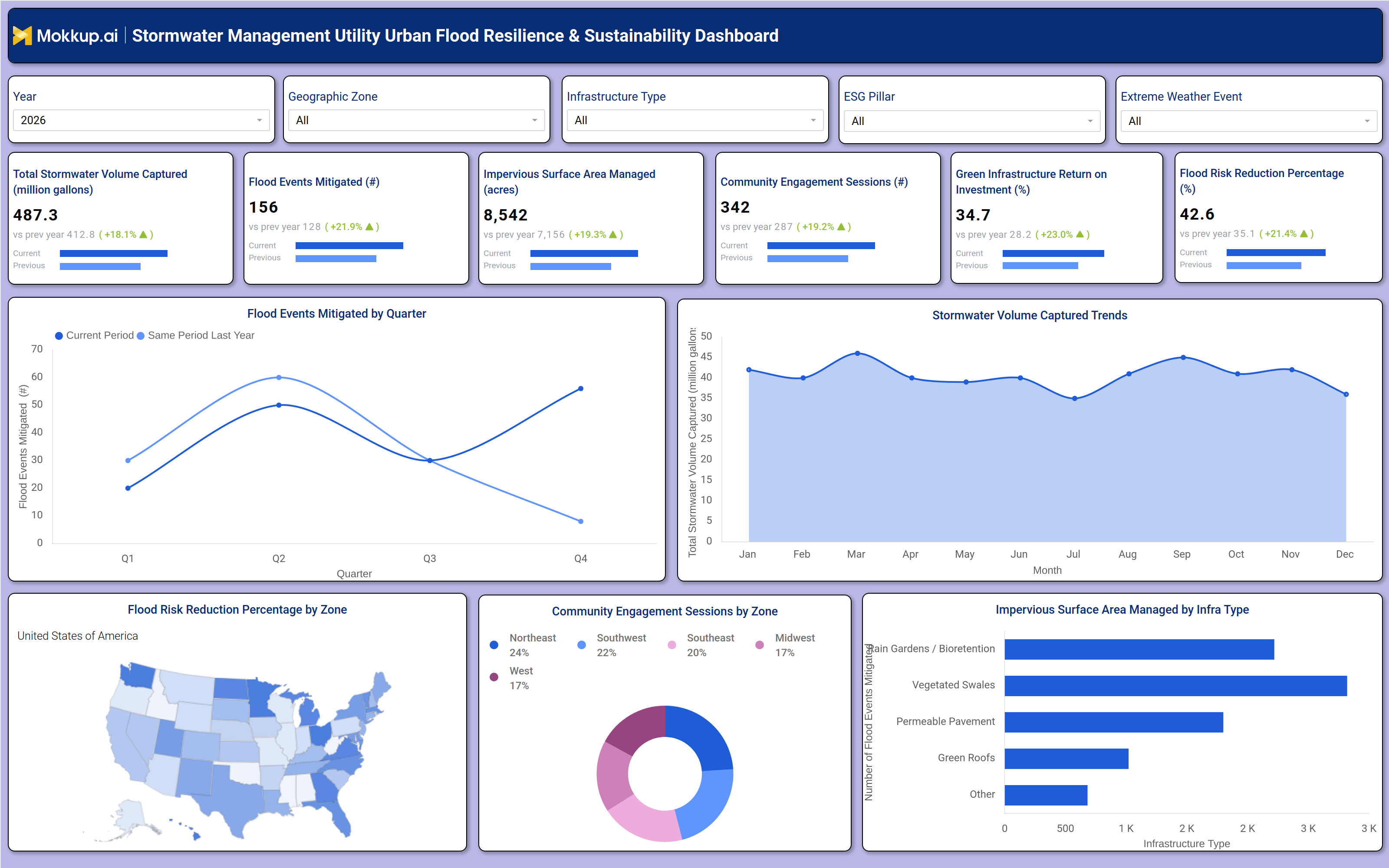
A stormwater utility program manager opening this dashboard for a quarterly review typically starts at the KPI row. The six cards covering stormwater volume captured, flood events mitigated, impervious surface area managed, community engagement sessions, green infrastructure return on investment, and flood risk reduction percentage each display the current period value alongside a comparison to the same period last year. This first pass tells the manager whether headline outcomes are improving and by how much, setting the agenda for the rest of the session. With filters for geographic zone, infrastructure type, ESG pillar, and extreme weather event already set, the manager is looking at a scoped slice of performance relevant to their reporting obligations. The urban flood risk reduction KPI monitoring tool workflow continues into the chart section.
The quarterly flood events mitigated line chart shows how mitigation counts have tracked across Q1 through Q4, with a same-period-last-year overlay that makes year-over-year progress immediately visible without any manual calculation. To the right, the monthly stormwater volume captured trend shows seasonal variation across twelve months, helping engineers understand which months place the highest load on the system. Together, these two temporal views support infrastructure investment planning and help justify capital project timelines to finance leadership.
Geographic and categorical analysis fills the bottom row. The flood risk reduction percentage choropleth map shows which zones across the service area are achieving the greatest risk improvements, helping program directors direct resources to underperforming regions. The community engagement sessions donut chart breaks down activity across five geographic zones, giving public affairs teams a clear view of where outreach is concentrated and where gaps exist. Finally, the horizontal bar chart showing impervious surface area managed by infrastructure type, covering rain gardens and bioretention, vegetated swales, permeable pavement, green roofs, and other categories, lets engineers assess which green infrastructure types are carrying the most load in terms of managed surface area. This bottom-row combination moves the session from headline performance into the operational specifics that drive the next cycle of planning.
How to Analyze Data in a Stormwater Management Utility Urban Flood Resilience & Sustainability Dashboard
Here is how you can analyze data from this dashboard:
- Apply the Geographic Zone filter to compare flood risk reduction performance and stormwater volumes across different districts or drainage areas.
- Use the ESG Pillar filter to isolate metrics relevant to specific sustainability reporting categories such as environmental impact or community engagement.
- Apply the Extreme Weather Event filter to assess how performance metrics shift during or after major storm events.
- Review the quarterly flood events mitigated line chart with the same-period-last-year overlay to identify seasonal patterns and year-over-year progress.
- Use the flood events mitigated by geographic zone visualization to direct field resources toward zones with the lowest mitigation rates.
- Track the monthly stormwater volume captured trend to identify peak-load months and plan infrastructure capacity accordingly.
- Cross-reference the flood risk reduction map with KPI card values to validate which geographic zones are driving aggregate risk improvements.
- Use the infrastructure type bar chart with the green infrastructure ROI tracking for the stormwater utilities KPI to assess which asset categories deliver the best return.
- Review the community engagement sessions donut chart by zone to identify where outreach programs are underrepresented.
- Compare current and previous period values on each KPI card to flag metrics that are not improving at a sufficient rate relative to program targets.
Benefits of a Stormwater Management Utility Urban Flood Resilience & Sustainability Dashboard
The following are the benefits of using this dashboard:
- Consolidates stormwater volume, flood mitigation, surface management, engagement, and ROI data into a single filterable view.
- Supports ESG reporting by pairing environmental performance metrics with community engagement and green infrastructure investment data.
- Enables geographic prioritization through a choropleth map that highlights which zones are achieving the greatest flood risk reductions.
- Reduces manual reporting effort by surfacing period-over-period comparisons automatically across all six KPI cards.
- Improves capital planning by connecting infrastructure type performance data to flood mitigation and volume capture outcomes.
- Supports community engagement tracking for stormwater sustainability programs with a zone-level breakdown of outreach activity.
- Helps teams respond to extreme weather events by filtering data to assess system performance during specific storm conditions.
- Makes green infrastructure performance data accessible to non-technical stakeholders, including finance teams and board members.
KPIs to Track in a Stormwater Management Utility Urban Flood Resilience & Sustainability Dashboard
The following key KPIs can be tracked by using this green infrastructure ROI tracking for stormwater utilities dashboard:
- Total Stormwater Volume Captured (million gallons): Measures the total volume of stormwater collected and managed by the utility's infrastructure, a primary indicator of system capacity utilization and effectiveness.
- Flood Events Mitigated (count): Counts the number of flood events successfully prevented or significantly reduced through active stormwater management interventions, tracked quarterly for seasonal analysis.
- Impervious Surface Area Managed (acres): Tracks the total acreage of impervious urban surfaces — rooftops, roads, parking lots — managed through green infrastructure, supporting impervious surface area management analytics for planning and compliance.
- Community Engagement Sessions (count): Quantifies the number of public outreach and education sessions conducted by the utility, a key ESG indicator for social program accountability.
- Green Infrastructure Return on Investment (%): Measures the financial return generated by green infrastructure investments relative to their cost, enabling cost-benefit evaluation of asset portfolios including rain gardens, vegetated swales, permeable pavement, and green roofs.
- Flood Risk Reduction Percentage (%): Tracks the overall percentage reduction in flood risk across the service area compared to the prior period, the headline measure of the utility's resilience program effectiveness.
Frequently Asked Questions
1. Who should use a Stormwater Management Utility Urban Flood Resilience & Sustainability Dashboard?
This dashboard is designed for municipal stormwater program managers, urban resilience planners, environmental engineers, ESG reporting teams, and public works directors responsible for tracking flood mitigation outcomes and green infrastructure performance. It is also useful for sustainability officers who need to report community engagement activity alongside environmental metrics.
2. How does the dashboard support ESG reporting requirements?
The dashboard includes dedicated metrics for community engagement sessions and green infrastructure ROI alongside environmental performance indicators such as stormwater volume captured and flood risk reduction. The ESG Pillar filter allows users to isolate data relevant to specific reporting categories, making it straightforward to pull figures needed for sustainability disclosures or stakeholder reports.
3. Can the dashboard be used to compare performance across geographic zones?
Yes. The Geographic Zone filter scopes all KPI cards and charts to a selected area, while the choropleth map provides a visual comparison of flood risk reduction rates across the entire service territory simultaneously. The community engagement donut chart also breaks activity down by zone, giving teams a complete geographic view of both environmental outcomes and outreach coverage.