
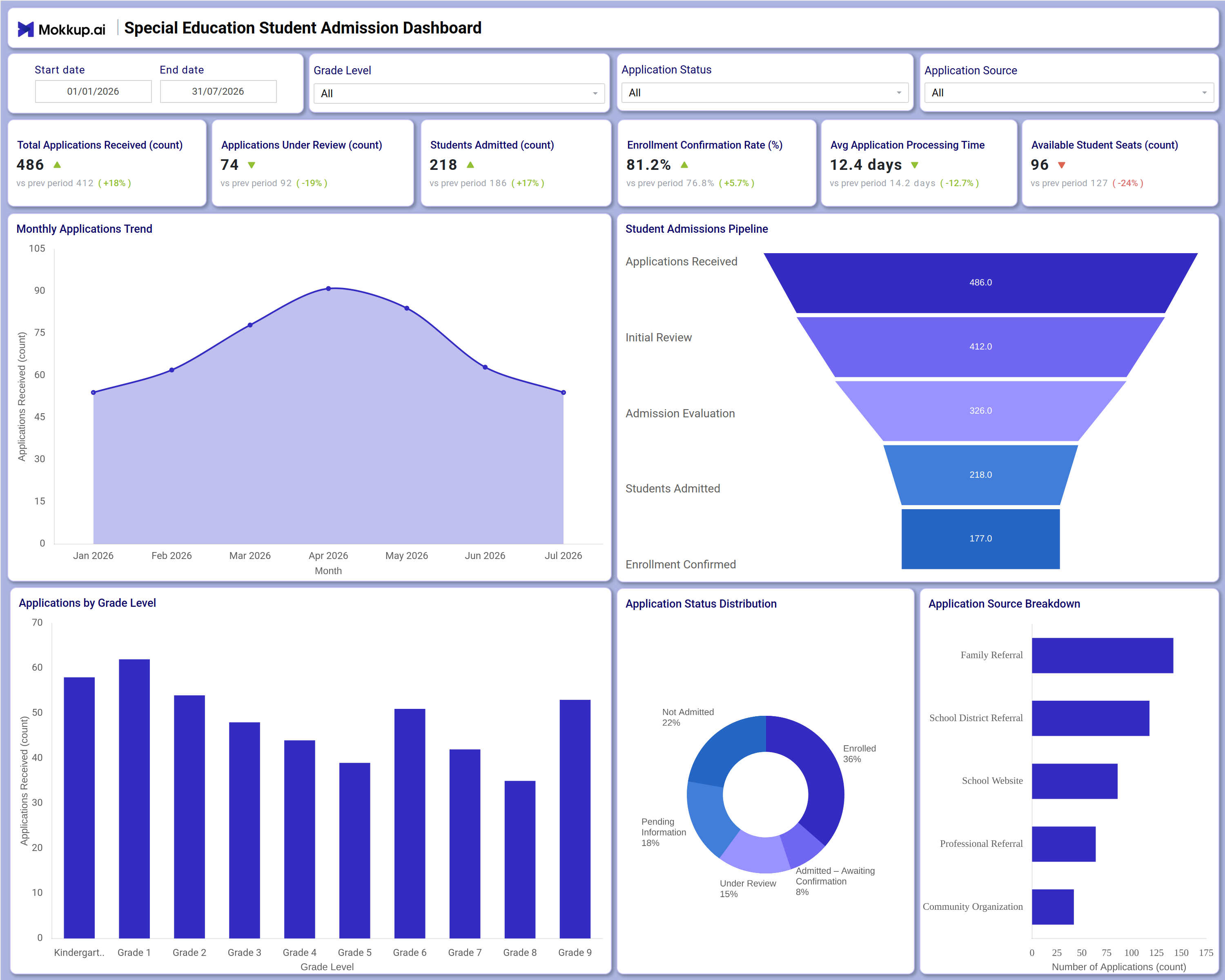
What is a Special Education Student Admission Dashboard
The Special Education Student Admission Dashboard is a purpose-built Special Education Student Admission Dashboard template that gives enrollment coordinators, special education administrators, and school leadership a single view of how applications move from first contact to enrollment. It consolidates a full student admissions pipeline tracking dashboard into one screen, covering everything from total applications received to seats still open, so administrators no longer need to combine data from spreadsheets or separate intake systems. The template surfaces trends across grade levels, application sources, and processing stages, giving teams a clear picture of demand and capacity throughout the enrollment cycle. Built on the Mokkup platform, it can be customized with an organization's own branding, filters, and data before being exported to a BI tool for deeper reporting.
How to Create a Special Education Student Admission Dashboard
You don't need to build your report from scratch—just start with a ready-to-use dashboard template from Mokkup. Add in your data and export it however you like. Here's how to do it:
1. Create or Log in to Your Mokkup Account
Start by signing up on Mokkup.ai using your email. If you already have an account, just log in, and you'll be good to go.
2. Choose and Customize Your Dashboard Template
Find the Special Education Student Admission Dashboard template in the Templates section. Use the drag-and-drop editor to adjust KPIs, edit filters, or add elements based on your data.
3. Export to Your BI Tool
Once your dashboard wireframe is ready, use the BI Tool Export feature to send it directly to Power BI or Tableau for further analysis and enhancements. You can also download the dashboard as a PDF, PNG, or JPEG, embed it on a platform, or invite your team to collaborate.
Note: This is a Pro template. You'll need a Pro subscription on Mokkup to use and customize this dashboard wireframe. Upgrade anytime to unlock full access.
Special Education Student Admission Dashboard Example
An admissions coordinator at a special education school typically opens this dashboard each morning to understand where the current enrollment cycle stands and whether the pipeline is moving fast enough to fill the seats available for the term. Using the Start date, End date, Grade Level, Application Status, and Application Source filters, they narrow the view to a specific intake window or a single grade band before reviewing how demand is trending. From the KPI row, the coordinator can gauge how quickly new applications are being processed and whether under-review cases are piling up faster than staff can clear them.
The Monthly Applications Trend chart lets planners identify seasonal spikes in interest so they can staff the intake team accordingly, while the Student Admissions Pipeline funnel helps them pinpoint exactly which stage—initial review, admission evaluation, or enrollment confirmation—is causing the biggest drop-off between applying and enrolling. Reviewing the Applications by Grade Level bar chart, staff compare demand across grade bands and decide where additional evaluation resources or classroom seats should be prioritized. The Application Status Distribution donut and Application Source Breakdown chart let the team see which outreach channels are converting best and where pending or not-admitted cases are concentrated, informing outreach strategy for the next cycle.
Together, these views help special education leadership move from reactive status checks to proactive capacity planning, ensuring available seats are filled with families who are the right fit, without applications stalling unnoticed in the pipeline.
How to Analyze Data in a Special Education Student Admission Dashboard
Here is how you can analyze data from this dashboard:
- Use the Grade Level filter to isolate applications by grade band and compare demand across cohorts.
- Filter by Application Status to separate enrolled, under review, pending, and not admitted cases at a glance.
- Apply the Application Source filter to compare which referral channels are driving the most admissions.
- Monitor the Monthly Applications Trend chart to spot seasonal spikes and plan intake staffing ahead of peak months.
- Review the Student Admissions Pipeline funnel as a student admissions pipeline tracking dashboard view to see where applicants drop off before enrollment.
- Track the enrollment confirmation rate tracking tool metric monthly to confirm follow-up is keeping pace with admitted students.
- Use the application source breakdown tracking dashboard view to compare channels like Family Referral, School District Referral, and School Website for conversion strength.
- Cross-check the Application Status Distribution donut against Available Student Seats to confirm capacity matches current demand.
Benefits of a Special Education Student Admission Dashboard
The following are the benefits of using this dashboard:
- Centralizes total applications, under-review counts, and enrollment outcomes in a single Special Education Student Admission Dashboard template.
- Functions as an application processing time monitoring dashboard that helps staff catch review delays before they affect enrollment decisions.
- Reduces manual tracking of admissions stages by visualizing the full pipeline from application to confirmed enrollment.
- Enables grade-level capacity planning by comparing demand against available student seats.
- Provides a source breakdown of applications so outreach teams can double down on channels that convert best.
- Gives administrators and enrollment coordinators a shared view of where applicants stand at any point in the cycle.
- Doubles as an applications-by-grade-level analysis tool that supports staffing and classroom planning decisions.
KPIs to Track in a Special Education Student Admission Dashboard
The following key KPIs can be tracked by using this dashboard:
- Total Applications Received (count): Measures overall inbound interest for the term and anchors every student admissions pipeline tracking dashboard view.
- Applications Under Review (count): Tracks how many applications are actively being evaluated, flagging when review capacity needs to scale up.
- Students Admitted (count): Counts applicants who have cleared evaluation, showing how many are progressing toward enrollment.
- Enrollment Confirmation Rate (%): An enrollment confirmation rate tracking tool metric showing what share of admitted students confirm their seat.
- Avg Application Processing Time (days): Quantifies how long applications take to move through each stage, key to application processing time monitoring dashboard analysis.
- Available Student Seats (count): Evaluates remaining capacity against demand, supporting an applications by grade level analysis workflow for classroom planning.
Frequently Asked Questions
1. What industries benefit most from this Special Education Student Admission Dashboard?
Special education schools, district admissions offices, and independent special needs programs benefit most, since each tracks applications, evaluations, and enrollment confirmations across grade levels. Enrollment coordinators and school leadership are the primary users.
2. Can this dashboard track where applications are coming from?
Yes. The application source breakdown tracking dashboard view compares channels such as Family Referral, School District Referral, School Website, Professional Referral, and Community Organization so teams know which sources convert best.
3. How does the Student Admissions Pipeline funnel work?
It shows how applications move from received through initial review, admission evaluation, students admitted, and enrollment confirmed, making it easy to spot exactly where drop-off occurs.