What is a Desalination Plant Expansion & New Capacity Dashboard?
The Desalination Plant Expansion & New Capacity Dashboard is a project management and operational monitoring tool built for water infrastructure teams overseeing desalination plant expansion capacity tracking across multiple regions. It consolidates project delivery timelines, physical completion progress, and financial performance into a single structured view.
Infrastructure planners, capital project managers, and regional operations leads use this dashboard to maintain visibility over construction pipelines, assess desalination capacity by region MGD, and track how current expansion efforts align with long-term supply targets. By surfacing key metrics like capacity utilization, cost variance, and on-time delivery alongside geographic distribution of capacity, it supports both operational oversight and strategic investment decisions across the entire desalination portfolio.
How to Create a Desalination Plant Expansion & New Capacity Dashboard
You don’t need to build your report from scratch, just start with a ready-to-use Desalination Plant Expansion & New Capacity dashboard template from Mokkup. Add in your data and export it however you like. Here’s how to do it:
1. Create or Log in to Your Mokkup Account
Start by signing up on Mokkup.ai using your email. If you already have an account, just log in, and you'll be good to go.
2. Choose and Customize Your Dashboard Template
Find the Desalination Plant Expansion & New Capacity Dashboard template in the Templates section. Use the drag-and-drop editor to adjust KPIs, edit filters, or add elements based on your data.
3. Export to Your BI Tool
Once your dashboard wireframe is ready, use the BI Tool Export feature to send it directly to Power BI or Tableau for further analysis and enhancements. You can also download the dashboard as a PDF, PNG, or JPEG, embed it on a platform, or invite your team to collaborate.
Note: This is a Pro template. You'll need a Pro subscription on Mokkup to use and customize this dashboard wireframe. Upgrade anytime to unlock full access.
Desalination Plant Expansion & New Capacity Dashboard Example
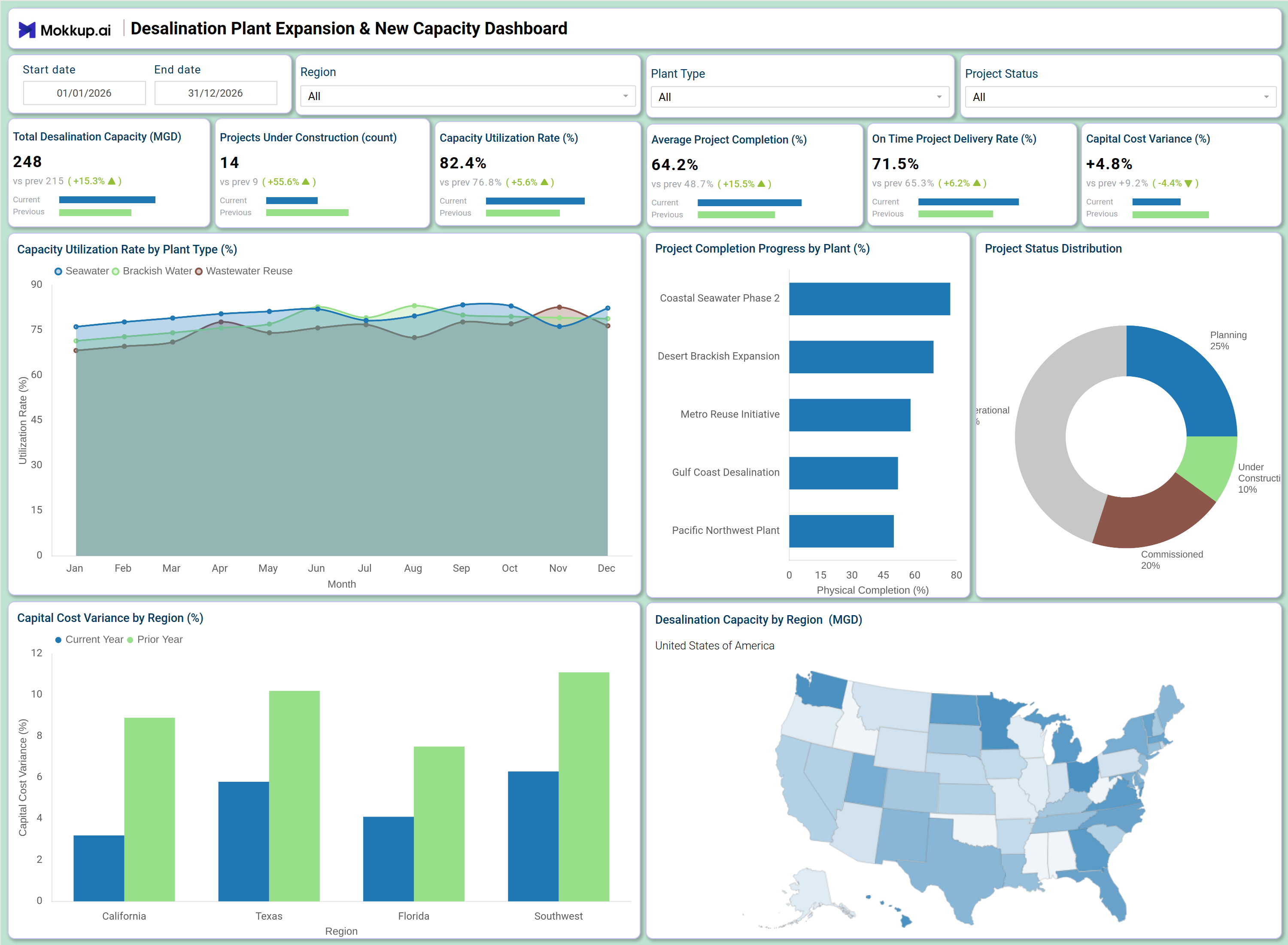
A capital projects director opens this dashboard at the start of a planning cycle to understand the overall health of the desalination expansion portfolio. The KPI tiles give an immediate read on how much capacity is online, how many projects are actively under construction, and whether the desalination project completion dashboard is signaling delays or budget overruns before they compound into larger issues. From the Capacity Utilization Rate by Plant Type line chart, operations managers can identify which plant type of seawater desalination, brackish water, or wastewater reuse is running near its operational limits month over month. Monitoring the capacity utilization rate desalination plant-by-plant makes it easier to prioritize where new capacity investments are most urgent and where existing infrastructure is underperforming relative to demand.
Project delivery teams use the Project Physical Completion Progress by Plant bar chart to assess physical completion progress across individual plant projects, quickly spotting which facilities are lagging. The Project Status Distribution donut chart gives leadership a portfolio-level summary of how many projects are in planning, under construction, operational, or completed, supporting resource allocation and scheduling decisions. Finance and regional leads rely on the Capital Cost Variance by Region chart to compare current-year spend against prior-year benchmarks across California, Texas, Florida, and the Southwest. Combined with the geographic capacity map showing desalination capacity by region MGD, this dashboard helps teams align capital investment with the regions where supply gaps are most critical.
How to Analyze Data in a Desalination Plant Expansion & New Capacity Dashboard
Here is how you can analyze data from this dashboard:
- Filter by Region: Compare capacity and cost performance across California, Texas, Florida, and the Southwest.
- Compare Plant Types: Analyze seawater, brackish water, and wastewater reuse facilities independently.
- Monitor Capacity Utilization: Track utilization trends to identify plants nearing operational limits.
- Review Construction Progress: Compare project completion status against planned milestones.
- Track Cost Variance: Analyze regional capital cost differences against prior-year spending.
- Assess Project Distribution: Review portfolio balance across planning, construction, and operational stages.
- Focus on Active Projects: Filter by project status to prioritize high-risk construction sites.
- Evaluate Regional Capacity: Use the geographic map to align expansion with supply-demand gaps.
Benefits of a Desalination Plant Expansion & New Capacity Dashboard
The following are the benefits of using this dashboard:
- Centralized Project Visibility: Combines capacity, cost, and delivery metrics in one dashboard.
- Lifecycle Monitoring: Tracks projects across all expansion and construction stages.
- Regional Cost Insights: Supports investment planning through cost variance analysis.
- Reduced Reporting Effort: Prebuilt KPIs simplify capacity and delivery tracking.
- Geographic Planning Support: Visualizes desalination capacity by region for supply planning.
- Shared Portfolio View: Aligns project managers and operations teams around portfolio health.
- Improved Delivery Alignment: Helps teams stay on track with infrastructure delivery targets.
KPIs to Track in a Desalination Plant Expansion & New Capacity Dashboard
The following key KPIs can be tracked by using this dashboard:
- Total Desalination Capacity (MGD): The core output metric in desalination plant expansion capacity tracking — measures the aggregate treated water output across all active facilities in million gallons per day.
- Projects Under Construction (count): Tracks the number of active construction projects in the portfolio, giving leadership visibility into pipeline load and resource demand.
- Average Project Completion (%): Quantifies the mean physical progress across all tracked projects — essential for assessing whether the desalination project completion dashboard reflects overall portfolio advancement or isolated delays.
- Capacity Utilization Rate (%): Measures how efficiently installed capacity is being used across plant types — a key indicator of the capacity utilization rate desalination plant teams rely on to determine where new investment is needed.
- On-Time Project Delivery Rate (%): Tracks the percentage of projects delivered within their planned schedule, a critical on-time project delivery rate water infrastructure metric for assessing contractor performance and project governance.
- Capital Cost Variance (%): Measures the percentage deviation between current-year capital spend and prior-year benchmarks — central to monitoring capital cost variance desalination projects across all regions.
Frequently Asked Questions
Q1. What types of organizations benefit most from this dashboard?
Water utilities, municipal infrastructure agencies, and regional water authorities managing multi-site desalination expansion programs benefit most. Capital project managers and operations directors responsible for capacity planning across large geographic portfolios will find the most value.
Q2. Can this dashboard track progress for individual plant projects?
Yes. The Project Physical Completion Progress by Plant bar chart displays physical completion percentage for each named facility, allowing teams to monitor individual project status alongside the overall portfolio.
Q3. Is this dashboard suitable for multi-region capital planning?
Yes. The Capital Cost Variance by Region chart and the Desalination Capacity by Region map together support regional investment analysis across California, Texas, Florida, and the Southwest, making it well-suited for multi-region capital planning cycles.