
What is a Special Education Assistive Technology Dashboard?
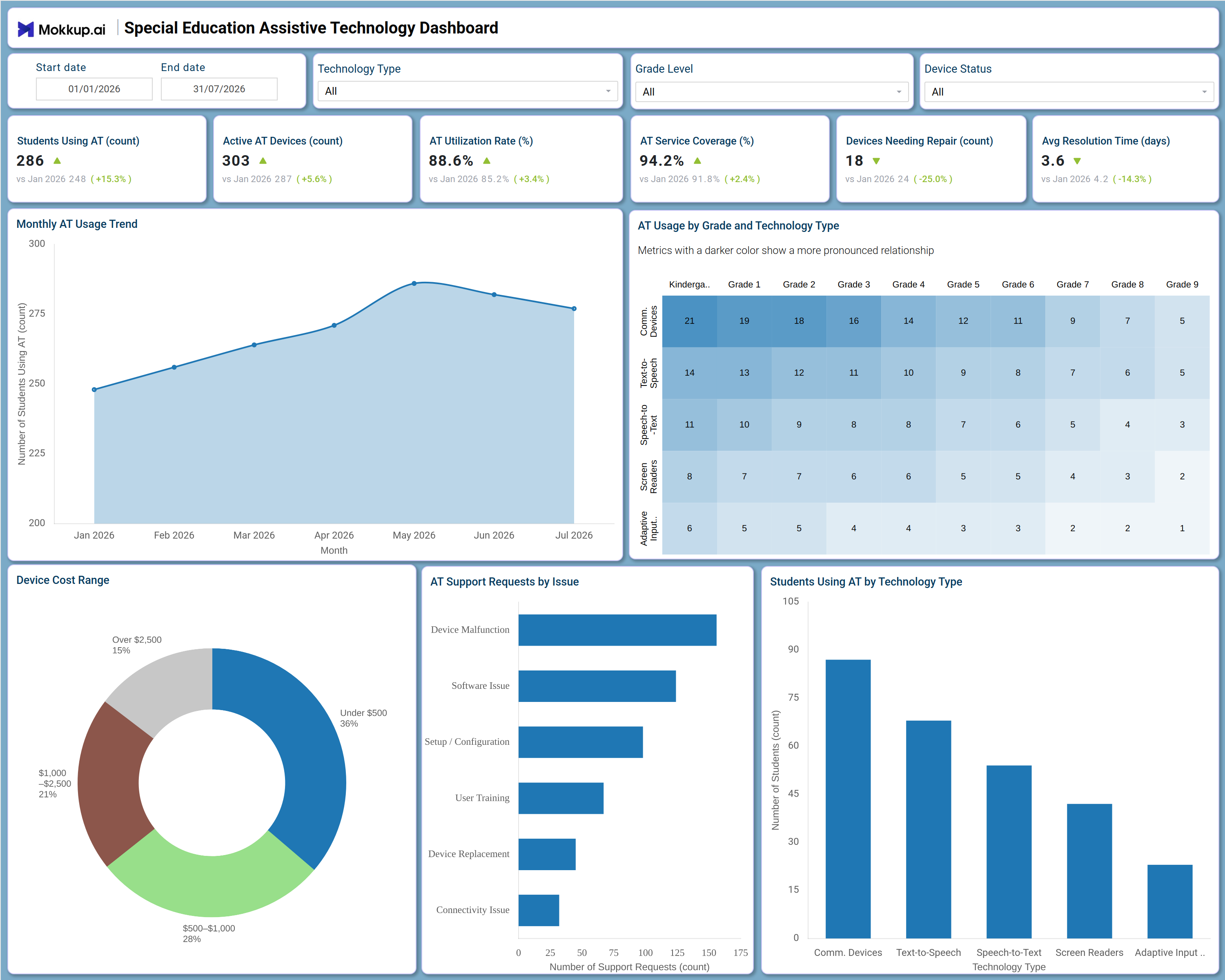
The Special Education Assistive Technology Dashboard is a ready-to-use analytics template built for special education directors, assistive technology (AT) coordinators, and district IT support teams who manage the devices that help students with disabilities access the curriculum. This special education assistive technology dashboard consolidates adoption metrics, device inventory, and support activity into a single view, tracking how many students are using AT, how many devices are active, and how efficiently that fleet is being used. Technology Type, Grade Level, and Device Status filters let a team narrow the view to a specific classroom, device category, or repair status in seconds. Pairing an AT utilization rate tracking dashboard view with device cost and support ticket data gives special education leaders one place to justify budget requests and demonstrate program impact.
How to Create a Special Education Assistive Technology Dashboard
You don’t need to start from scratch—just begin with a ready-to-use Dashboard Template from Mokkup. Here’s how:
1. Create or Log in to Your Mokkup Account
Start by signing up on Mokkup.ai using your email. If you already have an account, just log in, and you'll be good to go.
2. Choose and Customize Your Dashboard Template
Find the Special Education Assistive Technology Dashboard template in the Templates section. Use the drag-and-drop editor to adjust KPIs, edit filters, or add elements based on your data.
3. Export to Your BI Tool
Once your dashboard wireframe is ready, use the BI Tool Export feature to send it directly to Power BI or Tableau for further analysis and enhancements. You can also download the dashboard as a PDF, PNG, or JPEG, embed it on a platform, or invite your team to collaborate.
Note: This is a Pro template. You'll need a Pro subscription on Mokkup to use and customize this dashboard wireframe. Upgrade anytime to unlock full access.
Special Education Assistive Technology Dashboard Example
An assistive technology coordinator or special education director typically opens this dashboard at the start of a grading period to check whether adoption is growing in line with need and whether the device fleet can support it. Coming in with a specific question, such as which grade bands rely most heavily on communication devices versus screen readers, the coordinator uses the Technology Type, Grade Level, and Device Status filters to narrow straight to the segment that matters. From there, the coordinator can identify how usage has moved month over month and whether recent growth is holding steady or leveling off, which shapes procurement conversations. Using the AT usage by grade level analysis, the team can see which technology category, such as speech-to-text or adaptive input devices, is most concentrated in early grades versus upper grades, so training resources go to the right classrooms.
When support volume climbs, staff can trace it back to a specific issue type, whether that is device malfunction, setup, or connectivity, and prioritize technician time accordingly. Comparing device cost tiers alongside repair counts and average resolution time also shows whether cheaper devices are driving a large share of support tickets. The overall outcome is a special education department that can defend its assistive technology budget with evidence, respond to device failures before they interrupt a student's access to instruction, and continually rebalance its device mix toward what students are actually using. Instead of pulling numbers from separate spreadsheets each month, the team relies on this assistive technology support requests dashboard view to keep procurement, IT support, and instructional staff aligned on the same numbers.
How to Analyze Data in a Special Education Assistive Technology Dashboard
Here is how you can analyze data from this dashboard:
- Use the Technology Type filter to isolate usage and support trends for a single device category, such as text-to-speech or screen readers.
- Apply the Grade Level filter to see how assistive technology adoption differs between early elementary and upper grades.
- Filter by Device Status to focus on devices that are active, under repair, or retired before planning replacements.
- Monitor the Monthly AT Usage Trend to spot whether adoption is accelerating, plateauing, or declining across the selected date range.
- Use the AT usage by grade level analysis heatmap to identify which technology category is most concentrated in a specific grade band.
- Review the Device Cost Range donut chart as a device cost range tracking tool when weighing cheaper devices against premium models.
- Analyze the AT Support Requests by Issue chart to see whether malfunctions, setup issues, or connectivity problems drive the most tickets.
- Compare the Students Using AT by Technology Type chart to determine which device category serves the largest share of students.
Benefits of a Special Education Assistive Technology Dashboard
The following are the benefits of using this dashboard:
- Centralizes assistive technology adoption, device inventory, and support activity in one special education assistive technology dashboard.
- Gives AT coordinators an AT utilization rate tracking dashboard instead of separate device and usage spreadsheets.
- Surfaces devices needing repair and average resolution time so support teams can prioritize technician workload.
- Supports assistive technology device repair tracking across every technology type and grade level from one screen.
- Breaks down support requests by issue type to reduce recurring device malfunction and setup delays.
- Helps special education leaders justify budget requests with adoption and utilization evidence instead of anecdotes.
- Gives IT support and instructional staff a shared view of which students are using which assistive technology.
KPIs to Track in a Special Education Assistive Technology Dashboard
The following key KPIs can be tracked by using this dashboard:
- Students Using AT (count): The core reach metric on this special education assistive technology dashboard, showing how many students are actively using an assigned device.
- Active AT Devices (count): Tracks the total device fleet currently deployed across grades and technology types.
- AT Utilization Rate (%): Central to any AT utilization rate tracking dashboard, this KPI shows what share of the assigned device fleet is actively being used rather than sitting idle.
- AT Service Coverage (%): Measures the percentage of identified student need that currently has a device or service in place.
- Devices Needing Repair (count): Quantifies devices currently out of service, key to assistive technology device repair tracking and technician staffing.
- Avg Resolution Time (days): Tracks how quickly support requests move from ticket to resolved device, a core input for any assistive technology support requests dashboard.
- Device Cost Distribution (%): Breaks the device fleet down by price tier, functioning as a device cost range tracking tool for procurement planning.
Frequently Asked Questions
1. Who benefits most from the Special Education Assistive Technology Dashboard?
Special education directors, assistive technology coordinators, and district IT support teams use it to track device adoption, utilization, and repair activity in one place. Instructional staff also gain visibility into which students are using which technology types.
2. Can this dashboard track devices needing repair and resolution time?
Yes. The Devices Needing Repair and Avg Resolution Time KPIs show current repair volume and how quickly issues get resolved, supporting assistive technology device repair tracking across the fleet.
3. Does this template work as an assistive technology support requests dashboard?
Yes. The AT Support Requests by Issue chart breaks tickets down by cause, such as device malfunction or connectivity, making it easy to spot recurring problems and staff support accordingly.