What is a Solar Power Plant Supply Chain Dashboard?
A Solar Power Plant Supply Chain Dashboard is a centralized analytics system that monitors procurement activities, inventory levels, supply continuity risks, and vendor performance across large solar portfolios. It integrates data from procurement systems, warehouse tools, vendor portals, and plant operations to highlight how materials move from sourcing to on-ground deployment. The dashboard supports utility teams by visualizing inventory coverage, procurement spending, critical stock availability, supplier delays, lead-time deviation, quality failures, and disruption events. By functioning as a utility-scale solar procurement and inventory management analytics tool, it ensures that plants receive essential components such as modules, inverters, cables, BOS, and spares without delay. It also acts as a renewable energy supply chain visibility and vendor performance tool, offering real-time transparency into material shortages, logistics bottlenecks, and procurement inefficiencies
How to Create a Solar Power Plant Supply Chain Dashboard
You don’t need to build your report from scratch; just start with a ready-to-use dashboard template from Mokkup. Add your data and export it as needed. Here’s how to do it:
1. Create or Log in to Your Mokkup Account
Start by signing up on Mokkup.ai using your email. If you already have an account, just log in, and you’ll be good to go.
2. Choose and Customize Your Dashboard Template
Find the Solar Power Plant Supply Chain Dashboard template in the Templates section. Use the drag-and-drop editor to adjust KPIs, edit filters, or add elements based on your data.
3. Export to Your BI Tool
Once your dashboard wireframe is ready, use the BI Tool Export feature to send it directly to Power BI or Tableau for further analysis and enhancements. You can also download the dashboard as a PDF, PNG, or JPEG, embed it on a platform, or invite your team to collaborate.
Note: This is a Pro template. You’ll need a Pro subscription on Mokkup to use and customize this dashboard wireframe. Upgrade anytime to unlock full access.
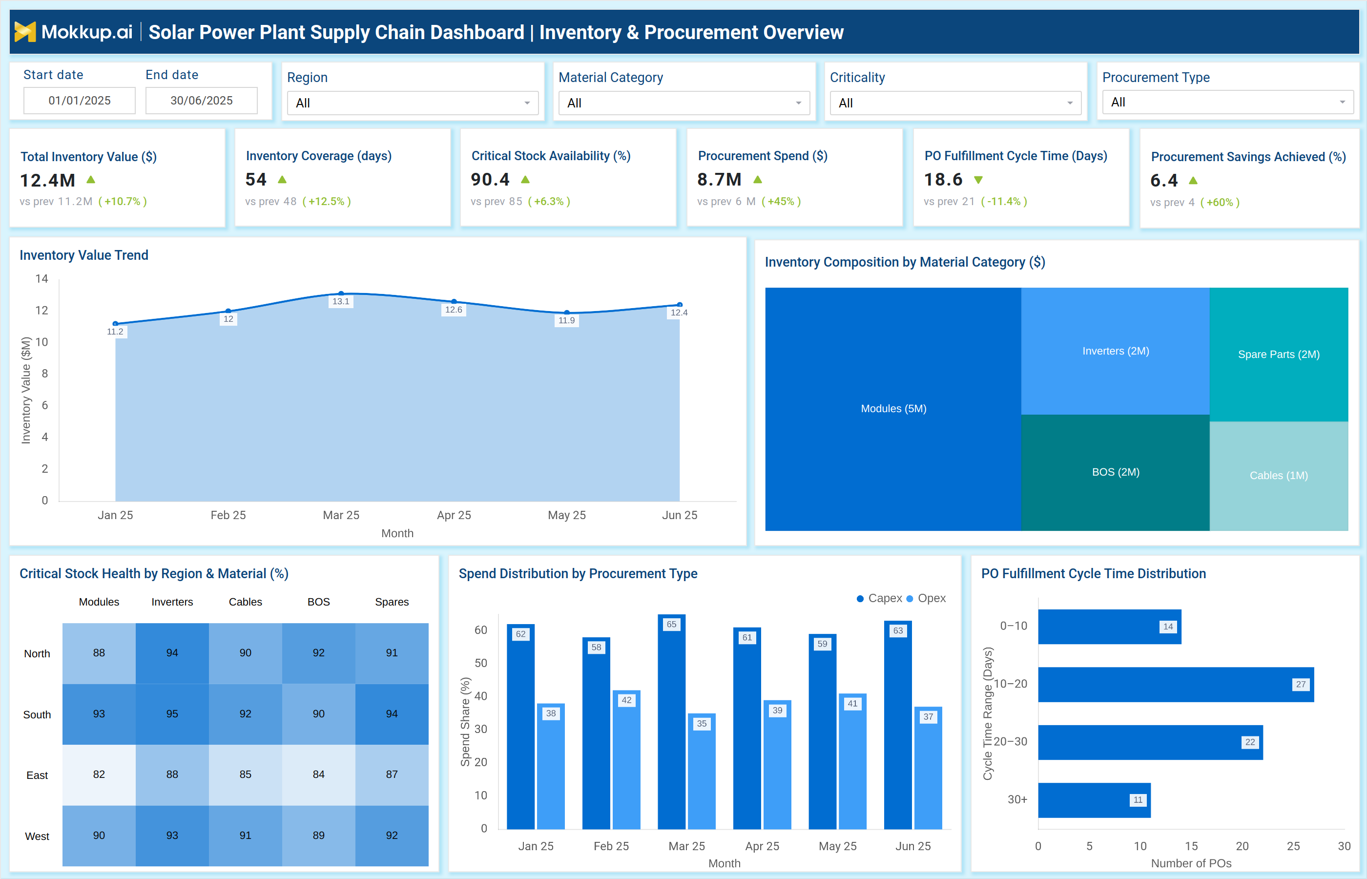
Solar Power Plant Supply Chain Dashboard Example
The example dashboard above provides a comprehensive, two-screen view covering both inventory & procurement and supply continuity & risk diagnostics. The first screen highlights KPIs such as Total Inventory Value, Inventory Coverage (days), Critical Stock Availability (%), Procurement Spend, PO Fulfillment Cycle Time, and Procurement Savings Achieved. It visualizes trends like Inventory Value over time, Material Category Composition, Spend Distribution by Procurement Type, and Cycle Time Distribution. These insights help companies analyze how efficiently the procurement and stocking process supports plant operations.
The second screen focuses on disruptions and root causes using visuals such as Monthly Lead-Time Variance Trend, Material Shortage Across Regions, Risk-Type Disruption Patterns, and Root Cause Breakdown for delivery delays, production shortages, quality rejection, or logistical issues. This aligns with the purpose of a plant material procurement and logistics tracking dashboard, enabling companies to pinpoint inefficiencies before they affect solar power generation. It also supports solar equipment delivery, stock movement, and lead time analysis, ensuring that operational teams maintain continuity even in challenging supply conditions. Overall, this dashboard serves as an electric utility solar supply chain risk and procurement efficiency dashboard, providing a comprehensive view of plant-level supply chain health.
How to Analyze Data in a Solar Power Plant Supply Chain Dashboard
Here is how you can analyze data from this dashboard:
- Track Inventory Coverage: Compare current days of coverage versus optimal thresholds.
- Evaluate Critical Material Availability: Identify shortages in modules, inverters, BOS, and spare parts.
- Analyze Procurement Spend Trends: Review monthly spend patterns by Capex/Opex.
- Measure PO Fulfillment Time: Detects delays in buyer approval, vendor processing, or logistics stages.
- Review Supplier Risk Indicators: Monitor quality failures, lead-time deviation, and shortage events.
- Study Disruption Patterns: Evaluate recurring issues such as delivery delays or production shortages.
- Map Material Shortage Across Regions: Identify plants or regions facing repeated risks.
- Assess Lead-Time Variance: Compare actual vs. planned procurement timelines.
- Check Root Cause Categories: Determine if disruptions stem from suppliers, logistics, or documentation gaps.
Benefits of Solar Power Plant Supply Chain Dashboard
The following are the benefits of using this dashboard:
- Improves procurement planning through real-time tracking of material usage and stock levels.
- Reduces operational downtime by identifying critical stock shortages early.
- Optimizes procurement spending with visibility into Capex/Opex allocations.
- Enhances vendor accountability through performance scoring and delay diagnostics.
- Strengthens supply continuity with early alerts for lead-time deviations and risk events.
- Supports cost efficiency by highlighting wastage, repeat failures, and unnecessary purchases.
- Improves logistics transparency with tracking across regions and material categories.
- Reduces quality and production risks through automated quality failure monitoring.
- Supports accurate budgeting by linking material usage with spend patterns.
- Improves decision-making using centralized dashboards for cross-functional teams.
KPIs to Track in Solar Power Plant Supply Chain Dashboard
The following key KPIs can be tracked by using this dashboard:
- Total Inventory Value ($): Measures current stock valuation across all plants.
- Inventory Coverage (days): Number of operational days the inventory can support.
- Critical Stock Availability (%): Readiness of essential materials like modules, inverters, and cables.
- Procurement Spend ($): Total monthly or quarterly procurement outflow.
- PO Fulfillment Cycle Time (Days): Time taken from PO creation to material delivery.
- Procurement Savings Achieved (%): Measurable savings from negotiation or optimization.
- Lead-Time Deviation (%): Difference between planned and actual delivery timelines.
- Material Quality Failure Rate (%): Proportion of materials failing quality checks.
- Supply Disruption Events (count): Number of procurement or logistics-related breakdowns.
- Critical SKU Shortage Events: Instances of essential materials running critically low.
- Alternate Source Coverage (%): Availability of backup vendors or suppliers.
- Monthly Disruption Pattern: Distribution of delays, shortages, logistics issues, and quality failures.
Frequently Asked Questions
1. Who uses a Solar Power Plant Supply Chain Dashboard?
Procurement leaders, supply chain managers, plant heads, logistics teams, and finance teams.
2. What KPIs can be monitored through this dashboard?
It typically includes metrics like stock levels, supplier OTIF, lead times, material consumption rates, pending POs, shipment status, and aging inventory.
3. How does it help reduce downtime?
By highlighting critical stock shortages early and alerting teams about procurement risks.