What is a Solar Plant Revenue & Cost Dashboard?
A Solar Plant Revenue & Cost Dashboard is a financial analytics system used by electric utilities, IPPs, and solar asset operators to monitor how effectively their solar plants generate revenue while controlling operational costs. It brings together all major financial drivers: total revenue earned, cost of generation, gross margin, budget utilization, tariff realization, and revenue leakage. This dashboard supports executives, finance teams, and plant managers by giving a transparent, real-time view of profitability performance across regions, capacities, and contract types. It operates as a complete solar revenue and cost performance monitoring dashboard, helping teams identify deviations, cost overruns, and lost revenue opportunities before they escalate.
How to Create a Solar Plant Revenue & Cost Dashboard
You don’t need to build your report from scratch—just start with a ready-to-use sample Solar Plant Revenue & Cost Dashboard template from Mokkup. Plug in your own data and export it however you like. Here’s how to do it:
1. Create or Log in to Your Mokkup Account
Start by signing up on Mokkup.ai using your email. If you already have an account, just log in, and you’ll be good to go.
2. Choose and Customize Your Dashboard Template
Find the Solar Plant Revenue & Cost Dashboard template in the Templates section. Use the drag-and-drop editor to adjust KPIs, edit filters, or add elements based on your data.
3. Export to Your BI Tool
Once your dashboard wireframe is ready, use the BI Tool Export feature to send it directly to Power BI or Tableau for further analysis and enhancements. You can also download the dashboard as a PDF, PNG, or JPEG, embed it on a platform, or invite your team to collaborate.
Note: This is a Pro template. You’ll need a Pro subscription on Mokkup to use and customize this dashboard wireframe. Upgrade anytime to unlock full access.
Solar Plant Revenue & Cost Dashboard Example
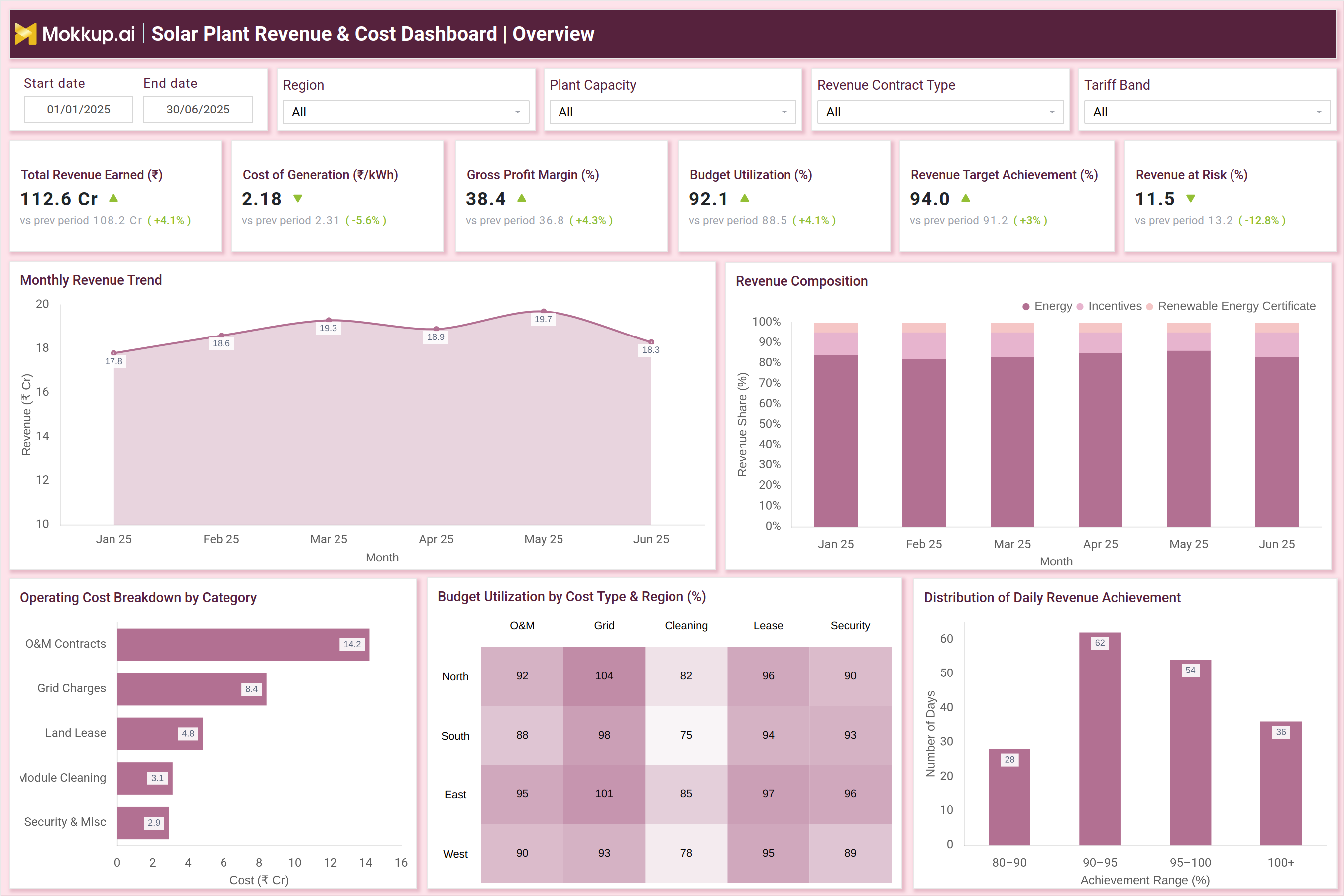
The example dashboard showcases how revenue and cost indicators integrate into a unified performance view. It includes essential KPIs such as Total Revenue Earned (₹ Cr), Cost of Generation (₹/kWh), Gross Profit Margin (%), Budget Utilization (%), Revenue Target Achievement (%), and Revenue at Risk (₹ Cr). Supporting visuals like the Monthly Revenue Trend, Revenue Composition, and Operating Cost Breakdown reveal how energy sales, incentives, and REC contributions shape revenue, while O&M contracts, grid charges, and cleaning costs influence operational spending. The dashboard also highlights root causes for revenue leakage, including PR drop, curtailment, DSM penalties, billing delays, and metering issues. Heatmaps for tariff deviation and profitability gaps across regions help financial teams understand where earnings fall short of expectations. Overall, this dashboard functions as a complete utility-scale solar financial performance analysis tool, offering both high-level profitability tracking and deep diagnostic insights.
How to Analyze Data in a Solar Plant Revenue & Cost Dashboard
Here is how you can analyze data from this dashboard:
- Track revenue growth trends to understand how seasonal irradiance, PPA conditions, and plant availability influence monthly earnings.
- Monitor the cost of generation to detect operational inefficiencies or rising O&M, grid, or lease expenses.
- Evaluate gross margin and net profitability to check whether revenue improvements translate into actual profit.
- Review revenue composition to quantify the contribution of energy, incentives, and renewable certificates.
- Analyze revenue leakage causes such as curtailment, metering errors, PR drop, and billing delays.
- Study budget utilization to ensure O&M, grid, and cleaning budgets are being deployed effectively.
- Assess regional tariff deviation to identify underperforming PPA regions or inconsistent billing.
- Measure profitability gaps to compare expected vs. actual revenue performance.
- Review financial risks to prioritize actions that minimize monetary losses.
Benefits of a Solar Plant Revenue & Cost Dashboard
The following are the benefits of using this dashboard:
- Centralized financial visibility across revenue, cost, and margin KPIs.
- Accurate profitability forecasting supported by structured financial data.
- Faster detection of revenue leakage for timely corrective actions.
- Improved cost efficiency through transparent breakdowns of operating costs.
- Higher revenue reliability via real-time monitoring of tariff deviations and billing performance.
- Better investor and executive reporting with consolidated financial metrics.
- Optimized regional and asset-level decisions using detailed profitability insights.
- Enhanced budget planning driven by utilization patterns and cost trends.
- Reduced financial risk exposure by tracking revenue-at-risk metrics and loss causes
KPIs to Track in a Solar Plant Revenue & Cost Dashboard
The following key KPIs can be tracked by using this dashboard:
- Total Revenue Earned (₹ Cr): Measures total income generated by the solar fleet.
- Cost of Generation (₹/kWh): Indicates how much it costs to produce each unit of energy.
- Gross Profit Margin (%): Shows profitability after accounting for direct costs.
- Budget Utilization (%): Tracks how efficiently O&M, cleaning, and grid budgets are used.
- Revenue Target Achievement (%): Measures alignment with monthly or quarterly revenue plans.
- Revenue at Risk (₹ Cr): Quantifies potential earnings loss from plant or grid issues.
- Operating Cost Breakdown: Analyzes spend across O&M, grid, land lease, cleaning, etc.
- Revenue Composition: Measures income from energy, incentives, and RECs.
Frequently Asked Questions
1. Who uses a Solar Plant Revenue & Cost Dashboard?
Finance teams, asset managers, executive leadership, solar operators, and utility planners.
2. Can this dashboard help reduce cost overruns?
Yes. It identifies high-cost categories and highlights inefficiencies.
3. Does it support portfolio-level performance comparison?
Yes. Regional and plant-level comparisons are core dashboard features.