
What is a Solar Power Plant Executive Overview Dashboard?
A Solar Power Plant Executive Overview Dashboard is a high-level reporting system designed for leadership teams in electric utilities, IPPs, and large solar portfolios. It aggregates generation, financial, operational, and regional performance data into a single executive view. This dashboard helps decision-makers monitor revenue trends, energy production, EBITDA margins, portfolio PR, collection efficiency, and enterprise risks that affect profitability. As a Solar Power Plant Executive Overview Dashboard, it allows C-suite users to evaluate performance against targets, assess underperforming assets, and guide investment or operational decisions with accurate and timely insights. Its purpose is to offer complete visibility across a utility-scale solar portfolio, enabling executives to optimize performance and improve long-term financial outcomes.
How to Create a Solar Power Plant Executive Overview Dashboard
You don’t need to build your report from scratch—just start with a ready-to-use sample Solar Power Plant Executive Overview Dashboard template from Mokkup. Plug in your own data and export it however you like. Here’s how to do it:
1. Create or Log in to Your Mokkup Account
Start by signing up on Mokkup.ai using your email. If you already have an account, just log in, and you’ll be good to go.
2. Choose and Customize Your Dashboard Template
Find the Solar Power Plant Executive Overview Dashboard template in the Templates section. Use the drag-and-drop editor to adjust KPIs, edit filters, or add elements based on your data.
3. Export to Your BI Tool
Once your dashboard wireframe is ready, use the BI Tool Export feature to send it directly to Power BI or Tableau for further analysis and enhancements. You can also download the dashboard as a PDF, PNG, or JPEG, embed it on a platform, or invite your team to collaborate.
Note: This is a Pro template. You’ll need a Pro subscription on Mokkup to use and customize this dashboard wireframe. Upgrade anytime to unlock full access.
Solar Power Plant Executive Overview Dashboard Example
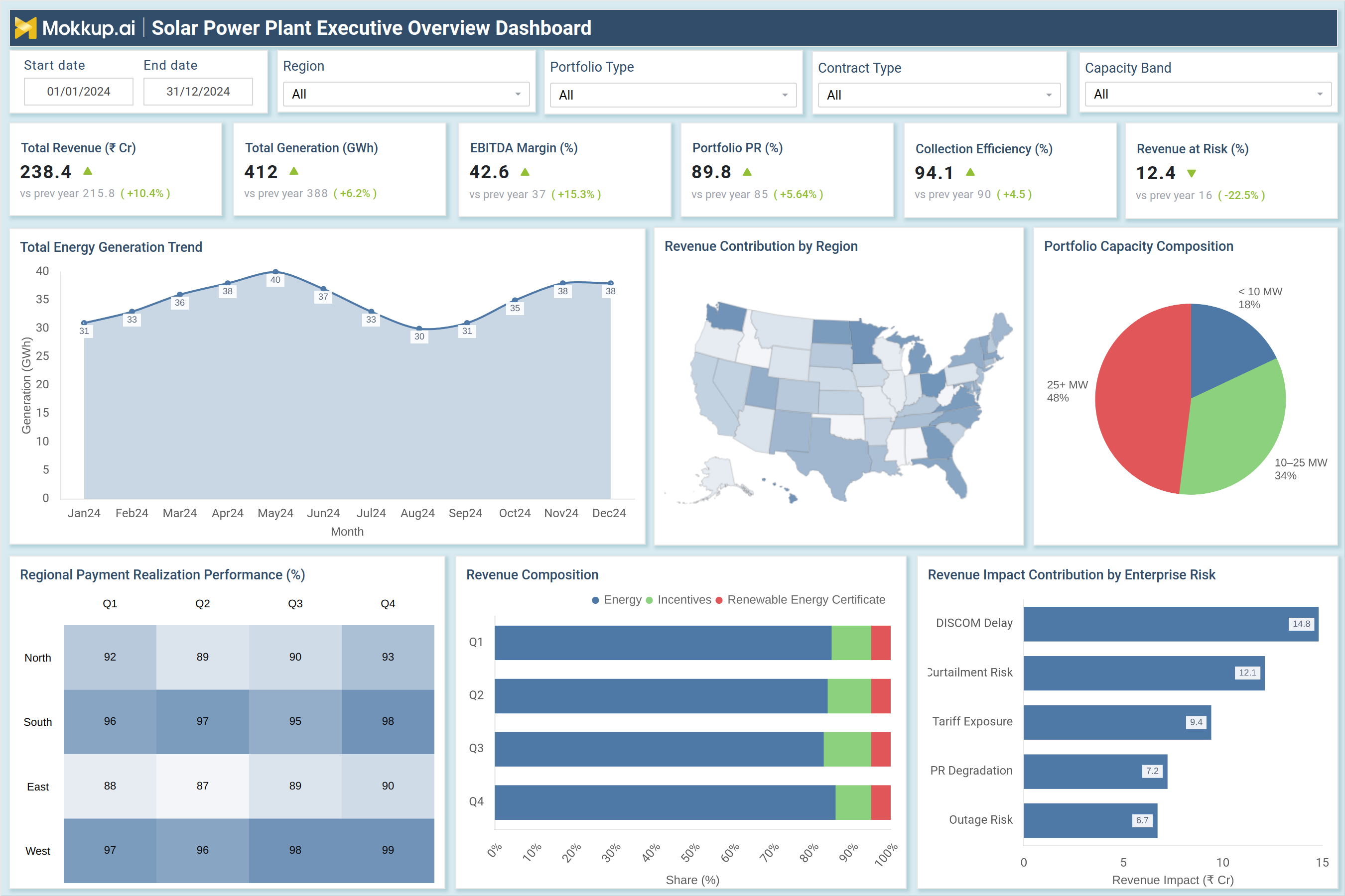
The sample dashboard provides a full portfolio overview using KPIs such as Total Revenue, Total Generation (GWh), EBITDA Margin, Portfolio PR (%), Collection Efficiency, and Revenue at Risk (₹ Cr). The Total Energy Generation Trend highlights month-wise production patterns, showing seasonal variability and generation peaks. Regional Revenue Contribution maps help executives understand which locations drive the highest financial output. A pie chart detailing Portfolio Capacity Composition gives clarity on how capacity is distributed across <10 MW, 10–25 MW, and >25 MW categories. Quarterly Regional Payment Realization heatmaps show how consistently payments are collected across North, South, East, and West regions—critical for revenue risk evaluation. The Revenue Composition chart provides a breakdown of income sources, including energy charges, incentives, and renewable energy certificates. The dashboard also includes a bar chart showing Revenue Impact Contribution by risks such as DISCOM delays, curtailment, tariff exposure, PR degradation, and outage impacts. Combined, these visuals form a complete utility-scale solar portfolio performance analytics solution that supports strategic financial and operational decisions.
How to Analyze Data in Solar Power Plant Executive Overview Dashboard
Here is how you can analyze data from this dashboard:
- Review total revenue and generation trends to understand the health of your portfolio and its seasonality.
- Monitor EBITDA margin to track profitability and cost efficiency across assets.
- Analyze the Portfolio PR (%) to identify plants that fall below expected performance benchmarks.
- Compare regional revenue contributions to determine which clusters generate maximum value.
- Evaluate collection efficiency to assess payment reliability and financial risk.
- Track revenue at risk to understand exposure to tariff delays, curtailment, or outages.
- Examine regional payment realization patterns for identifying overdue hotspots.
- Review quarterly revenue composition to compare core energy revenue vs incentive earnings.
- Assess enterprise risks and their financial impact to prioritize mitigation actions.
- Use capacity composition insights to evaluate diversification and scalability of the portfolio.
Benefits of Solar Power Plant Executive Overview Dashboard
The following are the benefits of using this dashboard:
- Offers a unified executive-level view of financial, operational, and regional portfolio performance.
- Enables leadership teams to monitor trends, risks, and KPIs in real time.
- Improves profitability by identifying underperforming plants and financial leakages.
- Strengthens strategic planning with high-quality solar power generation executive reporting.
- Helps executives prioritize capital allocation toward regions or assets with higher ROI potential.
- Enhances transparency across revenue cycles and grid-dependent payment processes.
- Supports risk mitigation with clear visibility into DISCOM delays, curtailment impacts, and tariff exposure.
- Provides accurate benchmarking for performance, capacity utilization, and production quality.
- Enables proactive management through the enterprise solar fleet performance management dashboard insights.
- Simplifies communication across leadership, operations, and finance teams with consistent, reliable data.
KPIs to Track in Solar Power Plant Executive Overview Dashboard
The following key KPIs can be tracked by using this dashboard:
- Total Revenue (₹ Cr): Measures the total financial output generated by the solar portfolio.
- Total Generation (GWh): Tracks overall energy production across the entire fleet.
- EBITDA Margin (%): This metric indicates profitability and operational efficiency.
- Portfolio PR (%): Reflects performance quality relative to plant design capacity.
- Collection Efficiency (%): Shows how effectively payments are collected from DISCOMs or buyers.
- Revenue at Risk (₹ Cr): Identifies potential revenue loss due to delays, outages, or curtailment.
- Regional Payment Realization (%): Helps assess payment reliability across regions.
- Revenue Composition: Breaks down income into energy, incentives, and certificates.
- Capacity Composition: Shows the distribution of capacity across plant size categories.
- Generation Trend: Displays month-by-month production seasonality and operational patterns.
- Enterprise Risk Impact: Quantifies financial impact from curtailment, tariff issues, PR loss, and grid outages.
Frequently Asked Questions
1. Who should use a Solar Power Plant Executive Overview Dashboard?
Executives, directors, CFOs, and portfolio managers responsible for strategic solar operations and financial planning.
2. What makes this dashboard different from plant-level dashboards?
It consolidates high-level KPIs from multiple solar assets, offering executive-centric insights rather than granular plant data.
3. How does this dashboard help with revenue optimization?
It highlights trends, risks, and regional variations that influence cash flow and profitability.