
What is a Portfolio Management Dashboard?
A Portfolio Management Dashboard is a centralized analytics view that helps financial teams track portfolio performance, monitor asset allocation, evaluate risk exposure, and assess client-level profitability. It consolidates investment portfolio data into a real-time interface, allowing analysts to measure total portfolio value, average ROI, risk levels, and performance trends across multiple asset classes.
This type of dashboard supports decision-making by providing an investment portfolio analytics dashboard that visualizes key metrics using charts such as line graphs, bar charts, and donut charts. It functions as a financial portfolio monitoring dashboard, providing clarity on how portfolios evolve, enabling managers to adjust strategies, rebalance allocations, and identify high-value clients. As a KPI dashboard for portfolio management, it ensures that all essential performance indicators are easily trackable in one place.
How to Create a Portfolio Management Dashboard
You don’t need to build your report from scratch—just start with a ready-to-use dashboard template from Mokkup. Add in your data and export it however you like. Here’s how to do it:
1. Create or Log in to Your Mokkup Account
Start by signing up on Mokkup.ai using your email. If you already have an account, just log in, and you’ll be good to go.
2. Choose and Customize Your Dashboard Template
Find the Portfolio Management Dashboard template in the Templates section. Use the drag-and-drop editor to adjust KPIs, edit filters, or add elements based on your data.
3. Export to Your BI Tool
Once your dashboard wireframe is ready, use the BI Tool Export feature to send it directly to Power BI or Tableau for further analysis and enhancements. You can also download the dashboard as a PDF, PNG, or JPEG, embed it on a platform, or invite your team to collaborate.
Note: This is a Pro template. You’ll need a Pro subscription on Mokkup to use and customize this dashboard wireframe. Upgrade anytime to unlock full access.
Portfolio Management Dashboard Example
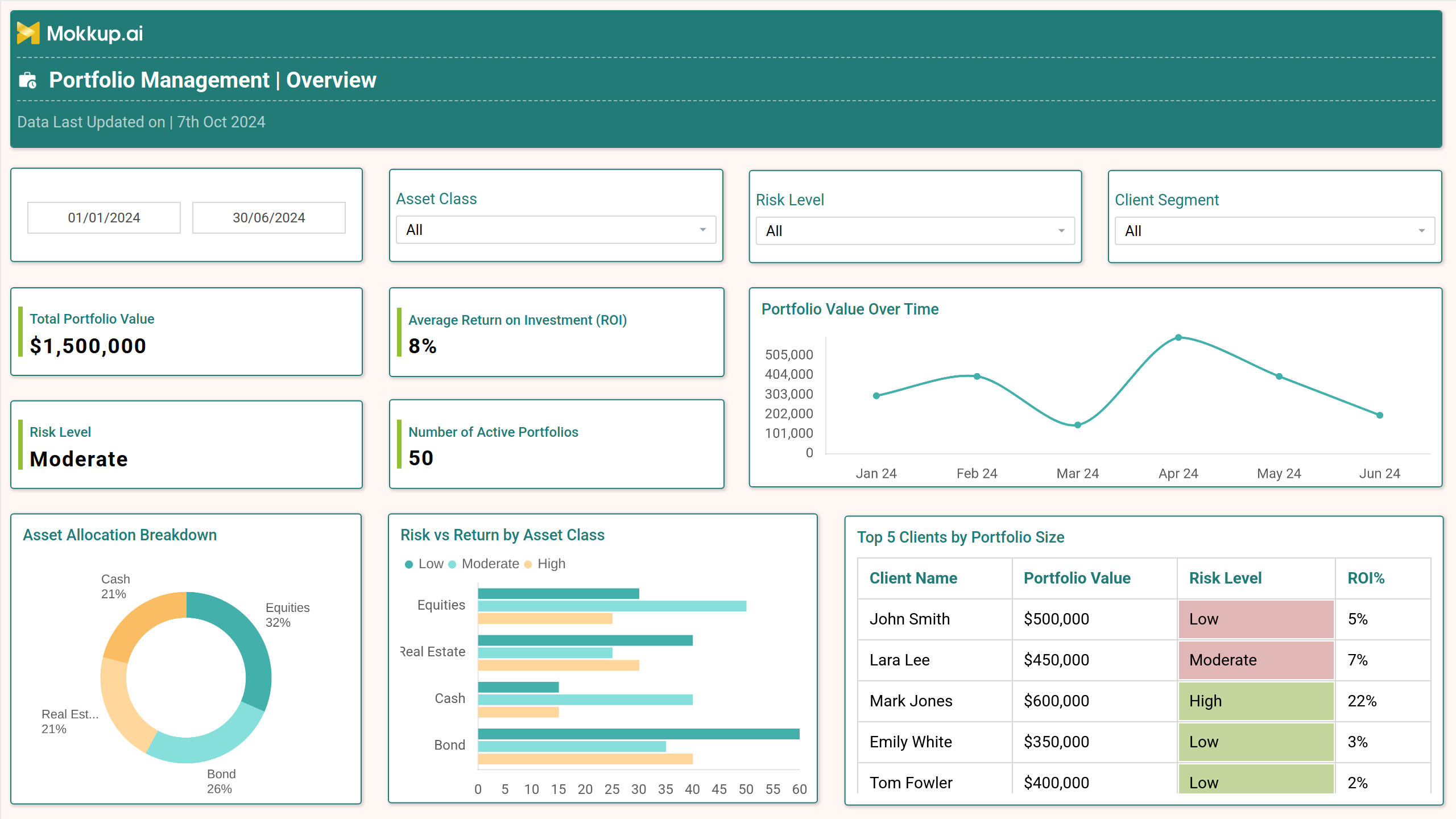
A Portfolio Management Dashboard example typically includes visual components designed for quick interpretation. The dashboard shown above displays KPIs such as total portfolio value ($1,500,000), average ROI (8%), number of active portfolios (50), and a unified risk level indicator. It utilizes a line chart to track portfolio value over time, enabling analysts to identify growth trends and market-driven fluctuations.
A donut chart illustrates the breakdown of asset allocation across equities, bonds, real estate, and cash, supporting diversification analysis. A bar chart compares risk vs return by asset class, showing how different assets behave under low, moderate, and high risk tiers. A tabular view lists the top five clients by portfolio size, providing insights into revenue-contributing clients. As a portfolio performance tracking dashboard, it serves as a complete decision-making tool for investment teams.
How to Analyze Data in Portfolio Management Dashboards
This portfolio management dashboard for decision making is a helpful tool that analyzes data in the following ways:
- Compare the total portfolio value against its historical performance to evaluate the direction of growth.
- Assess average ROI to understand overall portfolio profitability across the selected time period.
- Track patterns in the portfolio value over time chart to identify market impact or seasonal behavior.
- Study the asset allocation donut chart to ensure diversification aligns with investment goals.
- Use the risk vs. return bar chart to identify asset classes that offer the best return for an acceptable risk level.
- Review the top clients by portfolio size to prioritize high-value accounts for relationship management.
- Evaluate the risk level indicator to ensure alignment with the organization's or client's risk tolerance.
Benefits of Portfolio Management Dashboards
- Enables real-time financial monitoring and faster decision-making across investment portfolios.
- Consolidates performance, risk, allocation, and client metrics in a single view.
- Improves transparency by visualizing asset behavior using charts and data-driven insights.
- Helps portfolio managers identify underperforming assets and rebalance portfolios efficiently.
- Supports client reporting with structured metrics and performance visuals.
- Enhances forecasting accuracy through trend analysis and historical portfolio comparisons.
- Reduces manual reporting efforts with automated and dynamic data updates.
KPIs to Track in Portfolio Management Dashboards
- Total Portfolio Value: Measures the combined financial worth of all active portfolios.
- Average ROI: Calculates overall profitability across investments within the selected timeframe.
- Portfolio Value Over Time: Tracks value fluctuations to assess long-term performance trends.
- Risk Level: Shows consolidated risk exposure across all portfolios.
- Number of Active Portfolios: Indicates the total count of managed portfolios in the system.
- Asset Allocation Breakdown: Visualizes how investments are distributed across asset classes.
- Risk vs Return by Asset Class: Compares performance under different risk classifications.
- Top 5 Clients by Portfolio Size: Highlights high-value clients contributing to portfolio revenue.
Frequently Asked Questions
1. Who uses a Portfolio Management Dashboard?
Investment managers, financial analysts, wealth advisors, and portfolio management teams.
2. What charts are commonly used in these dashboards?
Line charts, bar charts, donut charts, and tabular data grids.
3. How does a portfolio management dashboard support decision-making?
It provides real-time insights into performance, risk, and allocation, enabling quick strategic adjustments.
4. Can the dashboard track multiple asset classes?
Yes. It enables users to monitor equities, bonds, real estate, cash, and other assets in a single view.