
What is a Smart Water Asset Health & Maintenance Dashboard?
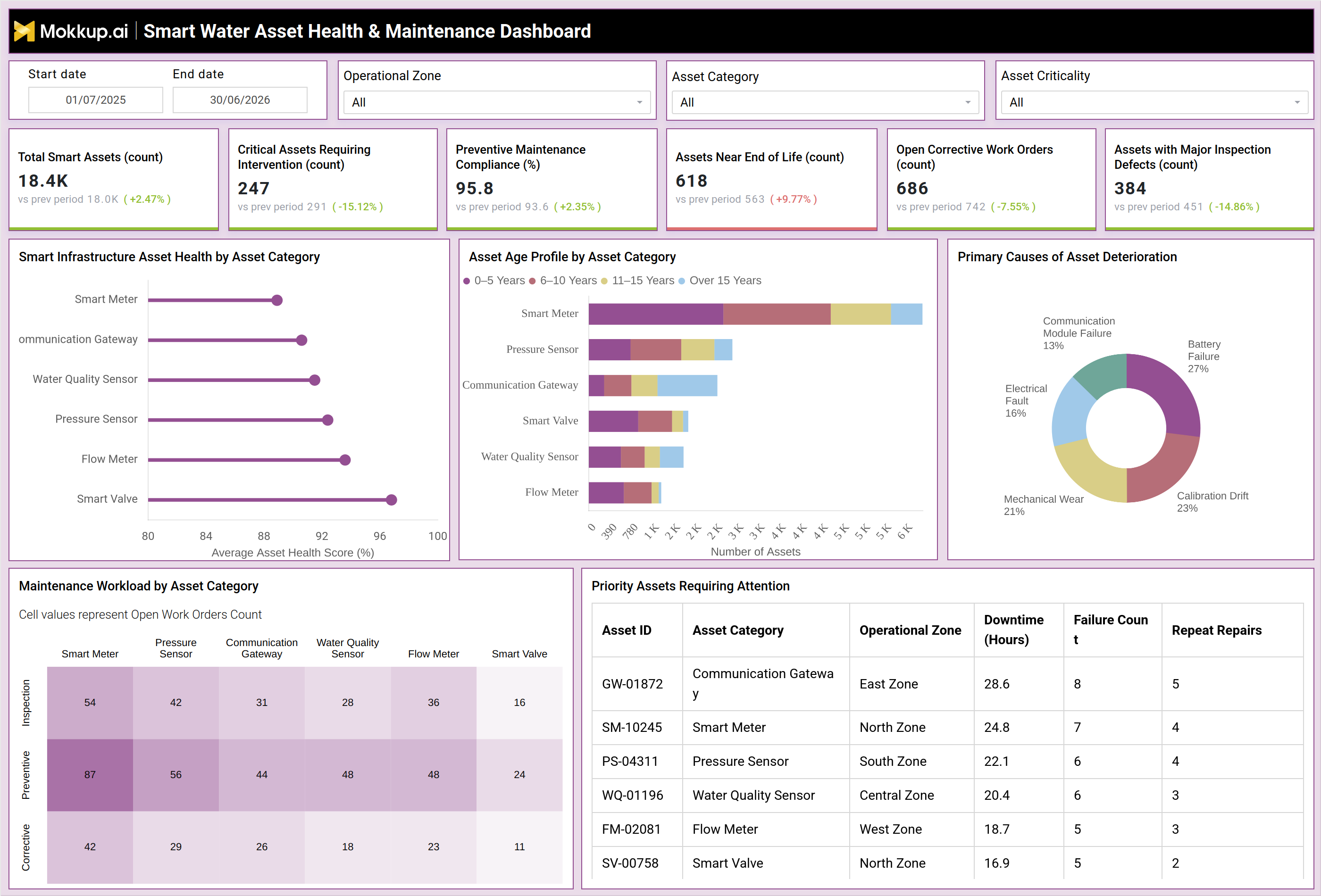
A Smart Water Asset Health & Maintenance Dashboard is a template built for water utility operations, engineering, and maintenance teams to monitor the condition and performance of connected field devices such as smart meters, pressure sensors, water quality sensors, flow meters, communication gateways, and smart valves. This smart water asset health dashboard brings together asset counts, compliance rates, work order volumes, and defect data into a single view that supports water infrastructure asset management across zones and asset categories.
Built on IoT-enabled water asset monitoring principles, it consolidates data on asset age, deterioration causes, and repair history so that operations leaders can shift from reactive repairs toward preventive maintenance compliance tracking. Tracking the right water utility maintenance KPIs in one place also helps leadership justify budget decisions. Filters for operational zone, asset category, asset criticality, and date range let teams narrow the view to the segment that matters most, whether that is a specific zone experiencing repeated failures or a category of assets nearing end of life.
How to Create a Smart Water Asset Health & Maintenance Dashboard
You don't need to build your report from scratch, just start with a ready-to-use dashboard template from Mokkup. Add in your data and export it however you like. Here's how to do it:
1. Create or Log in to Your Mokkup Account
Start by signing up on Mokkup.ai using your email. If you already have an account, just log in, and you'll be good to go.
2. Choose and Customize Your Dashboard Template
Find the Smart Water Asset Health & Maintenance Dashboard template in the Templates section. Use the drag-and-drop editor to adjust KPIs, edit filters, or add elements based on your data.
3. Export to Your BI Tool
Once your dashboard wireframe is ready, use the BI Tool Export feature to send it directly to Power BI or Tableau for further analysis and enhancements. You can also download the dashboard as a PDF, PNG, or JPEG, embed it on a platform, or invite your team to collaborate.
Note: This is a Pro template. You'll need a Pro subscription on Mokkup to use and customize this dashboard wireframe. Upgrade anytime to unlock full access.
Smart Water Asset Health & Maintenance Dashboard Example
A typical water utility maintenance manager opens this dashboard at the start of the week to understand which parts of the smart metering and sensor network need attention before problems escalate into service disruptions. Rather than pulling reports from multiple field systems, they use the filters for operational zone and asset category to narrow the view to the segment they are responsible for. From the overview, the manager can identify which asset categories are holding strong health scores and which are slipping, helping prioritize inspection schedules before failures occur.
By reviewing the asset age profile, planners can compare how much of the network is aging past its expected service life and plan replacement budgets accordingly. When deterioration causes a spike in one category, teams can trace the pattern back to root causes such as battery failure or calibration drift and adjust maintenance protocols instead of waiting for repeat breakdowns. The maintenance workload view lets supervisors compare inspection, preventive, and corrective effort across asset categories, so they can rebalance technician assignments toward categories carrying the heaviest corrective burden. Looking at the priority assets table, the team can shortlist devices with the highest downtime and repeat repairs, and asset criticality and failure tracking become the basis for deciding which units get expedited replacement versus continued monitoring.
Altogether, this dashboard helps utility teams move from firefighting isolated failures to running a structured, criticality-driven maintenance program, reducing unplanned downtime and extending the useful life of network assets while keeping preventive maintenance compliance tracking on target.
How to Analyze Data in a Smart Water Asset Health & Maintenance Dashboard
Here is how you can analyze data from this dashboard:
- Analyze regional performance: Filter by operational zone to isolate asset performance issues within a specific region.
- Compare asset categories: Segment assets to evaluate health scores across smart meters, sensors, gateways, and valves.
- Prioritize critical assets: Use asset criticality filters to focus on the equipment with the highest operational impact.
- Monitor aging infrastructure: Review the asset age profile to identify categories with a growing number of assets over 15 years old.
- Identify root causes: Cross-reference deterioration causes with the priority assets table to validate failure patterns.
- Assess maintenance workload: Compare maintenance workload across asset categories to identify those overloaded with corrective work orders.
- Measure improvement over time: Track period-over-period KPI changes to evaluate the effectiveness of maintenance interventions.
- Prioritize asset replacement: Sort the priority assets table by downtime and repeat repairs to identify the best replacement candidates.
Benefits of a Smart Water Asset Health & Maintenance Dashboard
The following are the benefits of using this dashboard:
- Centralize asset data: Bring water infrastructure asset information into a single dashboard instead of relying on scattered field reports.
- Improve maintenance compliance: Surface preventive maintenance gaps before audits to support compliance tracking.
- Reduce unplanned downtime: Identify assets nearing the end of their lifecycle before failures occur.
- Monitor connected assets: Track the health of smart meters, sensors, gateways, and valves through IoT-enabled monitoring.
- Prioritize maintenance efforts: Use asset criticality and failure trends to allocate technician time effectively.
- Speed up root-cause analysis: Link deterioration causes to specific asset categories to identify recurring issues faster.
- Support regional planning: Provide zone-level visibility to improve maintenance planning across service areas.
- Justify replacement budgets: Use asset age profiles to build a data-driven case for infrastructure replacement investments.
KPIs to Track in a Smart Water Asset Health & Maintenance Dashboard
The following key KPIs can be tracked by using this dashboard:
- Key Performance Indicators (KPIs) are quantifiable measures that show whether an asset management program is meeting its operational and reliability goals. Tracking the right water utility maintenance KPIs helps teams catch problems early and confirm the impact of maintenance investments.
- Total Smart Assets: the total count of connected devices being monitored across the network
- Critical Assets Requiring Intervention: the number of assets flagged as needing immediate attention
- Preventive Maintenance Compliance: the percentage of scheduled preventive maintenance tasks completed on time
- Assets Near End of Life: the count of assets approaching the end of their expected service life
- Open Corrective Work Orders: the number of unresolved reactive repair requests in the system
- Assets with Major Inspection Defects: the count of assets that failed inspection due to significant defects
Frequently Asked Questions
1. What data does the Smart Water Asset Health & Maintenance Dashboard track?
It tracks asset counts, health scores, maintenance compliance, work orders, and inspection defects across smart meters, sensors, gateways, and valves. Filters for zone, category, and criticality let teams narrow the view to specific segments.
2. Who should use this dashboard?
Water utility operations managers, maintenance planners, and asset management teams use it to monitor infrastructure health and prioritize repairs. It also supports engineering leaders reviewing asset criticality and failure tracking for budget planning.
3. Can I customize this dashboard template for my utility?
Yes, the template can be edited in Mokkup's drag-and-drop editor to match your asset categories, zones, and KPIs. Once customized, it can be exported to Power BI or Tableau, or downloaded as a PDF, PNG, or JPEG.