
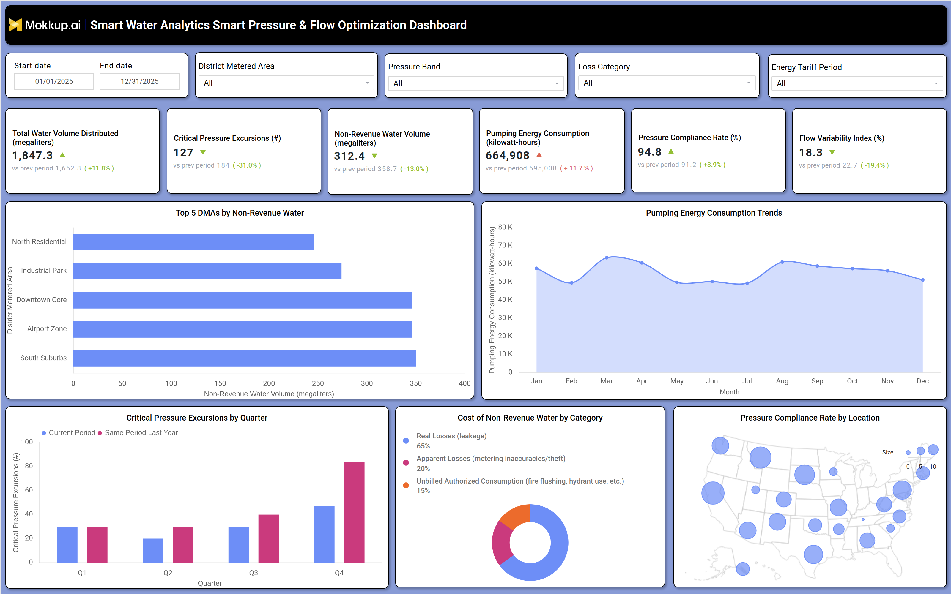
What is a Smart Water Analytics Smart Pressure & Flow Optimization Dashboard?
The Smart Water Analytics Smart Pressure & Flow Optimization Dashboard is a data visualization template built for water utility teams that manage distribution pressure, network losses, and pumping energy across service zones. It consolidates volume, pressure, and loss data into a single view so operations and engineering teams can evaluate how pressure management decisions affect both water loss and energy spend. As a smart water pressure and flow optimization dashboard, it brings together district metered area filters, pressure band segmentation, loss category classification, and energy tariff period controls so users can narrow the view to the exact conditions they are analyzing.
Because non-revenue water directly affects utility revenue and infrastructure planning, the dashboard also functions as a non-revenue water volume tracking dashboard, helping teams see where losses originate and how they trend against prior periods. Built on the Mokkup.ai platform, this dashboard wireframe can be customized with actual utility data before being exported to a business intelligence tool for deeper analysis.
How to Create a Smart Water Analytics Smart Pressure & Flow Optimization Dashboard
You don't need to build your report from scratch, just start with a ready-to-use dashboard template from Mokkup. Add in your data and export it however you like. Here's how to do it:
1. Create or Log in to Your Mokkup Account
Start by signing up on Mokkup.ai using your email. If you already have an account, just log in, and you'll be good to go.
2. Choose and Customize Your Dashboard Template
Find the Smart Water Analytics Smart Pressure & Flow Optimization Dashboard template in the Templates section. Use the drag-and-drop editor to adjust KPIs, edit filters, or add elements based on your data.
3. Export to Your BI Tool
Once your dashboard wireframe is ready, use the BI Tool Export feature to send it directly to Power BI or Tableau for further analysis and enhancements. You can also download the dashboard as a PDF, PNG, or JPEG, embed it on a platform, or invite your team to collaborate.
Note: This is a Pro template. You'll need a Pro subscription on Mokkup to use and customize this dashboard wireframe. Upgrade anytime to unlock full access.
Smart Water Analytics Smart Pressure & Flow Optimization Dashboard Example
A water utility operations manager opens the Smart Water Analytics Smart Pressure & Flow Optimization Dashboard at the start of a review cycle to understand whether pressure management is helping or hurting network performance. Using the date range, district metered area, pressure band, loss category, and energy tariff period filters, the manager narrows the view to the specific zone and time window under review and then checks whether volume distributed and pressure compliance are moving in the expected direction. From there, the manager can identify which district metered areas contribute most to non-revenue water and compare these with pressure excursion counts at the same locations, helping the team decide where field crews should prioritize leak detection and pressure regulation work. Reviewing the pumping energy trend alongside seasonal demand patterns lets engineering teams determine whether elevated pumping is driven by demand or by inefficient pressure settings, informing recommendations for network pressure zoning.
When pressure excursions spike in a particular quarter compared with the same period last year, teams can drill into that quarter to determine whether infrastructure age, demand surges, or new developments are the cause. Analysts can also compare the cost split between real losses, apparent losses, and unbilled authorized consumption to prioritize whether investment should go toward leak repair, meter accuracy improvements, or policy changes around authorized but unbilled use. Together, these views help utility leadership evaluate whether the smart water pressure and flow optimization dashboard is guiding capital spend toward the right zones, turning what used to be a once-a-year audit into an ongoing non-revenue water volume tracking dashboard practice that connects pressure performance, water loss, and energy cost into one shared reference point.
How to Analyze Data in a Smart Water Analytics Smart Pressure & Flow Optimization Dashboard
Here is how you can analyze data from this dashboard:
- Compare performance over time: Use the date range filter to evaluate current volume, water loss, and energy metrics against the previous period.
- Prioritize leak detection: Review the Top 5 DMAs by Non-Revenue Water chart to identify locations that need immediate leak investigation.
- Monitor energy usage: Track the Pumping Energy Consumption Trends chart month over month to distinguish seasonal demand from operational inefficiencies.
- Track pressure excursions: Review the quarterly critical pressure excursion chart to identify zones with increasing pressure events.
- Analyze water loss sources: Segment data by loss category to understand the contribution of real losses, apparent losses, and unbilled authorized consumption.
- Identify pressure compliance issues: Use the Pressure Compliance Rate by Location map to locate regions operating outside acceptable pressure thresholds.
- Measure mitigation effectiveness: Monitor critical pressure excursions quarter over quarter to confirm whether corrective actions are reducing repeat events.
Benefits of a Smart Water Analytics Smart Pressure & Flow Optimization Dashboard
The following are the benefits of using this pumping energy consumption trend analysis dashboard:
- Optimize pumping efficiency: Analyze pumping energy consumption trends to identify inefficient pumping schedules and pressure settings.
- Target water loss investments: Break down the cost of non-revenue water to prioritize spending on leak repairs, metering, and policy improvements.
- Prioritize infrastructure upgrades: Use location-based pressure compliance maps to identify service areas that need investment first.
- Measure pressure management performance: Compare quarterly pressure excursions to evaluate the effectiveness of pressure management initiatives.
- Customize operational analysis: Filter by district metered area, pressure band, loss category, and tariff period to answer specific operational questions.
- Balance cost and reliability: Analyze pumping energy consumption alongside water loss data to support better operational and financial decisions.
KPIs to Track in a Smart Water Analytics Smart Pressure & Flow Optimization Dashboard
The following key KPIs can be tracked by using this critical pressure excursion monitoring dashboard:
- Total Water Volume Distributed: total volume moved through the network in megaliters over the selected period, used as the baseline for demand and loss calculations.
- Critical Pressure Excursions: count of instances where pressure moved outside acceptable operating thresholds, a core measure for pressure compliance rate monitoring for water utility teams.
- Non-Revenue Water Volume: volume of treated water that is lost or unbilled, the central figure in any water loss category cost breakdown.
- Pumping Energy Consumption: kilowatt-hours used to move water through the system, reflecting how pressure settings and demand affect operating cost.
- Pressure Compliance Rate: percentage of the network operating within target pressure bands, a direct indicator of pressure compliance rate monitoring for water utility teams performance over time.
- Flow Variability Index: measure of how much flow fluctuates within the period, signaling instability that can accelerate pipe wear and pressure excursions.
Frequently Asked Questions
1. What is the Smart Water Analytics Smart Pressure & Flow Optimization Dashboard used for?
It is used to monitor pressure performance, non-revenue water, and pumping energy consumption across district metered areas. Utility teams use it to prioritize leak detection, pressure adjustments, and energy efficiency initiatives.
2. How does this dashboard support water loss category cost breakdown analysis?
The dashboard separates non-revenue water cost into real losses, apparent losses, and unbilled authorized consumption. This water loss category cost breakdown helps utilities decide whether to invest in leak repair, meter upgrades, or policy changes.
3. Can I customize this dashboard template with my own utility data?
Yes. The Smart Water Analytics Smart Pressure & Flow Optimization Dashboard is a Mokkup.ai Pro template that can be edited with the drag-and-drop editor and exported to Power BI, Tableau, PDF, PNG, or JPEG. A Pro subscription is required to customize and export it.