
What is a Desalination Energy Cost Risk Dashboard?
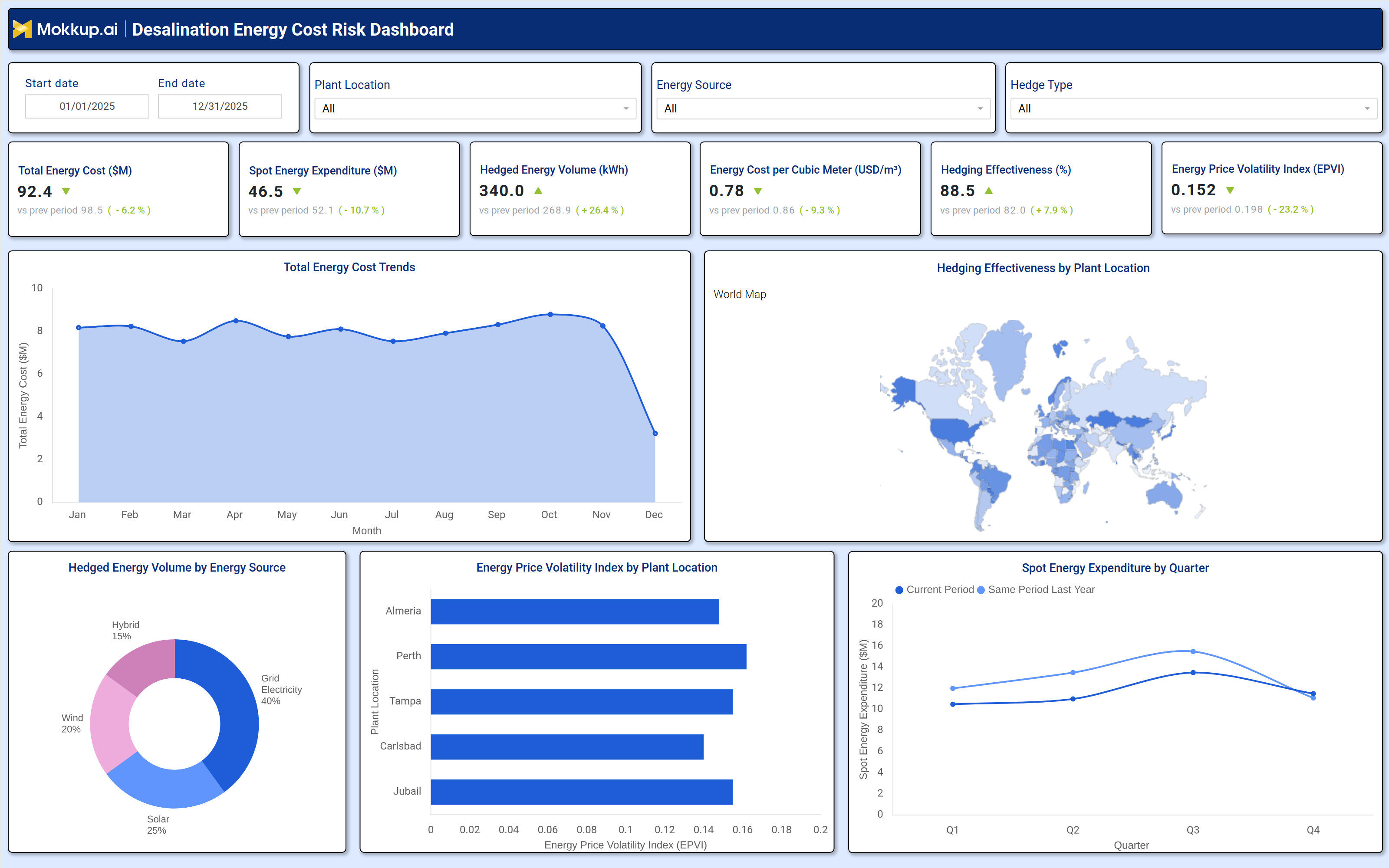
The Desalination Energy Cost Risk Dashboard is a specialized analytics tool for energy procurement managers, plant finance controllers, and operations leadership overseeing desalination energy cost risk management across global and regional facilities. It monitors total energy expenditure, spot market costs, hedged energy volume, price volatility indices, and per unit production efficiency giving teams a complete view of where energy spending is concentrated and how well hedging strategies are protecting against market swings.
By incorporating hedged energy volume optimization metrics alongside plant-level volatility comparisons, it enables teams to evaluate whether their procurement strategies are delivering cost stability or leaving the organization exposed to price fluctuations. Multisite desalination operators rely on this dashboard to align energy procurement decisions with cost targets and respond to shifting market conditions before they materially affect operational budgets.
How to Create a Desalination Energy Cost Risk Dashboard
You don’t need to build your report from scratch, just start with a ready-to-use Desalination Energy Cost Risk dashboard template from Mokkup. Add in your data and export it however you like. Here’s how to do it:
1. Create or Log in to Your Mokkup Account
Start by signing up on Mokkup.ai using your email. If you already have an account, just log in, and you'll be good to go.
2. Choose and Customize Your Dashboard Template
Find the Desalination Energy Cost Risk Dashboard template in the Templates section. Use the drag and drop editor to adjust KPIs, edit filters, or add elements based on your data.
3. Export to Your BI Tool
Once your dashboard wireframe is ready, use the BI Tool Export feature to send it directly to Power BI or Tableau for further analysis and enhancements. You can also download the dashboard as a PDF, PNG, or JPEG, embed it on a platform, or invite your team to collaborate.
Note: This is a Pro template. You'll need a Pro subscription on Mokkup to use and customize this dashboard wireframe. Upgrade anytime to unlock full access.
Desalination Energy Cost Risk Dashboard Example
At the start of a reporting period, energy procurement managers begin with the KPI row, reviewing total energy costs, spot expenditure, and hedging effectiveness to quickly assess performance against the previous period. Any significant change in overall spending is then broken down into drivers such as spot market fluctuations, hedged volume changes, or shifts in energy source mix. This view helps teams validate whether earlier procurement decisions like increasing hedging or diversifying energy sources are delivering the expected impact.
Hedging analysts and finance teams then focus on identifying high-risk locations using the energy price volatility index and hedging effectiveness views. By analyzing spot expenditure trends, energy source distribution, and regional hedging coverage, they can detect rising exposure and rebalance strategies before contract renewals. This enables a shift from reactive cost tracking to proactive, data-driven energy risk management that protects margins across desalination operations.
How to Analyze Data in a Desalination Energy Cost Risk Dashboard
Here is how you can analyze data from this dashboard:
- Filter by Plant Location: Compare energy cost and hedging performance across specific facilities.
- Track Total Energy Spend: Review the total energy cost KPI against prior periods and targets.
- Identify Cost Spikes: Monitor trends to spot months with unusually high energy expenditure.
- Assess Price Volatility: Analyze the volatility index to find plants facing unstable energy prices.
- Evaluate Hedging Mix: Review hedged volume by energy source to ensure alignment with procurement strategy.
- Compare Spot Spending: Track quarterly spot energy expenditure against last year to assess unhedged exposure.
- Analyze Hedge Performance: Filter by hedge type to measure contribution to overall effectiveness.
- Measure Cost Efficiency: Monitor energy cost per cubic meter to link energy spend with output efficiency.
Benefits of a Desalination Energy Cost Risk Dashboard
The following are the benefits of using this dashboard:
- Centralized Cost Visibility: Combines energy spend, volatility, and hedging metrics in one view.
- Improved Hedging Strategy: Tracks coverage and effectiveness against benchmarks.
- Reduced Reporting Effort: Prebuilt KPIs and charts simplify procurement analysis.
- Spot Exposure Insights: Identifies plants most affected by unhedged price fluctuations.
- Energy Mix Optimization: Visualizes hedged volume by source for better planning.
- Procurement Alignment: Supports consistent energy cost analysis across reporting periods.
- Shared Strategic View: Aligns energy managers and finance teams with a unified performance dashboard.
KPIs to Track in a Desalination Energy Cost Risk Dashboard
The following key KPIs can be tracked by using this dashboard:
- Total Energy Cost ($M): A core metric for desalination energy cost risk management measures aggregate energy expenditure across all sources and plant locations in the selected period, benchmarked against the prior period.
- Spot Energy Expenditure ($M): Tracks unhedged market energy spending essential for spot energy expenditure tracking and assessing how much of the total energy bill remains exposed to market price volatility quarter over quarter.
- Hedged Energy Volume (kWh): Quantifies the volume of energy consumption covered by hedging contracts a key indicator of energy price volatility index desalination risk mitigation strategy reach and coverage depth.
- Energy Cost per Cubic Meter (USD/m³): The desalination energy cost per cubic meter benchmark that links energy procurement spend directly to treated water output a critical efficiency measure for comparing cost performance across plant locations.
- Hedging Effectiveness (%): Evaluates how well current hedging strategies are reducing energy cost exposure central to hedging effectiveness desalination plant performance reviews and procurement contract renewal decisions.
- Energy Price Volatility Index (EPVI): Tracks the degree of energy price instability across facilities and periods used to prioritize where hedging coverage should be increased or reallocated to protect against cost overruns.
Frequently Asked Questions
Q1. What teams use a Desalination Energy Cost Risk Dashboard?
Energy procurement managers, plant finance controllers, operations leadership, and hedging strategy teams overseeing multi site desalination facilities typically rely on this dashboard to manage energy cost exposure and procurement performance.
Q2. How does this dashboard improve energy hedging decisions?
By combining the Hedging Effectiveness (%) KPI, the Hedged Energy Volume by Energy Source donut chart, and the Energy Price Volatility Index by Plant Location chart, teams can identify which sites have the most price exposure and whether current hedging coverage is sufficient to protect against market swings.
Q3. Can this dashboard compare energy spending across quarters?
Yes. The Spot Energy Expenditure by Quarter line chart plots both Current Period and Same Period Last Year, making it straightforward to assess whether unhedged energy spending is trending upward or downward relative to the prior year baseline.