
What is a Secondary School Digital Operations Dashboard?
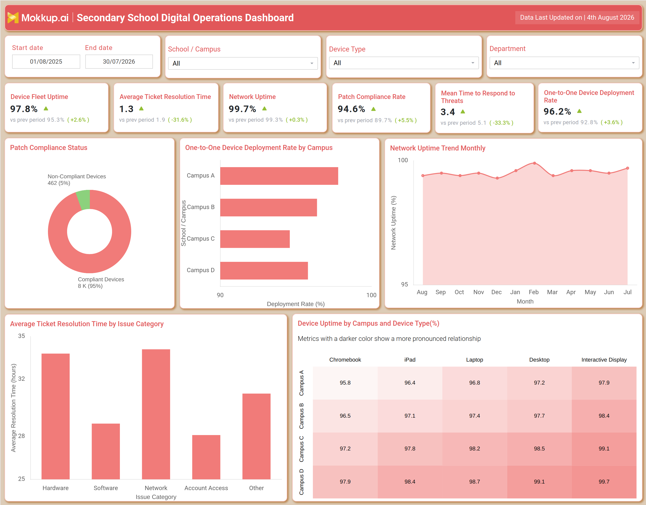
A secondary school digital operations dashboard gives IT administrators, campus technology coordinators, and district technology directors one central view of how digital infrastructure performs across school campuses. It brings together device health, network performance, security response, and help desk ticket data into a single view, replacing scattered spreadsheets. Built with filters for date range, school or campus, device type, and department, the dashboard lets technology teams narrow their view to a single site or compare performance across every school in the district. Because education IT environments run on a mix of Chromebooks, iPads, laptops, desktops, and interactive displays, this template reflects that reality rather than treating the fleet as one uniform category. Teams running school IT device fleet uptime tracking alongside network monitoring can use this template as a starting point for a wireframe that fits their existing reporting tools, and it doubles as an IT help desk ticket resolution time dashboard for schools.
How to Create a Secondary School Digital Operations Dashboard
You don't need to build your report from scratch; just start with a ready-to-use dashboard template from Mokkup. Add in your data and export it however you like. Here's how to do it:
1. Create or Log in to Your Mokkup Account
Start by signing up on Mokkup.ai using your email. If you already have an account, just log in, and you'll be good to go.
2. Choose and Customize Your Dashboard Template
Find the Secondary School Digital Operations Dashboard template in the Templates section. Use the drag-and-drop editor to adjust KPIs, edit filters, or add elements based on your data.
3. Export to Your BI Tool
Once your dashboard wireframe is ready, use the BI Tool Export feature to send it directly to Power BI or Tableau for further analysis and enhancements. You can also download the dashboard as a PDF, PNG, or JPEG, embed it on a platform, or invite your team to collaborate.
Note: This is a Pro template. You'll need a Pro subscription on Mokkup to use and customize this dashboard wireframe. Upgrade anytime to unlock full access.
Secondary School Digital Operations Dashboard Example
A district technology director opens the secondary school digital operations dashboard at the start of a review cycle to see how digital operations held up across campuses. Before checking individual charts, they use the School or Campus, Device Type, and Department filters to narrow focus, whether reviewing one campus or comparing all campuses side by side. The KPI row gives an immediate read on where device uptime, network stability, threat response speed, and patch compliance stand relative to the prior period, so the team quickly sees whether operations are trending in the right direction. From there, the director moves into the supporting charts to understand why the numbers look the way they do.
They can identify which campuses are lagging on one-to-one device deployment rate by campus and follow up with the site leads responsible for rollout. They can track how network stability has moved month over month, functioning like a school network uptime monitoring dashboard that separates a one-off outage from a sustained decline. When ticket volumes spike, they can compare resolution time across issue categories such as hardware, software, network, and account access to decide where the help desk needs more staffing. Reviewing device performance by campus and device type helps planners compare how Chromebooks perform against iPads, laptops, desktops, and interactive displays at each site to guide replacement budgets. By the end of the session, the technology team has a clear picture of which campuses are operating smoothly and which need intervention, whether that means patch rollout, network hardware, or help desk staffing. Instead of pulling data from multiple systems, they have one shared reference point that keeps IT leadership, campus administrators, and support staff aligned on the same priorities.
How to Analyze Data in a Secondary School Digital Operations Dashboard
Here is how you can analyze data from this dashboard:
- Filter by School or Campus to isolate performance for a single site before comparing it against the district
- Use the Device Type filter to separate Chromebook, iPad, laptop, desktop, and interactive display performance
- Apply the Department filter to see how digital operations metrics vary by function
- Set the Start date and End date range to compare current performance against a defined prior period
- Review the KPI row first to establish a baseline before drilling into supporting charts
- Use school IT device fleet uptime tracking figures alongside patch compliance data to time maintenance windows
- Compare one-to-one device deployment rate by campus to spot rollout gaps between sites
- Use Network Uptime Trend Monthly to separate a one-off outage from a sustained decline
- Break down Average Ticket Resolution Time by Issue Category to prioritize help desk improvements
- Apply patch compliance rate tracking for school devices to flag campuses needing urgent security updates
Benefits of a Secondary School Digital Operations Dashboard
The following are the benefits of using this dashboard:
- Centralizes device, network, security, and help desk data into one secondary school digital operations dashboard
- Reduces manual reporting effort for IT administrators managing multiple campuses
- Functions as a school network uptime monitoring dashboard without switching between separate tools
- Makes it easier to compare campuses on one-to-one device deployment rate by campus and act on gaps
- Helps IT leadership justify budget requests with a clear view of device replacement needs
- Ties patch compliance rate tracking for school devices to a visible, shared accountability metric
- Speeds up decision-making by surfacing help desk bottlenecks through the ticket resolution view
- Gives district leaders and campus administrators a shared reference point for term-over-term reviews
KPIs to Track in a Secondary School Digital Operations Dashboard
The following key KPIs can be tracked by using this dashboard:
- Device Fleet Uptime: the percentage of time managed devices across the district remain operational and available for classroom use
- Average Ticket Resolution Time: how long, on average, IT support takes to close a submitted help desk ticket
- Network Uptime: the percentage of time school network infrastructure remains available without disruption
- Patch Compliance Rate: the share of devices that have received required security patches and updates, central to patch compliance rate tracking for school devices
- Mean Time to Respond to Threats: how quickly the IT team responds after a security threat is detected
- One-to-One Device Deployment Rate: the percentage of eligible students issued a personal device under a one-to-one program
Frequently Asked Questions
1. Who should use the Secondary School Digital Operations Dashboard?
District technology directors, campus IT coordinators, and help desk managers use this secondary school digital operations dashboard to monitor device fleets, network health, and support operations across schools.
2. Can this dashboard template be customized for a single campus instead of a full district?
Yes. The School or Campus filter scopes the dashboard down to one site, and the wireframe can be adjusted in Mokkup's editor to match a single-campus reporting need.
3. Does this template double as an IT help desk ticket resolution time dashboard for schools?
Yes, the Average Ticket Resolution Time by Issue Category chart gives help desk managers a dedicated view of support performance, functioning as an IT help desk ticket resolution time dashboard for schools.