
What is a Rehabilitation Progress Dashboard?
A Rehabilitation Progress Dashboard is a data visualization and monitoring tool used in healthcare and long-term care centers to track therapy performance, patient outcomes, and clinical progress. It consolidates data from multiple therapy programs—such as physical, occupational, speech, and cognitive therapies—into one view to help clinicians and administrators make informed decisions.
This dashboard allows healthcare teams to measure therapy outcome tracking, monitor patient recovery trends, and evaluate treatment effectiveness across different rehabilitation programs. With real-time insights, clinical leaders can identify bottlenecks in patient care, optimize therapist utilization, and enhance overall program quality.
By focusing on clinical rehabilitation performance metrics, the dashboard supports evidence-based practice and promotes patient-centered care. It empowers healthcare facilities to monitor progress across time, reduce readmission risks, and improve long-term functional outcomes.
How to Create a Rehabilitation Progress Dashboard
You don’t need to build your report from scratch—just start with a ready-to-use dashboard template from Mokkup. Add your data and export it as needed. Here’s how to do it:
1. Create or Log in to Your Mokkup Account
Start by signing up on Mokkup.ai using your email. If you already have an account, log in, and you’ll be all set.
2. Choose and Customize Your Dashboard Template
Find the Rehabilitation Progress Dashboard template in the Templates section. Use the drag-and-drop editor to adjust KPIs, edit filters, or add elements based on your data.
3. Export to Your BI Tool
Once your dashboard wireframe is ready, use the BI Tool Export feature to send it directly to Power BI or Tableau for further analysis and enhancements. You can also download the dashboard as a PDF, PNG, or JPEG, embed it on a platform, or invite your team to collaborate.
Note: This is a Pro template. You’ll need a Pro subscription on Mokkup to use and customize this dashboard wireframe. Upgrade anytime to unlock full access.
Rehabilitation Progress Dashboard Example
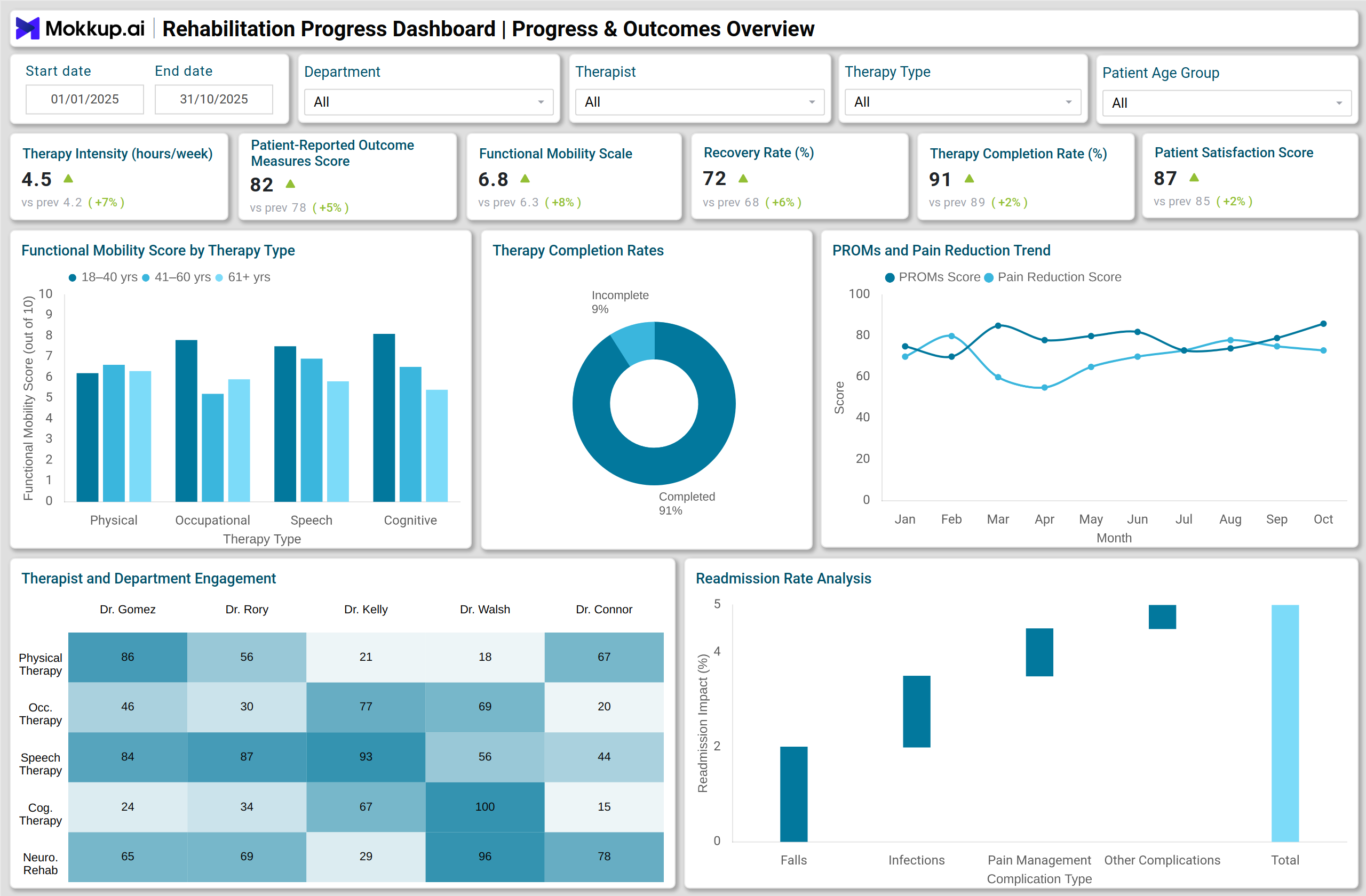
A well-designed Rehabilitation Progress Dashboard for healthcare centers typically integrates multiple visual elements to represent clinical and operational data effectively.
For instance, a Stacked Column Chart can display functional improvement by therapy type using the Functional Mobility Scale (FMS) Score as the measure. This helps identify which therapy types—physical, occupational, speech, or cognitive—deliver the best functional outcomes across different patient age groups.
A Line Chart showing PROMs Trend Over Time tracks changes in Patient-Reported Outcome Measures (PROMs) and Pain Reduction Scores, giving therapists insight into how patients perceive their recovery progress. Similarly, a Pie Chart can represent Therapy Completion Rates by Therapy Type, revealing adherence patterns across programs. A Heatmap showing Average Sessions per Patient by Therapist and Department identifies workload balance and therapy engagement.
Operationally, visuals such as a Donut Chart for Staff Utilization and a Funnel Chart for Patient Flow Through Therapy Programs highlight staffing efficiency and patient progression from admission to goal achievement. This comprehensive setup transforms raw data into meaningful rehabilitation insights, forming the foundation of a rehabilitation and therapy progress analytics system.
How to Analyze Data in Rehabilitation Progress Dashboards
Here is how you can analyze data in the Rehabilitation Progress Dashboard:
- Monitor Functional Improvement: Evaluate the Functional Mobility Scale (FMS) trends to measure the impact of different therapy types on patient mobility across age groups.
- Assess Therapy Effectiveness: Review the Treatment Effectiveness Percentage and Therapy Completion Rate Percentage to understand the success of therapy plans and adherence levels.
- Track Patient Outcomes: Analyze PROMs Average Scores and Recovery Rate Percent to track patient-reported progress and clinical recovery benchmarks.
- Identify Bottlenecks in Care Delivery: Use the Funnel Chart to identify patient drop-offs across stages from admission to goal achievement and plan targeted interventions.
- Optimize Resource Utilization: Assess Staff Utilization Percent and Average Sessions per Patient to balance therapist workloads and improve scheduling efficiency.
- Analyze Readmission Drivers: Use Waterfall Charts to determine which complications (e.g., falls, infections, pain) contribute most to readmission rates.
- Evaluate Departmental Performance: Compare Therapy Hours Delivered by Department and Patient Adherence Rate to identify top-performing therapy units.
Benefits of Rehabilitation Progress Dashboards
These are the benefits of using the Rehabilitation Progress Dashboard:
- Comprehensive Patient Tracking: Centralizes therapy performance and patient recovery data in one dashboard.
- Data-Driven Decision Making: Enables clinicians to make informed adjustments in therapy programs based on real-time data.
- Improved Therapy Outcomes: Facilitates monitoring of patient progress and outcome measures to optimize rehabilitation effectiveness.
- Operational Efficiency: Helps manage staff utilization, therapy schedules, and patient load for better service delivery.
- Enhanced Care Quality: Supports clinical governance by tracking complication rates and treatment success metrics.
- Reduced Readmissions: Identifies key complications contributing to readmission, allowing for targeted preventive measures.
- Regulatory Compliance and Reporting: Simplifies documentation for accreditation, audits, and quality reporting in healthcare facilities.
KPIs to Track in Rehabilitation Progress Dashboards
- Therapy Intensity – Measures the average therapy load per patient.
- Patient-Reported Outcome Measures (PROMs) Average Score – Captures patient feedback on perceived recovery.
- Functional Mobility Scale (FMS) Average Score – Evaluates functional improvement across therapy types.
- Recovery Rate Percent – Indicates the percentage of patients meeting defined recovery goals.
- Therapy Completion Rate Percent – Monitors adherence and program engagement.
- Patient Satisfaction Score – Measures overall satisfaction with therapy outcomes.
- Average Sessions per Patient – Tracks therapy session count per patient.
These KPIs help rehabilitation centers establish performance benchmarks and identify opportunities for clinical improvement.
Frequently Asked Questions
Q1. Who uses a Rehabilitation Progress Dashboard?
These dashboards are mainly used by clinical directors, rehabilitation managers, and therapists in long-term care centers and hospitals.
Q2. How often should the dashboard data be updated?
Ideally, updates should occur daily or weekly to support real-time monitoring and timely decision-making.
Q3. What’s the main advantage for administrators?
Administrators gain a clear view of therapy efficiency, resource utilization, and patient satisfaction—enabling data-driven operational improvements.