What is a Product Comparison & Performance Dashboard?
A product comparison and performance dashboard is a centralized analytics tool that helps businesses evaluate multiple products based on key metrics like sales, revenue, customer engagement, and pricing competitiveness. It consolidates data from various sources to provide a clear, side-by-side comparison, enabling buyers to make informed purchasing decisions. Unlike traditional spreadsheets, this dashboard automates data collection, visualizes trends, and highlights performance gaps, making it an essential multiproduct performance analysis tool for buyers.
For enterprises, this dashboard acts as a competitive intelligence tool, helping product managers and retail teams assess market trends, customer engagement, and pricing competitiveness. By tracking KPIs, companies can optimize product portfolios, refine marketing strategies, and align product decisions with business goals.
How to Create a Product Comparison & Performance Dashboard
You don’t need to build your report from scratch, just start with a ready-to-use Product Comparison & Performance dashboard template from Mokkup. Add in your data and export it however you like. Here’s how to do it:
1. Create or Log in to Your Mokkup Account
Start by signing up on Mokkup.ai using your email. If you already have an account, just log in, and you’ll be good to go.
2. Choose and Customize Your Dashboard Template
Find the Product Comparison & Performance Dashboard template in the Templates section. Use the drag and drop editor to adjust KPIs, edit filters, or add elements based on your data.
3. Export to Your BI Tool
Once your dashboard wireframe is ready, use the BI Tool Export feature to send it directly to Power BI or Tableau for further analysis and enhancements. You can also download the dashboard as a PDF, PNG, or JPEG, embed it on a platform, or invite your team to collaborate.
Note: This is a Pro template. You’ll need a Pro subscription on Mokkup to use and customize this dashboard wireframe. Upgrade anytime to unlock full access.
Product Comparison & Performance Dashboard Example
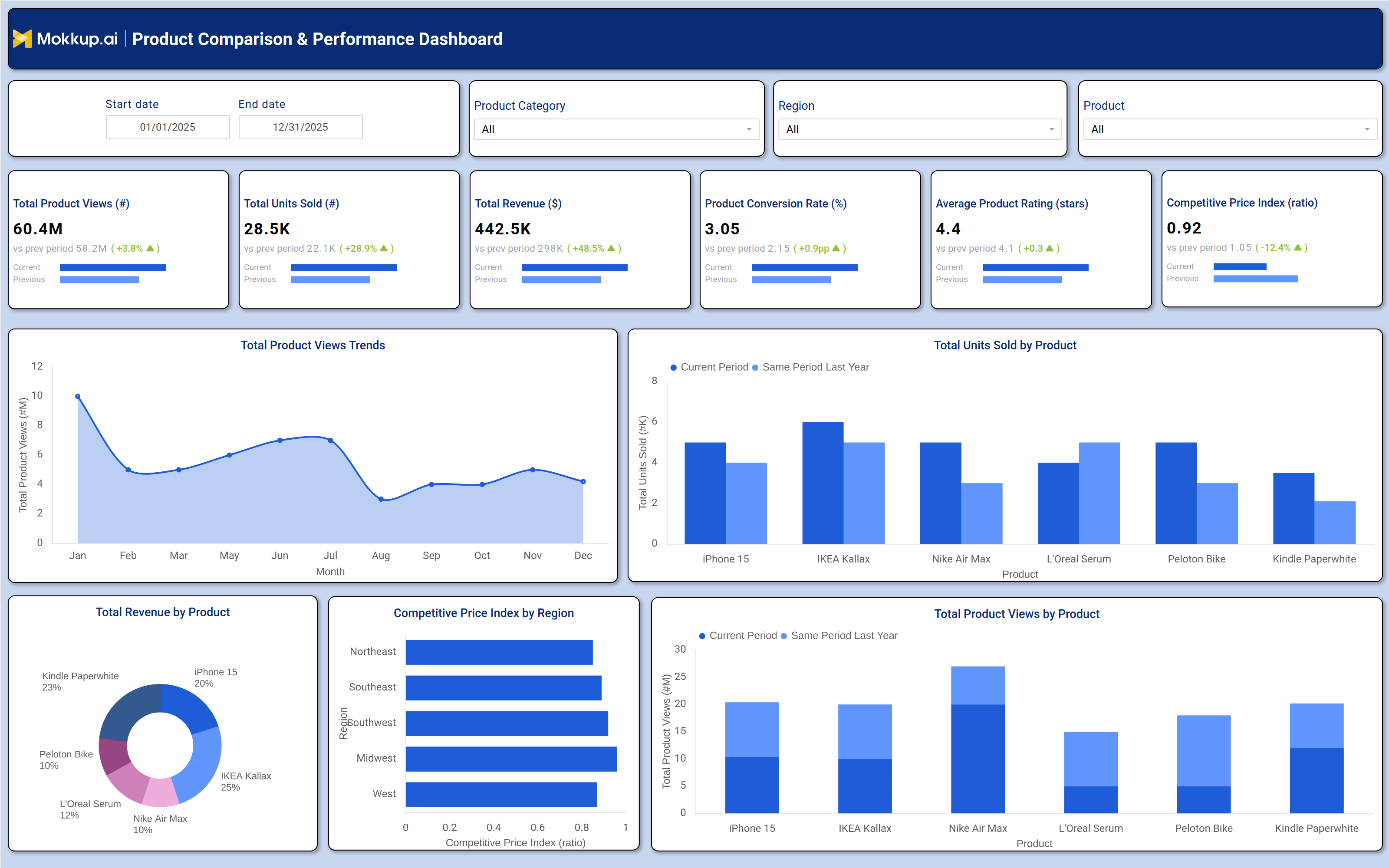
A well-designed product comparison and performance dashboard includes interactive filters for date ranges, product categories, and regions, allowing users to drill down into specific datasets. Key metrics such as total product views, units sold, revenue, conversion rates, average ratings, and competitive price index are displayed in tiles, showing trends compared to previous periods. For deeper analysis, the dashboard features visualizations like product view trends over time, revenue distribution by product, competitive pricing by region, and sales performance comparisons.
For example, a retail business can identify which products drive the most revenue, which have the highest conversion rates, and where pricing adjustments may be needed. This data-driven product comparison and decision-making tool ensures that purchasing decisions are based on factual insights rather than assumptions.
How to Analyze Data in a Product Comparison & Performance Dashboard
Here is how you can analyze data from this Product Comparison & Performance analytics dashboard:
- Track Product Views: Identify high-demand products and optimize marketing efforts.
- Monitor Units Sold: Evaluate sales performance and spot underperforming items.
- Analyze Revenue Trends: Review profitability trends to support pricing decisions.
- Measure Conversion Rates: Identify products that generate stronger customer engagement.
- Review Product Ratings: Monitor customer satisfaction and product quality feedback.
- Compare Competitive Pricing: Use the price index to benchmark against market competitors.
- Assess Regional Sales: Analyze geographic demand patterns across regions.
- Compare Historical Performance: Track growth and decline trends over time.
Benefits of a Product Comparison & Performance Dashboard
The following are the benefits of using this competitive price index dashboard:
- Better Decision-Making: Supports data-driven product comparison and planning.
- Improved Efficiency: Automates product performance monitoring and reporting.
- Stronger Product Strategy: Highlights bestselling and high-performing products.
- Cost Optimization: Identifies overpriced or underperforming items quickly.
- Competitive Benchmarking: Tracks pricing and market performance trends.
- Revenue Growth Support: Focuses attention on high-conversion, high-margin products.
- Automated Reporting: Simplifies KPI tracking with visual dashboards.
- Enhanced Market Positioning: Supports continuous monitoring of product performance.
KPIs to Track in a Product Comparison & Performance Dashboard
The following key KPIs can be tracked by using this dashboard:
- Total Product Views (count): Measures customer interest and engagement.
- Total Units Sold (count): Tracks sales volume and demand trends.
- Total Revenue ($): Evaluates financial performance per product.
- Product Conversion Rate (%): Indicates how well views translate into sales.
- Average Product Rating (stars): Reflects customer satisfaction and quality.
- Competitive Price Index (ratio): Compares pricing against market benchmarks.
Frequently Asked Questions
Q1. What is a multi-product analysis dashboard used for?
It helps businesses compare products based on sales, revenue, customer ratings, and pricing to make smart purchasing decisions.
Q2. What is the purpose of a Product Comparison & Performance Dashboard?
A Product Comparison & Performance Dashboard helps businesses track product demand, sales, revenue, pricing competitiveness, and customer satisfaction in one place, enabling faster and more informed product and marketing decisions.
Q3. Who should use a product comparison dashboard?
Product managers, retail managers, ecommerce businesses, and marketing teams.