
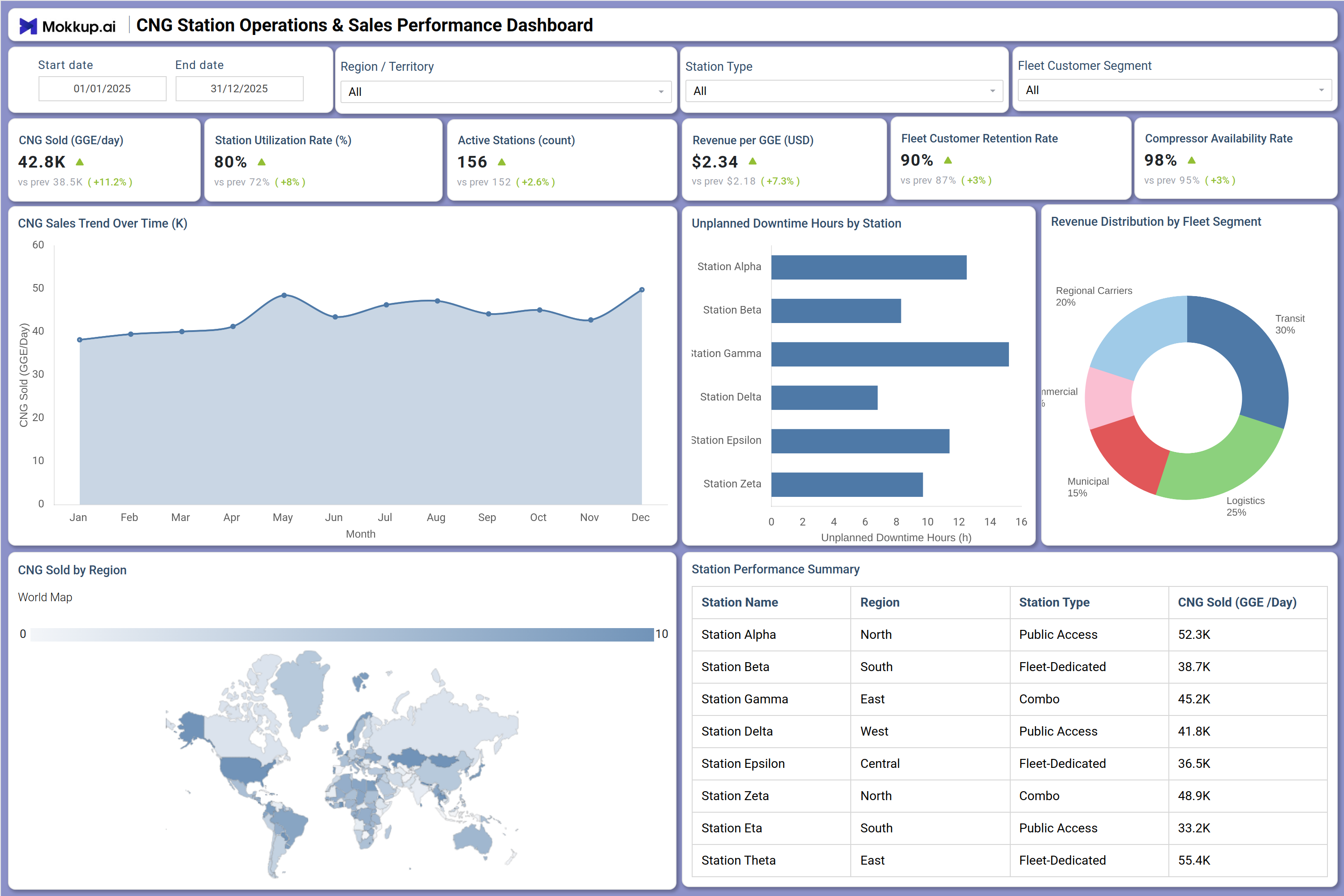
What is a CNG Station Operations & Sales Performance Dashboard?
The CNG Station Operations & Sales Performance Dashboard is a structured analytics template built for fuel network operators, fleet managers, and CNG infrastructure teams who need a consolidated view of station-level performance. As a CNG station operations performance dashboard, it tracks key metrics including CNG sold per station per day, revenue per GGE, active station count, and station utilization rates across a distributed network.
Teams working with CNG fuel station revenue per GGE data can monitor how efficiently each station converts throughput into revenue while comparing performance across station types, public access, fleet dedicated, and combo. The dashboard wireframe supports filtering by date range, region or territory, station type, and fleet customer segment, giving operators the precision they need to manage both day-to-day operations and longer-term sales strategy.
How to Create a CNG Station Operations & Sales Performance Dashboard
You don’t need to build your report from scratch, just start with a ready-to-use CNG Station Operations & Sales Performance dashboard template from Mokkup. Add in your data and export it however you like. Here’s how to do it:
1. Create or Log in to Your Mokkup Account
Start by signing up on Mokkup.ai using your email. If you already have an account, just log in, and you'll be good to go.
2. Choose and Customize Your Dashboard Template
Find the CNG Station Operations & Sales Performance Dashboard template in the Templates section. Use the drag-and-drop editor to adjust KPIs, edit filters, or add elements based on your data.
3. Export to Your BI Tool
Once your dashboard wireframe is ready, use the BI Tool Export feature to send it directly to Power BI or Tableau for further analysis and enhancements. You can also download the dashboard as a PDF, PNG, or JPEG, embed it on a platform, or invite your team to collaborate.
Note: This is a Pro template. You'll need a Pro subscription on Mokkup to use and customize this dashboard wireframe. Upgrade anytime to unlock full access.
CNG Station Operations & Sales Performance Dashboard Example
A regional CNG network manager opens this dashboard at the start of the week to assess how individual stations are performing against volume and revenue targets. The CNG sales trend analysis by region is visible through the area chart spanning a full year, allowing the manager to identify seasonal dips or growth periods without pulling separate reports. If a specific region or territory is underperforming, the manager applies the Region filter to isolate station-level data, then cross-references the Station Performance Summary table to pinpoint which stations are lagging in CNG sold per day.
Fleet account managers can monitor the fleet customer retention rate CNG stations metric alongside revenue distribution by fleet segment -- helping them prioritize which customer segments need attention before renewal cycles. The overall picture helps operations and sales teams align on which stations are maximizing capacity and which need intervention to close the gap between utilization and sales potential.
How to Analyze Data in a CNG Station Operations & Sales Performance Dashboard
Here is how you can analyze data from this dashboard:
- Filter by Region: Compare CNG sales and utilization across geographic territories.
- Analyze Station Types: Separate public, fleet-dedicated, and combo station performance.
- Track Sales Trends: Monitor monthly CNG sales patterns to identify declines early.
- Monitor Downtime: Review unplanned downtime by station to prioritize maintenance.
- Evaluate Revenue Mix: Use the fleet segment donut chart to identify top revenue contributors.
- Rank Station Performance: Sort the performance table by CNG sold per day to spot top and low performers.
- Check Equipment Availability: Track compressor availability rates to maintain throughput targets.
- Assess Fleet Retention: Filter by customer segment to analyze retention and outreach opportunities.
Benefits of a CNG Station Operations & Sales Performance Dashboard
The following are the benefits of using this dashboard:
- Centralized Operations View: Combines sales, utilization, downtime, and revenue metrics in one dashboard.
- Regional & Station Insights: Highlights localized operational issues without custom reporting.
- Reduced Manual Tracking: Prebuilt KPI tiles simplify compressor availability monitoring.
- Shared Sales & Operations Visibility: Connects fleet retention metrics with revenue performance.
- Seasonal Trend Analysis: Supports forecasting through multi-period sales tracking.
- Faster Prioritization: Ranked station tables help identify high and low performers quickly.
- BI Tool Compatibility: Easily integrates with Power BI and Tableau for extended analysis.
KPIs to Track in a CNG Station Operations & Sales Performance Dashboard
The following key KPIs can be tracked by using this dashboard:
- CNG Sold (GGE/Day per Station): The core throughput metric in any CNG station operations performance dashboard. It measures daily gas-gallon equivalent volume sold per station to track demand and station productivity.
- Station Utilization Rate (%): Tracks the proportion of a station operational capacity being actively used for low utilization signals either demand shortfall or equipment availability issues.
- Active Stations (Count): Counts the number of stations currently online and operational across the network. It is a foundational metric for understanding network availability.
- Revenue per GGE (USD): Measures the average revenue generated per gas-gallon equivalent sold to essential monitoring of CNG fuel station revenue per GGE margins and pricing strategy effectiveness.
- Fleet Customer Retention Rate (%): Tracks the percentage of fleet accounts retained over a period -- the fleet customer retention rate CNG stations report is a direct indicator of customer satisfaction and contract health.
- Compressor Availability Rate (%): Evaluates the percentage of time compressors are operational and ready to dispense -- the compressor availability rate CNG station teams monitor is directly tied to unplanned downtime and lost sales.
- Unplanned Downtime Hours by Station: Quantifies total unplanned downtime hours per station -- unplanned downtime tracking CNG stations helps maintenance teams prioritize repairs and reduce revenue loss.
Frequently Asked Questions
Q1. Who is this CNG Station Operations & Sales Performance Dashboard designed for?
This dashboard is built for CNG network operators, fleet fuel managers, and regional sales leads who oversee multiple stations. It provides a structured view of station throughput, revenue, and equipment performance across an entire network.
Q2. Can this dashboard track performance across different station types?
Yes. The Station Type filter lets users isolate and compare public access, fleet dedicated, and combo stations independently, so each category can be evaluated against its own operational benchmarks.
Q3. How does the Unplanned Downtime Hours by Station chart work?
The horizontal bar chart ranks stations by total unplanned downtime hours, making it easy to identify which stations experience the most disruptions. This supports targeted maintenance scheduling and helps reduce revenue loss from equipment failures.