
What is a Primary Schools Executive Performance Dashboard?
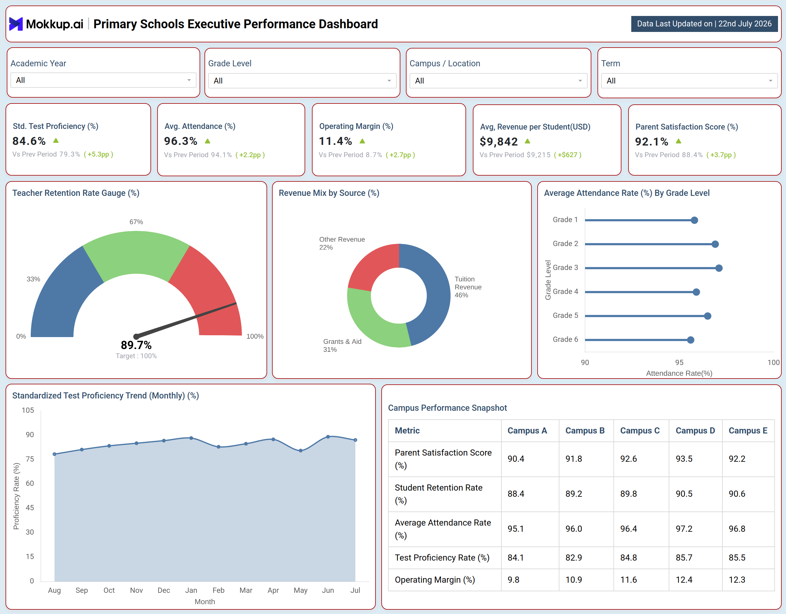
The Primary Schools Executive Performance Dashboard gives school leadership and administrators a single view of academic outcomes, financial health, and staffing stability across a school network. Instead of pulling data from separate systems for grades, finance, and HR, principals and superintendents can rely on one primary schools executive performance dashboard to see how test scores, attendance, revenue, and teacher retention are trending together. The layout is organized around filters for academic year, grade level, campus or location, and term, so leadership can narrow the view to a single campus or compare performance across the entire network. This dashboard template helps school boards and executive teams move faster from reviewing numbers to deciding where investment, staffing, or policy changes are needed.
How to Create a Primary Schools Executive Performance Dashboard
You don't need to build your report from scratch; just start with a ready-to-use dashboard template from Mokkup. Add in your data and export it however you like. Here's how to do it:
1. Create or Log in to Your Mokkup Account
Start by signing up on Mokkup.ai using your email. If you already have an account, just log in, and you'll be good to go.
2. Choose and Customize Your Dashboard Template
Find the Primary Schools Executive Performance Dashboard template in the Templates section. Use the drag-and-drop editor to adjust KPIs, edit filters, or add elements based on your data.
3. Export to Your BI Tool
Once your dashboard wireframe is ready, use the BI Tool Export feature to send it directly to Power BI or Tableau for further analysis and enhancements. You can also download the dashboard as a PDF, PNG, or JPEG, embed it on a platform, or invite your team to collaborate.
Note: This is a Pro template. You'll need a Pro subscription on Mokkup to use and customize this dashboard wireframe. Upgrade anytime to unlock full access.
Primary Schools Executive Performance Dashboard Example
A school superintendent typically opens this dashboard at the start of a review cycle, looking to confirm whether the network is meeting academic and financial targets ahead of the next board meeting. The filters at the top let them narrow the view to a specific academic year, term, grade level, or campus, so they are not sorting through irrelevant data before getting to the question that matters most that week.On the main view, executive teams can track how academic performance is holding up alongside attendance and satisfaction trends, and quickly spot whether a dip in one area lines up with a shift in another. Finance leaders can rely on operating margin trend tracking for schools to confirm whether margin is moving in the right direction, while HR and academic leads can check whether teacher retention is stable enough to support continuity in the classroom.
When attendance patterns vary by grade level, planners can identify which grades may need additional support before it affects academic outcomes.The campus comparison view lets district leaders benchmark satisfaction, retention, attendance, proficiency, and margin side by side across every campus in the network, using it as a revenue per student analysis for primary schools alongside broader performance benchmarking. This makes it straightforward to identify which locations are outperforming peers and which ones need closer attention, without needing a separate report for each site. Leadership can also use parent satisfaction score tracking for schools to confirm that operational or financial gains are not coming at the cost of family experience.Altogether, the dashboard helps executive teams move from scattered, campus-level reporting to one coordinated view of how the school network is performing academically, financially, and operationally, so leadership can prioritize resources and interventions where they will have the most impact.
How to Analyze Data in a Primary Schools Executive Performance Dashboard
Here is how you can analyze data from this dashboard:
- Apply the Academic Year and Term filters to isolate performance for a specific reporting period.
- Use the Grade Level filter to compare attendance and proficiency trends across grades.
- Switch the Campus / Location filter to review a single school before comparing it against the network.
- Use the Standardized Test Proficiency Trend chart as a standardized test proficiency tracking tool to spot seasonal dips or sustained improvement.
- Check the Teacher Retention Rate Gauge, part of this teacher retention rate monitoring dashboard, against its target to gauge staffing stability.
- Scan the Revenue Mix by Source donut to understand dependence on tuition versus grants and aid.
- Use the Campus Performance Snapshot table to benchmark every campus on the same set of metrics.
- Cross-reference Average Attendance Rate by Grade Level with the proficiency trend to flag at-risk grades.
Benefits of a Primary Schools Executive Performance Dashboard
The following are the benefits of using this dashboard:
- Consolidates academic, financial, and staffing metrics into one primary schools executive performance dashboard.
- Reduces time spent compiling separate campus-level reports for board meetings.
- Makes it easy to benchmark campuses against each other on the same set of metrics.
- Surfaces teacher retention rate monitoring dashboard signals early so staffing gaps can be addressed proactively.
- Supports revenue per student analysis for primary schools alongside operating margin review for faster budget decisions.
- Pairs academic and financial KPIs with parent satisfaction score tracking for schools to confirm gains are not costing family experience.
- Gives non-technical leadership a clear visual layout without added jargon.
- Customizable filters let each stakeholder focus on the campus, grade, or term relevant to them.
KPIs to Track in a Primary Schools Executive Performance Dashboard
The following key KPIs can be tracked by using this dashboard:
- Standardized Test Proficiency Rate (%) - measures the share of students meeting or exceeding academic proficiency standards, functioning as a standardized test proficiency tracking tool for academic leaders.
- Average Attendance Rate (%) - tracks how consistently students are present, a leading indicator of engagement and outcomes.
- Operating Margin (%) - shows revenue less operating costs as a share of revenue, supporting operating margin trend tracking for schools at the executive level.
- Average Revenue per Student (USD) - measures revenue generated per enrolled student, supporting revenue per student analysis for primary schools across the network.
- Parent Satisfaction Score (%) - captures satisfaction through survey feedback, forming the basis of parent satisfaction score tracking for schools.
Frequently Asked Questions
1. What is a Primary Schools Executive Performance Dashboard used for?
It gives school leadership a single, consolidated view of academic, financial, and staffing performance across a school network. It replaces separate campus-level reports with one primary schools executive performance dashboard built for board-level reporting and decision-making.
2. Which KPIs should school executives track most closely?
Standardized test proficiency, attendance, operating margin, and teacher retention are core indicators of academic quality, financial health, and staffing stability. Pairing these with parent satisfaction score tracking for schools helps confirm that operational gains are not coming at the cost of family experience.
3. Can this dashboard be customized for a specific school network?
Yes, the template can be edited to match campus names, grade levels, and terms specific to a given network. Users can adjust filters and metrics using the drag-and-drop editor before exporting to Power BI, Tableau, or downloading as PDF, PNG, or JPEG.