
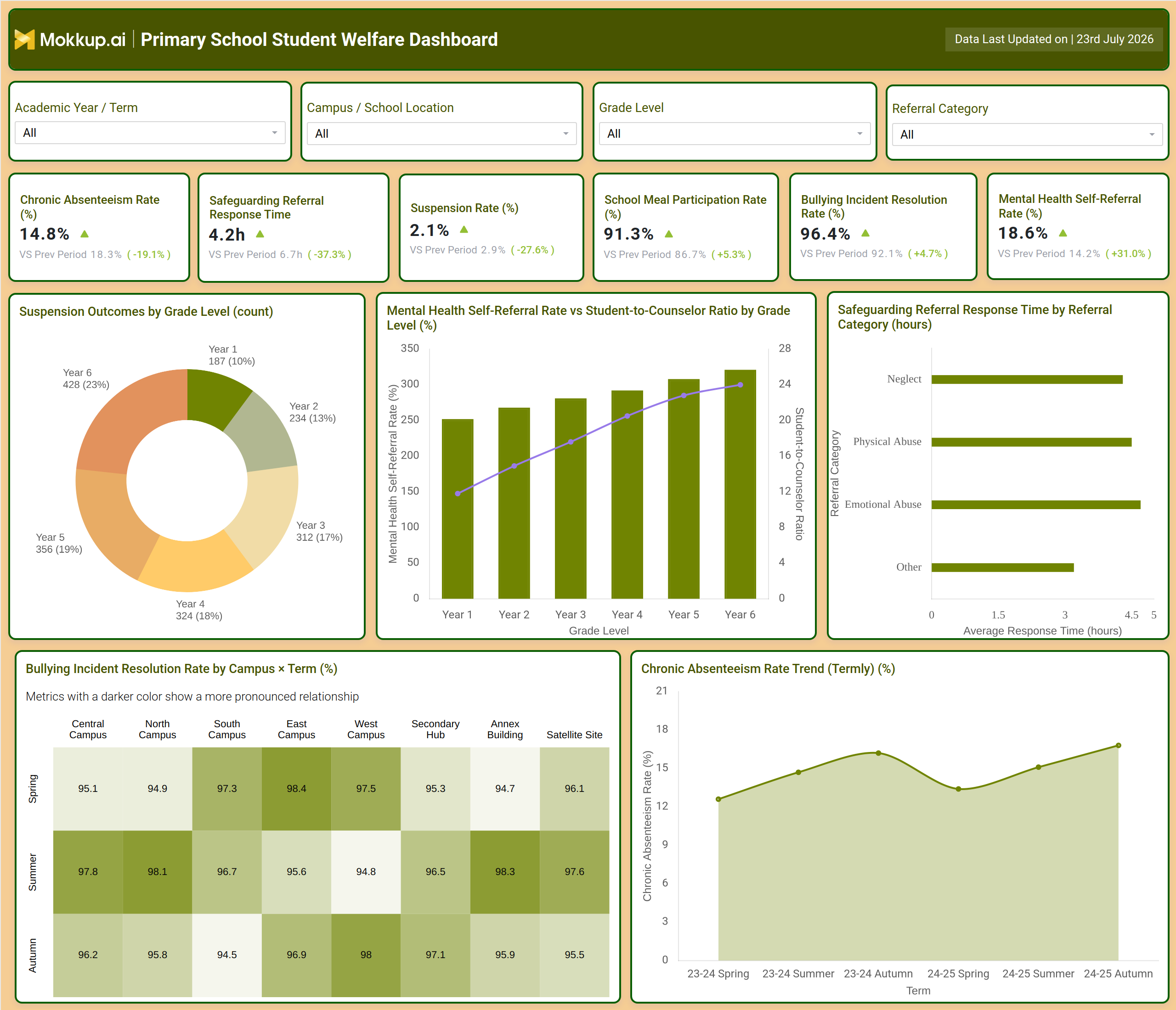
What is a Primary School Student Welfare Dashboard?
The Primary School Student Welfare Dashboard is a wireframe template designed for school administrators, safeguarding leads, and pastoral care staff who need a consolidated view of student wellbeing across a campus network. Rather than pulling attendance logs, safeguarding case files, counseling notes, and meal program records from separate systems, this primary school student welfare dashboard brings chronic absenteeism, safeguarding referral handling, suspension outcomes, mental health self-referrals, bullying incident resolution, and school meal participation into a single screen. Filters for academic year, campus location, grade level, and referral category let the same template scale from a single primary school to a multi-campus network reporting into a district welfare office, giving every stakeholder a shared, filterable reference point instead of fragmented spreadsheets.
How to Create a Primary School Student Welfare Dashboard
You don't need to build your report from scratch; just start with a ready-to-use dashboard template from Mokkup. Add in your data and export it however you like. Here's how to do it:
1. Create or Log in to Your Mokkup Account
Start by signing up on Mokkup.ai using your email. If you already have an account, just log in, and you'll be good to go.
2. Choose and Customize Your Dashboard Template
Find the Primary School Student Welfare Dashboard template in the Templates section. Use the drag-and-drop editor to adjust KPIs, edit filters, or add elements based on your data.
3. Export to Your BI Tool
Once your dashboard wireframe is ready, use the BI Tool Export feature to send it directly to Power BI or Tableau for further analysis and enhancements. You can also download the dashboard as a PDF, PNG, or JPEG, embed it on a platform, or invite your team to collaborate.
Note: This is a Pro template. You'll need a Pro subscription on Mokkup to use and customize this dashboard wireframe. Upgrade anytime to unlock full access.
Primary School Student Welfare Dashboard Example
A school welfare coordinator typically opens this dashboard at the start of a term to understand where student wellbeing needs attention before issues escalate into formal safeguarding cases. The question driving that first look is usually simple: which grade levels, campuses, or referral categories are showing early warning signs that a static report would not surface quickly enough. Instead of waiting for a periodic compliance summary, the coordinator filters to the current term and grade level to get an immediate read on where support should be prioritized. From there, the dashboard supports a chain of decisions rather than a single glance. Pastoral teams can track how quickly safeguarding referrals are being resolved by category, so that neglect, physical abuse, emotional abuse, and other referral types are not left waiting past acceptable response windows.
Administrators can compare suspension outcomes across grade levels to identify whether disciplinary patterns cluster in specific year groups, prompting a review of behavior support programs where needed. Because mental health self-referral activity is shown alongside the student-to-counselor ratio by grade, counseling leads can judge whether rising self-referral volume reflects growing awareness or a genuine capacity gap, and staff planners can decide where additional counseling resources are needed most. Campus leaders can also compare bullying incident resolution performance across campuses and terms to identify which sites are closing cases consistently and which need process support.The result is a welfare team that spends less time compiling data from disconnected registers and more time acting on it. Used as a chronic absenteeism rate tracking tool alongside its safeguarding and wellbeing views, the dashboard turns scattered welfare records into a single reference point that helps schools respond to student needs earlier and more consistently across every campus.
How to Analyze Data in a Primary School Student Welfare Dashboard
Here is how you can analyze data from this dashboard:
- Filter by Academic Year / Term to compare welfare metrics across consecutive terms.
- Segment by Campus / School Location to identify which sites need added welfare support.
- Break down by Grade Level to see how absenteeism and suspensions vary by year group.
- Use the Referral Category filter for safeguarding referral response time monitoring by case type.
- Review Suspension Outcomes by Grade Level to spot year groups with higher disciplinary volume.
- Compare Mental Health Self-Referral Rate against Student-to-Counselor Ratio to judge capacity fit.
- Read the Bullying Incident Resolution Rate by Campus x Term heatmap for slower-closing sites.
- Use it as a chronic absenteeism rate tracking tool by comparing the termly trend chart against grade-level filters.
Benefits of a Primary School Student Welfare Dashboard
The following are the benefits of using this dashboard:
- Centralizes attendance, safeguarding, and wellbeing metrics into one primary school student welfare dashboard view.
- Supports safeguarding referral response time monitoring so cases never sit past acceptable windows.
- Makes bullying incident resolution rate by campus comparisons visible without manual data pulls.
- Helps counseling teams match staffing to actual mental health self-referral rate tracking data by grade.
- Supports school meal participation tracking alongside wellbeing indicators for a fuller picture.
- Gives multi-campus leadership a consistent student wellbeing KPI dashboard for schools reporting across sites.
- Reduces reliance on static spreadsheets that go out of date between review cycles.
KPIs to Track in a Primary School Student Welfare Dashboard
The following key KPIs can be tracked by using this dashboard:
- Chronic Absenteeism Rate (%) - the share of students missing school often enough to be classified as chronically absent.
- Safeguarding Referral Response Time (hours) - the average time taken to respond to a safeguarding referral after it is raised.
- Suspension Rate (%) - the proportion of students who received a suspension within the selected period.
- School Meal Participation Rate (%) - the percentage of enrolled students participating in the school meal program.
- Bullying Incident Resolution Rate (%) - the share of reported bullying incidents that reach a resolved outcome.
- Mental Health Self-Referral Rate (%) - a core metric for mental health self-referral rate tracking, showing how many students initiate their own referral for support.
Frequently Asked Questions
1. What is the Primary School Student Welfare Dashboard used for?
It is used to track attendance, safeguarding, disciplinary, and mental health indicators for primary school students in one screen. Administrators and pastoral teams use it as a student wellbeing KPI dashboard for schools to prioritize support before issues escalate.
2. Can this dashboard be customized for a specific school or district?
Yes, the template can be edited inside Mokkup to adjust KPIs, filters, and layout to match a school's own welfare metrics. Once customized, it can be exported to Power BI, Tableau, or downloaded as PDF, PNG, or JPEG.
3. What data is required to populate this dashboard?
Schools need attendance records, safeguarding referral logs, suspension data, meal program participation records, and counseling or mental health self-referral data. These sources feed the KPIs and charts shown across the dashboard.