
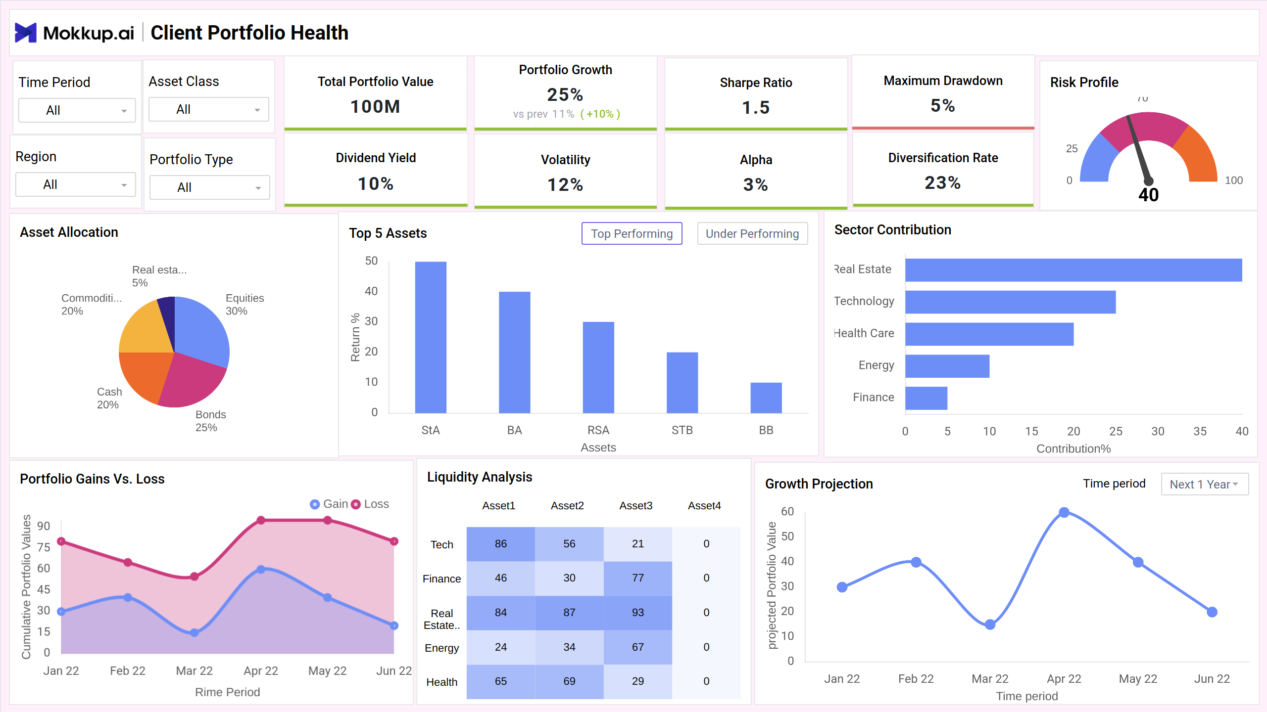
What is a Portfolio Risk Analysis Dashboard?
The Portfolio Risk Analysis Dashboard template is essential for financial advisors and wealth managers. It offers a detailed overview of portfolio performance, asset allocation, and risk factors, allowing users to make informed decisions about investment strategies. Focusing on both performance and risk-adjusted returns, this dashboard enables stakeholders to optimize client portfolios, track growth trends, and identify opportunities for diversification and risk mitigation.
Portfolio Risk Dashboard Example
The Portfolio Risk Dashboard offers a clear, data-driven overview of investment risks across asset classes, geographies, and sectors. It is designed for portfolio managers, analysts, and individual investors looking to monitor risk exposure, volatility, and asset performance in one consolidated view.
How to Analyze Data in Risk Dashboards
Analyzing the Mokkup.ai Risk Dashboard template helps wealth managers and investors evaluate performance, understand risk exposure, and plan long-term strategies. Here’s how to break it down:
- Assess portfolio growth vs. volatility using KPIs like Total Portfolio Value, Sharpe Ratio, and Volatility. These highlight whether gains are justified by the level of risk.
- Evaluate asset allocation through pie charts and bar visuals. This helps detect over-concentration in specific classes or sectors and improve diversification.
- Track underperformance and drawdowns using Max Drawdown and Gain vs. Loss trends. These identify periods of sharp decline and areas needing adjustment.
- Check risk-adjusted metrics like Alpha and Risk Profile to benchmark against the market and ensure alignment with the investor’s risk appetite.
- Monitor liquidity and flexibility via heatmaps and sector-wise liquidity analysis. This helps determine how easily assets can be converted to cash when needed.
The Portfolio Risk Dashboard provides customers with clear, data-driven insights, enabling them to manage performance and risk while maintaining a strong portfolio in markets that are unpredictable.
How to Create a Portfolio Risk Dashboard
You don’t need to build your report from scratch—just start with a ready-to-use sample Portfolio Risk Analysis Dashboard template from Mokkup. Add in your data and export it however you like. Here’s how to do it:
1. Create or Log in to Your Mokkup Account
Start by signing up on Mokkup.ai using your email. Already have an account? Just log in, and you’re good to go.
2. Choose and Customize Your Dashboard Template
Find the Portfolio Risk Analysis Dashboard in the Templates section. Use the drag-and-drop editor to adjust KPIs, edit filters, or add elements based on your data.
3. Export to Your BI Tool
Once your dashboard wireframe is ready, use the BI Tool Export feature to send it directly to Power BI or Tableau for further analysis and enhancements. You can also download the dashboard as a PDF, PNG, or JPEG, embed it on a platform, or invite your team to collaborate.
Note: This is a Pro template. To use and customize this dashboard wireframe, you’ll need a Pro subscription on Mokkup. Upgrade anytime to unlock full access.
Benefits of Portfolio Risk Dashboards
Portfolio risk dashboards provide financial professionals with a centralized view of investment performance and risk exposure. By visualizing key metrics, they help in making faster, smarter decisions. Here are the main benefits:
- Holistic Risk Monitoring: Track key indicators like volatility, drawdown, and diversification to assess the overall risk level of a portfolio in real time.
- Informed Decision-Making: Combine performance metrics with risk insights to make balanced investment choices aligned with client goals.
- Improved Asset Allocation: Identify overexposed sectors or asset classes, allowing for rebalancing to maintain a healthy portfolio structure.
- Early Detection of Underperformance: Spot declining sectors or assets before they significantly impact the portfolio’s overall returns.
- Enhanced Client Communication: Use clear visuals and insights to explain portfolio health and justify changes or recommendations during reviews.
KPIs to Track in Portfolio Risk Dashboards
Tracking the right KPIs is key to understanding both the performance and risk exposure of investment portfolios. These metrics help wealth managers assess stability, spot imbalances, and guide data-backed decisions.
- Total Portfolio Value: Shows the current total worth of all investments within the portfolio.
- Portfolio Growth: Measures how much the portfolio’s value has increased over a specific period.
- Sharpe Ratio: Evaluates returns relative to the risk taken, helping gauge risk-adjusted performance.
- Maximum Drawdown: Indicates the largest single drop from peak to trough, highlighting potential downside risk.
- Dividend Yield: Reflects income from dividends as a percentage of portfolio value, useful for income-focused strategies.
- Volatility: Measures the degree of price variation over time, indicating market risk and potential instability.
- Alpha: Compares portfolio returns with a benchmark to determine whether it's outperforming or underperforming the market.
Frequently Asked Questions
Q1. What is the main purpose of a Portfolio Risk Dashboard?
It provides a comprehensive view of investment performance and risk metrics, helping investors and advisors make informed decisions by tracking value, volatility, diversification, and more.
Q2. How often should I monitor my portfolio risk metrics?
Ideally, risk metrics should be reviewed monthly or quarterly, but during volatile market conditions, weekly reviews can help mitigate potential losses.
Q3. What is the difference between the Sharpe Ratio and Alpha?
The Sharpe Ratio shows returns adjusted for risk, while Alpha compares portfolio performance to a benchmark, indicating whether it’s outperforming the market.