
What is an Outage Management Dashboard?
An Outage Management Dashboard is a business intelligence solution that helps utility companies monitor outages, measure customer impact, and track restoration efficiency. It acts as a power outage monitoring system and provides insights into outage duration, downtime, and the number of affected customers. Utility teams can assess financial losses, ensure SLA compliance, and identify critical incidents faster. The dashboard also supports performance benchmarking, cost analysis, and reliability tracking. Integrating data into a single view enhances operational responsiveness and fosters customer trust, ultimately improving production line performance.
How to Create an Outage Management Dashboard
You don’t need to build your report from scratch-just start with a ready-to-use outage management dashboard template from Mokkup. Add your data and export it as needed. Here’s how to do it:
1. Create or Log in to Your Mokkup Account
Start by signing up on Mokkup.ai using your email. If you already have an account, simply log in, and you’ll be all set.
2. Choose and Customize Your Dashboard Template
Find the Outage Management Dashboard template in the Templates section. Use the drag-and-drop editor to adjust KPIs, edit filters, or add elements based on your data.
3. Export to Your BI Tool
Once your dashboard wireframe is ready, use the BI Tool Export feature to send it directly to Power BI or Tableau for further analysis and enhancements. You can also download the dashboard as a PDF, PNG, or JPEG, embed it on a platform, or invite your team to collaborate.
Note: This is a Pro template. You’ll need a Pro subscription on Mokkup to use and customize this dashboard wireframe. Upgrade anytime to unlock full access.
Outage Management Dashboard Example
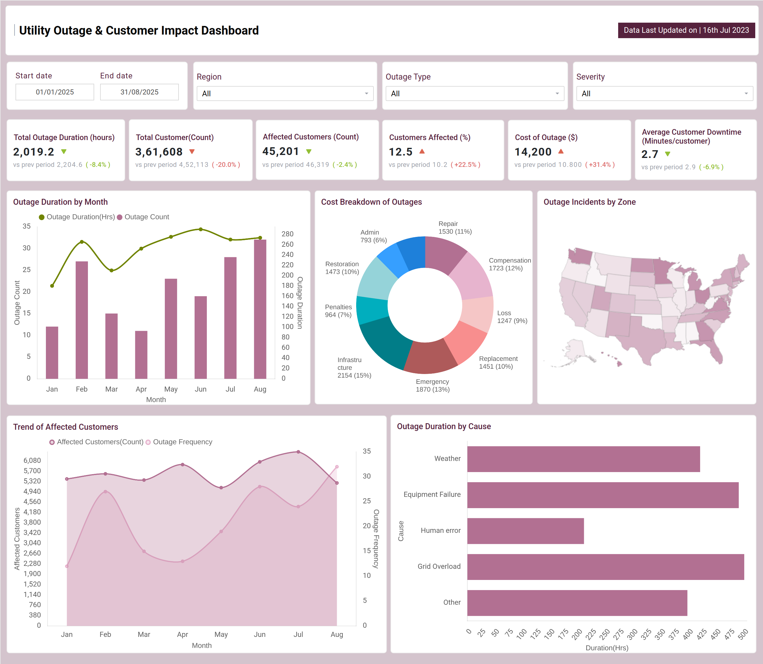
Utility Outage & Customer Impact gives executives visibility into outage duration, affected customers, average downtime, and financial impact. A real-time outage tracking dashboard with filters for region, outage type, and severity highlights where and why outages occur. Visuals such as cost breakdown, affected customer trends, and outage cause analysis help spot patterns and financial drivers.
Response and restoration Efficiency focus on operational performance, measuring response time, resolution time, and SLA compliance. By comparing restoration speed against outage frequency, utilities can evaluate team efficiency. Regional resolution maps and unit benchmarking further identify areas for improvement and faster customer service.
How to Analyze Data in an Outage Management Dashboard
An Outage Management Dashboard combines real-time data, historical trends, and predictive insights to help utilities, IT teams, and facility managers reduce downtime costs and improve response. To analyze data effectively, follow the steps:
- Start with KPIs by comparing Total Outage Duration, number of Affected Customers, and SLA Compliance to measure overall performance.
- Assess Customer Downtime with Average Downtime per Customer to understand the impact on service users.
- Spot Hotspots use geo maps and severity filters to identify outage-prone regions and problem clusters quickly.
- Quantify Financial Loss with donut charts that break down cost drivers and show the business impact.
- Track SLA Compliance by comparing First Response times against Resolution SLAs to ensure service commitments are met.
- Review Team Efficiency by benchmarking response units in tables to highlight the best and underperforming teams.
- Identify Trends with line and area charts to monitor reliability improvements and recurring outage patterns.
Benefits of Outage Management Dashboards
The key benefits of the outage tracking and reporting dashboard include:
- Real-time visibility into outages and downtime enables quick detection and faster resolution.
- Using utility outage management analytics, financial impact reporting provides executives with clear insights into revenue loss and cost drivers.
- SLA monitoring ensures operational accountability by tracking response and resolution commitments.
- Benchmarking of response teams highlights efficiency gaps and identifies top-performing units.
- Data-driven prioritization helps focus resources on high-severity incidents for faster recovery.
- Improved customer trust comes from quicker restoration times and transparent communication.
KPIs to Track in Outage Management Dashboards
The key KPIs include:
- Total Outage Duration (hrs) - Measures total downtime hours across all incidents.
- % Customers Affected - Highlights the proportion of the customer base impacted.
- Cost of Outage ($) -Calculates outages' direct and indirect financial impact.
- Total Outage Incidents -Counts the total number of outage events recorded.
- Avg Response Time (minutes) -Shows the average time teams respond after outage detection.
- Avg Resolution Time (hrs) - Measures how long it takes to resolve outages fully.
- Average Time to Restore (ATTR) -Captures the average restoration speed after incidents.
Frequently Asked Questions
1. How does an Outage Management Dashboard help reduce customer downtime?
Tracking average downtime per customer and restoration speed highlights where response delays occur, allowing teams to act more quickly. As an energy outage reporting tool, it provides visibility into downtime trends and helps utilities improve service reliability.
2. Can I customize an Outage Management Dashboard?
Yes. Using tools like Power BI or Tableau, dashboards can be customized to display KPIs relevant to your organization, such as downtime cost, outage frequency, customer complaints, or compliance metrics.