What is a Downtime Cost Analysis Dashboard?
A Downtime Cost Analysis Dashboard is a performance monitoring tool that helps organizations track the financial and operational impact of equipment downtime. It consolidates key metrics such as total downtime hours, revenue lost, repair times, preventive maintenance savings, and planned vs unplanned downtime.
By centralizing these KPIs, the downtime cost analysis dashboard template enables manufacturers, logistics firms, and service providers to pinpoint inefficiencies, evaluate root causes, and reduce unplanned outages. As a real-time downtime monitoring dashboard, it helps leaders improve equipment utilization, optimize maintenance, and reduce revenue loss.
How To Create Downtime Cost Analysis Dashboards
You don’t need to build your report from scratch—just start with a ready-to-use sample Downtime Cost Analysis Dashboard template from Mokkup. Plug in your own data and export it however you like. Here’s how to do it:
1. Create or Log in to Your Mokkup Account
Start by signing up on Mokkup.ai using your email. Already have an account? Just log in, and you’re good to go.
2. Choose and Customize Your Dashboard Template
Find the Downtime Cost Analysis Dashboard template in the Templates section. Use the drag-and-drop editor to adjust KPIs, edit filters, or add elements based on your data.
3. Export to Your BI Tool
Once your dashboard is ready, use the BI Tool Export feature to send it directly to Power BI or Tableau for further analysis and enhancements. You can also download the dashboard as a PDF, PNG, or JPEG, embed it on a platform, or invite your team to collaborate.
Note: This is a Pro template. To use and customize this dashboard wireframe, you’ll need a Pro subscription on Mokkup. Upgrade anytime to unlock full access.
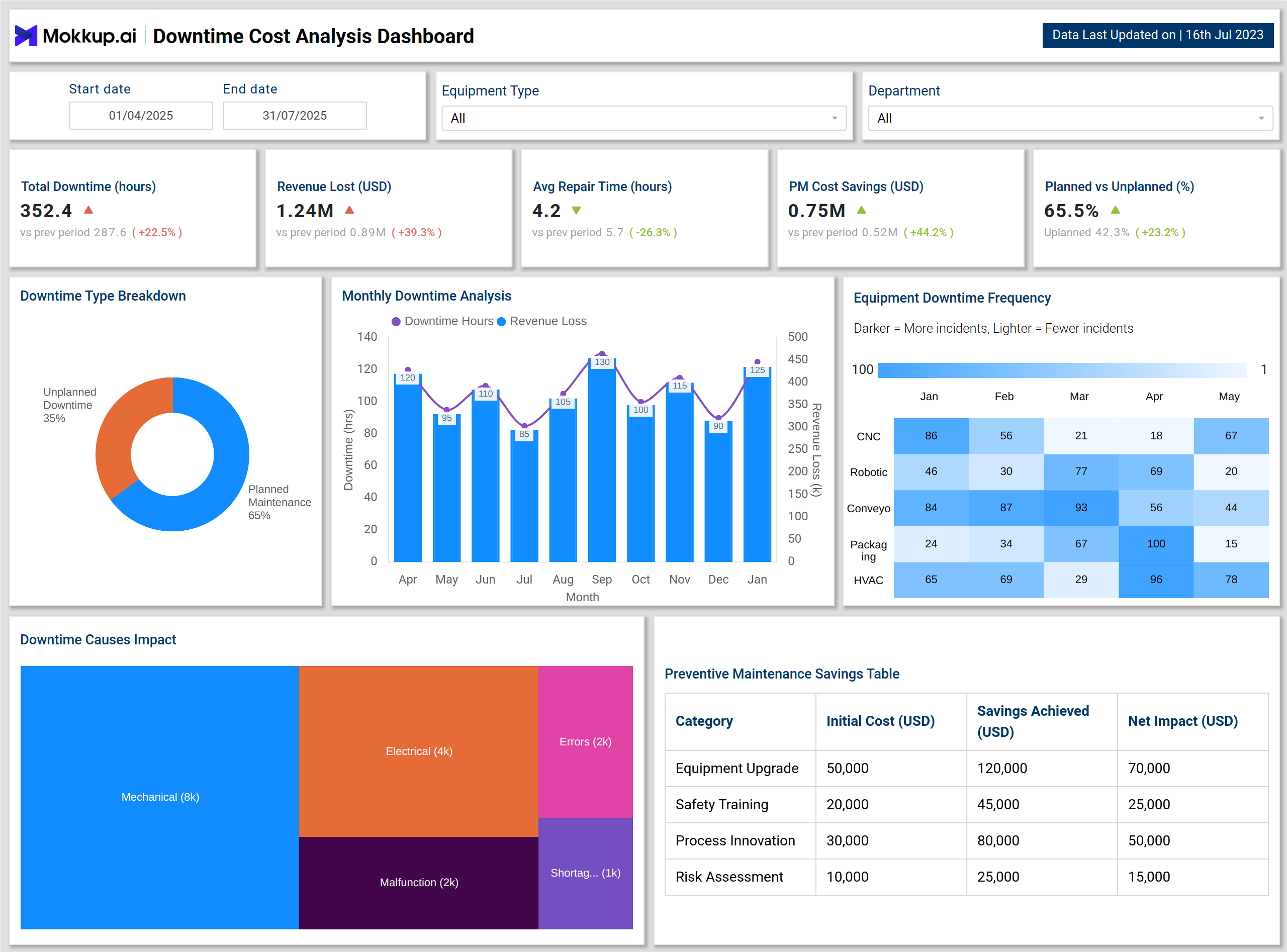
Downtime Cost Analysis Dashboard Example
Visualizations include a Downtime Type Breakdown pie chart that shows the proportion of planned versus unplanned maintenance. The Monthly Downtime Analysis chart connects downtime hours with revenue loss to highlight financial risks. A heatmap of equipment downtime frequency identifies which equipment types, such as CNC machines, robotics, or HVAC, face the most failures over time.
Additionally, the Downtime Causes Impact treemap reveals the cost impact of root causes such as mechanical failures, electrical issues, human errors, malfunctions, and shortages. The Preventive Maintenance Savings Table demonstrates the financial benefits of equipment upgrades, safety training, process innovation, and risk assessments.
This downtime cost management dashboard provides operational and financial insights, helping organizations reduce costs and improve uptime.
How to Analyze Data in the Downtime Cost Analysis Dashboard
Organizations can use a downtime cost analysis dashboard template by following these steps:
- Track Total Downtime and Revenue Loss – Identify how downtime hours correlate with lost revenue.
- Compare Planned vs Unplanned Downtime – Use the breakdown to measure how much downtime is preventable.
- Review Average Repair Time – Assess maintenance team efficiency and highlight areas for improvement.
- Analyze Equipment Downtime Frequency – Treat the tool as an incident tracking and downtime dashboard to monitor failures by machine type.
- Examine Root Cause Impact – Use the downtime causes treemap to prioritize corrective actions.
- Evaluate Preventive Maintenance ROI – Monitor cost savings from upgrades, training, and process changes.
Organizations can then make weekly performance reports based on the equipment utilization trends.
Benefits of Downtime Cost Analysis Dashboard
Implementing a Downtime Cost Analysis Dashboard provides several advantages for your business, such as:
- Reduced Revenue Loss: Real-time visibility into downtime costs enables faster corrective action.
- Planned Maintenance Optimization: The downtime cost analysis dashboard template helps shift downtime from unplanned to planned, lowering risks.
- Improved Equipment Reliability: An incident tracking and downtime dashboard highlights recurring equipment issues.
- Better Maintenance ROI: Preventive maintenance savings data support resource allocation and investment decisions.
- Operational Efficiency: Leaders can monitor repair times and identify inefficiencies in maintenance processes.
- Strategic Decision-Making: The real-time downtime monitoring dashboard aligns cost reduction with long-term equipment strategies.
KPIs to Track in the Downtime Cost Analysis Dashboard
The Key KPIs from this dashboard include:
- Total Downtime (hours) – Measures the total hours equipment is offline, reflecting the scale of production loss.
- Revenue Lost (USD) – Tracks the financial impact of downtime by quantifying revenue shortfall.
- Average Repair Time (hours) – Evaluates how quickly maintenance teams restore equipment functionality.
- Preventive Maintenance Savings (USD) – Calculates savings from planned initiatives like upgrades, training, and risk assessments.
- Planned vs Unplanned Downtime (%) – Compares controllable downtime with unexpected failures to highlight areas for proactive intervention.
Organizations can reduce operational risk and optimize maintenance planning by monitoring these KPIs.
Frequently Asked Questions
1. Why is a Downtime Cost Analysis Dashboard important?
It provides visibility into downtime-related costs, enabling organizations to reduce revenue loss, optimize maintenance, and improve uptime.
2. Which industries benefit most from Downtime Cost Analysis Dashboards?
Manufacturing, logistics, energy, and service industries benefit most due to their high dependency on equipment uptime.
3. Can this dashboard integrate with maintenance systems?
Yes. The downtime cost analysis dashboard template can integrate with CMMS and ERP systems to provide seamless monitoring and reporting.