What is an Oil Power Plant Operational Efficiency Dashboard?
An Oil Power Plant Operational Efficiency Dashboard template is a monitoring system designed for electric power utilities operating oil-fired generation units. It helps operations teams assess how well the plant performs across various metrics, including availability, reliability, thermal efficiency, and energy output. This dashboard wireframe consolidates operational efficiency metrics for oil power plants, supporting plant managers, reliability engineers, and operations leaders in informed decision-making. The purpose of this dashboard wireframe is to provide insights for improving efficiency in oil-fired power utilities by tracking performance patterns, equipment behavior, outage factors, and fuel usage.
It supports energy output performance tracking for oil power stations, helping to identify areas where losses occur in the generation cycle. By monitoring heat rate, thermal efficiency, auxiliary load, and emissions output, utilities can optimize fuel usage and improve the cost per MWh for oil-based power plants. This structure makes the dashboard a reliable tool for performance benchmarking, operational discipline, and asset health assessment.
How to Create an Oil Power Plant Operational Efficiency Dashboard
You don’t need to build your report from scratch—just start with a ready-to-use Oil Power Plant Operational Efficiency dashboard template from Mokkup. Add in your data and export it however you like. Here’s how to do it:
1. Create or Log in to Your Mokkup Account
Start by signing up on Mokkup.ai using your email. If you already have an account, just log in, and you’ll be good to go.
2. Choose and Customize Your Dashboard Template
Find the Oil Power Plant Operational Efficiency Dashboard template in the Templates section. Use the drag-and-drop editor to adjust KPIs, edit filters, or add elements based on your data.
3. Export to Your BI Tool
Once your dashboard wireframe is ready, use the BI Tool Export feature to send it directly to Power BI or Tableau for further analysis and enhancements. You can also download the dashboard as a PDF, PNG, or JPEG, embed it on a platform, or invite your team to collaborate.
Note: This is a Pro template. You’ll need a Pro subscription on Mokkup to use and customize this dashboard wireframe. Upgrade anytime to unlock full access.
Oil Power Plant Operational Efficiency Dashboard Example
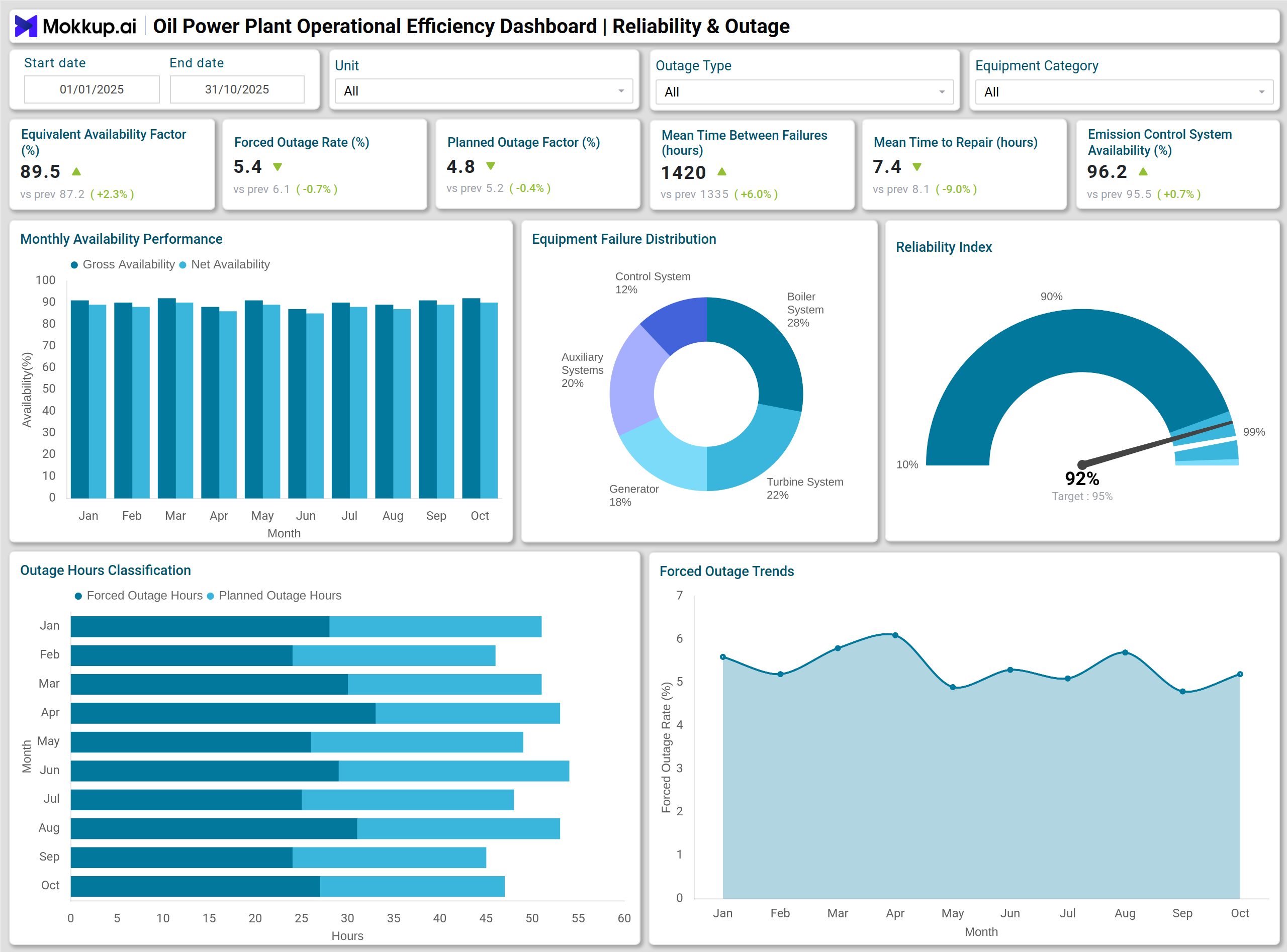
A typical Oil Power Plant Operational Efficiency Dashboard displays availability performance, outage patterns, reliability indicators, and generation efficiency. Monthly availability trends are displayed using a multi-series column chart, enabling teams to compare the Equivalent Availability Factor, Planned Outage Factor, and other key indicators. A single-line chart highlights the Forced Outage Rate trend, making it easier to track reliability issues linked to unit trips or equipment failures. Outage hour classification appears through a stacked bar chart that separates planned, forced, and maintenance outages. Fuel consumption behavior is visualized through an area chart based on monthly usage for each generating unit. A treemap displays the fuel cost composition across various categories. Net generation and heat rate are shown together in a combo chart for efficiency benchmarking.
The dashboard also includes a pie chart for failure mode distribution, a donut chart for auxiliary power use distribution, and a gauge chart that represents the plant’s reliability index. Emissions performance is displayed through a waterfall chart, which breaks down total CO₂ emissions into contributions from process steps, fuel type, and emission control systems. With these visuals, teams gain insights into oil-fired power generation performance monitoring that support improvement programs and operational planning.
How to Analyze Data in Oil Power Plant Operational Efficiency Dashboards
Here is how you can analyze operational and efficiency trends using this dashboard:
- Review Availability Indicators: Understand how much time the plant remains in service versus planned or forced outage conditions.
- Track Forced Outage Rate Trends: Identify reliability risks linked to equipment failures, process variations, or aging assets.
- Compare Monthly Heat Rate Variations: Assess changes in thermal efficiency driven by unit loading, fuel quality, or equipment condition.
- Examine Auxiliary Power Consumption: Detect internal energy losses that reduce net generation.
- Assess Outage Hour Classification: Review the share of planned, forced, and maintenance downtimes.
- Benchmark Generation Output: Use the Net Generation vs Heat Rate combo chart to compare output against historical baselines.
- Monitor Fuel Usage Trends: Identify inefficiencies in combustion performance or boiler operations.
- Evaluate Emissions Breakdown: Analyze contributions from equipment, operations, and fuel mix to total CO₂ per MWh.
Benefits of Oil Power Plant Operational Efficiency Dashboards
Here are the key advantages of using this dashboard:
- Improves Operational Visibility: Enhances transparency across availability, reliability, and generation output.
- Supports Early Issue Detection: Uses outage and failure mode trends to uncover equipment risks sooner.
- Optimizes Fuel and Thermal Performance: Helps utilities reduce costs by improving heat rate and fuel efficiency.
- Enables Better Reliability Control: Uses MTBF and MTTR to strengthen maintenance and reliability planning.
- Provides Energy Output Tracking: Supports operational planning with consistent power generation insights.
- Enhances Emissions Management: Identifies opportunities for reduction across operational processes.
- Strengthens Decision-Making: Equips operations teams with structured benchmarking and data-driven insights.
KPIs to Track in Oil Power Plant Operational Efficiency Dashboards
Key performance indicators that matter in operational efficiency analysis:
- Equivalent Availability Factor (EAF) Percent: Measures the percentage of time the plant is available for generation.
- Forced Outage Rate (FOR) Percent: Tracks unexpected outages that reduce reliability.
- Planned Outage Factor Percent: Shows planned maintenance or inspection downtime.
- Mean Time Between Failures (MTBF) Hours: Indicates reliability based on time between equipment failures.
- Mean Time to Repair (MTTR) Hours: Measures average repair duration after a failure.
- Emission Control System Availability Percentage: Reflects the system's readiness to manage emissions output.
- Heat Rate (Net BTU/kWh): Measures fuel-to-energy conversion efficiency.
Frequently Asked Questions
Q1. Who uses an Oil Power Plant Operational Efficiency Dashboard?
Operations teams, reliability engineers, performance analysts, and plant managers use the dashboard for monitoring and improvement.
Q2. How does the dashboard support efficiency improvement?
It tracks heat rate, thermal efficiency, auxiliary power usage, and fuel consumption trends to identify opportunities for improvement.
Q3. What makes this dashboard important for oil-fired generation units?
It helps manage reliability risks, control emissions, optimize fuel usage, and improve overall generation performance.
Q4. Which visual is most useful for reliability monitoring?
The line chart for Forced Outage Rate and the gauge chart for the reliability index are key indicators of reliability.
Q5. How does the dashboard support cost optimization?
By showing patterns in heat rate, specific fuel consumption, and auxiliary power usage that influence cost per MWh optimization for oil-based power plants.