What is a Natural Gas Retail Supply & Distribution Performance Dashboard?
A Natural Gas Retail Supply & Distribution Performance Dashboard is a consolidated visual analytics tool designed to give retail gas operators, distribution network managers, and supply chain planners a unified view of how effectively their networks meet demand. Rather than juggling disconnected reports across operations, compliance, and customer service teams, this type of dashboard brings every critical signal into one interface, from how reliably gas is being delivered to how much of it cannot be accounted for. For organizations operating in the retail gas sector, where margins are thin and regulatory scrutiny is high, having instant visibility into fulfillment rates, pressure adherence, curtailment activity, and loss metrics is not optional — it is operationally essential. This dashboard enables teams to move from reactive firefighting to proactive network governance, supporting the natural gas retail supply performance dashboard needs of every stakeholder involved in distribution operations.
How to Create a Natural Gas Retail Supply & Distribution Performance Dashboard
You don't need to build your report from scratch, just start with a ready-to-use dashboard template from Mokkup. Add in your data and export it however you like. Here's how to do it:
1. Create or Log in to Your Mokkup Account
Start by signing up on Mokkup.ai using your email. If you already have an account, just log in, and you'll be good to go.
2. Choose and Customize Your Dashboard Template
Find the Natural Gas Retail Supply & Distribution Performance Dashboard template in the Templates section. Use the drag-and-drop editor to adjust KPIs, edit filters, or add elements based on your data.
3. Export to Your BI Tool
Once your dashboard wireframe is ready, use the BI Tool Export feature to send it directly to Power BI or Tableau for further analysis and enhancements. You can also download the dashboard as a PDF, PNG, or JPEG, embed it on a platform, or invite your team to collaborate.
Note: This is a Pro template. You'll need a Pro subscription on Mokkup to use and customize this dashboard wireframe. Upgrade anytime to unlock full access.
Natural Gas Retail Supply & Distribution Performance Dashboard Example
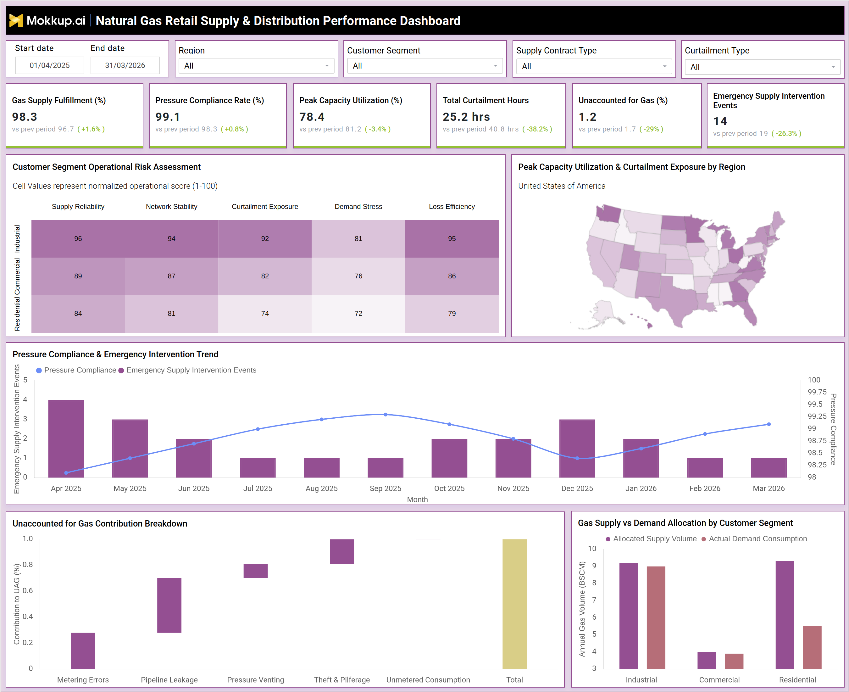
Imagine a regional distribution manager at a mid-size retail gas operator starting their morning shift. Before the dashboard was in place, their first hour was spent pulling reports from three different systems, cross-referencing curtailment logs, and waiting for compliance summaries from the regulatory team. With the Natural Gas Retail Supply & Distribution Performance Dashboard, they open a single interface, apply their regional filter, and within seconds, they see that pressure compliance has dipped slightly in the current period. They glance at the trend chart and notice that the dip aligns with a month where emergency intervention events were also elevated, confirming this is not a one-off anomaly. They drill into the customer segment risk heatmap and find that the Commercial segment is showing elevated curtailment exposure scores.
They cross-reference the supply vs demand allocation chart and confirm that allocated volumes for commercial customers are running below actual demand consumption, meaning the network may be undersupplying that segment during peak periods. Armed with this context, they escalate to the supply planning team before the morning stand-up, flag the commercial shortfall for contract review, and log the observation in the operations report. The gas distribution curtailment monitoring tool has turned an hours-long investigation into a five-minute diagnostic session.
How to Analyze Data in a Natural Gas Retail Supply & Distribution Performance Dashboard
Here is how you can analyze data from this dashboard:
- Start with the six headline KPIs. Gas Supply Fulfillment (%), Pressure Compliance Rate (%), Peak Capacity Utilization (%), Total Curtailment Hours, Unaccounted for Gas (%), and Emergency Supply Intervention Events, to get an immediate pulse on network health before diving deeper.
- Use the Customer Segment Operational Risk Assessment heatmap to compare normalized scores across Industrial, Commercial, and Residential segments on five dimensions: Supply Reliability, Network Stability, Curtailment Exposure, Demand Stress, and Loss Efficiency.
- Examine the Peak Capacity Utilization & Curtailment Exposure by Region map to identify geographic hotspots where the network is under the most stress. High utilization combined with high curtailment exposure in the same region signals infrastructure risk.
- Analyze the Pressure Compliance & Emergency Intervention Trend chart on a monthly basis to detect whether declining compliance periods correlate with spikes in emergency intervention events.
- Use the Unaccounted for Gas Contribution Breakdown to decompose total UFG into its constituent causes — Metering Errors, Pipeline Leakage, Pressure Venting, Theft & Pilferage, and Unmetered Consumption.
- Review the Gas Supply vs Demand Allocation by Customer Segment chart to identify segments where actual demand consumption consistently exceeds allocated supply volume.
Benefits of a Natural Gas Retail Supply & Distribution Performance Dashboard
The following are the benefits of using this dashboard:
- Provides a single source of truth for natural gas retail supply performance dashboard metrics, eliminating the need to reconcile data from multiple disconnected systems.
- Enables proactive gas distribution curtailment monitoring by surfacing curtailment hours and capacity utilization trends before they escalate into service failures.
- Improves pipeline pressure compliance tracking dashboard capabilities by combining compliance rate trends with emergency intervention event data in one view.
- Supports unaccounted-for gas contribution breakdown analytics by decomposing UFG into specific causes, enabling targeted and cost-effective loss reduction investments.
- Enhances customer segment gas demand allocation reporting by showing where supply volumes are misaligned with actual consumption patterns.
- Strengthens regulatory preparedness by centralizing curtailment hours, pressure compliance rates, and emergency supply intervention trend analysis natural gas data in one auditable interface.
KPIs to Track in a Natural Gas Retail Supply & Distribution Performance Dashboard
The following key KPIs can be tracked by using this dashboard:
- Gas Supply Fulfillment (%) — the percentage of contracted supply volumes successfully delivered to customers across the network.
- Pressure Compliance Rate (%) — the share of time that distribution network pressure levels remain within regulatory and operational thresholds.
- Peak Capacity Utilization (%) — how close the network is operating to its maximum throughput capacity during high-demand windows.
- Total Curtailment Hours — the cumulative duration of supply interruptions during the reporting period.
- Unaccounted for Gas (%) (UFG) — the share of injected gas volume that cannot be reconciled with metered consumption, encompassing leakage, theft, venting, and metering errors.
- Emergency Supply Intervention Events — the number of unscheduled emergency actions taken to maintain supply continuity.
- Customer Segment Risk Scores across Supply Reliability, Network Stability, Curtailment Exposure, Demand Stress, and Loss Efficiency dimensions.
- UFG Contribution Breakdown by category: Metering Errors, Pipeline Leakage, Pressure Venting, Theft & Pilferage, Unmetered Consumption.
Frequently Asked Questions
1. What is a Natural Gas Retail Supply & Distribution Performance Dashboard?
It is a visual analytics tool that consolidates key supply, pressure, curtailment, and loss metrics for retail natural gas distribution networks into a single interface, enabling operators to monitor fulfillment obligations, identify risk by customer segment, and diagnose performance gaps without switching between systems.
2. Who should use this dashboard?
Distribution network managers, supply planning teams, regulatory compliance officers, operations directors, and commercial teams in the retail natural gas sector all benefit from this dashboard. It supports both daily operational monitoring and longer-term strategic planning.
3. What does Unaccounted for Gas (UFG) mean in this dashboard?
UFG represents the percentage of gas injected into the distribution network that cannot be reconciled with metered customer consumption. The dashboard's unaccounted-for gas contribution breakdown analytics feature decomposes this figure into specific causes, including pipeline leakage, metering errors, pressure venting, theft and pilferage, and unmetered consumption, so operators can target remediation efforts precisely.
4. How does the Customer Segment Operational Risk Assessment work?
The heatmap scores Industrial, Commercial, and Residential customer segments against five normalized risk dimensions — Supply Reliability, Network Stability, Curtailment Exposure, Demand Stress, and Loss Efficiency — on a 1-100 scale. Higher scores indicate greater operational risk, allowing planners to prioritize which segment and which risk type requires the most urgent attention.
5. Can this dashboard be filtered by region or customer segment?
Yes. The dashboard includes filters for Start Date, End Date, Region, Customer Segment, Supply Contract Type, and Curtailment Type. Applying these filters allows users to isolate performance data for specific geographies, customer categories, or contract types for focused analysis.