
What is a CNG Distribution Network Expansion Dashboard?
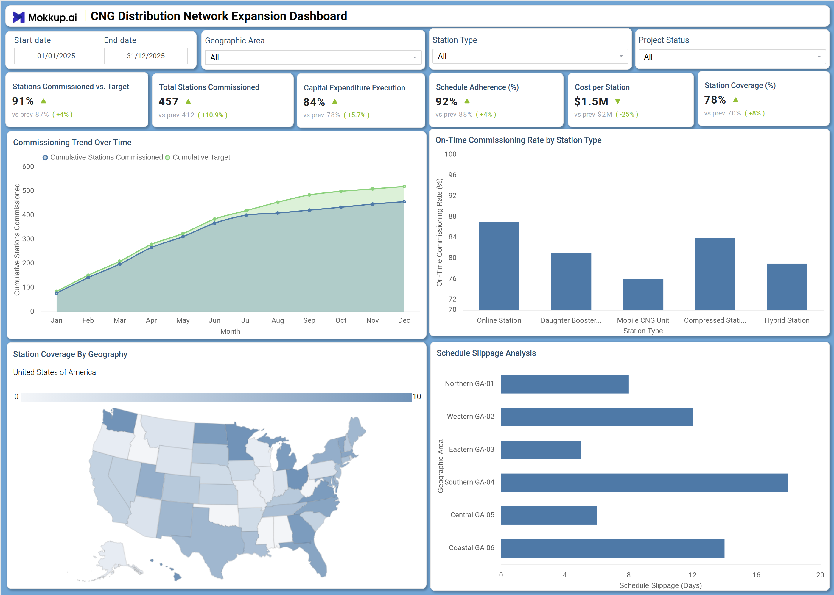
The CNG Distribution Network Expansion Dashboard is a structured analytical template designed for energy infrastructure teams managing the rollout of compressed natural gas fueling stations across geographic regions. This CNG distribution network expansion dashboard consolidates commissioning progress, budget execution, and schedule performance into a single view, giving project managers and operations teams a clear picture of how the network build-out is tracking against plan. It is built for organizations executing large-scale CNG infrastructure programs where monitoring station-level milestones and cost discipline are essential to meeting expansion targets. Used as a CNG station commissioning tracking template, this dashboard helps teams measure on-time delivery, identify slippage by geography, and ensure capital is being deployed within approved limits. The on-time commissioning rate by station type is a central feature, allowing planners to pinpoint which station formats consistently meet the schedule and which need corrective attention.
How to Create a CNG Distribution Network Expansion Dashboard
You don't need to build your report from scratch, just start with a ready-to-use dashboard template from Mokkup. Add in your data and export it however you like. Here's how to do it:
1. Create or Log in to Your Mokkup Account
Start by signing up on Mokkup.ai using your email. If you already have an account, just log in, and you'll be good to go.
2. Choose and Customize Your Dashboard Template
Find the CNG Distribution Network Expansion Dashboard template in the Templates section. Use the drag-and-drop editor to adjust KPIs, edit filters, or add elements based on your data.
3. Export to Your BI Tool
Once your dashboard wireframe is ready, use the BI Tool Export feature to send it directly to Power BI or Tableau for further analysis and enhancements. You can also download the dashboard as a PDF, PNG, or JPEG, embed it on a platform, or invite your team to collaborate.
Note: This is a Pro template. You'll need a Pro subscription on Mokkup to use and customize this dashboard wireframe. Upgrade anytime to unlock full access.
CNG Distribution Network Expansion Dashboard Example
A project director overseeing a multi-region CNG expansion program opens this dashboard at the start of each reporting cycle to assess whether the commissioning pipeline is on pace with annual targets. The overview KPI row immediately surfaces whether the overall Stations Commissioned vs. Target rate is holding within acceptable bounds and flags any deterioration in Capital Expenditure Execution, allowing the team to course-correct before budget overruns compound. The Commissioning Trend Over Time chart gives planners a month-by-month view of cumulative stations commissioned against the cumulative target, making it straightforward to see whether the gap between actual delivery and plan is narrowing or widening over the year.
When the schedule adherence metric signals pressure in a specific region, the team shifts attention to the schedule slippage analysis chart, which breaks down delay days by geographic area so that resource reallocation decisions are grounded in data rather than assumptions. The Station Coverage By Geography map supports conversations with regional stakeholders by making the spatial distribution of the network instantly visible, while the natural gas infrastructure project schedule adherence view ensures accountability stays tied to real delivery outcomes across every district. Managers tracking CNG station coverage geographic analysis use the map alongside slippage data to decide where to focus commissioning resources next.
How to Analyze Data in a CNG Distribution Network Expansion Dashboard
Here is how you can analyze data from this dashboard:
- Use the Geographic Area filter to isolate commissioning performance and schedule slippage for a specific region.
- Use the Station Type filter to compare delivery rates across Online Stations, Mobile CNG Units, Daughter Boosting Stations, Compressed Stations, and Hybrid Stations.
- Monitor the Commissioning Trend Over Time chart to assess whether cumulative commissioned stations are tracking above or below the cumulative target each month.
- Review the On-Time Commissioning Rate by Station Type bar chart to identify which station formats consistently meet the schedule and which require intervention.
- Analyze the schedule slippage analysis chart to pinpoint which geographic areas carry the highest delay days and prioritize those zones for follow-up.
- Track capital expenditure execution to verify that budget utilization is aligned with commissioning progress and flag any underspend or overspend patterns, which is essential for capital expenditure execution, CNG network oversight.
- Use the Station Coverage By Geography map to assess the spatial distribution of commissioned stations and identify underserved territories, supporting CNG station coverage geographic analysis decisions.
- Filter by Project Status to segment active, completed, and delayed projects and understand how each category contributes to overall schedule adherence.
Benefits of a CNG Distribution Network Expansion Dashboard
The following are the benefits of using this dashboard:
- Centralizes CNG station commissioning tracking, schedule adherence, and budget data across all geographic areas in one structured template.
- Supports capital expenditure execution and CNG network monitoring by linking spend performance directly to commissioning milestones.
- Eliminates manual status reporting by providing pre-built KPI tiles for commissioning rate, cost per station, and station coverage.
- Enables geographic-area-level analysis of schedule slippage to guide resource reallocation and prioritization decisions.
- Provides a station-type breakdown for the on-time commissioning rate by station type to support targeted operational efficiency improvements.
- Gives project directors and regional managers a shared view of network build-out progress without requiring separate reporting tools.
- Supports accountability across teams by surfacing deviations from commissioning targets before they escalate into program-level delays.
KPIs to Track in a CNG Distribution Network Expansion Dashboard
The following key KPIs can be tracked by using this dashboard:
- Stations Commissioned vs. Target (%): Measures the CNG distribution network expansion dashboard core delivery metric, tracking the percentage of planned stations successfully commissioned against the period target.
- Total Stations Commissioned: Tracks the absolute count of CNG stations brought online, providing a direct measure of physical network growth over the reporting period.
- Capital Expenditure Execution (%): Quantifies how much of the approved capital budget has been deployed, supporting capital expenditure execution CNG network oversight and ensuring spend aligns with commissioning milestones.
- Schedule Adherence (%): Measures the proportion of commissioning activities completed on or before planned dates, a core indicator of natural gas infrastructure project schedule adherence across the program.
- Cost per Station ($): Evaluates the average capital outlay per commissioned station against benchmarks, flagging cost efficiency trends and supporting budget forecasting for remaining expansion phases.
- Station Coverage (%): Tracks the percentage of target geographic coverage achieved by commissioned stations, directly reflecting CNG station commissioning tracking progress and identifying gaps in network reach.
Frequently Asked Questions
1. What industries and teams benefit most from the CNG Distribution Network Expansion Dashboard?
This dashboard is built for energy utility companies, natural gas distributors, and infrastructure project management teams overseeing CNG network rollouts. It is most useful for project directors, regional operations managers, and capital planning teams who need a consolidated view of commissioning and budget performance.
2. Can this dashboard track schedule slippage by geographic region?
Yes. The Schedule Slippage Analysis chart breaks down delay days by named geographic areas, making it straightforward to identify which districts are running behind schedule. Teams can combine this with the Geographic Area filter to focus on a specific zone.
3. How does the Commissioning Trend Over Time chart work?
The chart plots two lines, Cumulative Stations Commissioned and Cumulative Target, across each month of the year. The gap between the lines shows whether actual delivery is ahead of or behind plan, giving planners an immediate cue for whether the expansion program is on track.