
What is a Natural Gas Retail Expansion & New Connections Dashboard?
A Natural Gas Retail Expansion & New Connections Dashboard is a data-driven analytics tool designed for gas utilities and retail providers to monitor market growth, customer acquisition, and infrastructure expansion. It consolidates key performance metrics such as new residential and commercial connections, mainline extensions, therms delivered, connection density, and customer acquisition costs into a single view.
This dashboard helps energy companies assess expansion trends, optimize resource allocation, and make data-driven decisions to scale operations. By tracking regional performance, backlog trends, and cost efficiency, utilities can identify high-growth areas, streamline new-connection processes, and improve customer-acquisition strategies.
How to Create a Natural Gas Retail Expansion & New Connections Dashboard
You don’t need to build your report from scratch; just start with a ready-to-use dashboard template from Mokkup. Add in your data and export it however you like. Here’s how to do it:
1. Create or Log in to Your Mokkup Account
Start by signing up on Mokkup.ai using your email. If you already have an account, just log in, and you’ll be good to go.
2. Choose and Customize Your Dashboard Template
Find the Natural Gas Retail Expansion & New Connections Dashboard template in the Templates section. Use the drag and drop editor to adjust KPIs, edit filters, or add elements based on your data.
3. Export to Your BI Tool
Once your dashboard wireframe is ready, use the BI Tool Export feature to send it directly to Power BI or Tableau for further analysis and enhancements. You can also download the dashboard as a PDF, PNG, or JPEG, embed it on a platform, or invite your team to collaborate.
Note: This is a Pro template. You’ll need a Pro subscription on Mokkup to use and customize this dashboard wireframe. Upgrade anytime to unlock full access.
Natural Gas Retail Expansion & New Connections Dashboard Example
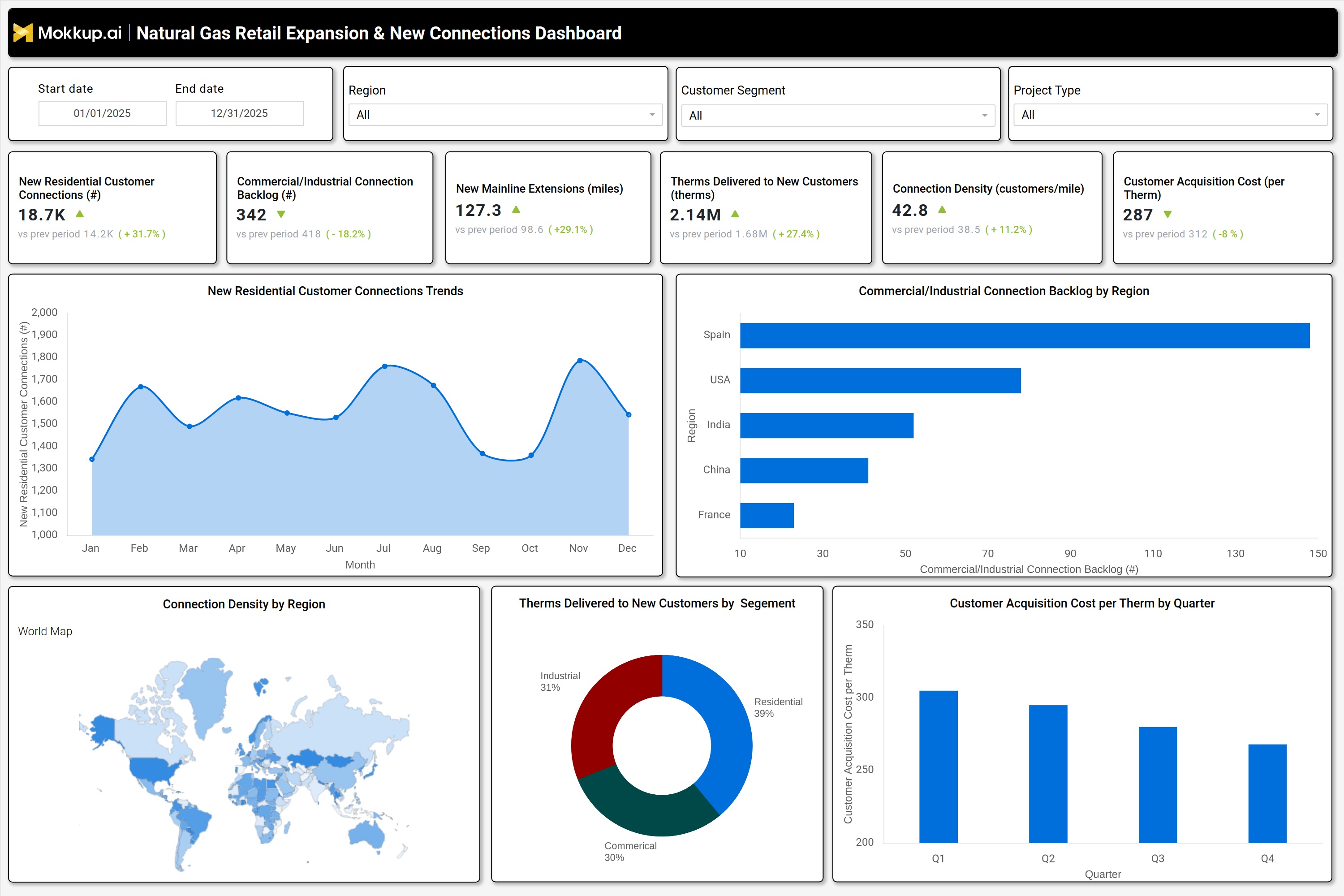
A well-structured natural gas retail expansion dashboard includes interactive filters for date ranges, regions, customer segments, and project types. Key metrics displayed in performance tiles include, New residential customer connections (with growth comparisons),Commercial/industrial connection backlog (by region),Mainline extensions (in miles), Therms delivered to new customers (volume trends), Connection density (customers per mile), Customer acquisition cost per therm.
Visualizations such as trend charts, regional heatmaps, and segmentwise therm distribution provide deeper insights. For example, a dashboard for monitoring gas retail growth trends may show a rising demand in residential connections while highlighting backlog challenges in commercial projects. This helps utilities prioritize expansion efforts and allocate resources efficiently.
How to Analyze Data in a Natural Gas Retail Expansion & New Connections Dashboard
Here is how you can analyze data from this infrastructure expansion dashboard:
- Track new residential and commercial connections to identify growth patterns and demand shifts.
- Monitor mainline extension progress to assess infrastructure expansion efficiency.
- Compare therms delivered to new customers across segments to evaluate market penetration.
- Analyze connection density by region to optimize pipeline deployment.
- Review customer acquisition cost trends to improve cost efficiency in marketing and onboarding.
- Assess commercial/industrial backlog by region to prioritize high-demand areas.
- Benchmark performance against previous periods to measure expansion success.
Benefits of a Natural Gas Retail Expansion & New Connections Dashboard
The following are the benefits of using this new connections tracking dashboard:
- Enhances market expansion planning with data-driven growth insights.
- Improves customer acquisition efficiency by tracking cost per connection.
- Optimizes pipeline and infrastructure investments using connection density analytics.
- Reduces backlog delays by identifying high-demand regions.
- Supports regulatory compliance with transparent reporting on new connections.
- Boosts operational efficiency by streamlining new customer onboarding.
- Enables competitive benchmarking against industry standards.
KPIs to Track in a Natural Gas Retail Expansion & New Connections Dashboard
The following key KPIs can be tracked by using this expanding natural gas retail market insights dashboard:
- New Residential Customer Connections (count): Tracks the number of new household gas connections.
- Commercial/Industrial Connection Backlog (count): Measures pending commercial gas connection requests.
- New Mainline Extensions (miles): Monitors pipeline expansion progress.
- Therms Delivered to New Customers (therms): Evaluates gas consumption growth from new connections.
- Connection Density (customers/mile): Assesses pipeline utilization efficiency.
- Customer Acquisition Cost per Therm ($): Tracks marketing and onboarding expenses per unit of gas delivered.
Frequently Asked Questions
1. What is a natural gas retail expansion dashboard used for?
A Natural Gas Retail Performance Metrics dashboard helps utilities track new connections, monitor growth trends, and optimize expansion strategies.
2. Who should use the gas utility customer acquisition tracking dashboard?
Gas retailers, utility providers, energy analysts, and infrastructure planners.
3. What data sources feed into this expanding natural gas retail market insights dashboard?
CRM systems, pipeline management tools, customer onboarding platforms, and regional demand reports.