
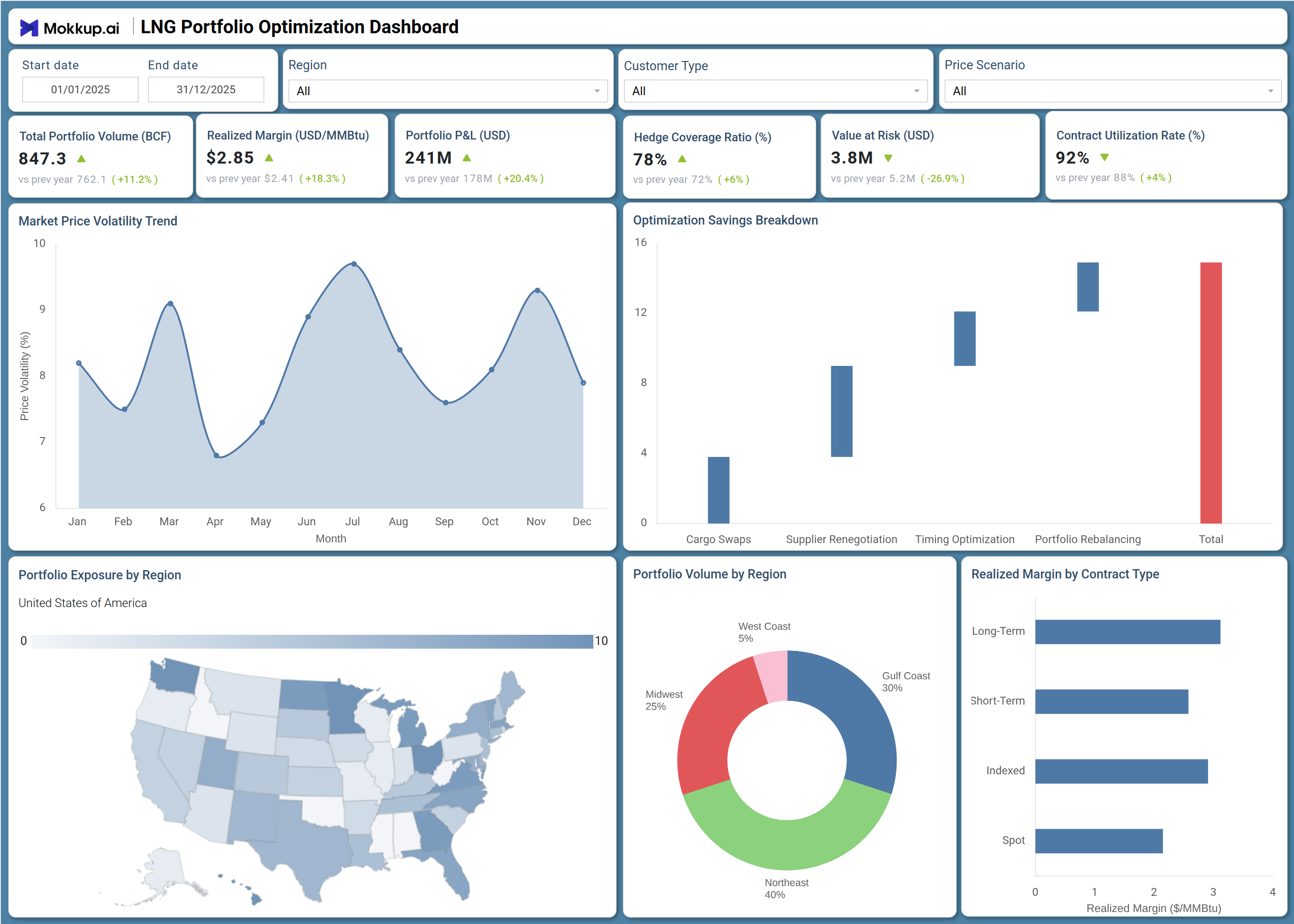
What is a LNG Portfolio Optimization Dashboard?
The LNG Portfolio Optimization Dashboard is a structured analytics template designed for energy traders, portfolio managers, and LNG procurement teams who need a consolidated view of their liquefied natural gas operations. It tracks core financial and risk metrics including total portfolio volume, realized margin, portfolio P&L, hedge coverage ratio, value at risk, and contract utilization rate in a single interface.
By combining regional exposure mapping, contract-type margin analysis, and LNG market price volatility tracking in one place, this LNG portfolio optimization dashboard eliminates the need for multiple disconnected spreadsheets. It is particularly valuable for teams managing a natural gas contract utilization rate across diverse customer types and pricing scenarios who need fast, reliable visibility into portfolio health.
How to Create a LNG Portfolio Optimization Dashboard
You don’t need to build your report from scratch, just start with a ready-to-use LNG Portfolio Optimization dashboard template from Mokkup. Add in your data and export it however you like. Here’s how to do it:
1. Create or Log in to Your Mokkup Account
Start by signing up on Mokkup.ai using your email. If you already have an account, just log in, and you'll be good to go.
2. Choose and Customize Your Dashboard Template
Find the LNG Portfolio Optimization Dashboard template in the Templates section. Use the drag-and-drop editor to adjust KPIs, edit filters, or add elements based on your data.
3. Export to Your BI Tool
Once your dashboard wireframe is ready, use the BI Tool Export feature to send it directly to Power BI or Tableau for further analysis and enhancements. You can also download the dashboard as a PDF, PNG, or JPEG, embed it on a platform, or invite your team to collaborate.
Note: This is a Pro template. You'll need a Pro subscription on Mokkup to use and customize this dashboard wireframe. Upgrade anytime to unlock full access.
LNG Portfolio Optimization Dashboard Example
An energy trading desk typically opens this dashboard at the start of each day to assess overall portfolio health before making contract decisions. The six KPI tiles at the top give an immediate read on whether total volume, margin, and risk exposure are within acceptable bounds without requiring any drill-down. From there, the team can use the Market Price Volatility Trend chart for LNG market price volatility tracking across the full calendar year, identifying seasonal spikes that warrant hedging adjustments or contract renegotiation. The Optimization Savings Breakdown chart helps planners quantify which levers — cargo swaps, supplier renegotiation, timing optimization, or portfolio rebalancing — are delivering the most savings, so resources can be allocated accordingly.
Meanwhile, the Realized Margin by Contract Type chart allows managers to evaluate LNG realized margin by contract type across long-term, short-term, indexed, and spot arrangements, revealing which structure performs best under current market conditions. Taken together, the dashboard gives portfolio teams the clarity to manage hedge coverage ratio LNG portfolio exposure and act with confidence on both operational and strategic decisions, making ongoing LNG portfolio P&L analysis straightforward and consistent.
How to Analyze Data in a LNG Portfolio Optimization Dashboard
Here is how you can analyze data from this dashboard:
- Filter by Region: Isolate portfolio exposure and volume distribution by geographic market.
- Compare Customer Segments: Use the Customer Type filter to analyze margin and contract utilization differences.
- Model Price Scenarios: Apply pricing scenarios to evaluate changes in LNG portfolio P&L outcomes.
- Track Market Volatility: Monitor price volatility trends to identify rising market risk early.
- Evaluate Optimization Strategies: Review the waterfall chart to see which strategies drive the highest savings.
- Analyze Contract Margins: Compare realized margin by contract type to identify the most profitable structures.
- Monitor Regional Concentration: Use the regional volume donut chart to assess concentration risk.
- Assess Geographic Exposure: Track portfolio exposure by region to support diversification planning.
Benefits of a LNG Portfolio Optimization Dashboard
The following are the benefits of using this dashboard:
KPIs to Track in a LNG Portfolio Optimization Dashboard
The following key KPIs can be tracked by using this dashboard:
- Total Portfolio Volume (BCF): Core metric in any LNG portfolio optimization dashboard — measures the total volume of liquefied natural gas held across all contracts within the selected period.
- Realized Margin (USD/MMBtu): Tracks the actual margin earned per unit of LNG delivered — central to any LNG realized margin by contract type evaluation across long-term, short-term, indexed, and spot structures.
- Portfolio P&L (USD): The primary measure of LNG portfolio P&L analysis — captures total profit and loss generated by the portfolio over the selected timeframe.
- Hedge Coverage Ratio (%): Quantifies the share of portfolio volume protected by hedging instruments, central to managing hedge coverage ratio LNG portfolio risk thresholds.
- Value at Risk (USD): Measures the maximum potential financial loss under adverse market conditions within a defined confidence interval.
- Contract Utilization Rate (%): Tracks how effectively contracted LNG volumes are being utilized — a critical measure of natural gas contract utilization rate efficiency and capacity optimization.
Frequently Asked Questions
Q1. What industries benefit most from the LNG Portfolio Optimization Dashboard?
This dashboard is built for energy trading firms, LNG procurement teams, and natural gas utilities managing multi-contract portfolios. Risk analysts and portfolio managers who need consolidated views of margin, volume, and hedging performance across regions will find it most useful.
Q2. Can this dashboard track performance across different contract types?
Yes. The Realized Margin by Contract Type chart breaks down margin performance across long-term, short-term, indexed, and spot contracts. This allows managers to compare which structure delivers the best return under current pricing conditions.
Q3. Is this dashboard suitable for risk management and hedging analysis?
Yes. The dashboard includes dedicated KPI tiles for Hedge Coverage Ratio and Value at Risk, giving risk teams immediate visibility into portfolio exposure. Combined with the Market Price Volatility Trend chart, it supports proactive hedging decisions.