What is an LNG Digital Systems & Predictive Analytics Dashboard?
The LNG Digital Systems & Predictive Analytics Dashboard is a structured monitoring tool built for LNG terminal operators, digital operations teams, and infrastructure managers who need a unified view of system health, maintenance forecasting, and security posture across their facilities. As an LNG digital systems predictive analytics dashboard, it consolidates performance data from SCADA systems, IoT sensors, and predictive analytics platforms into one interface, making it easier to track equipment reliability, alert volumes, and automation gains without switching between tools. Teams use it for digital system uptime monitoring of LNG terminal assets that depend on it, compare equipment-level maintenance accuracy, and identify where automation is generating measurable efficiency improvements. The dashboard supports decisions around maintenance scheduling, cybersecurity threat detection for oil and gas facilities, and operational continuity across the full LNG infrastructure.
How to Create an LNG Digital Systems & Predictive Analytics Dashboard
You don't need to build your report from scratch—just start with a ready-to-use dashboard template from Mokkup. Add in your data and export it however you like. Here’s how to do it:
1. Create or Log in to Your Mokkup Account
Start by signing up on Mokkup.ai using your email. If you already have an account, just log in, and you'll be good to go.
2. Choose and Customize Your Dashboard Template
Find the LNG Digital Systems & Predictive Analytics Dashboard template in the Templates section. Use the drag-and-drop editor to adjust KPIs, edit filters, or add elements based on your data.
3. Export to Your BI Tool
Once your dashboard wireframe is ready, use the BI Tool Export feature to send it directly to Power BI or Tableau for further analysis and enhancements. You can also download the dashboard as a PDF, PNG, or JPEG, embed it on a platform, or invite your team to collaborate.
Note: This is a Pro template. You'll need a Pro subscription on Mokkup to use and customize this dashboard wireframe. Upgrade anytime to unlock full access.
LNG Digital Systems & Predictive Analytics Dashboard Example
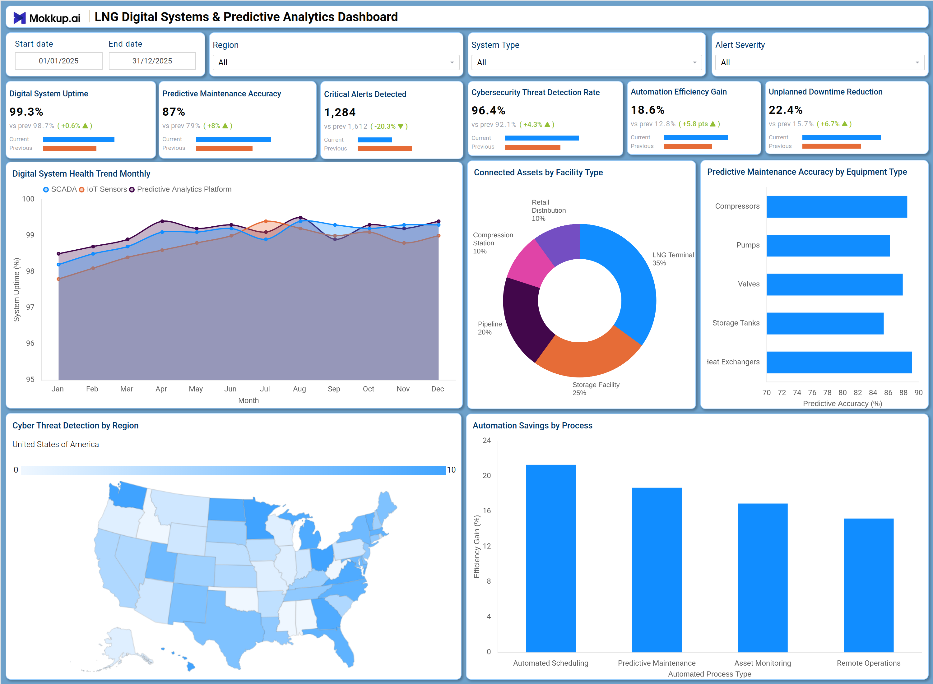
An operations manager at an LNG terminal opens this dashboard at the start of a shift to assess whether the facility is running within expected performance windows. The top row of KPI tiles provides an immediate read on overall system health: teams can quickly assess whether the digital system uptime monitoring LNG terminal operations require is holding within acceptable thresholds, how accurately predictive models are flagging maintenance needs, and how many critical alerts are currently active. If alert volumes are elevated, the cybersecurity team can cross-reference the Cyber Threat Detection by Region map to identify whether threats are concentrated in specific geographies.
This is particularly important where cybersecurity threat detection of oil and gas infrastructure is treated as a priority, since a regional surge in threats can signal a coordinated attack pattern. On the equipment side, the Predictive Maintenance Accuracy by Equipment Type chart allows maintenance planners to compare forecast reliability across compressors, pumps, valves, storage tanks, and heat exchangers, so teams can direct inspection resources where predictive maintenance accuracy in LNG equipment programs shows the greatest gap. The Automation Savings by Process chart shows that automation efficiency gains are most pronounced across automated scheduling, predictive maintenance, asset monitoring, and remote operations, supporting informed decisions about where to invest further in automation.
How to Analyze Data in an LNG Digital Systems & Predictive Analytics Dashboard
Here is how you can analyze data from this dashboard:
- Use the Region filter to narrow the Cyber Threat Detection by Region map to a specific geographic area and assess local risk.
- Apply the System Type filter to isolate performance metrics for SCADA, IoT Sensors, or Predictive Analytics Platform separately.
- Use the Alert Severity filter to focus on high-severity alerts and prioritize response actions across the facility.
- Monitor the Digital System Health Trend Monthly line chart to detect uptime degradation across SCADA and IoT sensor streams over the year.
- Review the Connected Assets by Facility Type donut chart to understand asset distribution across LNG Terminals, Pipelines, and Storage Facilities.
- Analyze the Predictive Maintenance Accuracy by Equipment Type chart to identify which equipment class has the lowest forecast reliability.
- Use the Automation Savings by Process bar chart to compare efficiency gains across Automated Scheduling, Predictive Maintenance, Asset Monitoring, and Remote Operations.
- Set the Start Date and End Date filters to compare performance across specific operational periods.
Benefits of a LNG Digital Systems & Predictive Analytics Dashboard
The following are the benefits of using this dashboard:
- Consolidates SCADA, IoT, and predictive analytics platform data into one structured LNG digital systems predictive analytics dashboard.
- Supports predictive maintenance accuracy LNG equipment tracking across five distinct equipment types in a single view.
- Reduces manual reporting effort with pre-built KPI tiles covering uptime, alert volumes, and automation gains.
- Enables facility-level visibility through the connected assets facility type LNG dashboard breakdown across terminals, pipelines, and storage.
- Provides a regional threat map that strengthens cybersecurity threat detection oil and gas operations teams depend on.
- Tracks automation efficiency gain LNG operations leadership can act on, broken down by process type.
- Supports date-range filtering for period-over-period analysis without rebuilding the report structure.
KPIs to Track in a LNG Digital Systems & Predictive Analytics Dashboard
The following key KPIs can be tracked by using this dashboard:
- Digital System Uptime: Measures the percentage of time digital systems remain operational, central to digital system uptime monitoring LNG terminal teams rely on.
- Predictive Maintenance Accuracy: Tracks how often predictive models correctly forecast maintenance needs, a core metric in predictive maintenance accuracy LNG equipment programs.
- Critical Alerts Detected: Counts the number of high-priority alerts raised across monitored systems, indicating potential failures or security events requiring immediate action.
- Cybersecurity Threat Detection Rate: Measures the proportion of threats identified by security systems, directly supporting cybersecurity threat detection oil and gas facilities require.
- Automation Efficiency Gain: Quantifies the operational efficiency improvement delivered by automation tools, tied directly to automation efficiency gain LNG operations leadership tracks.
- Unplanned Downtime Reduction: Tracks the decrease in unplanned outages over the measured period, reflecting the combined effect of predictive maintenance and digital monitoring programs.
Frequently Asked Questions
1. Who should use the LNG Digital Systems & Predictive Analytics Dashboard?
This dashboard is built for LNG terminal operators, digital infrastructure managers, and cybersecurity teams. It is also relevant for operations analysts and maintenance planners who need a consolidated view of system health, alert activity, and automation performance.
2. Can this dashboard track performance across different facility types?
Yes. The Connected Assets by Facility Type donut chart breaks down asset distribution across LNG Terminals, Storage Facilities, Pipelines, Compression Stations, and Power Distribution. Teams can use the System Type filter to further isolate data by system category.
3. How does the Cyber Threat Detection by Region map work?
The map visualizes threat detection activity across U.S. regions using a choropleth format, where color intensity indicates the concentration of detected threats. Security teams can use it alongside the Alert Severity filter to prioritize regional response actions.