What is an Irrigation Water Distribution Losses & Efficiency Dashboard?
The Irrigation Water Distribution Losses and Efficiency Dashboard is a structured analytics tool designed for water utility managers, irrigation planners, and infrastructure teams who need to monitor the efficiency of water movement from source to end use. It consolidates supply, delivery, and loss data into a single view, enabling teams to track distribution performance across multiple source types, including reservoir supply, river intake, groundwater wells, and canal feed systems. The dashboard is built to surface patterns in water loss, identify zones where distribution efficiency falls below acceptable thresholds, and support decisions on maintenance prioritization and infrastructure investment. By combining flow analysis, trend monitoring, loss attribution, and geographic performance mapping, it gives operations teams the complete picture needed to reduce waste and improve irrigation network performance.
How to Create an Irrigation Water Distribution Losses & Efficiency Dashboard
You don't need to build your report from scratch, just start with a ready-to-use dashboard template from Mokkup. Add in your data and export it however you like. Here's how to do it:
1. Create or Log in to Your Mokkup Account
Start by signing up on Mokkup.ai using your email. If you already have an account, just log in, and you'll be good to go.
2. Choose and Customize Your Dashboard Template
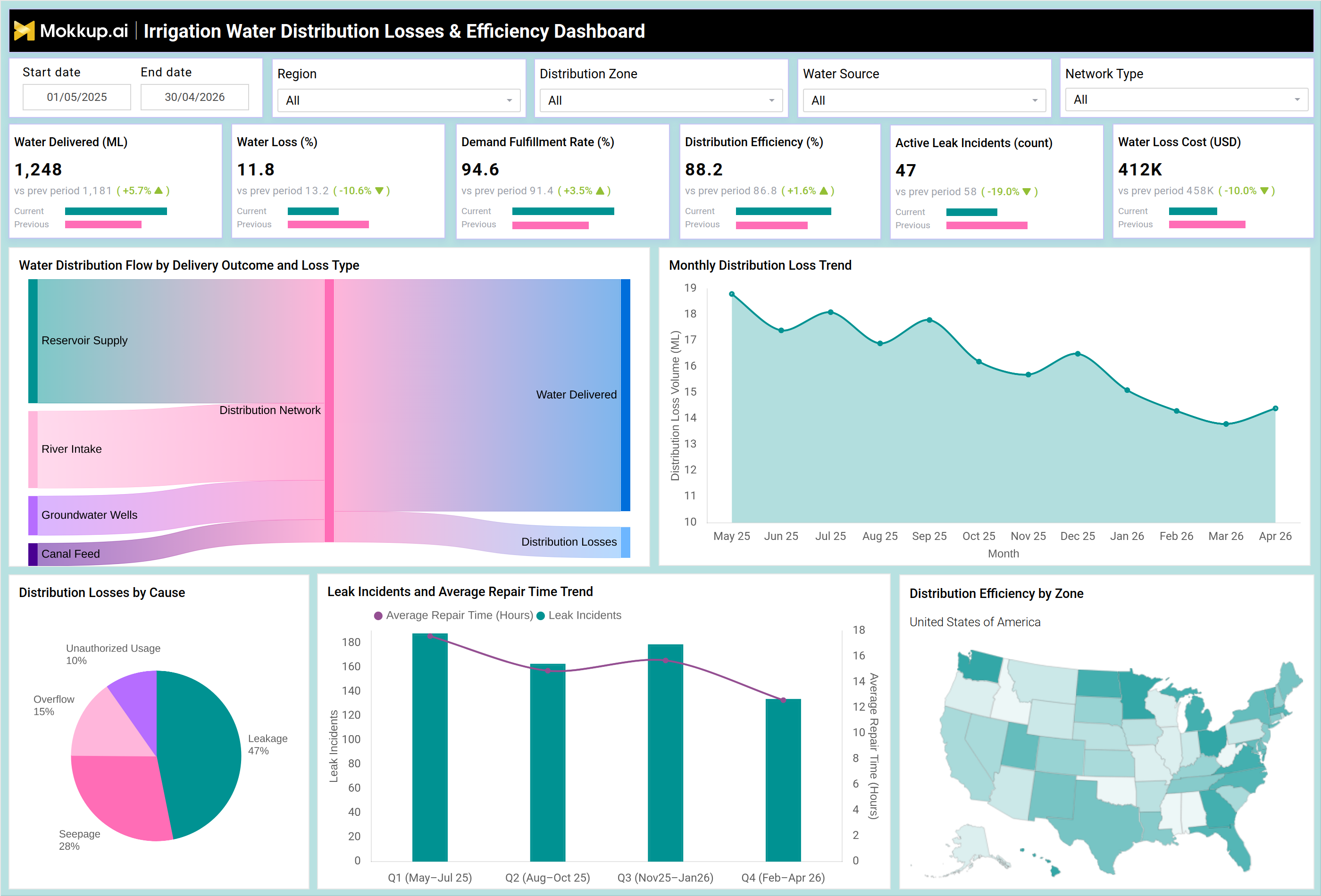
Find the Irrigation Water Distribution Losses & Efficiency Dashboard template in the Templates section. Use the drag-and-drop editor to adjust KPIs, edit filters, or add elements based on your data.
3. Export to Your BI Tool
Once your dashboard wireframe is ready, use the BI Tool Export feature to send it directly to Power BI or Tableau for further analysis and enhancements. You can also download the dashboard as a PDF, PNG, or JPEG, embed it on a platform, or invite your team to collaborate.
Note: This is a Pro template. You'll need a Pro subscription on Mokkup to use and customize this dashboard wireframe. Upgrade anytime to unlock full access.
Irrigation Water Distribution Losses & Efficiency Dashboard Example
When an irrigation network manager opens this dashboard, the first thing they see is a summary row of core operational metrics, covering total water delivered, the percentage lost in transit, demand fulfillment performance, overall distribution efficiency, the count of active leak incidents, and the financial cost attributed to water loss. These headline figures immediately signal whether the network is performing within acceptable bounds or whether corrective action is needed before the situation worsens. Moving deeper into the dashboard, teams can trace water distribution losses and efficiency tracking across the full delivery chain using the flow diagram, which maps volume from each source type through the distribution network and into final delivery or loss categories. This helps planners pinpoint which source-to-delivery pathways are contributing most to losses, supporting more targeted remediation.
The monthly distribution loss trend view allows managers to compare current-period performance against prior months, making it straightforward to identify whether loss rates are seasonal, structural, or tied to specific maintenance gaps. The losses-by-cause breakdown enables operations teams to distinguish between leakage, overflow, seepage, and unauthorized usage, which is critical for water loss monitoring since each cause type demands a different response. Meanwhile, the leak incident management view tracks both the volume of incidents over time and how quickly repair teams are resolving them, giving supervisors visibility into field responsiveness across quarters. For regional planners, the geographic efficiency map provides water distribution zone efficiency analysis at a glance, making it easy to compare performance across zones and direct resources toward areas with the greatest need. Taken together, the dashboard gives irrigation teams the data depth needed to reduce losses, improve fulfillment rates, and make evidence-based decisions about irrigation network performance and infrastructure priorities.
How to Analyze Data in an Irrigation Water Distribution Losses & Efficiency Dashboard
Here is how you can analyze data from this leak incident management dashboard:
- Use the flow diagram to trace where water volume is lost across each source-to-delivery pathway.
- Monitor the monthly distribution loss trend to detect seasonal patterns or deteriorating network conditions.
- Review the losses-by-cause breakdown to separate leakage, overflow, seepage, and unauthorized usage.
- Track leak incident counts alongside average repair time to evaluate field team responsiveness.
- Apply the Distribution Zone filter to isolate the irrigation water distribution losses dashboard data by network segment.
- Use the geographic map for water distribution zone efficiency analysis across regions.
- Filter by Water Source and Network Type to compare performance across different infrastructure configurations.
- Compare current-period and prior-period KPI values to assess whether distribution efficiency tracking is improving.
Benefits of an Irrigation Water Distribution Losses & Efficiency Dashboard
The following are the benefits of using this distribution efficiency tracking dashboard:
- Gives operations teams a single source of truth for water loss monitoring across the full irrigation network.
- Supports faster identification of high-loss zones through geographic and categorical breakdowns.
- Reduces investigation time by attributing losses to specific causes, such as leakage or unauthorized usage.
- Improves maintenance planning by linking leak incident volume to repair turnaround time.
- Enables data-driven budget justification for infrastructure upgrades based on water loss cost figures.
- Supports compliance reporting by tracking demand fulfillment and distribution efficiency over time.
- Helps planners prioritize resources toward zones with the weakest irrigation network performance.
- Provides trend context that distinguishes short-term spikes from persistent structural loss patterns.
KPIs to Track in an Irrigation Water Distribution Losses & Efficiency Dashboard
The following key KPIs can be tracked by using this dashboard:
- Water Delivered (ML): The total volume of water, measured in megalitres, that successfully reaches end-use points within the irrigation network during the selected period.
- Water Loss (%): The percentage of total water input that is lost in transit due to leakage, seepage, overflow, or unauthorized usage before reaching the delivery point.
- Demand Fulfillment Rate (%): The proportion of total water demand that is successfully met through the distribution network, indicating how well supply matches agricultural or end-user need.
- Distribution Efficiency (%): A composite measure of how effectively the network delivers water from source to destination, accounting for losses across all delivery pathways.
- Active Leak Incidents (count): The current number of identified and unresolved leak events within the network, used to gauge the scale of ongoing maintenance requirements.
- Water Loss Cost (USD): The estimated financial cost associated with water lost during distribution, used to quantify the economic impact of network inefficiencies.
- Average Repair Time (hours): The mean time taken to resolve a reported leak incident, tracked across quarters to assess the responsiveness of maintenance operations.
Frequently Asked Questions
1. What types of water loss can this dashboard help identify?
The dashboard categorizes losses into leakage, overflow, seepage, and unauthorized usage, allowing teams to understand the primary drivers of water loss in their network. Each category points to a different operational or infrastructure issue, making it easier to direct the right response.
2. Can this dashboard be used for both large-scale and small irrigation networks?
Yes, the template is designed to scale across network sizes. The distribution zone and region filters allow teams to narrow the view to specific segments, making it suitable for both broad utility-level oversight and localized irrigation network performance monitoring.
3. How does the leak incident trend help with maintenance planning?
By pairing incident counts with average repair time across quarters, the dashboard highlights whether the maintenance backlog is growing and whether response times are improving or declining. This supports more informed staffing and scheduling decisions for field operations teams.