
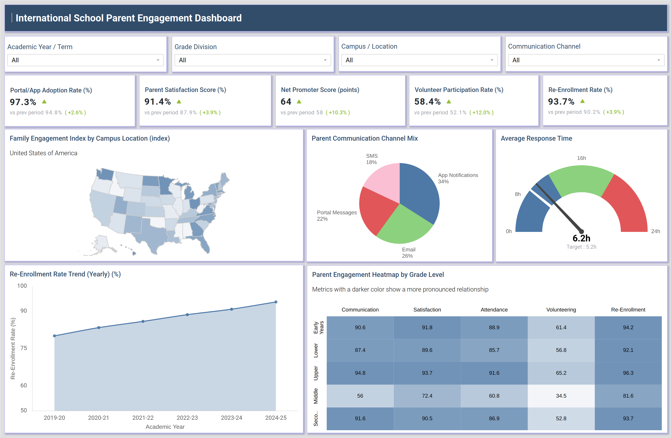
What is an International School Parent Engagement Dashboard
An International School Parent Engagement Dashboard is a reporting tool that helps school leadership and communications teams monitor how effectively they reach, inform, and involve parents across an international school network. It consolidates portal adoption, satisfaction, communication response, and volunteering signals into a single view so administrators do not have to pull data from separate systems. As a parent portal adoption rate tracking tool, it also shows whether digital communication tools are gaining consistent use across grade divisions and campuses.
Because international schools often operate across multiple campuses, grade divisions, and communication channels, this international school parent engagement dashboard brings consistency to how engagement is measured and compared across contexts. Filters for academic year, grade division, campus location, and communication channel let teams narrow the view to a specific term, division, or outreach method without losing the full picture. The dashboard also supports a re-enrollment rate trend analysis for schools across multiple academic years, connecting day-to-day engagement activity to long-term family retention outcomes.
How to Create an International School Parent Engagement Dashboard
You don't need to build your report from scratch-just start with a ready-to-use dashboard template from Mokkup. Add your data and export it as needed. Here's how to do it:
1. Create or Log in to Your Mokkup Account
Start by signing up on Mokkup.ai using your email. If you already have an account, just log in, and you'll be good to go.
2. Choose and Customize Your Dashboard Template
Find the International School Parent Engagement Dashboard template in the Templates section. Use the drag-and-drop editor to adjust KPIs, edit filters, or add elements based on your data.
3. Export to Your BI Tool
Once your dashboard wireframe is ready, use the BI Tool Export feature to send it directly to Power BI or Tableau for further analysis and enhancements. You can also download the dashboard as a PDF, PNG, or JPEG, embed it on a platform, or invite your team to collaborate.
Note: This is a Pro template. You'll need a Pro subscription on Mokkup to use and customize this dashboard wireframe. Upgrade anytime to unlock full access.
International School Parent Engagement Dashboard Example
A communications director or head of school opens this international school parent engagement dashboard at the start of each term to understand how parents across every campus are engaging with the school. They arrive with a specific question in mind, whether the parent portal is being adopted consistently across grade divisions or whether one campus is lagging on family engagement. Before making any outreach decisions, they want a clear read on where attention is needed and where existing programs are working.
From here, teams can identify which campus locations show weaker family engagement so outreach resources can be redirected accordingly. Managers can compare how parents are choosing to communicate, whether through app notifications, email, portal messages, or SMS, and adjust which channel gets emphasized for a given announcement. When response times to parent messages start slipping against the target, staffing or workflow changes can be prioritized before satisfaction erodes. Planners can also track how engagement patterns differ by grade division, since younger grade divisions tend to show different volunteering and communication behavior than upper grades, and can tailor programs to each division rather than applying a single approach school-wide.
Taken together, this view helps school leadership move from reacting to isolated complaints toward proactively strengthening the relationships that drive both satisfaction and long-term re-enrollment. Instead of guessing which campuses or grade divisions need more attention, teams can prioritize limited outreach resources where the data shows the clearest gaps and track whether those efforts are moving the needle over successive academic years.
How to Analyze Data in an International School Parent Engagement Dashboard
Here is how you can analyze data from this dashboard:
- Filter by Academic Year / Term: Compare engagement patterns across different periods without mixing historical data.
- Segment by Grade Division: Identify how communication and volunteering habits vary across age groups.
- Use Campus / Location filters: Track the family engagement index by campus and compare scores across school sites.
- Switch the Communication Channel filter: Review the parent communication channel mix to see which channels parents use most.
- Cross-reference the Parent Engagement Heatmap by Grade Level: Identify where communication, satisfaction, attendance, volunteering, and re-enrollment overlap.
- Track Average Response Time: Compare response times against the target to identify service slowdowns early.
- Monitor Re-Enrollment Rate Trend: Connect current engagement activity with future enrollment outcomes.
Benefits of an International School Parent Engagement Dashboard
The following are the benefits of using this dashboard:
- Consolidates Engagement Data: Brings portal adoption, satisfaction, and communication data into one view instead of scattered reports.
- Monitors Average Response Time: Helps schools identify service gaps before they affect parent satisfaction.
- Tracks Parent Portal Adoption: Measures portal usage across campuses to gauge how widely families use the platform.
- Analyzes Communication Preferences: Shows which channels parents prefer, helping schools improve outreach targeting and campaign timing.
- Connects Engagement to Re-Enrollment: Links engagement metrics with re-enrollment outcomes to support stronger retention planning.
- Supports Term-over-Term Reviews: Gives administrators a shared view for comparing engagement across terms and grade divisions.
KPIs to Track in an International School Parent Engagement Dashboard
The following key KPIs can be tracked by using this parent communication channel mix analysis dashboard:
- Portal/App Adoption Rate (%): the share of parents actively using the school's parent portal or mobile app.
- Parent Satisfaction Score (%): overall parent sentiment toward school communication and engagement efforts.
- Net Promoter Score (points): the likelihood that parents would recommend the school to other families.
- Volunteer Participation Rate (%): the share of parents taking part in volunteering programs and school events.
- Re-Enrollment Rate (%): the share of families choosing to re-enroll their children for the next academic year.
Frequently Asked Questions
1. What is the purpose of an International School Parent Engagement Dashboard?
It gives school leadership a single view of how parents are engaging with the school across campuses, grade divisions, and communication channels. This makes it easier to spot gaps in outreach and respond before satisfaction or re-enrollment is affected.
2. Which metrics matter most on a parent engagement dashboard?
Portal adoption, parent satisfaction, response time, and re-enrollment rate are the core metrics because they connect communication quality with long-term family retention. Communication channel mix also matters since it shows where outreach investment should go.
3. Can this dashboard be customized for a specific school network?
Yes. Using the drag-and-drop editor, filters, KPIs, and chart layouts can all be adjusted to match a specific school network before running a re-enrollment rate trend analysis for schools on your own data.