
What is a Hydrogen Blend Pricing & Tariff Impact Dashboard?
The Hydrogen Blend Pricing & Tariff Impact Dashboard is a structured analytics template designed for energy utility planners, tariff analysts, and regulatory affairs teams managing the commercial transition to blended hydrogen gas networks. As utilities begin integrating hydrogen into existing natural gas infrastructure, pricing structures become significantly more complex. This hydrogen blend pricing dashboard template provides a centralized view of tariff performance, regulatory approval cycles, and bill impact across customer segments. It tracks key financial and compliance metrics, including average tariff rates, hydrogen cost premium monitoring across regions, and revenue recovery rates, giving teams the clarity they need to make data-informed pricing decisions. By consolidating region-level tariff data alongside regulatory status tracking, this template helps organizations manage the customer bill impact of hydrogen blend programs without losing sight of affordability or regulatory compliance.
How to Create a Hydrogen Blend Pricing & Tariff Impact Dashboard
You don’t need to build your report from scratch—just start with a ready-to-use dashboard template from Mokkup. Add in your data and export it however you like. Here’s how to do it:
1. Create or Log in to Your Mokkup Account
Start by signing up on Mokkup.ai using your email. If you already have an account, just log in, and you'll be good to go.
2. Choose and Customize Your Dashboard Template
Find the Hydrogen Blend Pricing & Tariff Impact Dashboard template in the Templates section. Use the drag-and-drop editor to adjust KPIs, edit filters, or add elements based on your data.
3. Export to Your BI Tool
Once your dashboard wireframe is ready, use the BI Tool Export feature to send it directly to Power BI or Tableau for further analysis and enhancements. You can also download the dashboard as a PDF, PNG, or JPEG, embed it on a platform, or invite your team to collaborate.
Note: This is a Pro template. You'll need a Pro subscription on Mokkup to use and customize this dashboard wireframe. Upgrade anytime to unlock full access.
Hydrogen Blend Pricing & Tariff Impact Dashboard Example
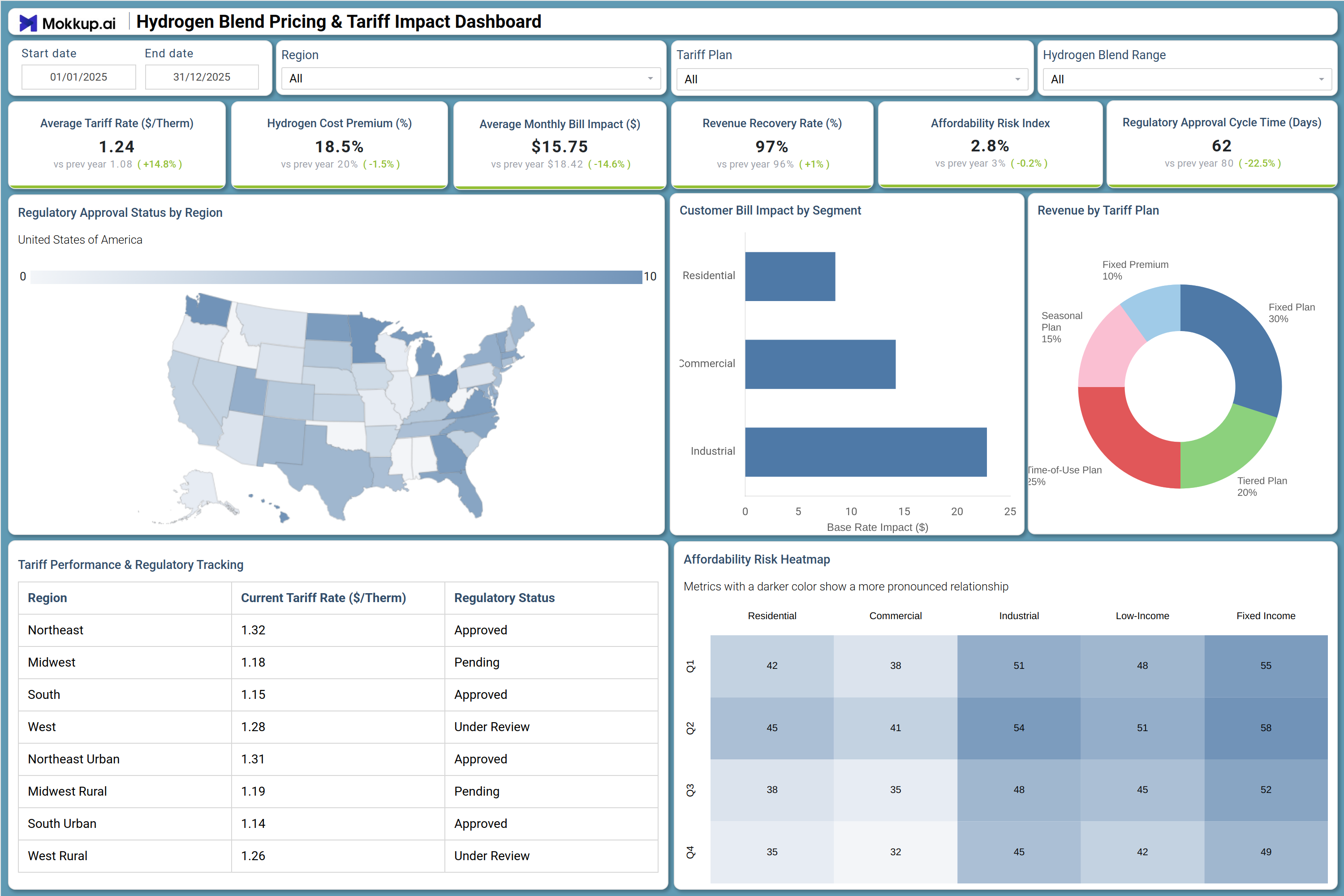
A utility pricing analyst opens this dashboard at the start of a quarterly tariff review cycle to assess how the current hydrogen blend pricing program is performing across regions and customer segments. The six KPI tiles immediately surface whether the average tariff rate has shifted from the prior year, whether the hydrogen cost premium is tracking within acceptable thresholds, and how revenue recovery is holding. If the affordability risk index hydrogen tariff metric is trending upward, the team can move directly into the Affordability Risk Heatmap to understand which customer segments are carrying the greatest financial exposure.
Regulatory affairs teams use the Regulatory Approval Status by Region map to identify which states have pending or under-review tariff filings, allowing them to prioritize follow-up before approval cycles extend beyond target timelines. The Tariff Performance & Regulatory Tracking table provides a line-by-line breakdown of current tariff rates by region alongside their regulatory status, supporting the tariff impact analysis that hydrogen energy teams need to align pricing strategy with jurisdiction-specific timelines. The Customer Bill Impact by Segment chart and the Revenue by Tariff Plan donut chart give pricing and policy teams a complete view of how revenue is distributed across plan types and how customer bill impact hydrogen blend programs are affecting each segment.
How to Analyze Data in a Hydrogen Blend Pricing & Tariff Impact Dashboard
Here is how you can analyze data from this dashboard:
- Use the Region dropdown to isolate tariff performance and regulatory approval status for a specific geographic market.
- Apply the Tariff Plan filter to compare how fixed, tiered, time-of-use, seasonal, and fixed premium structures drive revenue distribution.
- Use the Hydrogen Blend Range filter to assess how blend concentration levels correlate with cost premiums and bill impacts.
- Monitor the Regulatory Approval Cycle Time KPI to flag regions where regulatory approval tracking hydrogen utilities workflows are running over benchmark.
- Review the Affordability Risk Heatmap to identify which customer segments face the highest financial exposure from tariff adjustments.
- Analyze the Customer Bill Impact by Segment bar chart to compare base rate impact across residential, commercial, and industrial customers.
- Use the Tariff Performance & Regulatory Tracking table to cross-reference current tariff rates with regulatory status across all regions.
- Track Revenue Recovery Rate over time to confirm that pricing adjustments are sustaining utility financial targets.
Benefits of a Hydrogen Blend Pricing & Tariff Impact Dashboard
The following are the benefits of using this dashboard:
- Centralizes tariff rate, regulatory status, and bill impact data across all regions in one structured dashboard template.
- Supports tariff impact analysis hydrogen energy programs by tracking multiple pricing plan types simultaneously.
- Reduces manual data compilation for quarterly tariff reviews with pre-built KPI tiles and visual chart layouts.
- Enables region-level affordability risk index hydrogen tariff monitoring to guide pricing and infrastructure decisions.
- Provides a heatmap breakdown of affordability exposure across residential, commercial, industrial, low-income, and fixed income segments.
- Helps regulatory affairs teams align tariff submissions with jurisdiction-specific approval timelines and status tracking.
- Gives pricing analysts and policy planners a shared view of hydrogen blend program financial and regulatory performance
KPIs to Track in a Hydrogen Blend Pricing & Tariff Impact Dashboard
The following key KPIs can be tracked by using this dashboard:
- Average Tariff Rate ($/Therm): Core to any hydrogen blend pricing dashboard template — measures the blended cost per therm charged to customers against prior year benchmarks.
- Hydrogen Cost Premium (%): Tracks the percentage markup that hydrogen blending adds to the base natural gas tariff, supporting hydrogen cost premium monitoring tool workflows across all regions.
- Average Monthly Bill Impact ($): Quantifies the dollar change in a typical customer monthly bill attributable to hydrogen blend pricing adjustments.
- Revenue Recovery Rate (%): Measures how effectively current tariff structures are recovering allowable utility costs — key to tariff impact analysis hydrogen energy evaluations.
- Affordability Risk Index: Evaluates the financial burden placed on customer segments by hydrogen pricing changes — a lower value indicates reduced strain, central to affordability risk index hydrogen tariff assessments.
- Regulatory Approval Cycle Time (Days): Tracks average days from tariff filing to regulatory approval, supporting regulatory approval tracking hydrogen utilities workflows across all jurisdictions.
Frequently Asked Questions
1. What industries benefit most from this Hydrogen Blend Pricing & Tariff Impact Dashboard?
This dashboard is most valuable for natural gas utilities, energy regulatory teams, and public utility commissions managing hydrogen blend programs. Energy consultants and tariff analysts advising utilities on pricing strategy will also find it useful.
2. Can this dashboard track regulatory approval status across multiple regions?
Yes. The Regulatory Approval Status by Region map and the Tariff Performance & Regulatory Tracking table both display approval status — Approved, Pending, or Under Review — for each region, enabling teams to monitor all jurisdictions simultaneously.
3. Is this dashboard suitable for affordability analysis of hydrogen tariff programs?
Yes. The Affordability Risk Heatmap segments financial exposure across residential, commercial, industrial, low-income, and fixed income customer groups, making it well-suited for affordability impact assessment alongside hydrogen pricing strategy work.