What is a Hydrogen Blend Gas Risk Exposure and Scenario Performance Dashboard?
The Hydrogen Blend Gas Risk Exposure and Scenario Performance Dashboard is a structured analytical tool designed for energy sector teams managing risk across hydrogen blending operations. It consolidates enterprise-wide risk metrics, financial exposure data, compliance status, and asset health into a single, decision-ready view. The dashboard surfaces KPIs such as total risk exposure percentage, potential financial loss, compliant operations rate, and stress test pass rates — giving operations managers a precise picture of where risk concentrations exist across equipment types and business areas. With filters for facility, risk category, and asset type, teams can slice data by operational context and apply hydrogen blend gas risk exposure scenario analysis to isolate the factors that matter most to their planning cycles.
How to Create a Hydrogen Blend Gas Risk Exposure and Scenario Performance Dashboard
You don't need to build your report from scratch—just start with a ready-to-use dashboard template from Mokkup. Add in your data and export it however you like. Here's how to do it:
1. Create or Log in to Your Mokkup Account
Start by signing up on Mokkup.ai using your email. If you already have an account, just log in, and you'll be good to go.
2. Choose and Customize Your Dashboard Template
Find the Hydrogen Blend Gas Risk Exposure and Scenario Performance Dashboard template in the Templates section. Use the drag-and-drop editor to adjust KPIs, edit filters, or add elements based on your data.
3. Export to Your BI Tool
Once your dashboard wireframe is ready, use the BI Tool Export feature to send it directly to Power BI or Tableau for further analysis and enhancements. You can also download the dashboard as a PDF, PNG, or JPEG, embed it on a platform, or invite your team to collaborate.
Note: This is a Pro template. You'll need a Pro subscription on Mokkup to use and customize this dashboard wireframe. Upgrade anytime to unlock full access.
Hydrogen Blend Gas Risk Exposure and Scenario Performance Dashboard Example
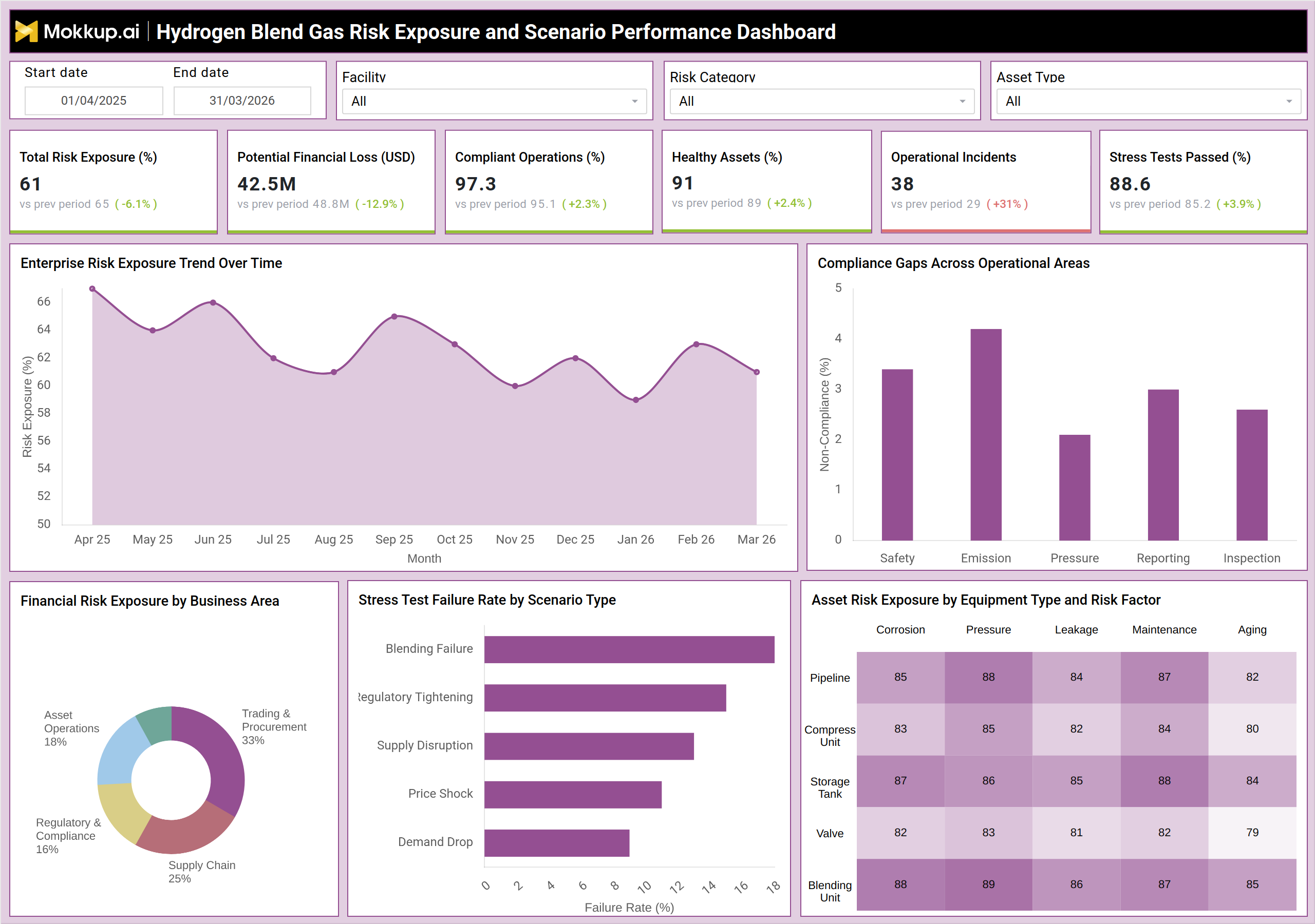
A risk manager at a natural gas utility using hydrogen blending programs would open this dashboard at the start of each reporting cycle to get a fast read on enterprise risk posture. The KPI row provides an immediate snapshot — total risk exposure, compliant operations percentage, healthy assets, and stress tests passed — so the team knows before any deep-dive whether the operation is trending in or out of tolerance. The Enterprise Risk Exposure Trend Over Time chart lets managers track how hydrogen blend gas risk exposure has shifted month by month, spotting whether recent blending adjustments have driven the exposure percentage up or down across the 12-month window.
From there, teams can compare compliance gaps across operational areas — safety, emission, pressure, reporting, and inspection — to prioritize which compliance deficits need immediate attention. The Financial Risk Exposure by Business Area donut chart enables procurement and supply chain planners to identify which segments carry the heaviest financial concentration, supporting hydrogen blending infrastructure risk management decisions around budget allocation and vendor strategy. A dedicated stress test failure rate chart by scenario type covering blending failure, regulatory tightening, supply disruption, price shock, and demand drop gives scenario planners the data they need to evaluate which failure modes pose the greatest operational threat.
The Asset Risk Exposure heatmap rounds out the analytical picture by mapping equipment categories — including pipeline, compressor unit, storage tank, valve, and blending unit — against risk factors including corrosion, pressure, leakage, maintenance, and aging. Maintenance engineers can identify which equipment and risk factor combinations require priority intervention, making it straightforward to build a targeted inspection schedule. Together, these views support an end-to-end gas infrastructure risk assessment workflow, from executive summary to asset-level detail. The dashboard also includes date range controls and category filters that allow teams to apply hydrogen blend performance scenario modeling for specific time windows or facility types. This makes it easy to generate period-over-period comparisons and present focused risk narratives to stakeholders without navigating multiple reports.
How to Analyze Data in a Hydrogen Blend Gas Risk Exposure and Scenario Performance Dashboard
Here is how you can analyze data from this dashboard:
- Filter by facility, risk category, or asset type to narrow the analysis to a specific operational segment.
- Use the Enterprise Risk Exposure Trend chart to track exposure percentage movement over the 12 months.
- Review the Compliance Gaps bar chart to rank operational areas by non-compliance rate and direct remediation efforts.
- Consult the Financial Risk Exposure donut chart to identify which business areas carry disproportionate financial risk.
- Evaluate stress test failure rates by scenario type to determine which external disruptions pose the highest threat to hydrogen blending operations.
- Cross-reference the Asset Risk Exposure heatmap against maintenance schedules to prioritize inspection and repair tasks.
- Compare current KPI values against previous period benchmarks to assess whether hydrogen blend gas safety performance monitoring is improving.
Benefits of a Hydrogen Blend Gas Risk Exposure and Scenario Performance Dashboard
The following are the benefits of using this dashboard:
- Provides a consolidated view of enterprise-wide risk across all hydrogen blending facilities and asset classes.
- Supports hydrogen blend performance scenario modeling by presenting multiple failure scenario types in a single chart.
- Enables compliance gap identification across safety, emission, pressure, reporting, and inspection areas at a glance.
- Reduces the time required to prepare risk reports by centralizing KPIs, trends, and heatmaps in one screen.
- Improves hydrogen blending infrastructure risk management by mapping asset-level risk factors to specific equipment types.
- Facilitates clearer communication with stakeholders by presenting financial exposure and stress test data in accessible visual formats.
- Supports period-over-period performance comparison using built-in trend charts and variance indicators on each KPI tile.
- Strengthens hydrogen blend operational compliance tracking by consolidating compliance gap data, incident counts, and audit-ready KPIs in one screen.
KPIs to Track in a Hydrogen Blend Gas Risk Exposure and Scenario Performance Dashboard
The following key KPIs can be tracked by using this dashboard:
- Total Risk Exposure (%): The aggregate percentage of operations or assets currently classified as at-risk, used for hydrogen blend gas risk exposure scenario analysis.
- Potential Financial Loss (USD): The estimated monetary value at risk across all business areas and facilities.
- Compliant Operations (%): The percentage of operational activities meeting regulatory and internal compliance requirements.
- Healthy Assets (%): The share of assets across equipment types assessed as fully operational and within acceptable performance thresholds.
- Operational Incidents: The count of recorded incidents within the selected period — a core metric in hydrogen blend gas safety performance monitoring.
- Stress Tests Passed (%): The percentage of scenario-based stress tests where operations met required resilience criteria, directly tied to hydrogen blend performance scenario modeling outcomes.
- Non-Compliance Rate by Operational Area: Derived from the Compliance Gaps chart; breaks down compliance failures across safety, emission, pressure, reporting, and inspection.
- Asset Risk Score by Equipment and Risk Factor: Heatmap-derived scores for pipeline, compressor unit, storage tank, valve, and blending unit across corrosion, pressure, leakage, maintenance, and aging dimensions.
- Stress Test Failure Rate by Scenario Type: Failure rates for blending failure, regulatory tightening, supply disruption, price shock, and demand drop scenarios.
- Financial Risk Exposure by Business Area: Percentage share of total financial risk attributable to asset operations, trading & procurement, supply chain, and regulatory & compliance segments.
Frequently Asked Questions
1. What types of scenarios does this dashboard cover for stress testing?
The dashboard covers five scenario types: blending failure, regulatory tightening, supply disruption, price shock, and demand drop. Each is displayed with its associated failure rate so teams can prioritize scenario planning based on the highest-risk outcomes.
2. Can this dashboard be used for gas infrastructure risk assessment across multiple facilities?
Yes. The Facility filter allows teams to isolate data for individual sites or view aggregated results across all facilities. This makes it suitable for enterprise-level gas infrastructure risk assessment as well as site-specific reporting.
3. How does this dashboard support hydrogen blend gas safety performance monitoring over time?
The Enterprise Risk Exposure Trend Over Time chart displays month-by-month exposure data across a 12-month window. Combined with period-over-period variance indicators on each KPI tile, it gives teams a structured view of whether safety performance is improving or declining.