What Is a Hydrogen Blend Gas Decarbonization & Emissions Reduction Dashboard?
A hydrogen gas decarbonization and emissions reduction dashboard is a specialized analytics platform designed for natural gas utilities to monitor, track, and optimize the environmental impact of blending hydrogen with natural gas. This hydrogen gas emissions reduction tracking dashboard consolidates key performance metrics, including total hydrogen volume blended, avoided CO₂ emissions, methane leakage rates, and infrastructure investments, into a single, interactive interface. By integrating data from pipeline operations, blending facilities, and emissions monitoring systems, utilities gain insights into decarbonization progress and operational efficiency.
This natural gas utilities decarbonization monitoring tool helps energy providers assess the effectiveness of hydrogen blending programs, identify emission reduction opportunities, and ensure compliance with sustainability regulations. It also enables stakeholders to compare performance across different geographic regions, blend ratios, and funding sources, supporting data-driven decision-making for a cleaner energy transition.
How to Create a Hydrogen Blend Gas Decarbonization & Emissions Reduction Dashboard
You don’t need to build your report from scratch, just start with a ready-to-use dashboard template from Mokkup. Add in your data and export it however you like. Here’s how to do it:
1. Create or Log in to Your Mokkup Account
Start by signing up on Mokkup.ai using your email. If you already have an account, just log in, and you’ll be good to go.
2. Choose and Customize Your Dashboard Template
Find the Hydrogen Blend Gas Decarbonization & Emissions Reduction Dashboard template in the Templates section. Use the drag and drop editor to adjust KPIs, edit filters, or add elements based on your data.
3. Export to Your BI Tool
Once your dashboard wireframe is ready, use the BI Tool Export feature to send it directly to Power BI or Tableau for further analysis and enhancements. You can also download the dashboard as a PDF, PNG, or JPEG, embed it on a platform, or invite your team to collaborate.
Note: This is a Pro template. You’ll need a Pro subscription on Mokkup to use and customize this dashboard wireframe. Upgrade anytime to unlock full access.
Hydrogen Blend Gas Decarbonization & Emissions Reduction Dashboard Example
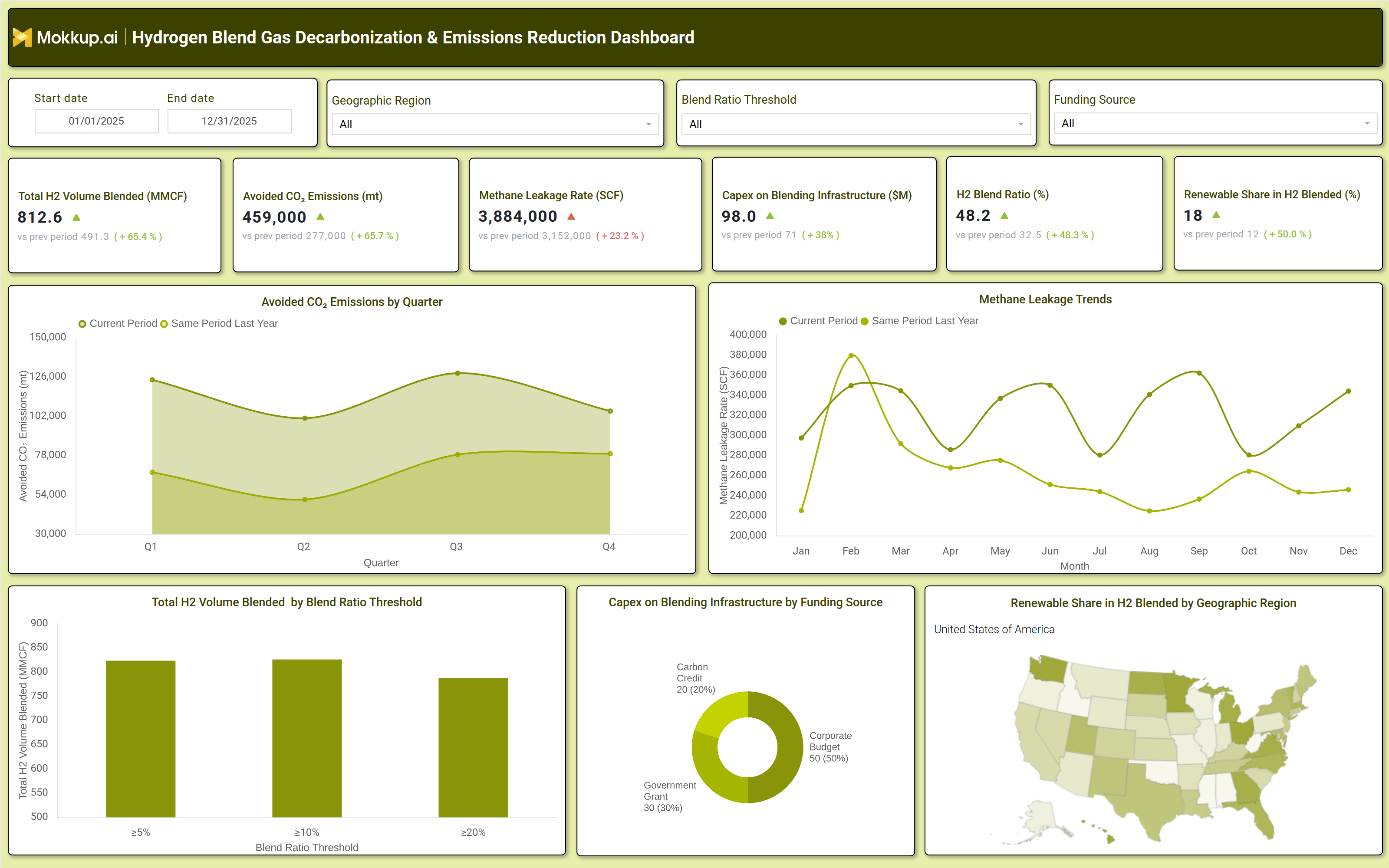
A well-structured hydrogen gas pipeline carbon footprint dashboard includes interactive filters for date range, geographic region, blend ratio thresholds, and funding sources, allowing users to customize their analysis. Key performance tiles display critical metrics such as total hydrogen volume blended (MMCF), avoided CO₂ emissions (metric tons), methane leakage rates (SCF), capital expenditure on blending infrastructure ($M), hydrogen blend ratio (%), and renewable share in hydrogen blended (%). Trend charts compare avoided CO₂ emissions by quarter and methane leakage trends by month, providing a clear view of progress over time.
A blend ratio threshold analysis shows how different hydrogen concentrations impact total volume blended, while a funding source breakdown highlights investment distribution across government grants, corporate budgets, and carbon credits. Additionally, a geographic heatmap visualizes renewable hydrogen adoption across regions, helping utilities identify high-performing and underperforming areas. Together, these components create a comprehensive hydrogen and natural gas blend sustainability dashboard that enables utilities to track decarbonization efforts effectively.
How to Analyze Data in a Hydrogen Blend Gas Decarbonization & Emissions Reduction Dashboard
Here is how you can analyze data from this dashboard:
- Track total hydrogen volume blended to measure adoption rates and scalability of hydrogen blending programs.
- Monitor avoided CO₂ emissions to assess the environmental impact of hydrogen integration in natural gas pipelines.
- Evaluate methane leakage rates to identify pipeline inefficiencies and reduce fugitive emissions.
- Compare capital expenditure on blending infrastructure across funding sources to optimize budget allocation.
- Analyze hydrogen blend ratios to determine the most efficient and cost effective blending levels.
- Assess renewable share in hydrogen blended to ensure compliance with green energy mandates.
- Review geographic trends to identify regions with high decarbonization potential and areas needing improvement.
- Benchmark current performance against previous periods to track progress in emissions reduction and operational efficiency.
Benefits of a Hydrogen Blend Gas Decarbonization & Emissions Reduction Dashboard
The following are the benefits of using this hydrogen blend sustainability monitoring dashboard:
- Enhances visibility into decarbonization progress by consolidating emissions, blending, and infrastructure data.
- Supports regulatory compliance by providing accurate reporting for hydrogen gas programs.
- Optimizes hydrogen blending strategies by identifying the most effective blend ratios and geographic regions.
- Reduces operational costs by minimizing methane leakage and improving pipeline efficiency.
- Improves investment decisions with clear insights into funding allocation and infrastructure spending.
- Accelerates sustainability goals by tracking avoided CO₂ emissions and renewable hydrogen adoption.
- Enables data driven decisionmaking for utility executives, engineers, and policymakers.
- Facilitates stakeholder communication with transparent, actionable emissions and performance data.
KPIs to Track in a Hydrogen Blend Gas Decarbonization & Emissions Reduction Dashboard
The following key KPIs can be tracked by using this hydrogen pipeline carbon footprint dashboard:
- Total H₂ Volume Blended (MMCF): Measures the total volume of hydrogen blended into natural gas pipelines, indicating adoption scale.
- Avoided CO₂ Emissions (metric tons): Tracks the reduction in carbon emissions achieved through hydrogen blending.
- Methane Leakage Rate (SCF): Monitors fugitive methane emissions, a critical factor in pipeline efficiency and environmental impact.
- Capex on Blending Infrastructure ($M): Evaluates investment in hydrogen blending facilities and pipeline upgrades.
- H₂ Blend Ratio (%): Shows the percentage of hydrogen in the natural gas blend, influencing emissions and combustion efficiency.
- Renewable Share in H₂ Blended (%): Measures the proportion of green hydrogen in the blend, ensuring compliance with sustainability targets.
Frequently Asked Questions
1. What is a Hydrogen Gas Emissions Tracking Dashboard used for?
It tracks emissions reduction, hydrogen blending efficiency, and infrastructure investments for natural gas utilities transitioning to cleaner energy.
2. What data sources feed into this hydrogen blend gas decarbonization dashboard?
Pipeline monitoring systems, emissions tracking tools, blending facility reports, and financial investment records.
3. How does this Natural Gas Utility Emissions Reduction Dashboard help reduce carbon emissions?
By monitoring hydrogen blend ratios, methane leakage, and avoiding CO₂ emissions, utilities can optimize blending strategies for maximum decarbonization.