
What is a Hydrogen Blend Gas Network Monitoring & Digital Control Dashboard?
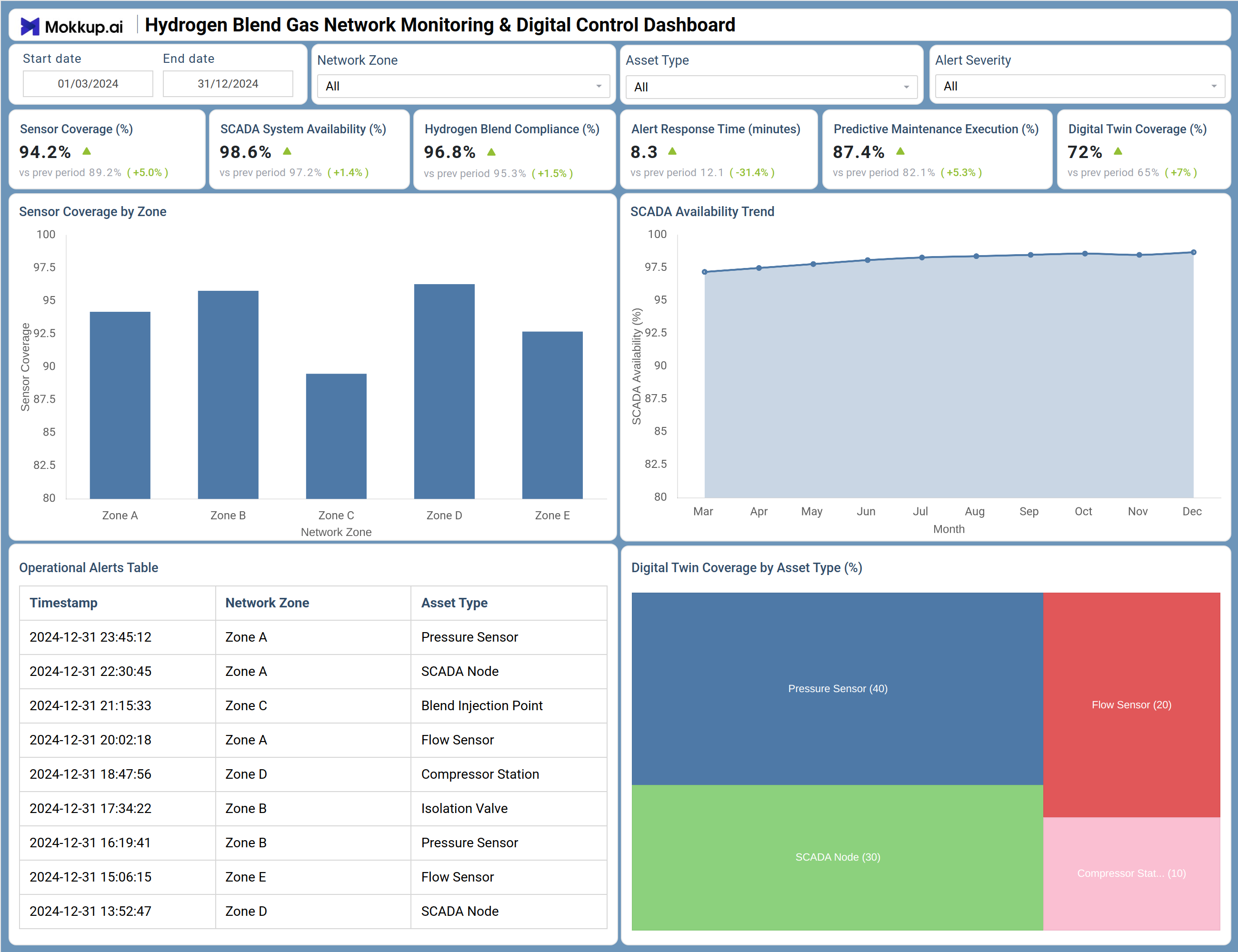
The Hydrogen Blend Gas Network Monitoring & Digital Control Dashboard is a structured template designed for natural gas utility teams managing hydrogen-blend gas infrastructure. It consolidates operational data across network zones into a single view, covering sensor performance, SCADA system availability, hydrogen blend compliance, and digital twin coverage. Six KPI tiles run across the top, giving operations and IT teams an immediate read on network health. Below them, a bar chart breaks down sensor coverage by zone, a trend chart tracks SCADA availability across months, an alerts table logs operational events by zone and asset type, and a treemap maps digital twin coverage across asset categories. Filters for Start Date, End Date, Network Zone, Asset Type, and Alert Severity let teams narrow data to specific segments. This hydrogen network monitoring dashboard template is built for utility teams that need operational visibility, compliance tracking, and maintenance readiness in one view.
How to Create a Hydrogen Blend Gas Network Monitoring & Digital Control Dashboard?
You don't need to build your report from scratch; just start with a ready-to-use dashboard template from Mokkup. Add in your data and export it however you like. Here's how to do it:
1. Create or Log in to Your Mokkup Account
Start by signing up on Mokkup.ai using your email. If you already have an account, just log in, and you'll be good to go.
2. Choose and Customize Your Dashboard Template
Find the Hydrogen Blend Gas Network Monitoring & Digital Control Dashboard template in the Templates section. Use the drag-and-drop editor to adjust KPIs, edit filters, or add elements based on your data.
3. Export to Your BI Tool
Once your dashboard wireframe is ready, use the BI Tool Export feature to send it directly to Power BI or Tableau for further analysis and enhancements. You can also download the dashboard as a PDF, PNG, or JPEG, embed it on a platform, or invite your team to collaborate.
Note: This is a Pro template. You'll need a Pro subscription on Mokkup to use and customize this dashboard wireframe. Upgrade anytime to unlock full access.
Hydrogen Blend Gas Network Monitoring & Digital Control Dashboard Example
The dashboard opens with six KPI tiles: Sensor Coverage (%), SCADA System Availability (%), Hydrogen Blend Compliance (%), Alert Response Time (minutes), Predictive Maintenance Execution (%), and Digital Twin Coverage (%). Each tile shows a comparison to the prior period, signaling whether performance is trending up or down. The Sensor Coverage by Zone bar chart breaks sensor performance down across Zone A through Zone E. The SCADA Availability Trend chart plots monthly availability across a full year, supporting longer-range analysis.
Below these, the Operational Alerts & Events table logs timestamped events with their associated network zone and asset type, while the Digital Twin Coverage by Asset Type treemap shows coverage distribution across pressure sensors, SCADA nodes, blend injection points, flow sensors, and compressor stations. The filter bar — covering date range, network zone, asset type, and alert severity — lets teams scope the natural gas utility digital control dashboard to specific operational contexts.
How to Analyze Data in a Hydrogen Blend Gas Network Monitoring & Digital Control Dashboard
Here is how you can analyze data from this dashboard:
- Filter by Network Zone to compare sensor coverage and SCADA availability across Zone A through Zone E
- Use the SCADA Availability Trend chart to identify months where availability dipped and cross-reference with the alerts table
- Review the Operational Alerts & Events table to trace which asset types and zones generate the most events
- Examine the Digital Twin Coverage treemap to identify asset categories with lower coverage and prioritize deployment
- Apply the Alert Severity filter to isolate high-priority events when reviewing the alerts table
- Use the Asset Type filter to focus on a specific asset class — compressor stations, flow sensors, or blend injection points
- Compare Hydrogen Blend Compliance (%) and Predictive Maintenance Execution (%) over time using the date range filter
Benefits of a Hydrogen Blend Gas Network Monitoring & Digital Control Dashboard
The following are the benefits of using this dashboard:
- Provides a consolidated view of network health across all monitored zones, removing the need to check multiple systems
- Enables hydrogen blend compliance monitoring across the network with a dedicated KPI tile and period-over-period comparison
- Supports predictive maintenance dashboard workflows for hydrogen infrastructure by surfacing maintenance execution rates alongside compliance data
- Tracks digital twin coverage by asset type, helping teams understand where digital twin deployment gaps exist
- The SCADA system availability tracking for gas utilities trend view surfaces long-term availability patterns that point-in-time metrics would miss
- Structured filter set allows teams to isolate specific zones, asset types, or alert severities without building custom queries
- Operational alerts table provides a timestamped event log that supports post-incident review and root cause analysis
KPIs to Track in a Hydrogen Blend Gas Network Monitoring & Digital Control Dashboard
The following key KPIs can be tracked by using this dashboard:
- Sensor Coverage (%) - Measures the proportion of the network actively covered by sensors; supports sensor coverage tracking by network zone to identify under-monitored areas
- SCADA System Availability (%) - Tracks the uptime of the SCADA system across the network; a drop here signals potential control and monitoring risk for hydrogen infrastructure
- Hydrogen Blend Compliance (%) - Indicates how consistently the hydrogen blend ratio meets regulatory or operational standards; the hydrogen blend compliance monitoring tool component of the dashboard
- Alert Response Time (minutes) - Measures the average time taken to respond to operational alerts; lower values indicate faster incident handling across zones and asset types
- Predictive Maintenance Execution (%) - Tracks how much of the scheduled predictive maintenance has been completed; directly tied to asset reliability in hydrogen infrastructure
- Digital Twin Coverage (%) - Shows the percentage of assets covered by a digital twin model; supports the digital twin coverage dashboard for gas networks use case by identifying gaps in virtual asset representation
Frequently Asked Questions
1. What types of teams use the Hydrogen Blend Gas Network Monitoring & Digital Control Dashboard?
This dashboard is designed for operations and IT teams within natural gas utility organizations managing hydrogen-blend gas networks. It is particularly useful for network operations managers, digital infrastructure leads, and compliance officers who need a consolidated view of sensor performance, SCADA health, and blend compliance.
2. Can I filter the dashboard by specific network zones or asset types?
Yes. The dashboard includes filter controls for Network Zone, Asset Type, and Alert Severity, in addition to a date range selector. These filters let teams apply the hydrogen network monitoring dashboard template to specific segments of the network without modifying the underlying structure.
3. How does this dashboard support predictive maintenance for hydrogen infrastructure?
The Predictive Maintenance Execution (%) KPI tile tracks how much of the planned maintenance program has been completed. Combined with the Digital Twin Coverage treemap and the SCADA Availability Trend chart, teams can cross-reference maintenance execution against system availability and asset coverage to identify where gaps in the predictive maintenance dashboard for the hydrogen infrastructure program are affecting network performance.
4. What KPIs does the Hydrogen Blend Gas Network Monitoring & Digital Control Dashboard track?
The dashboard tracks six key KPIs: Sensor Coverage (%), SCADA System Availability (%), Hydrogen Blend Compliance (%), Alert Response Time (minutes), Predictive Maintenance Execution (%), and Digital Twin Coverage (%). Each tile shows a comparison to the prior period to signal performance trends.
5. What is digital twin coverage and why is it tracked in this dashboard?
Digital Twin Coverage (%) shows the percentage of assets covered by a digital twin model. The dashboard's treemap view breaks this down by asset type — including pressure sensors, SCADA nodes, blend injection points, flow sensors, and compressor stations — helping teams identify gaps in virtual asset representation and prioritize deployment.