What is a Hydrogen Blend Gas Grants & Incentive Utilization Dashboard?
A hydrogen grant incentive utilization dashboard provides grant managers, policy affairs teams, and utility finance directors with a structured view of how hydrogen blending funding programs are secured, deployed, and converted into project outcomes. It tracks KPIs, including total grant funds secured, hydrogen grant match funds leverage ratios, incentive applications submitted, grant utilization rates, and incentive tax credits claimed, giving program teams a complete picture of both funding capture and deployment efficiency. Unutilized grant fund volumes sit alongside utilization rates, ensuring that funds committed but not yet deployed are tracked and acted on before expiry windows close. Gas utilities, clean energy program offices, and infrastructure developers use this template to maximize the value of federal and state hydrogen incentive programs, including DOE H2Hubs, IRA provisions, and Low Carbon Fuel Standard credits, and to demonstrate accountability to funders and regulators.
How to Create a Hydrogen Blend Gas Grants & Incentive Utilization Dashboard
You don't need to build your report from scratch, just start with a ready-to-use dashboard template from Mokkup. Add in your data and export it however you like. Here's how to do it:
1. Create or Log in to Your Mokkup Account
Start by signing up on Mokkup.ai using your email. If you already have an account, just log in, and you'll be good to go.
2. Choose and Customize Your Dashboard Template
Find the Hydrogen Blend Gas Grants & Incentive Utilization Dashboard template in the Templates section. Use the drag-and-drop editor to adjust KPIs, edit filters, or add elements based on your data.
3. Export to Your BI Tool
Once your dashboard wireframe is ready, use the BI Tool Export feature to send it directly to Power BI or Tableau for further analysis and enhancements. You can also download the dashboard as a PDF, PNG, or JPEG, embed it on a platform, or invite your team to collaborate.
Note: This is a Pro template. You'll need a Pro subscription on Mokkup to use and customize this dashboard wireframe. Upgrade anytime to unlock full access.
Hydrogen Blend Gas Grants & Incentive Utilization Dashboard Example
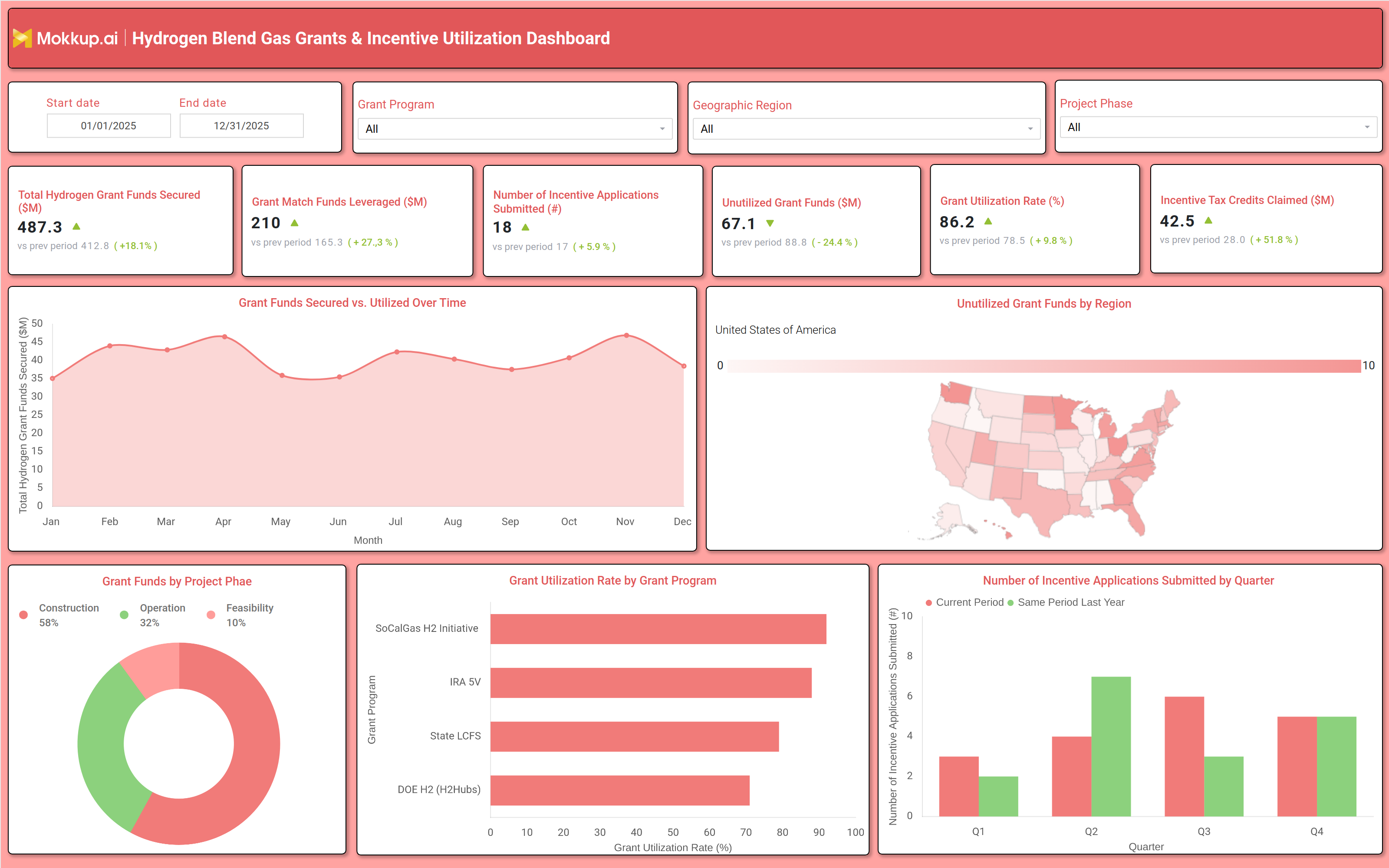
A grants and incentives manager opens this dashboard at the start of each program reporting cycle to assess whether the tracking of secured hydrogen grant funds shows the portfolio growing at the rate committed to in the utility's clean energy investment plan. The KPI tiles provide an immediate read on funding health, whether new grants have been secured above prior-period levels, whether match leverage is scaling appropriately, and whether the overall grant utilization rate is moving toward full deployment. A high total of unutilized grant funds alongside a strong secured balance is a warning sign that the program office is capturing funding faster than projects can absorb it, which risks grant clawback or reputational risk with federal and state funders.
Program operations teams use the monthly grant trend chart to understand whether the pace of funds secured and utilized is moving in sync over the year. Periods where utilization lags behind secured amounts signal project delays, procurement bottlenecks, or contract execution gaps that need to be resolved before the end of the grant performance period. The Grant Program filter allows teams to isolate this analysis for specific programs, comparing whether the DOE H2Hubs drawdown is on pace versus the IRA or State LCFS programs independently. Policy and regulatory affairs teams rely on the grant utilization rate program monitoring view to assess which grant programs are achieving the highest deployment efficiency. Programs with utilization rates below target indicate that project milestones, reporting requirements, or fund release conditions are creating friction and that program management resources should be redirected to clear those barriers before they affect funder relationships.
The quarterly applications chart gives a complementary view of whether the team is maintaining consistent submission momentum. Finance and executive teams close the review by examining the project phase breakdown and the regional unutilized funds map. The donut chart showing construction, operation, and feasibility phase allocations confirms whether the grant portfolio is balanced appropriately across the hydrogen program lifecycle, while the map identifies which states or regions are sitting on the highest volumes of undeployed funds, enabling regional program managers to focus acceleration efforts where unutilized hydrogen grant funds reduction is most urgent.
How to Analyze Data in a Hydrogen Blend Gas Grants & Incentive Utilization Dashboard
Here is how you can analyze data from this dashboard:
- Use the Grant Program filter to isolate utilization rates, secured funds, and application counts for SoCalGas H2 Initiative, IRA SV, State LCFS, or DOE H2 (H2Hubs) programs independently.
- Review the Grant Funds Secured vs. Utilized Over Time area chart for hydrogen grant funds secured tracking, identifying months where utilization is lagging behind secured amounts and investigating project or procurement delays.
- Monitor the Grant Utilization Rate KPI tile for grant utilization rate program monitoring, confirming whether the overall deployment rate is improving and whether unutilized balances are declining.
- Analyze the Grant Utilization Rate by Grant Program horizontal bar chart to identify which programs are achieving the highest and lowest utilization rates.
- Compare the unutilized grant funds by Region choropleth map to identify which states are holding the highest volumes of undeployed funds and direct regional program management resources for unutilized hydrogen grant funds reduction.
- Investigate the Grant Funds by Project Phase donut chart to assess whether construction, operation, and feasibility phase allocations are aligned with the program's current project pipeline.
- Filter by Project Phase to isolate grant fund deployment and utilization metrics for construction, operation, or feasibility phases and identify which stage is creating deployment bottlenecks.
- Track the Incentive Tax Credits Claimed KPIs across reporting periods to measure whether the utility is capturing the full incentive tax credits that hydrogen utility programs are entitled to under IRA and LCFS provisions.
Benefits of a Hydrogen Blend Gas Grants & Incentive Utilization Dashboard
The following are the benefits of using this dashboard:
- Centralizes grant funds secured, utilization rates, match leverage, and tax credit claims across all hydrogen programs and project phases in one structured grant management template.
- Supports grant utilization rate program monitoring across grant programs, geographic regions, and project phases from a single dashboard view.
- Reduces manual data compilation for federal and state grant performance reporting with prebuilt KPI tiles and chart layouts covering funding capture, deployment, and incentive claims.
- Enables region-level analysis of unutilized hydrogen grant funds reduction priorities, identifying which states are most at risk of grant expiry and directing program management resources accordingly.
- Provides a donut chart breakdown of grant allocations by project phase for pipeline balance assessment and funds deployment planning across construction, operation, and feasibility stages.
- Helps grant managers and policy teams align with program funder requirements without rebuilding utilization performance reports from scratch each reporting cycle.
- Gives utility finance teams and executive leadership a shared view of funding capture efficiency, matched leverage performance, and incentive claims progress across the full hydrogen incentive portfolio.
KPIs to Track in a Hydrogen Blend Gas Grants & Incentive Utilization Dashboard
The following key KPIs can be tracked by using this dashboard:
- Total Hydrogen Grant Funds Secured ($M): At the core of any hydrogen grant incentive utilization dashboard, this is a measure of the cumulative value of grants awarded across all programs and regions, tracking the utility's success in capturing available hydrogen funding.
- Grant Match Funds Leveraged ($M): Tracks the total private or co-investment capital mobilized alongside secured grants, the primary indicator of hydrogen grant match funds leverage efficiency and the multiplier value being generated from public funding commitments.
- Number of Incentive Applications Submitted (#): Quantifies the total count of grant and incentive applications filed across all programs, measuring pipeline activity and application momentum.
- Unutilized Grant Funds ($M): Measures the volume of secured grant funds not yet deployed into projects, the key risk indicator for unutilized hydrogen grant funds reduction programs and funder accountability management.
- Grant Utilization Rate (%): Evaluates the share of secured grant funds that have been successfully deployed, supporting grant utilization rate program monitoring and demonstrating performance against funder deployment commitments.
- Incentive Tax Credits Claimed ($M): Tracks the total value of tax credits claimed under IRA, State LCFS, and other incentive provisions, the key financial return metric for incentive tax credits, hydrogen utility programs, and clean energy investment optimization.
Frequently Asked Questions
1. What teams use a Hydrogen Blend Gas Grants & Incentive Utilization Dashboard?
This dashboard is used by grants and incentives managers, policy and regulatory affairs teams, utility finance directors, clean energy program offices, and executive leadership at gas utilities and hydrogen infrastructure developers pursuing federal and state funding programs.
2. How does this dashboard help maximize hydrogen grant utilization?
By surfacing unutilized fund balances, utilization rates by grant program, and deployment trends in one view, program teams can identify which grants are at risk of underperformance against funder expectations, enabling targeted project acceleration, milestone restructuring, or reallocation before funds expire or relationship consequences arise.
3. Can this dashboard track performance across multiple hydrogen grant programs simultaneously?
Yes, the Grant Utilization Rate by Grant Program horizontal bar chart compares utilization performance across SoCalGas H2 Initiative, IRA SV, State LCFS, and DOE H2 (H2Hubs) programs side by side, and the Grant Program filter allows teams to isolate any single program for deeper analysis of secured amounts, utilization, and application volumes.