What is a Heart Center Emergency & Critical Care Dashboard?
An Heart Center Emergency & Critical Care Dashboard is a centralized tool designed for hospital leadership to monitor real-time performance in the emergency and critical care departments, including CEOs, COOs, medical directors, and board members. The heart center performance dashboard provides visibility into emergency patient volumes, cardiac and other critical cases, ICU and ventilator utilization, mortality rates, door-to-balloon times, and staff efficiency. Unlike static reports, this dashboard serves as a real-time performance command center, enabling hospitals to track operational efficiency, patient outcomes, and resource allocation in one place.
How to Create an Emergency & Critical Care Overview Dashboard
You don’t need to build your report from scratch—start with a ready-to-use Emergency & Critical Care Dashboard template from Mokkup. Add in your hospital data and export it as needed.
Steps:
1. Create or Log in to Your Mokkup Account
Sign up on Mokkup.ai using your email, or log in if you already have an account.
2. Choose and Customize Your Dashboard Template
Find the Emergency & Critical Care Dashboard template in the Templates section. Use the drag-and-drop editor to adjust KPIs, add filters, or insert visuals based on your data.
3. Export to Your BI Tool
Once your dashboard wireframe is ready, use the BI Tool Export feature to send it to Power BI or Tableau for deeper analysis. You can also download the dashboard as a PDF, PNG, or JPEG, embed it on a hospital portal, or invite your team to collaborate.
Note: This is a Pro template. You’ll need a Pro subscription on Mokkup to use and customize this dashboard wireframe. Upgrade anytime to unlock full access.
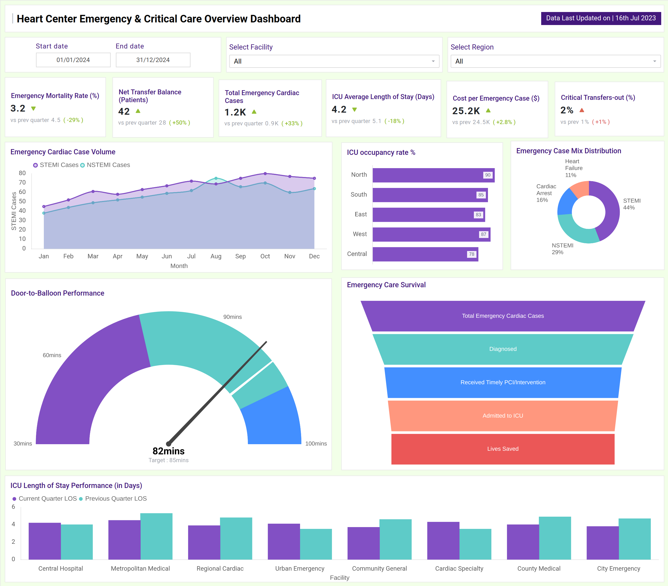
Heart Center Emergency & Critical Care Dashboard Example
You can create a Heart Center Emergency & Critical Care Overview Dashboard with a mix of KPI tiles and visualizations. At the top, KPI cards track key metrics such as Emergency Mortality Rate, Net Transfer Balance, Total Emergency Cardiac Cases, and ICU Average Length of Stay, often showing comparisons to previous periods. Below that, charts display trends in emergency case volumes (such as STEMI/NSTEMI), mortality rates, and case mix distribution. Funnel charts can visualize the patient journey from diagnosis to lives saved, while bar charts compare ICU occupancy rate across multiple regions. Together, this dashboard serves as a comprehensive tool for tracking critical cardiology metrics, ensuring a clear view of heart center patient care efficacy, and resource allocation.
How to Analyze Data in Heart Center Emergency & Critical Care Dashboards
Here’s how hospital leaders can make the most of the data available on the Hospital ICU & ER monitoring dashboard:
- Monitor Clinical Outcomes: Track the Emergency Mortality Rate trend over time to assess the effectiveness of new protocols or treatments.
- Assess Operational Efficiency: Analyze Door-to-Balloon Time and ICU Average Length of Stay against benchmarks to identify bottlenecks in critical care pathways.
- Track Patient Flow: Utilize the Net Transfer Balance to determine whether your facility is a net receiver or sender of complex cardiac cases, which indicates your reputation and capacity.
- Review Case Severity and Volume: Break down Total Emergency Cardiac Cases by type (e.g., STEMI, Cardiac Arrest) to anticipate resource needs and tailor staff training.
- Evaluate Facility Performance: Compare ICU Length of Stay across different facilities (e.g., Central Hospital, Community General) to share best practices and standardize care.
- Measure Intervention Success: Follow the patient journey from diagnosis to "Lives Saved" to gauge the overall effectiveness of the emergency department.
Benefits of Heart Center Emergency & Critical Care Dashboards
Here are the benefits of implementing the Lives Saved Analytics Dashboard:
- Improved Patient Survival Rates: Real-time tracking of mortality rates and response times enables immediate intervention to improve outcomes.
- Operational Efficiency: Monitors ICU occupancy, length of stay, and ventilator utilization to optimize resource allocation and minimize bottlenecks.
- Enhanced Clinical Decision-Making: Provides a data-driven foundation for evaluating treatment protocols and emergency response strategies.
- Strategic Resource Planning: Analysis of case volumes, transfer balances, and facility performance guides strategic investments and capacity planning.
- Performance Benchmarking: Enables the comparison of key metrics, such as door-to-balloon time, across different facilities or regions to promote quality improvement.
- Compliance & Reporting: Functions as a cardiology critical care reporting and compliance dashboard, simplifying audits and governance reporting with accurate, up-to-date data.
Together, these elements provide leadership with a unified view of clinical and operational performance, making it easier to align life-saving efforts with institutional goals. That’s why many healthcare leaders call it the best dashboard for cardiac centers focused on excellence in emergency and critical care.
KPIs to Track in Heart Center Emergency & Critical Care Dashboards
You can track the following KPIs from this Real-time critical care KPI dashboard:
- Emergency Mortality Rate (%): A primary indicator of care quality and patient outcomes.
- Net Transfer Balance (Patients): This metric reflects the facility's capacity and reputation for handling complex cases.
- Total Emergency Cardiac Cases: Overall volume of critical cardiac presentations.
- ICU Average Length of Stay (Days): Key metric for ICU efficiency and patient flow.
- Door-to-Balloon Time (Minutes): Critical benchmark for STEMI treatment efficiency.
- Lives Saved (Count): The ultimate measure of emergency care effectiveness.
- ICU Occupancy Rate (%): Measure of critical care bed utilization and capacity pressure.
- Emergency Case Mix Distribution: Understanding the types and acuity of cases presented.
Frequently Asked Questions
1. Who should use a Heart Center Emergency & Critical Care Overview Dashboard?
Clinical Department Heads, Chief Cardiologists, and ICU Directors are responsible for the strategy and performance of cardiac emergency services.
2. Can this dashboard help reduce emergency mortality rates?
Yes. By providing real-time visibility into mortality trends, response times, and the entire patient care pathway, leadership can identify areas for improvement and implement life-saving protocols more effectively.
3. How does it support resource management in the ICU?
It tracks ICU occupancy, length of stay, and other key metrics, allowing managers to anticipate capacity issues, optimize staff scheduling, and ensure resources are available for critical patients.
4. Is this dashboard useful for compliance?
Yes, because a cardiac emergency workflow and outcome analytics dashboard supports governance, accreditation reporting, and compliance audits with standardized, trackable data.