
What is a Dialysis Treatment Volume Dashboard?
A dialysis treatment volume dashboard for hospitals is a visual analytics tool designed to monitor dialysis sessions, patient adherence, and operational efficiency across multiple centers. It helps healthcare providers analyze treatment performance and ensure consistent patient care delivery. This dialysis data analytics and reporting tool gives administrators a single view of all dialysis centers, tracking metrics such as completed sessions, missed treatments, treatment duration, and patient adherence. By consolidating this data into one interface, hospitals can make timely, data-driven decisions to improve outcomes and optimize resource utilization.
How to Create a Dialysis Treatment Volume Dashboard
You don’t need to build your report from scratch—just start with a ready-to-use dashboard template from Mokkup. Add in your data and export it however you like. Here’s how to do it:
1. Create or Log in to Your Mokkup Account
Start by signing up on Mokkup.ai using your email. If you already have an account, just log in, and you’ll be good to go.
2. Choose and Customize Your Dashboard Template
Find the Dialysis Treatment Volume Dashboard template in the Templates section. Use the drag-and-drop editor to adjust KPIs, edit filters, or add elements based on your data.
3. Export to Your BI Tool
Once your dashboard wireframe is ready, use the BI Tool Export feature to send it directly to Power BI or Tableau for further analysis and enhancements. You can also download the dashboard as a PDF, PNG, or JPEG, embed it on a platform, or invite your team to collaborate.
Note: This is a Pro template. You’ll need a Pro subscription on Mokkup to use and customize this dashboard wireframe. Upgrade anytime to unlock full access.
Dialysis Treatment Volume Dashboard Example
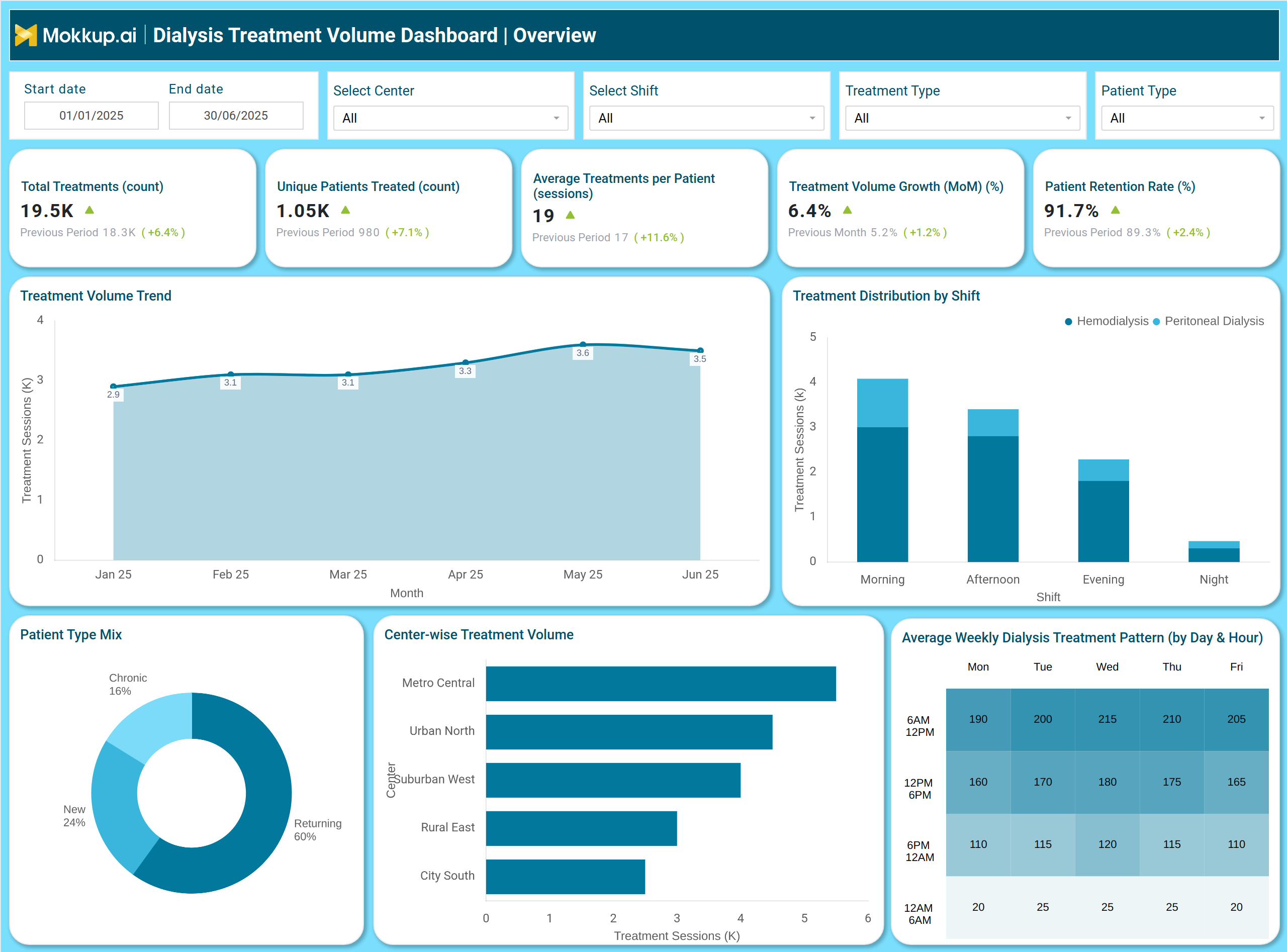
In the example shown, the dialysis operations management dashboard presents both high-level and detailed insights. The upper section displays KPIs like Completed Treatments (%), Missed Session Rate (%), Average Treatment Duration (hours), On-Time Session Start Rate (%), and Average Wait Time per Patient (minutes).
Visuals such as bar charts and line graphs track trends in treatment volume, adherence, and performance by shift or center. For instance, one chart highlights Scheduled vs Completed Treatments by Center, helping identify where delays or cancellations occur. Another section breaks down On-Time Session Performance by Shift, providing clarity on operational efficiency.
The second dashboard view offers an overall Treatment Volume Overview—covering Total Treatments, Unique Patients Treated, Average Treatments per Patient, and Patient Retention Rate. Together, these visuals act as a real-time dialysis treatment tracking dashboard, enabling healthcare managers to evaluate patient flow and resource utilization across multiple centers.
How to Analyze Data in a Dialysis Treatment Volume Dashboard
Here’s how hospital teams can make the most of insights within a Dialysis Treatment Volume Dashboards:
- Track Treatment Volume Trends: Observe monthly trends in total and completed dialysis sessions to identify performance growth or decline.
- Compare Center-Wise Output: Evaluate which dialysis centers deliver higher treatment volumes or experience session drop-offs.
- Monitor Shift Performance: Analyze on-time start rates and adherence by shift (morning, afternoon, evening, night) to identify operational gaps.
- Study Patient Adherence: Review patient-level data showing scheduled versus completed sessions to improve engagement and follow-up.
- Measure Wait Times and Efficiency: Identify delays or long waiting periods to streamline patient flow.
- Track Retention and Growth Rates: Assess patient retention and month-on-month growth to plan capacity and staffing needs effectively.
Benefits of Dialysis Treatment Volume Dashboard
A Dialysis Treatment Volume dashboards empower with below benefits:
- Improved Operational Efficiency: Streamlines data from all dialysis centers into one view for quick decision-making.
- Enhanced Patient Care: Helps track adherence and reduce missed or delayed treatments.
- Real-Time Monitoring: Enables continuous monitoring through a real-time dialysis treatment tracking dashboard.
- Data-Driven Decision Making: Empowers hospitals to optimize schedules, staffing, and equipment usage.
- Transparency Across Centers: Facilitates comparison of center-wise performance and identifies improvement areas.
- Compliance and Quality Tracking: Supports quality assurance by monitoring adherence and patient retention.
KPIs to Track in Dialysis Treatment Volume Dashboard
Key KPIs are:
- Total Treatments (Count) – Tracks total dialysis sessions completed.
- Unique Patients Treated (Count) – Measures patient reach and coverage.
- Missed Session Rate (%) – Indicates adherence and operational issues.
- On-Time Session Start Rate (%) – Evaluates schedule discipline and service reliability.
- Average Treatment Duration (Hours) – Monitors consistency in treatment length.
- Patient Retention Rate (%) – Tracks continuity of care and satisfaction.
- Treatment Volume Growth (MoM %) – Shows progress over time for performance benchmarking.
- Average Wait Time per Patient (Minutes) – Measures patient experience and process efficiency.
- Center-Wise Treatment Volume – Helps compare outputs and manage workloads across facilities.
Frequently Asked Questions
Q1. What is the purpose of a Dialysis Treatment Volume Dashboard?
It helps hospitals monitor dialysis treatment performance, patient adherence, and operational efficiency in real-time for better management decisions.
Q2. Who can use this dashboard?
This dashboard is ideal for hospital administrators, dialysis center managers, nephrologists, and data analysts managing treatment operations.
Q3. Can the dashboard track multiple dialysis centers?
Yes. The patient treatment volume analysis for dialysis centers feature allows monitoring performance across multiple locations from a single dashboard.