What is an Operational Efficiency Dashboard?
An Operational Efficiency Dashboard is a healthcare analytics template that helps heart care hospitals monitor performance, track procedure efficiency, and optimize resources. It provides insights into on-time procedure tracking, emergency response, patient flow, and staff workload. Hospitals can quickly identify bottlenecks, reduce delays, and improve patient care. By consolidating multiple data sources, the dashboard supports heart care analytics and better decision-making for operational excellence.
How to Create an Operational Efficiency Dashboard
You don’t need to build your report from scratch—just start with a ready-to-use Operational Efficiency Dashboard template from Mokkup. Add in your data and export it however you like. Here’s how to do it:
1. Create or Log in to Your Mokkup Account
Start by signing up on Mokkup.ai using your email. If you already have an account, just log in, and you’ll be good to go.
2. Choose and Customize Your Dashboard Template
Find the Operational Efficiency Dashboard template in the Templates section. Use the drag-and-drop editor to adjust KPIs, edit filters, or add elements based on your data.
3. Export to Your BI Tool
Once your dashboard wireframe is ready, use the BI Tool Export feature to send it directly to Power BI or Tableau for further analysis and enhancements. You can also download the dashboard as a PDF, PNG, or JPEG, embed it on a platform, or invite your team to collaborate.
Note: This is a Pro template. You’ll need a Pro subscription on Mokkup to use and customize this dashboard wireframe. Upgrade anytime to unlock full access.
Operational Efficiency Dashboard Example
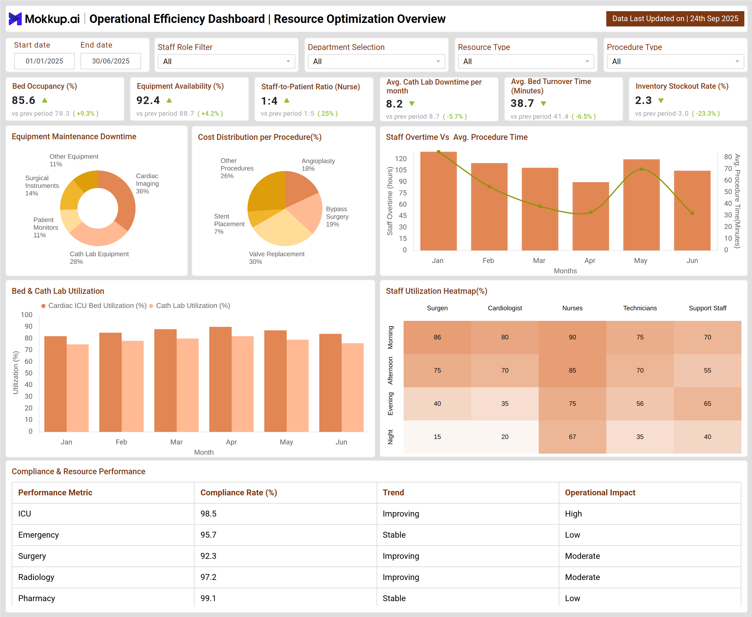
An Operational Efficiency Dashboard template provides a comprehensive view of hospital performance by tracking both resource utilization and patient care workflows. The Resource Optimization Overview monitors critical hospital assets, including beds, equipment, and staff, highlighting utilization trends, downtime, and compliance metrics to ensure efficient operations. Department-specific comparisons make it easy to identify areas that are over- or underutilized. Meanwhile, the Procedural Efficiency & Patient Flow section focuses on the timeliness of cardiac procedures, patient wait times, and procedural quality. Hospitals can enhance care delivery and streamline operational workflows by pinpointing bottlenecks, assessing discharge efficiency, and tracking patient satisfaction.
How to Analyze Data in an Operational Efficiency Dashboard
Analyzing data in an Operational Efficiency Dashboard helps hospitals make informed decisions to optimize resources, improve patient care, and enhance overall workflow:
- Start with KPIs: Compare metrics like on-time procedure tracking, emergency response times, and average length of stay to evaluate operational performance.
- Assess Staff & Equipment Efficiency: Track staff-to-patient ratios, equipment availability, and overtime trends to optimize hospital resource management.
- Spot Bottlenecks: Use heat maps and geographic overlays to identify wards, departments, or equipment with high downtime or delays.
- Track Patient Flow & Costs: Monitor procedure completion times, average bed turnover, and readmission rates to enhance patient flow optimization.
- Measure Quality & Satisfaction: Review patient satisfaction scores, feedback trends, and CSAT to ensure high-quality care.
- Identify High-Impact Interventions: Analyze procedure-specific performance (e.g., angioplasty, bypass, stent placement) and use heart care analytics to focus quality improvement initiatives.
Benefits of Operational Efficiency Dashboards
Operational Efficiency Dashboards empower hospitals with actionable insights, enabling better patient care and optimized use of resources:
- Real-time visibility into procedure timings, patient flow, and emergency readiness (emergency response monitoring)
- Resource optimization by tracking staff allocation and equipment utilization.
- Reduced delays and improved patient satisfaction.
- Financial insights from procedure costs, bed turnover, and readmission trends.
- Quality improvement by identifying high-risk procedures and bottlenecks.
- Enhanced patient trust through consistent, timely care.
KPIs to Track in Operational Efficiency Dashboards
Monitoring the right KPIs ensures hospitals can make data-driven decisions to improve operational performance and patient outcomes:
- On-time Start of Procedures (%): Measures how often scheduled procedures start on time.
- Emergency Response Time (mins): Average time taken for staff to respond to emergency cases.
- Average Procedure Completion Time (hrs): Average duration of procedures, varying by type.
- Average Length of Stay (days): Tracks patient hospitalization duration.
- Staff-to-Patient Ratio (Nurse): Measures nursing availability per patient.
- Equipment Availability (%): Tracks functionality of critical medical equipment.
Frequently Asked Questions
Q1. Why is tracking the On-time Start of Procedures important?
It ensures efficient use of ORs, reduces patient wait time, and helps maintain high operational standards through effective on-time procedure tracking.
Q2. How can the Average Length of Stay be optimized?
By monitoring patient flow, improving discharge planning, and reducing procedure delays, hospitals can achieve optimal stay durations and optimize patient flow.
Q3. What insights does Emergency Response Time provide?
It highlights the hospital’s readiness for critical cases and identifies areas for improvement in emergency response monitoring and staff allocation.
Q4. How does Equipment Availability affect operations?
High equipment uptime ensures procedures aren’t delayed, supports efficient hospital resource management, and reduces patient wait times.