
What is a Desalination Treated Water Quality Dashboard?
A Desalination Treated Water Quality dashboard is a centralized analytics platform designed to monitor, analyze, and optimize the quality of desalinated water. It consolidates key metrics such as total dissolved solids (TDS), chemical usage, adverse quality events, membrane cleaning frequency, and regulatory compliance into a single, interactive interface. This desalination water quality monitoring dashboard helps plant operators, environmental engineers, and utility managers ensure that treated seawater meets safety and regulatory standards. By tracking salinity levels, contaminant concentrations, and treatment efficiency, the dashboard enables data-driven decision-making to improve operational performance, reduce costs, and maintain compliance with environmental regulations.
How to Create a Desalination Treated Water Quality Dashboard
You don’t need to build your report from scratch; just start with a ready-to-use dashboard template from Mokkup. Add in your data and export it however you like. Here’s how to do it:
1. Create or Log in to Your Mokkup Account
Start by signing up on Mokkup.ai using your email. If you already have an account, just log in, and you’ll be good to go.
2. Choose and Customize Your Dashboard Template
Find the Desalination Treated Water Quality Dashboard template in the Templates section. Use the drag and drop editor to adjust KPIs, edit filters, or add elements based on your data.
3. Export to Your BI Tool
Once your dashboard wireframe is ready, use the BI Tool Export feature to send it directly to Power BI or Tableau for further analysis and enhancements. You can also download the dashboard as a PDF, PNG, or JPEG, embed it on a platform, or invite your team to collaborate.
Note: This is a Pro template. You’ll need a Pro subscription on Mokkup to use and customize this dashboard wireframe. Upgrade anytime to unlock full access.
Desalination Treated Water Quality Dashboard Example
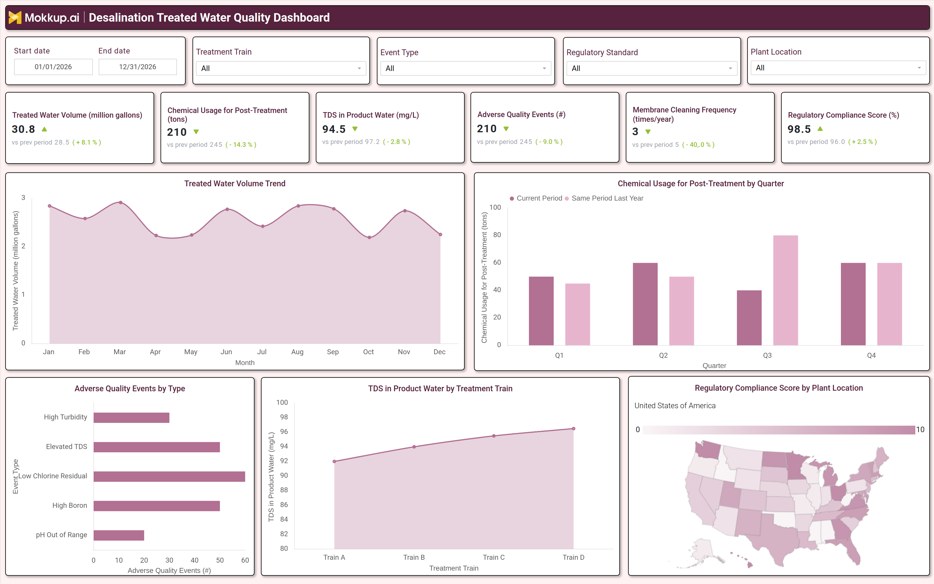
A typical Desalination Water Quality Dashboard includes interactive filters for date range, treatment train, event type, regulatory standards, and plant location. Key performance tiles display metrics such as treated water volume, chemical usage for post treatment, TDS levels, adverse quality events, membrane cleaning frequency, and regulatory compliance scores. Trend charts compare current performance against historical data, showing fluctuations in treated water volume and chemical usage by quarter.
A breakdown of adverse quality events by type (e.g., high turbidity, elevated TDS, low chlorine residual) helps identify recurring issues. Additionally, a TDS distribution chart by treatment train highlights variations in water quality across different desalination processes, while a regulatory compliance heatmap visualizes performance by plant location. Together, these components provide a comprehensive view of desalinated water quality, enabling operators to detect anomalies, optimize treatment processes, and ensure consistent compliance.
How to Analyze Data in a Desalination Treated Water Quality Dashboard
Here is how you can analyze data from this dashboard:
- Review treated water volume trends to assess production efficiency and identify seasonal or operational fluctuations.
- Monitor TDS levels in product water to ensure compliance with regulatory limits and detect deviations in desalination performance.
- Track chemical usage for posttreatment to optimize dosing, reduce costs, and minimize environmental impact.
- Analyze adverse quality events by type to pinpoint recurring issues (e.g., high boron, low chlorine residual) and implement corrective actions.
- Compare membrane cleaning frequency across treatment trains to evaluate maintenance efficiency and membrane lifespan.
- Assess regulatory compliance scores by plant location to identify underperforming facilities and prioritize improvements.
- Evaluate trends in treated water volume vs. chemical usage to detect inefficiencies in the desalination process.
- Use geographic heatmaps to visualize compliance and water quality variations across different desalination plants.
Benefits of a Desalination Treated Water Quality Dashboard
The following are the benefits of using this chemical post‑treatment optimization dashboard:
- Ensures regulatory compliance by tracking salinity, contaminants, and treatment efficiency against standards.
- Optimizes chemical usage by monitoring posttreatment dosing, reducing costs, and minimizing environmental impact.
- Improves water quality consistency by detecting and addressing adverse events (e.g., high turbidity, elevated TDS).
- Enhances operational efficiency by identifying underperforming treatment trains and optimizing membrane maintenance.
- Supports data driven decision making with historical trend analysis for better process control.
- Reduces downtime by predicting membrane fouling and scheduling proactive cleaning.
- Provides transparency for stakeholders with automated compliance reporting and performance tracking.
KPIs to Track in a Desalination Treated Water Quality Dashboard
The following key KPIs can be tracked by using this adverse quality events tracking dashboard:
- Treated Water Volume (million gallons) – Measures total desalinated water produced, indicating plant capacity and efficiency.
- TDS in Product Water (mg/L) – Tracks salinity levels to ensure compliance with drinking water standards.
- Chemical Usage for PostTreatment (tons) – Monitors chemical consumption to optimize dosing and reduce costs.
- Adverse Quality Events (count) – Counts incidents (e.g., high turbidity, low chlorine residual) to assess water quality stability.
- Membrane Cleaning Frequency (times/year) – Evaluates maintenance efficiency and membrane lifespan.
- Regulatory Compliance Score (%) – Measures adherence to water quality standards, ensuring legal and safety compliance.
Frequently Asked Questions
1. What is a treated water TDS monitoring dashboard used for?
It helps monitor salinity, contaminants, and treatment efficiency in desalinated water, ensuring compliance and optimizing plant performance.
2. What data sources feed into this membrane cleaning frequency dashboard?
Data comes from SCADA systems, lab reports, chemical dosing logs, membrane performance records, and regulatory compliance databases.
3. Who should use a desalination water quality monitoring dashboard?
Plant operators, environmental engineers, utility managers, and regulatory compliance teams.