
What is a Desalination Environmental Impact & Marine Protection Dashboard?
The Desalination Environmental Impact & Marine Protection Dashboard is a purpose-built analytics tool for environmental managers, coastal regulators, and desalination facility operators who need to track the ecological consequences of plant operations. This desalination environmental impact dashboard consolidates brine salinity levels, effluent compliance rates, seagrass health, renewable energy consumption, and carbon intensity across multiple discharge zones and facilities into a single structured view. It is designed to help teams ensure that operational activity stays within regulatory thresholds while actively protecting sensitive marine ecosystems from chemical and thermal stress. By bringing carbon intensity desalination plant data together with biodiversity indicators like seagrass cover change, it bridges the gap between operational efficiency and environmental stewardship.
How to Create a Desalination Environmental Impact & Marine Protection Dashboard
You don't need to build your report from scratch—just start with a ready-to-use dashboard template from Mokkup. Add in your data and export it however you like. Here's how to do it:
1. Create or Log in to Your Mokkup Account
Start by signing up on Mokkup.ai using your email. If you already have an account, just log in, and you'll be good to go.
2. Choose and Customize Your Dashboard Template
Find the Desalination Environmental Impact & Marine Protection Dashboard template in the Templates section. Use the drag-and-drop editor to adjust KPIs, edit filters, or add elements based on your data.
3. Export to Your BI Tool
Once your dashboard wireframe is ready, use the BI Tool Export feature to send it directly to Power BI or Tableau for further analysis and enhancements. You can also download the dashboard as a PDF, PNG, or JPEG, embed it on a platform, or invite your team to collaborate.
Note: This is a Pro template. You'll need a Pro subscription on Mokkup to use and customize this dashboard wireframe. Upgrade anytime to unlock full access.
Desalination Environmental Impact & Marine Protection Dashboard Example
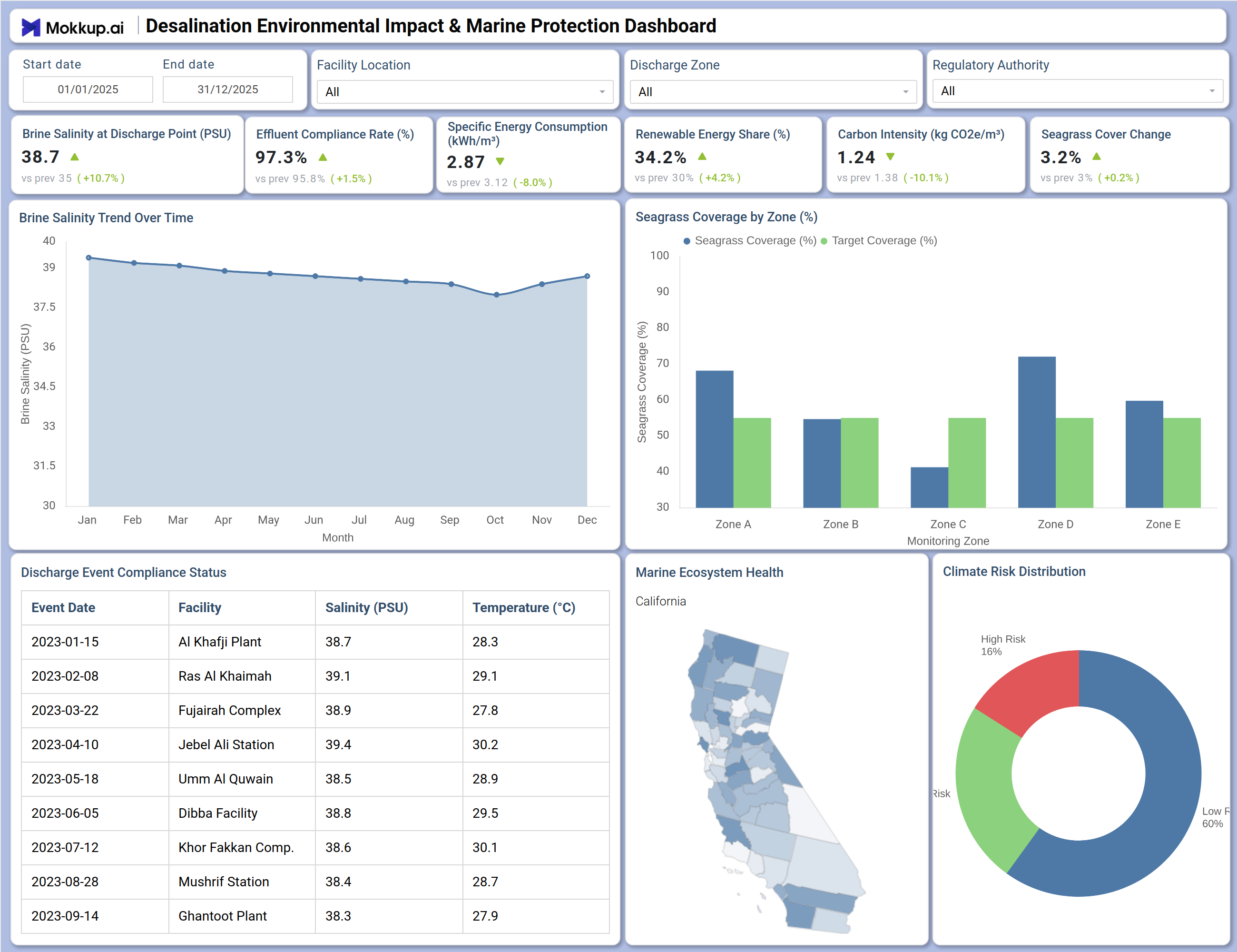
When an environmental compliance team opens this dashboard, their first focus is on understanding whether brine salinity discharge monitoring is within safe limits across all active facilities. They scan the Brine Salinity Trend Over Time chart to determine whether discharge concentrations have been rising or holding steady across the year and cross-reference the Discharge Event Compliance Status table to pinpoint which specific plants logged events, and what salinity and temperature conditions were recorded at the time. When a pattern of exceedance emerges at a particular station, teams can filter by facility location to isolate that site and investigate the underlying operational factors before escalating to the relevant regulatory authority. From there, sustainability officers and coastal zone managers shift their attention to the Seagrass Coverage by Zone chart, comparing actual marine vegetation levels against target thresholds across all five monitoring zones. This view reveals whether seagrass, a key biological indicator of brine and thermal impact, is recovering or declining near discharge points.
The marine ecosystem health tracking map adds a spatial dimension, helping teams identify which geographic areas are under the greatest ecological pressure and where site visits or interventions are most urgently needed. Leadership teams and reporting officers use the KPI tiles at the top of the dashboard as a daily environmental health check, scanning renewable energy share, carbon intensity, effluent compliance rates, and changes in seagrass cover. The Climate Risk Distribution donut chart completes the picture by showing how risk is distributed across high, medium, and low tiers, helping managers prioritize which facilities or zones require immediate attention. By toggling the Discharge Zone, Regulatory Authority, and Facility Location filters, different stakeholders can tailor the same view to their specific oversight jurisdiction without needing custom reports.
How to Analyze Data in a Desalination Environmental Impact & Marine Protection Dashboard
Here is how you can analyze data from this dashboard:
- Use the Facility Location filter to isolate brine salinity and compliance data for a specific desalination plant.
- Review brine salinity at Discharge Point (PSU) to determine whether current discharge concentrations are approaching thresholds that could stress marine habitats.
- Monitor the Brine Salinity Trend Over Time chart to detect seasonal concentration spikes before they trigger a regulatory violation.
- Analyze the seagrass coverage by zone chart to assess marine ecosystem health tracking across all five monitoring zones and compare actual coverage against targets.
- Compare the Marine Ecosystem Health map to identify geographic areas with the highest concentration of environmental stress relative to discharge activity.
- Investigate the Discharge Event Compliance Status table to find which facilities logged the highest salinity or temperature exceedances across the reporting period.
- Filter by Regulatory Authority to align compliance output with the specific standards and thresholds of the governing body for each discharge zone.
- Track Seagrass Cover Change over time to measure progress in marine habitat recovery relative to brine reduction and discharge management efforts.
Benefits of a Desalination Environmental Impact & Marine Protection Dashboard
The following are the benefits of using this dashboard:
- Centralizes brine salinity, seagrass coverage, carbon intensity, and climate risk metrics across multiple desalination facilities into a single structured template.
- Supports brine salinity discharge monitoring across all discharge zones and facility locations simultaneously, reducing oversight gaps.
- Reduces manual data compilation for environmental compliance reporting with pre-built KPI tiles and chart layouts covering both operational and ecological indicators.
- Enables zone-level analysis of effluent compliance rate monitoring to guide regulatory intervention and prioritize infrastructure upgrades where exceedances are most frequent.
- Provides a donut chart breakdown of climate risk distribution for operational and environmental risk planning across high, medium, and low exposure zones.
- Helps environmental managers align with multiple regulatory authority standards without rebuilding compliance reports from scratch for each jurisdiction.
- Gives facility operators and coastal regulators a shared view of marine protection performance, enabling coordinated responses across all active discharge sites.
KPIs to Track in a Desalination Environmental Impact & Marine Protection Dashboard
The following key KPIs can be tracked by using this dashboard:
- Brine Salinity at Discharge Point (PSU): A foundational desalination environmental impact dashboard metric — measures the concentration of salt in discharged water to ensure it remains within limits that marine ecosystems can tolerate.
- Effluent Compliance Rate (%): Tracks the percentage of discharge events that meet regulatory standards — a direct measure of how consistently facilities operate within their environmental permits.
- Specific Energy Consumption (kWh/m³): Quantifies the energy needed to produce each cubic meter of desalinated water — supporting carbon intensity desalination plant benchmarking and energy efficiency planning.
- Renewable Energy Share (%): Measures the proportion of operations powered by renewable sources — key to effluent compliance rate monitoring strategies that prioritize low-carbon production methods.
- Carbon Intensity (kg CO2e/m³): Evaluates greenhouse gas emissions per cubic meter of water produced against facility-level sustainability targets — supporting decarbonization planning across the portfolio.
- Seagrass Cover Change: Tracks seagrass coverage zone analysis across Zone A through Zone E monitoring zones — providing a direct biological indicator of brine and thermal discharge impact on coastal marine habitats.
Frequently Asked Questions
1. What teams use a Desalination Environmental Impact & Marine Protection Dashboard?
Environmental compliance officers, coastal zone regulators, desalination facility operators, and sustainability reporting teams rely on this dashboard to monitor ecological impact, track discharge compliance, and maintain alignment with regulatory authority requirements across all active zones.
2. How does this dashboard improve environmental compliance outcomes?
By combining the Effluent Compliance Rate KPI with the Discharge Event Compliance Status table, teams can identify which facilities and specific events are at risk of breaching regulatory thresholds, enabling early intervention before violations are formally recorded.
3. Can this dashboard track seagrass health across multiple monitoring zones?
Yes. The Seagrass Coverage by Zone chart displays actual seagrass coverage against target coverage for each of the five monitoring zones (Zone A through Zone E), making it straightforward to identify where marine vegetation is declining below acceptable recovery levels.
4. How does the Climate Risk Distribution chart work?
The Climate Risk Distribution donut chart categorizes discharge zones or facilities into high, medium, and low-risk tiers based on combined environmental exposure factors. It gives managers an immediate view of where climate-related ecological risk is most concentrated so they can prioritize inspections and mitigation activity.
5. What does Specific Energy Consumption measure?
Specific Energy Consumption (kWh/m³) tracks how much energy is needed to produce one cubic meter of desalinated water. Reducing this figure lowers thermal and chemical discharge intensity, directly supporting seagrass coverage zone analysis by reducing the stress placed on adjacent marine ecosystems.