
What is a Desalination Strategic Performance Dashboard?
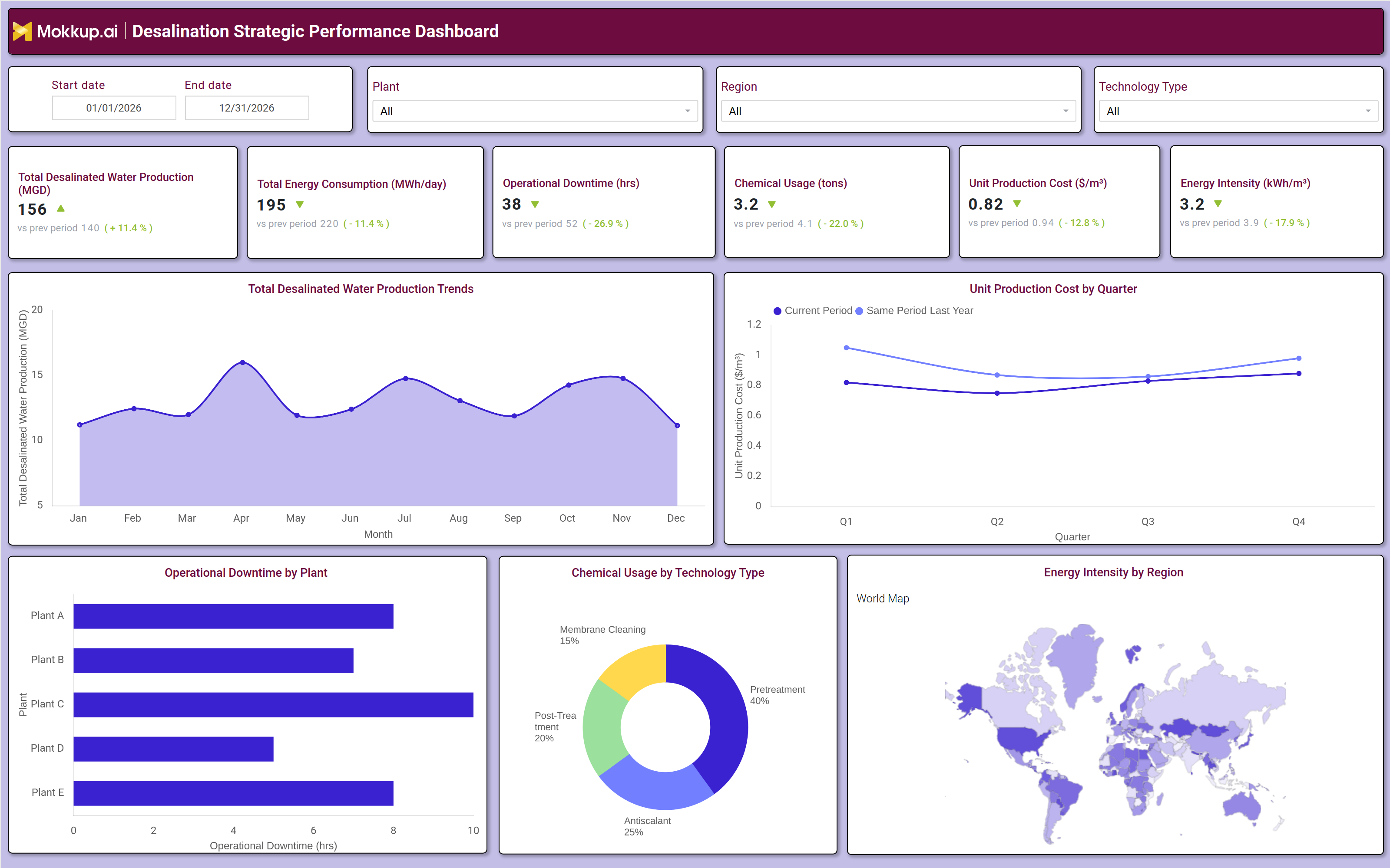
A Desalination Strategic Performance Dashboard gives utility directors, plant operations managers, and sustainability teams a consolidated view of how water production output, energy efficiency, unit costs, and plant reliability are performing across desalination facilities. It tracks KPIs, including total desalinated water production, energy consumption, operational downtime, chemical usage, unit production cost, and energy intensity, giving leadership the cross-facility picture needed to assess operational and financial performance simultaneously.
Chemical usage desalination technology type breakdowns sit alongside regional energy intensity benchmarks, enabling teams to evaluate process efficiency at both the plant and portfolio level. Regional water authorities, independent desalination operators, and municipal utilities use this template to align executive oversight with plant-level performance and to drive continuous improvement across production, cost, and sustainability metrics.
How to Create a Desalination Strategic Performance Dashboard?
You don’t need to build your report from scratch—just start with a ready-to-use dashboard template from Mokkup. Add in your data and export it however you like. Here’s how to do it:
1. Create or Log in to Your Mokkup Account
Start by signing up on Mokkup.ai using your email. If you already have an account, just log in, and you'll be good to go.
2. Choose and Customize Your Dashboard Template
Find the Desalination Strategic Performance Dashboard template in the Templates section. Use the drag and drop editor to adjust KPIs, edit filters, or add elements based on your data.
3. Export to Your BI Tool
Once your dashboard wireframe is ready, use the BI Tool Export feature to send it directly to Power BI or Tableau for further analysis and enhancements. You can also download the dashboard as a PDF, PNG, or JPEG, embed it on a platform, or invite your team to collaborate.
Note: This is a Pro template. You'll need a Pro subscription on Mokkup to use and customize this dashboard wireframe. Upgrade anytime to unlock full access.
Desalination Strategic Performance Dashboard Example
An executive team at a regional water authority opens this dashboard at the start of each reporting period to assess how the desalination portfolio is performing against output, cost, and reliability targets. The KPI tiles deliver an immediate operational summary of whether desalinated water production trend monitoring shows output growing to meet demand forecasts, whether energy consumption is declining per unit of water produced, and whether unit production costs are continuing to fall as operational improvements take hold. When a cost or reliability metric is trending in the wrong direction, the Plant and Technology Type filters allow leadership to isolate which facility or process configuration is driving the variance before engaging operations teams. Operations managers use the monthly production trend chart alongside the quarterly unit production cost line to track whether the two metrics are moving in alignment. Rising output should ideally coincide with falling or stable unit costs, confirming that scale benefits are being realized. When production grows, but costs rise in parallel, it signals that energy or chemical consumption is increasing faster than volume gains, prompting a deeper look at process efficiency across specific technology configurations.
The chemical usage breakdown by technology type gives process engineers a view of where chemical inputs, pre-treatment, antiscalant, post-treatment, and membrane cleaning are being consumed most heavily, supporting chemical procurement optimization and technology-level cost management. Sustainability and strategy teams complete the review using the energy intensity world map, which shows how energy efficiency compares across global regions where the utility operates or benchmarks. Identifying that certain regions achieve significantly lower energy intensity per cubic meter of desalinated water helps leadership set realistic improvement targets for higher intensity facilities and supports the utility's broader decarbonization narrative when engaging with regulators, investors, and community stakeholders.
How to Analyze Data in a Desalination Strategic Performance Dashboard
Here is how you can analyze data from this dashboard:
- Use the Plant filter to isolate one facility's production, energy, and downtime vs. portfolio averages.
- Check the Total Desalinated Water Production Trends area chart for desalinated water production trend monitoring and flag dips.
- Use the Unit Production Cost by Quarter line chart for desalination unit production cost tracking vs. the same quarter last year.
- Use the Operational Downtime by Plant bar chart for desalination operational downtime plant analysis to spot the worst plants (A–E).
- Use the Energy Intensity by Region map for desalination energy intensity regional benchmarking and set targets for high-intensity sites.
- Use the Chemical Usage by Technology Type donut for chemical usage desalination technology type to find the biggest consumer.
- Filter by Technology Type to find the most efficient desalination configuration.
- Track the Energy Intensity KPI over time to gauge efficiency progress.
Benefits of a Desalination Strategic Performance Dashboard
The following are the benefits of using this dashboard:
- Centralizes water production output, energy intensity, unit costs, chemical usage, and operational downtime across all desalination plants in one structured executive template.
- Supports desalinated water production trend monitoring across plants, regions, and technology types from a single dashboard view.
- Reduces manual data compilation for executive and operational reporting with prebuilt KPI tiles and chart layouts covering production, cost, energy, and reliability metrics.
- Enables plant level desalination operational downtime plant analysis to identify reliability gaps and prioritize maintenance investments before production shortfalls affect supply commitments.
- Provides a donut chart breakdown of chemical usage by technology type for procurement optimization and process efficiency planning across pretreatment and membrane treatment stages.
- Helps operations managers and sustainability teams align with energy efficiency and cost reduction targets without rebuilding plant performance reports from scratch each reporting cycle.
- Gives utility executives and plant engineers a shared view of production efficiency, cost performance, and regional energy intensity benchmarks across the full desalination portfolio.
KPIs to Track in a Desalination Strategic Performance Dashboard
The following key KPIs can be tracked by using this dashboard:
- Total Desalinated Water Production (MGD): At the core of any Desalination Strategic Performance Dashboard, measures total daily water output across all plants, the primary indicator of supply capacity and production target achievement.
- Total Energy Consumption (MWh/day): Tracks daily energy consumed across all desalination operations essential for desalination energy intensity regional benchmarking and understanding the relationship between production scale and energy draw.
- Operational Downtime (hrs): Measures total unplanned downtime hours across all plants the key reliability indicator for desalination operational downtime plant analysis and maintenance prioritization decisions.
- Chemical Usage (tons): Quantifies total chemical inputs consumed across all technology types and treatment stages supporting chemical usage desalination technology type optimization and procurement cost management.
- Unit Production Cost ($/m³): Evaluates the all-in cost of producing one cubic meter of desalinated water, the primary financial efficiency metric for desalination unit production cost tracking and cross plant benchmarking.
- Energy Intensity (kWh/m³): Tracks energy consumed per cubic meter of water produced the core sustainability metric for desalination energy intensity regional benchmarking and progress tracking toward decarbonization and efficiency improvement targets.
Frequently Asked Questions
1. What teams use a Desalination Strategic Performance Dashboard ?
This dashboard is used by utility directors, plant operations managers, reliability and maintenance engineers, sustainability teams, and executive leadership at regional water authorities, municipal utilities, and independent desalination operators.
2. How does this dashboard improve production efficiency and cost management?
By surfacing unit production costs, energy intensity, and output trends together, teams can identify whether rising costs are driven by energy inefficiency, chemical overuse, or downtime and direct operational improvements to the specific driver before it compounds across the production year.
3. Can this dashboard compare operational downtime across multiple plants?
The Operational Downtime by Plant horizontal bar chart displays downtime hours for each facility, Plant A through Plant E, allowing reliability engineers and operations managers to immediately identify which plant is generating the most unplanned downtime and prioritize maintenance or equipment investment accordingly.