
What is a Desalination Plant Workforce Management Dashboard?
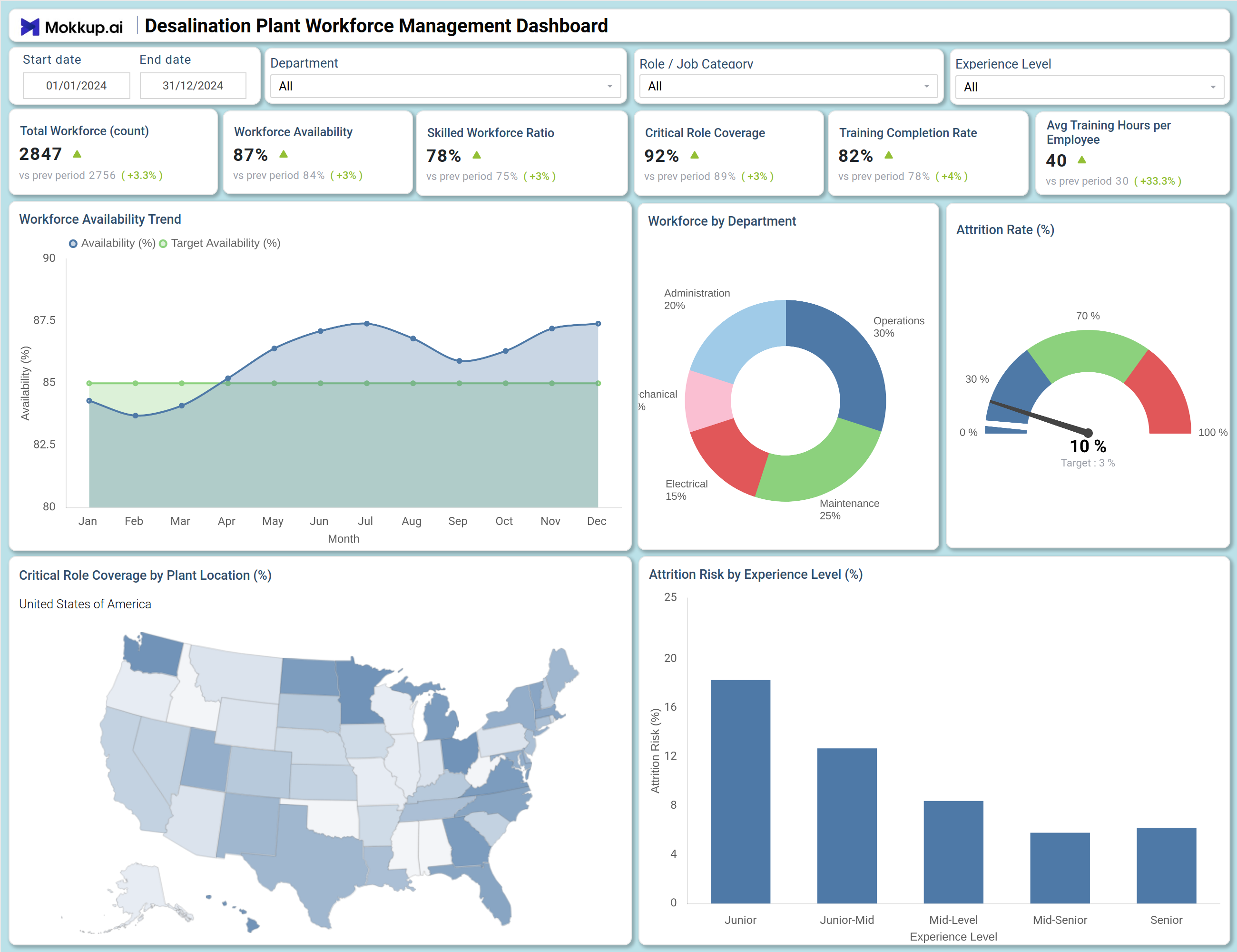
The Desalination Plant Workforce Management Dashboard is a purpose-built analytics tool designed to help HR managers, plant directors, and operations teams at desalination facilities track and optimize their workforce performance. Built around desalination plant workforce management, it consolidates critical metrics, workforce availability, skilled workforce ratios, critical role coverage, training completion, and attrition into a single structured view. Teams responsible for desalination workforce availability tracking rely on this dashboard to maintain operational continuity, especially in facilities where specialized technical roles are difficult to replace. Whether managing a single site or overseeing multiple plant locations, it provides the intelligence needed to proactively address staffing risks and support workforce productivity development.
How to Create a Desalination Plant Workforce Management Dashboard
You don't need to build your report from scratch; just start with a ready-to-use dashboard template from Mokkup. Add in your data and export it however you like. Here's how to do it:
1. Create or Log in to Your Mokkup Account
Start by signing up on Mokkup.ai using your email. If you already have an account, just log in, and you'll be good to go.
2. Choose and Customize Your Dashboard Template
Find the Desalination Plant Workforce Management Dashboard template in the Templates section. Use the drag-and-drop editor to adjust KPIs, edit filters, or add elements based on your data.
3. Export to Your BI Tool
Once your dashboard wireframe is ready, use the BI Tool Export feature to send it directly to Power BI or Tableau for further analysis and enhancements. You can also download the dashboard as a PDF, PNG, or JPEG, embed it on a platform, or invite your team to collaborate.
Note: This is a Pro template. You'll need a Pro subscription on Mokkup to use and customize this dashboard wireframe. Upgrade anytime to unlock full access.
Desalination Plant Workforce Management Dashboard Example
When a plant HR director opens this dashboard, the first priority is assessing whether the workforce is adequately available and technically qualified to support continuous operations. If availability trends are dipping below target in any month, teams can immediately cross-reference departmental headcount distribution to identify whether the gap is concentrated in high-dependency areas like Maintenance or Operations, and act before shift scheduling is disrupted.
The skilled workforce ratio desalination teams maintain is a clear signal of operational readiness; workforce planners can monitor whether upskilling initiatives are translating into measurable improvements across job categories and experience levels. As teams move deeper into the analysis, the attrition dimension becomes central. Managers can examine which experience bands carry the greatest attrition risk and where senior or junior talent retention requires more deliberate intervention. For organizations managing plants across multiple regions, the geographic view enables leadership to pinpoint which locations have the weakest critical role coverage and prioritize hiring or transfer decisions accordingly. This structure gives both HR and plant operations teams the shared, data-driven foundation they need to stay ahead of staffing shortfalls rather than responding to them after the fact.
How to Analyze Data in a Desalination Plant Workforce Management Dashboard
Here is how you can analyze data from this dashboard:
- Use the Department filter to isolate workforce metrics for specific teams such as Operations, Maintenance, Electrical, or Mechanical.
- Review the Total Workforce and Workforce Availability KPIs together to assess whether current headcount is sufficient to sustain plant operations.
- Monitor the Workforce Availability Trend line chart to detect months when availability falls below the target threshold before it disrupts shift planning.
- Analyze the Attrition Risk by Experience Level bar chart to identify which experience segments — particularly Junior or Junior-Mid — carry the highest attrition risk and require targeted retention efforts.
- Compare the Critical Role Coverage by Plant Location map to find which geographic regions have the weakest critical role coverage, plant location performance, and need prioritized resourcing.
- Examine the Workforce by Department donut chart to understand how headcount is distributed and whether high-dependency departments like Maintenance or Operations are adequately staffed.
- Filter by Role / Job Category to align workforce analysis with specific technical functions and assess coverage gaps at a granular level.
- Track Training Completion Rate and Avg Training Hours per Employee over time to measure progress toward a more certified and skilled workforce.
Benefits of a Desalination Plant Workforce Management Dashboard
The following are the benefits of using this dashboard:
- Centralizes workforce availability, skilled workforce ratio, and attrition metrics across desalination plant operations in one structured template.
- Supports skilled workforce ratio desalination monitoring across departments, job categories, and experience levels simultaneously.
- Reduces manual data compilation for HR reporting with pre-built KPI tiles covering availability, coverage, training, and attrition.
- Enables plant-level analysis of workforce attrition risk management to guide targeted retention, succession planning, and hiring decisions.
- Provides a geographic breakdown of critical role coverage for multi-location infrastructure oversight and resource prioritization.
- Helps HR directors align workforce strategy with operational staffing requirements without rebuilding reports from scratch.
- Gives plant managers and HR teams a shared view of workforce health and readiness across all departments and experience levels.
KPIs to Track in a Desalination Plant Workforce Management Dashboard
The following key KPIs can be tracked by using this dashboard:
- Total Workforce (count): A foundational desalination plant workforce management metric that tracks total active headcount — establishing the baseline for all downstream availability and coverage calculations.
- Workforce Availability (%): Tracks the share of the workforce that is actively deployable — essential for shift planning and maintaining operational continuity across plant functions.
- Skilled Workforce Ratio (%): Quantifies the proportion of employees with specialized technical qualifications — directly informing critical role coverage plant location assessments and readiness decisions.
- Critical Role Coverage (%): Measures how effectively essential technical positions are filled across facilities — key to workforce attrition risk management analysis and succession planning.
- Training Completion Rate (%): Reflects the training completion rate water plant teams achieve against defined learning targets — supporting upskilling programs and certification compliance workflows.
- Avg Training Hours per Employee: Tracks the average training investment per employee across all departments and experience levels — supporting benchmarking for workforce development programs.
Frequently Asked Questions
1. What teams use a Desalination Plant Workforce Management Dashboard?
This dashboard is used by HR managers at desalination and water treatment facilities, plant operations directors, regional workforce planning teams, and facility managers responsible for monitoring staffing performance and compliance across multiple plant locations.
2. How does this dashboard improve workforce planning in desalination facilities?
By combining KPIs like Workforce Availability, Skilled Workforce Ratio, and Critical Role Coverage with trend analysis and geographic charts, the dashboard gives planners a complete picture of staffing health. Teams can identify gaps before they affect operations and make proactive decisions about hiring, training, or cross-location redeployment.
3. Can this dashboard track attrition risk by experience level?
Yes. The Attrition Risk by Experience Level bar chart breaks down risk across five experience bands — Junior, Junior-Mid, Mid-Level, Mid-Senior, and Senior — enabling HR teams to identify which cohorts need the most urgent retention attention and design targeted retention strategies accordingly.
4. How does the Critical Role Coverage by Plant Location map work?
The map displays critical role coverage rates geographically across plant locations in the United States. Shading intensity indicates coverage levels — lighter areas flag locations where critical technical roles may be understaffed, enabling regional prioritization of hiring or internal transfer actions.
5. What does the Training Completion Rate measure?
Training Completion Rate measures the percentage of employees who have completed required training programs within the reporting period. As a core training completion rate water plant metric, it reveals whether the workforce is keeping pace with certification and upskilling requirements essential for safe and compliant plant operations.