What is a Desalination Plant & Equipment Health Dashboard?
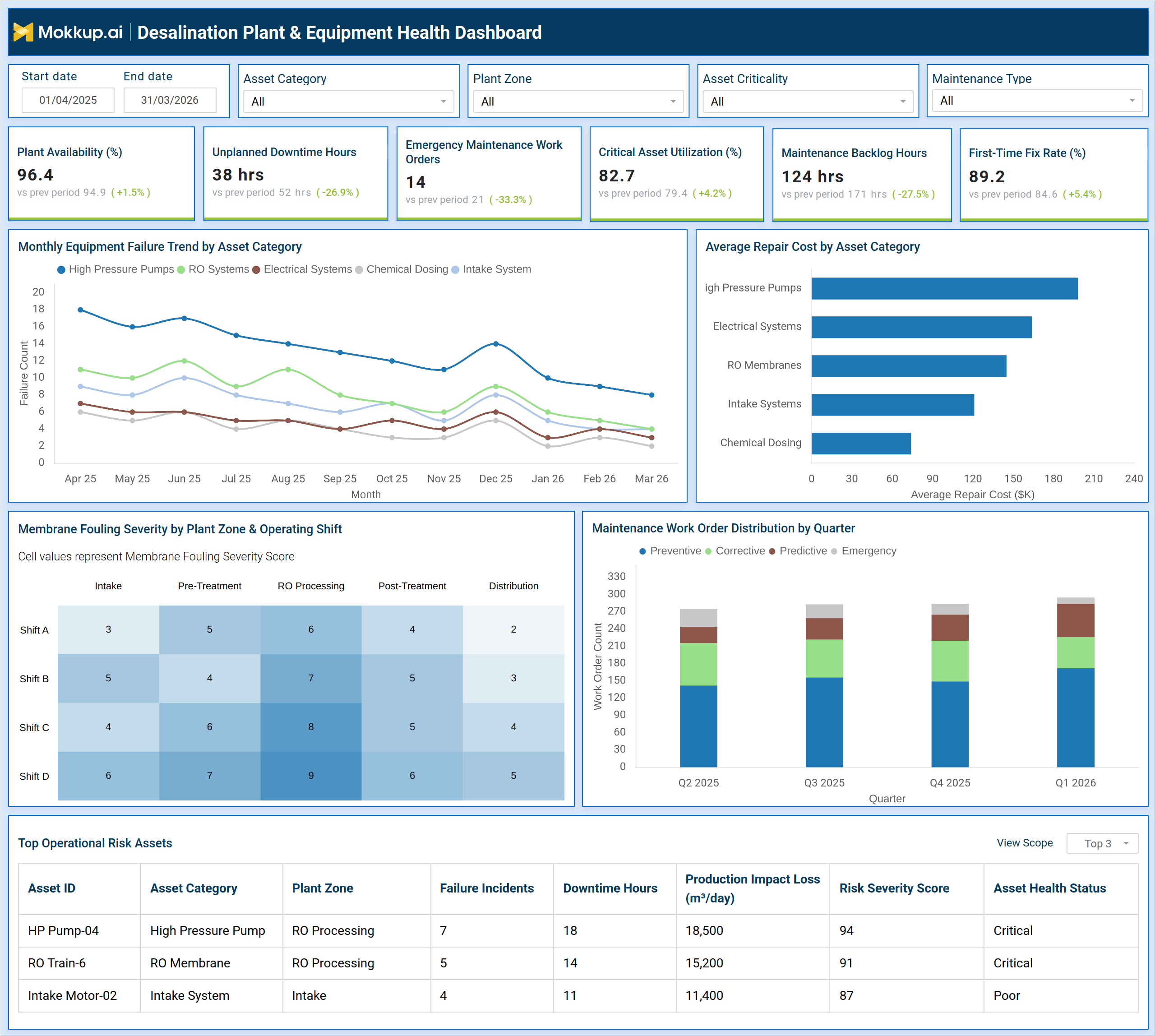
The Desalination Plant & Equipment Health Dashboard is a structured monitoring tool built for plant engineers, maintenance managers, and operations teams responsible for keeping desalination infrastructure running at peak capacity. It consolidates critical metrics across equipment availability, maintenance workflows, and asset risk into a single, filterable view. Teams can segment data by asset category, plant zone, asset criticality, and maintenance type to narrow their focus to specific operational areas. The dashboard tracks six core performance indicators — plant availability, unplanned downtime hours, emergency maintenance work orders, critical asset utilization, maintenance backlog hours, and first-time fix rate, giving supervisors a reliable picture of equipment health across all processing stages, from intake to distribution. It also surfaces trends in equipment failure across asset categories over time, highlights repair cost patterns, maps membrane fouling severity across shifts and plant zones, and identifies the top assets posing operational risk at any given moment. For facilities where equipment failure directly affects water production output, this dashboard provides the structured visibility needed to act before small issues become costly shutdowns.
How to Create a Desalination Plant & Equipment Health Dashboard
You don't need to build your report from scratch, just start with a ready-to-use dashboard template from Mokkup. Add in your data and export it however you like. Here's how to do it:
1. Create or Log in to Your Mokkup Account
Start by signing up on Mokkup.ai using your email. If you already have an account, just log in, and you'll be good to go.
2. Choose and Customize Your Dashboard Template
Find the Desalination Plant & Equipment Health Dashboard template in the Templates section. Use the drag-and-drop editor to adjust KPIs, edit filters, or add elements based on your data.
3. Export to Your BI Tool
Once your dashboard wireframe is ready, use the BI Tool Export feature to send it directly to Power BI or Tableau for further analysis and enhancements. You can also download the dashboard as a PDF, PNG, or JPEG, embed it on a platform, or invite your team to collaborate.
Note: This is a Pro template. You'll need a Pro subscription on Mokkup to use and customize this dashboard wireframe. Upgrade anytime to unlock full access.
Desalination Plant & Equipment Health Dashboard Example
A maintenance manager at a multi-zone desalination facility opens this dashboard at the start of each shift to answer one core question: which assets require immediate attention and which maintenance tasks are falling behind schedule? By applying filters for plant zone and asset criticality, they can isolate the areas under greatest stress without scrolling through unrelated data. The desalination plant equipment health monitoring dashboard serves as the starting point for every shift handover discussion, giving the incoming team a clear view of equipment health across all processing stages. With the top-level KPI tiles in view, the manager can immediately identify whether plant availability has dipped, whether unplanned downtime hours are trending above acceptable thresholds, and whether emergency maintenance work orders are accumulating faster than the team can resolve them. The first-time fix rate indicates maintenance execution quality, while the critical asset utilization figure shows how hard the most important equipment is being pushed.
These indicators together allow the team to prioritize work orders and allocate technicians to the highest-impact areas before production losses compound. Using a water treatment asset failure tracking software approach, the dashboard makes it possible to compare performance across asset categories, and determine where repair costs are climbing fastest. By tracking maintenance work order distribution desalination facility-wide across preventive, corrective, predictive, and emergency categories, operations leadership can measure whether their maintenance strategy is actually reducing emergency interventions over time. The membrane fouling severity view helps teams track RO membrane fouling severity across shifts and plant zones, catching fouling buildups in specific zones before they affect membrane lifespan or output quality. The top operational risk assets table allows supervisors to prioritize inspection and intervention on the assets with the highest failure incidents, longest downtime hours, and greatest production impact loss, keeping water output targets within reach even during periods of elevated equipment stress.
How to Analyze Data in a Desalination Plant & Equipment Health Dashboard
Here is how you can analyze data from this dashboard:
- Apply the Asset Category and Plant Zone filters to isolate performance data for a specific processing area.
- Review the six KPI tiles to assess current plant availability, downtime, emergency orders, utilization, backlog, and fix rate.
- Use the Monthly Equipment Failure Trend chart to compare failure frequency across high-pressure pumps, RO systems, electrical systems, and chemical dosing equipment over time.
- Check the Average Repair Cost by Asset Category bar chart to identify which asset groups are driving the highest maintenance spend.
- Examine the Membrane Fouling Severity heatmap to detect fouling hotspots by plant zone and operating shift.
- Review the Maintenance Work Order Distribution by Quarter chart to evaluate whether preventive and predictive work orders are growing relative to emergency and corrective ones.
- Sort the Top Operational Risk Assets table by Risk Severity Score or Downtime Hours to prioritize inspection and intervention on the most at-risk equipment.
- Compare production impact loss figures across assets to understand which failures are most directly affecting daily water output.
Benefits of a Desalination Plant & Equipment Health Dashboard
The following are the benefits of using this dashboard:
- Centralizes equipment health data across all asset categories and plant zones into one filterable view.
- Tracks plant availability KPIs that desalination operations teams rely on to meet daily production targets.
- Identifies high-risk assets before failure incidents accumulate into extended downtime events.
- Supports maintenance strategy evaluation by separating preventive, corrective, predictive, and emergency work order volumes.
- Reduces time spent locating performance data by combining KPI tiles, trend charts, a fouling heatmap, and a risk asset table in one dashboard.
- Helps operations teams compare repair cost trends across asset categories to guide budget allocation decisions.
- Enables shift-level fouling severity comparisons to support targeted membrane maintenance scheduling.
- Improves first-time fix rates by giving technicians clear, asset-specific risk and downtime context before beginning repairs.
KPIs to Track in a Desalination Plant & Equipment Health Dashboard
The following key KPIs can be tracked by using this dashboard:
- Plant Availability (%): the percentage of scheduled operating time during which plant equipment is fully functional and available for production.
- Unplanned Downtime Hours: total hours during the period when equipment stopped operating due to unexpected failures rather than scheduled maintenance.
- Emergency Maintenance Work Orders: the count of work orders raised in response to urgent, unplanned equipment failures requiring immediate action.
- Critical Asset Utilization (%): the proportion of available capacity being used by assets classified as critical to plant operations.
- Maintenance Backlog Hours: the total estimated hours of maintenance work that have been identified but not yet completed.
- First-Time Fix Rate (%): the percentage of maintenance work orders resolved correctly on the first visit without requiring a follow-up intervention.
- Average Repair Cost by Asset Category: the mean cost incurred to repair equipment within each asset group, used to track spend concentration.
- Membrane Fouling Severity Score: a numeric indicator of fouling buildup intensity on RO membranes, mapped by plant zone and shift.
- Risk Severity Score: a composite score used to rank assets by their overall operational risk, combining failure frequency, downtime, and production impact.
- Production Impact Loss (m³/day): the estimated daily water production volume lost as a result of asset failure or downtime.
Frequently Asked Questions
1. What types of assets does this dashboard cover?
The dashboard tracks high-pressure pumps, RO membranes, electrical systems, intake systems, and chemical dosing equipment. Assets are filterable by category, plant zone, and criticality level to focus on the most relevant subset for a given shift or review.
2. How does the dashboard support predictive maintenance desalination equipment programs?
The Maintenance Work Order Distribution chart breaks down work orders by preventive, corrective, predictive, and emergency types across quarters. This allows teams to measure whether predictive and preventive activities are reducing emergency interventions over time, which is the core goal of any predictive maintenance desalination equipment strategy.
3. Can this dashboard help reduce production impact losses?
Yes. The Top Operational Risk Assets table includes a Production Impact Loss column that quantifies how much daily water output is affected by each asset's downtime. Teams can use this data to prioritize repairs on the assets with the greatest effect on production volumes.