What is a Desalination Brine Disposal Efficiency Dashboard?
A Desalination Brine Disposal Efficiency Dashboard is a centralized analytics tool that monitors and optimizes brine waste management in desalination plants. It consolidates key performance metrics such as brine volume disposed, storage capacity utilization, energy consumption for treatment, transport costs, and regulatory compliance rates into a single interface.
This dashboard helps plant operators, environmental engineers, and utility managers track efficiency trends, identify inefficiencies, and implement cost-saving measures. By providing data-driven insights, it ensures sustainable brine disposal while minimizing environmental impact and operational expenses.
How to Create a Desalination Brine Disposal Efficiency Dashboard
You don’t need to build your report from scratch, just start with a ready-to-use Desalination Brine Disposal Efficiency dashboard template from Mokkup. Add in your data and export it however you like. Here’s how to do it:
1. Create or Log in to Your Mokkup Account
Start by signing up on Mokkup.ai using your email. If you already have an account, just log in, and you’ll be good to go.
2. Choose and Customize Your Dashboard Template
Find the Desalination Brine Disposal Efficiency Dashboard template in the Templates section. Use the drag and drop editor to adjust KPIs, edit filters, or add elements based on your data.
3. Export to Your BI Tool
Once your dashboard wireframe is ready, use the BI Tool Export feature to send it directly to Power BI or Tableau for further analysis and enhancements. You can also download the dashboard as a PDF, PNG, or JPEG, embed it on a platform, or invite your team to collaborate.
Note: This is a Pro template. You’ll need a Pro subscription on Mokkup to use and customize this dashboard wireframe. Upgrade anytime to unlock full access.
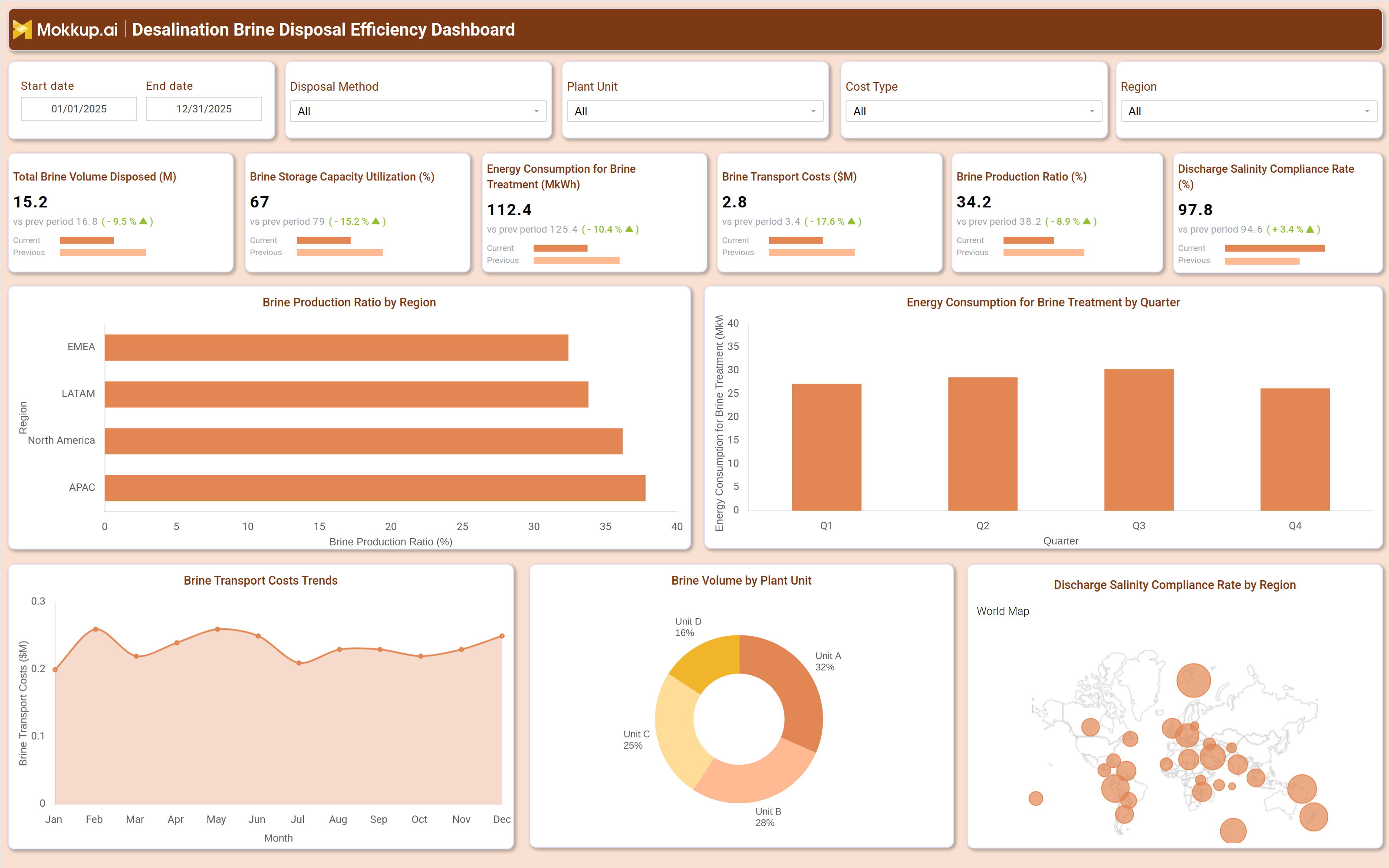
Desalination Brine Disposal Efficiency Dashboard Example
A typical desalination brine production ratio dashboard includes interactive filters for date range, disposal method, plant unit, cost type, and region. Key performance tiles display metrics such as total brine volume disposed, storage capacity utilization, energy consumption for treatment, transport costs, brine production ratio, and discharge salinity compliance rate.
Trend charts compare current performance against previous periods, while regional breakdowns highlight variations in brine production efficiency. A geographic map visualizes compliance rates across different locations, and a pie chart segments brine volume by plant unit. Together, these components provide a comprehensive view of brine disposal operations, enabling utilities to optimize waste management strategies.
How to Analyze Data in a Desalination Brine Disposal Efficiency Dashboard
Here is how you can analyze data from this dashboard:
- Track Brine Disposal Volume: Monitor waste generation trends and identify production spikes.
- Monitor Storage Utilization: Review brine storage capacity to prevent overflow risks.
- Compare Treatment Energy Usage: Benchmark energy consumption against industry standards.
- Analyze Transport Costs: Identify logistics inefficiencies and cost-saving opportunities.
- Evaluate Brine Production Ratio: Measure plant efficiency and detect process issues.
- Review Salinity Compliance: Track discharge salinity to ensure regulatory compliance.
- Assess Plant-Level Performance: Use regional and facility breakdowns to identify underperforming units.
- Compare Historical Trends: Measure long-term improvements and operational progress over time.
Benefits of a Desalination Brine Disposal Efficiency Dashboard
The following are the benefits of using this dashboard:
- Improved Disposal Efficiency: Tracks brine volume and treatment performance in one dashboard.
- Reduced Operational Costs: Optimizes energy usage and transport logistics.
- Better Regulatory Compliance: Monitors discharge salinity and environmental standards.
- Data-Driven Decision-Making: Supports waste management planning with actionable insights.
- Lower Environmental Risk: Identifies disposal inefficiencies before they escalate.
- Sustainability Support: Helps reduce energy consumption and waste generation.
- Operational Visibility: Gives teams a proactive view of brine disposal performance.
KPIs to Track in a Desalination Brine Disposal Efficiency Dashboard
The following key KPIs can be tracked by using this discharge salinity compliance dashboard:
- Total Brine Volume Disposed (M³): Measures the total waste volume generated and disposed of by the plant.
- Brine Storage Capacity Utilization (%): Tracks how efficiently storage facilities are being used.
- Energy Consumption for Brine Treatment (MkWh): Monitors energy usage in brine processing to optimize costs.
- Brine Transport Costs ($M): Evaluates logistics expenses for waste disposal.
- Brine Production Ratio (%): Compares brine output to freshwater production to assess plant efficiency.
- Discharge Salinity Compliance Rate (%): Ensures brine disposal meets environmental regulations.
Frequently Asked Questions
Q1. How does a brine transport cost monitoring dashboard improve desalination plant operations?
It provides actionable insights into waste volume, energy use, and compliance, helping plants optimize disposal processes and reduce costs.
Q2. What data sources feed into this desalination brine disposal dashboard?
Plant operational data, energy consumption logs, transport records, and environmental compliance reports.
Q3. Who should use a brine treatment efficiency dashboard?
Plant managers, environmental engineers, utility operators, and regulatory compliance teams.