What is a Daily Weather Monitoring Dashboard?
A daily weather monitoring dashboard is a centralized analytics tool that consolidates meteorological data, forecast accuracy metrics, and climate trends into a single interface. Designed for meteorologists, disaster management teams, agriculture businesses, and logistics operators, this dashboard provides accurate meteorological data tracking with historical and predictive insights. It helps organizations monitor severe weather alerts, precipitation probability, sensor network uptime, and forecast accuracy to make data-driven decisions. By visualizing trends in weather analytics, businesses can optimize operations, reduce risks, and improve preparedness for extreme weather events.
How to Create a Daily Weather Monitoring Dashboard?
You don’t need to build your report from scratch; just start with a ready-to-use dashboard template from Mokkup. Add in your data and export it however you like. Here’s how to do it:
1. Create or Log in to Your Mokkup Account
Start by signing up on Mokkup.ai using your email. If you already have an account, just log in, and you’ll be good to go.
2. Choose and Customize Your Dashboard Template
Find the Daily Weather Monitoring Dashboard template in the Templates section. Use the drag-and-drop editor to adjust KPIs, edit filters, or add elements based on your data.
3. Export to Your BI Tool
Once your dashboard wireframe is ready, use the BI Tool Export feature to send it directly to Power BI or Tableau for further analysis and enhancements. You can also download the dashboard as a PDF, PNG, or JPEG, embed it on a platform, or invite your team to collaborate.
Note: This is a Pro template. You’ll need a Pro subscription on Mokkup to use and customize this dashboard wireframe. Upgrade anytime to unlock full access.
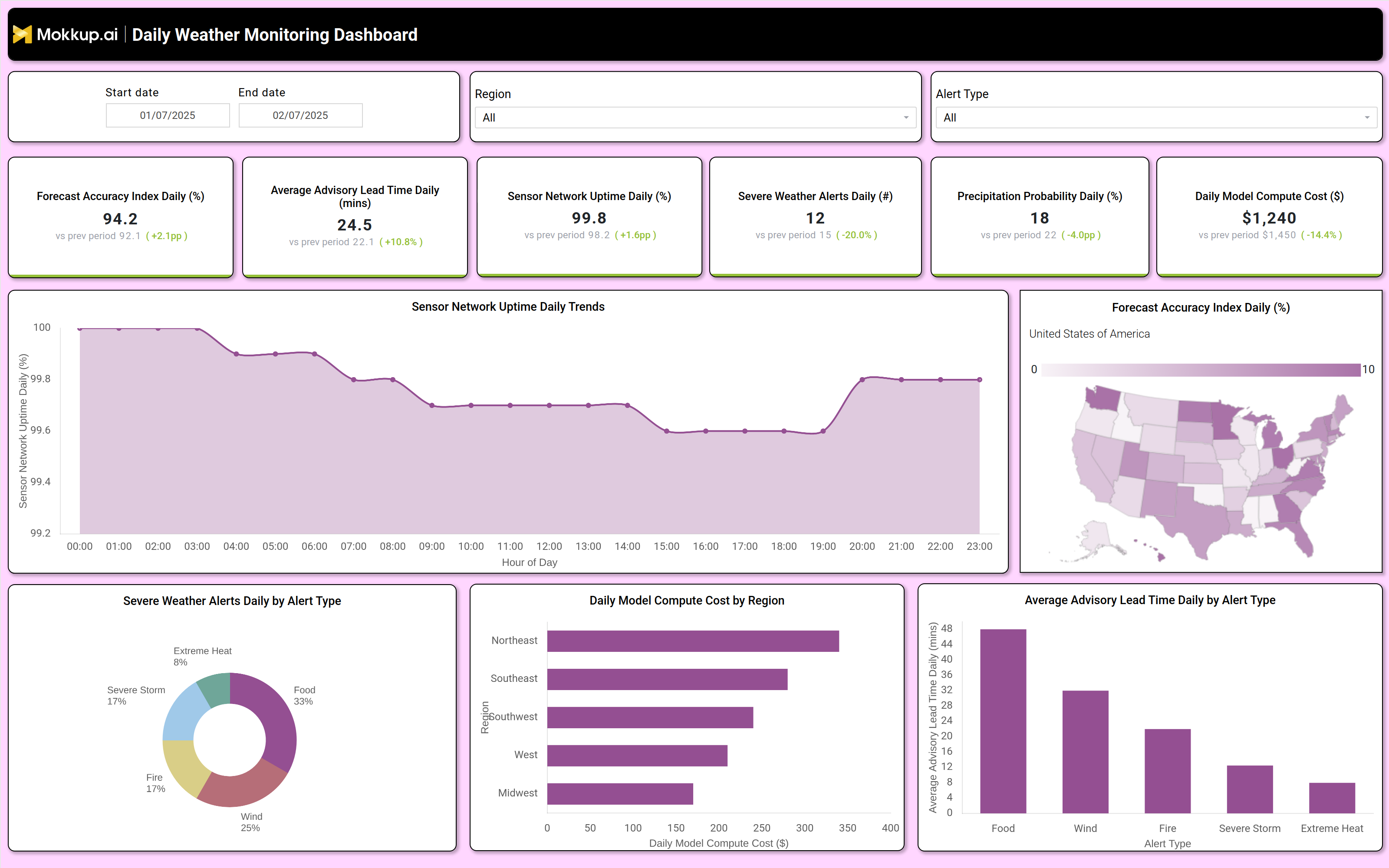
Daily Weather Monitoring Dashboard Example
A well structured daily weather monitoring dashboard includes interactive filters for date ranges, regions, and alert types, allowing users to drill down into specific weather patterns. Key performance tiles display forecast accuracy percentages, average advisory lead times, sensor network uptime, severe weather alerts, precipitation probability, and daily model compute costs. Trend charts show hourly sensor uptime fluctuations, while a geographic heatmap highlights forecast accuracy variations by region. Additional visualizations, such as pie charts for severe weather alert types and bar graphs for compute costs by region, provide deeper operational insights. This sensor network uptime dashboard ensures that meteorological teams, emergency responders, and businesses have a clear view of weather conditions and predictive performance.
How to Analyze Data in a Daily Weather Monitoring Dashboard
Here is how you can analyze data from this dashboard:
- Monitor forecast accuracy trends to assess prediction reliability and identify regional discrepancies.
- Track severe weather alerts by type (flood, wind, fire, extreme heat) to prioritize disaster response efforts.
- Evaluate sensor network uptime to ensure data collection consistency and detect potential hardware failures.
- Compare precipitation probability against actual rainfall to refine forecasting models.
- Analyze daily model compute costs by region to optimize budget allocation for weather simulations.
- Review advisory lead times to determine how early warnings are issued for different weather events.
- Assess historical trends in forecast accuracy and sensor performance to improve long-term climate monitoring.
Benefits of a Daily Weather Monitoring Dashboard
The following are the benefits of using this precipitation probability dashboard:
- Enhances decision-making with accurate meteorological data tracking for industries like agriculture, aviation, and logistics.
- Improves disaster preparedness by providing daily weather updates for emergency response teams.
- Optimizes resource allocation by identifying high risk weather patterns and compute cost inefficiencies.
- Supports climate research with historical weather trend analysis for long term environmental studies.
- Reduces operational risks by enabling proactive measures against severe weather disruptions.
- Increases forecast reliability through continuous performance benchmarking of prediction models.
- Streamlines reporting with automated data visualization for stakeholders and regulatory compliance.
KPIs to Track in a Daily Weather Monitoring Dashboard
The following key KPIs can be tracked by using such a Severe Weather Alert dashboard:
- Forecast Accuracy Index (%) – Measures the precision of weather predictions compared to actual conditions.
- Average Advisory Lead Time (mins) – Tracks how early weather warnings are issued before an event occurs.
- Sensor Network Uptime (%) – Indicates the reliability of weather data collection infrastructure.
- Severe Weather Alerts (count) – Counts the number of high risk weather notifications issued daily.
- Precipitation Probability (%) – Predicts the likelihood of rainfall or snowfall in a given region.
- Daily Model Compute Cost ($) – Monitors the financial expenditure on weather simulation models.
Frequently Asked Questions
1. How does a severe weather alert dashboard improve disaster response?
It provides early severe weather alerts, precipitation forecasts, and sensor uptime tracking, enabling faster emergency planning.
2. What data sources feed into this forecast accuracy tracking dashboard?
Data comes from satellites, radar systems, weather stations, IoT sensors, and AIdriven forecasting models.
3. Who should use a daily weather monitoring dashboard?
Meteorologists, disaster management agencies, agriculture businesses, logistics companies, and energy providers use this dashboard to track weather patterns and optimize operations.