
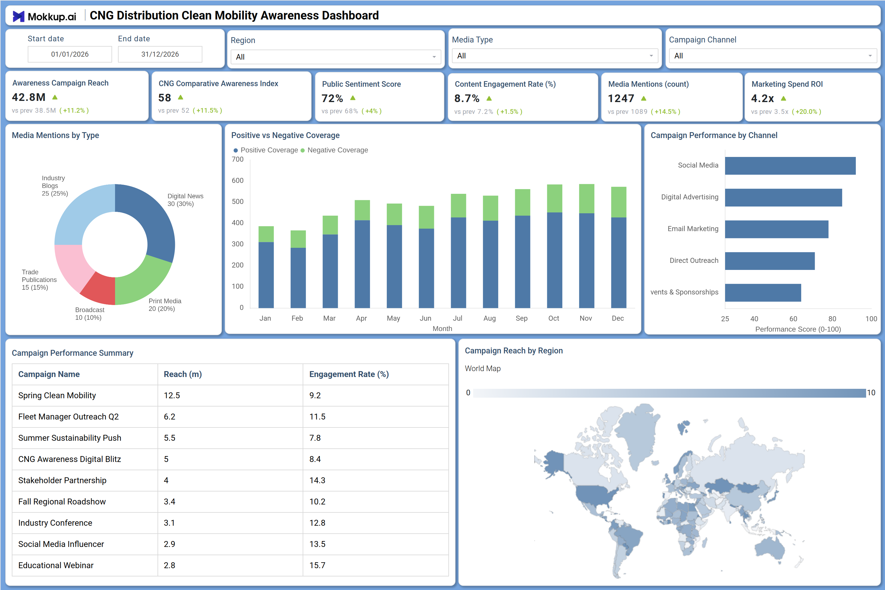
What is a CNG Distribution Clean Mobility Awareness Dashboard?
The CNG Distribution Clean Mobility Awareness Dashboard is a purpose-built analytics template for energy distributors, fleet operators, and sustainability marketers who need to measure the effectiveness of their clean mobility campaigns. This CNG distribution clean mobility awareness dashboard consolidates campaign performance metrics, media coverage trends, and audience sentiment data into a single structured view that eliminates the need to pull reports from multiple platforms. It tracks KPIs such as Awareness Campaign Reach, CNG Comparative Awareness Index, Public Sentiment Score, Content Engagement Rate, Media Mentions, and Marketing Spend ROI, giving communication teams a clear picture of how their messaging is landing. Designed for the natural gas and alternative fuels sector, this clean transportation public sentiment dashboard helps teams monitor brand visibility, evaluate which channels drive results, and make budget decisions based on performance evidence rather than assumptions.
How to Create a CNG Distribution Clean Mobility Awareness Dashboard
You don't need to build your report from scratch; just start with a ready-to-use dashboard template from Mokkup. Add in your data and export it however you like. Here's how to do it:
1. Create or Log in to Your Mokkup Account
Start by signing up on Mokkup.ai using your email. If you already have an account, just log in, and you'll be good to go.
2. Choose and Customize Your Dashboard Template
Find the CNG Distribution Clean Mobility Awareness Dashboard template in the Templates section. Use the drag-and-drop editor to adjust KPIs, edit filters, or add elements based on your data.
3. Export to Your BI Tool
Once your dashboard wireframe is ready, use the BI Tool Export feature to send it directly to Power BI or Tableau for further analysis and enhancements. You can also download the dashboard as a PDF, PNG, or JPEG, embed it on a platform, or invite your team to collaborate.
Note: This is a Pro template. You'll need a Pro subscription on Mokkup to use and customize this dashboard wireframe. Upgrade anytime to unlock full access.
CNG Distribution Clean Mobility Awareness Dashboard Example
A communications manager at a CNG distribution company opens this dashboard at the start of each month to assess whether their awareness campaigns are gaining traction across target regions. They use the date range, region, media type, and campaign channel filters to focus on specific program windows or geography, for example isolating a regional push versus a national digital effort. The CNG campaign performance tracking dashboard makes this segmentation fast and actionable without manual data assembly.On the campaign side, the team examines which programs drove the most reach and which generated the highest engagement rates. The Campaign Performance Summary table lists each campaign by name alongside its reach in millions and engagement percentage, allowing managers to rank programs and redirect investment toward proven formats.
The Campaign Performance by Channel bar chart shows which channels, including social media, digital advertising, email marketing, direct outreach, and events and sponsorships, scored highest on performance.The media coverage section helps teams understand how CNG awareness campaign reach metrics translate into earned media. The Positive vs Negative Coverage chart tracks monthly sentiment direction across the full year, making it easy to identify periods where negative coverage spiked and required a response. The Media Mentions by Type donut chart breaks down coverage across industry blogs, digital news, trade publications, broadcasts, and print media, showing where distribution is concentrated.The Campaign Reach by Region world map gives leadership a geographic layer for evaluating clean mobility media sentiment analysis across markets. Together, these views give the full team a shared foundation for reviewing what worked, what needs adjustment, and where the next phase of outreach should focus.
How to Analyze Data in a CNG Distribution Clean Mobility Awareness Dashboard
Here is how you can analyze data from this dashboard:
- Use the Region filter to compare CNG awareness campaign reach metrics across different geographic markets.
- Apply the Campaign Channel filter to isolate performance scores for social media, digital advertising, email marketing, direct outreach, and events.
- Review the Positive vs Negative Coverage chart to identify months where sentiment shifted and correlate changes to campaign events.
- Analyze the Campaign Performance by Channel bar chart to determine which channel delivers the highest performance score.
- Use the Campaign Performance Summary table to rank individual campaigns by reach and engagement rate, then prioritize budget toward top performers.
- Monitor the Media Mentions by Type donut chart to assess where earned media is concentrated and identify gaps across trade publications or broadcast outlets.
- Track Marketing Spend ROI alongside Content Engagement Rate to evaluate whether high-spend campaigns generate proportional interaction.
- Use the Campaign Reach by Region world map to support clean mobility media sentiment analysis across multi-regional deployments.
- Filter by Media Type to segment coverage data and assess how different formats contribute to the overall CNG Comparative Awareness Index.
Benefits of a CNG Distribution Clean Mobility Awareness Dashboard
The following are the benefits of using this dashboard:
- Centralizes campaign reach, sentiment, media mentions, and channel performance into one structured template for CNG distribution and clean mobility programs.
- Supports CNG campaign performance tracking dashboard workflows by eliminating manual report compilation across multiple platforms.
- Enables side-by-side comparison of individual campaigns using reach and engagement metrics to guide future investment decisions.
- Provides a monthly trend view of positive versus negative media coverage to support proactive reputation management.
- Helps marketing and communications teams align natural gas vehicle marketing ROI tracking with channel-level performance data.
- Gives leadership and campaign managers a shared view of awareness metrics without requiring separate reporting workflows.
- Supports geographic analysis of campaign reach through a world map visual highlighting the regional distribution of clean mobility outreach.
KPIs to Track in a CNG Distribution Clean Mobility Awareness Dashboard
The following key KPIs can be tracked by using this dashboard:
- Awareness Campaign Reach (millions): Measures the total estimated audience exposed to CNG awareness content and serves as the core output metric for any CNG distribution clean mobility awareness dashboard tracking program scale.
- CNG Comparative Awareness Index (score): Tracks how awareness of CNG as a clean fuel option compares across defined benchmarks or time periods, helping teams measure brand recognition momentum.
- Public Sentiment Score (%): Quantifies the proportion of positive sentiment in public-facing coverage and social response, central to any clean transportation public sentiment dashboard assessment.
- Content Engagement Rate (%): Measures the percentage of exposed audiences who interact with campaign content, a direct indicator of message relevance and creative effectiveness.
- Media Mentions (count): Counts the total volume of earned media placements across industry blogs, digital news, trade publications, broadcasts, and print media over the selected period.
- Marketing Spend ROI (multiplier): Tracks return generated per unit of campaign spend, essential for natural gas vehicle marketing ROI tracking and budget justification across channel types.
Frequently Asked Questions
1. Who is this dashboard designed for?
This dashboard is built for communications managers, campaign strategists, and marketing leads at CNG distributors, fleet management companies, and clean energy advocacy organizations. It is also useful for sustainability reporting teams that need to document public awareness outcomes alongside operational data.
2. Can this dashboard track performance across multiple campaign channels simultaneously?
Yes. The Campaign Performance by Channel bar chart scores Social Media, Digital Advertising, Email Marketing, Direct Outreach, and Events and Sponsorships within the same view. The Campaign Channel filter lets users isolate any single channel for a more focused analysis.
3. How does the Positive vs Negative Coverage chart work?
The chart displays monthly stacked bars across a full year, with each bar divided between positive and negative media coverage volumes. Teams can read month-by-month shifts in sentiment direction and link spikes in negative coverage to specific campaign events or external news cycles.